
Client
Mankai
Industry
Food/Beverages | Health
Skills
brand_strategy | visual_identity | copywriting | packaging
Eat your greens
Superfoods have become quite the buzzword to describe any nutrient-dense food or some supplements – but some foods are truly super. Such is Mankai, as we’ve learned closely after embarking on a mutual journey to redefine its brand identity, and lead the change through a new role. Mankai is the product of Hinnoman, an Israeli food-tech startup, with its flagship product, a tiny and powerful, frozen vegetable with 60 vital nutrients, uniquely raised in special farms in southern Israel. It was immediately obvious that this tiny plant is actually epic, and offers real nutritional value. It was up to us to tell the right story, to make it sparkle.

Shake it up
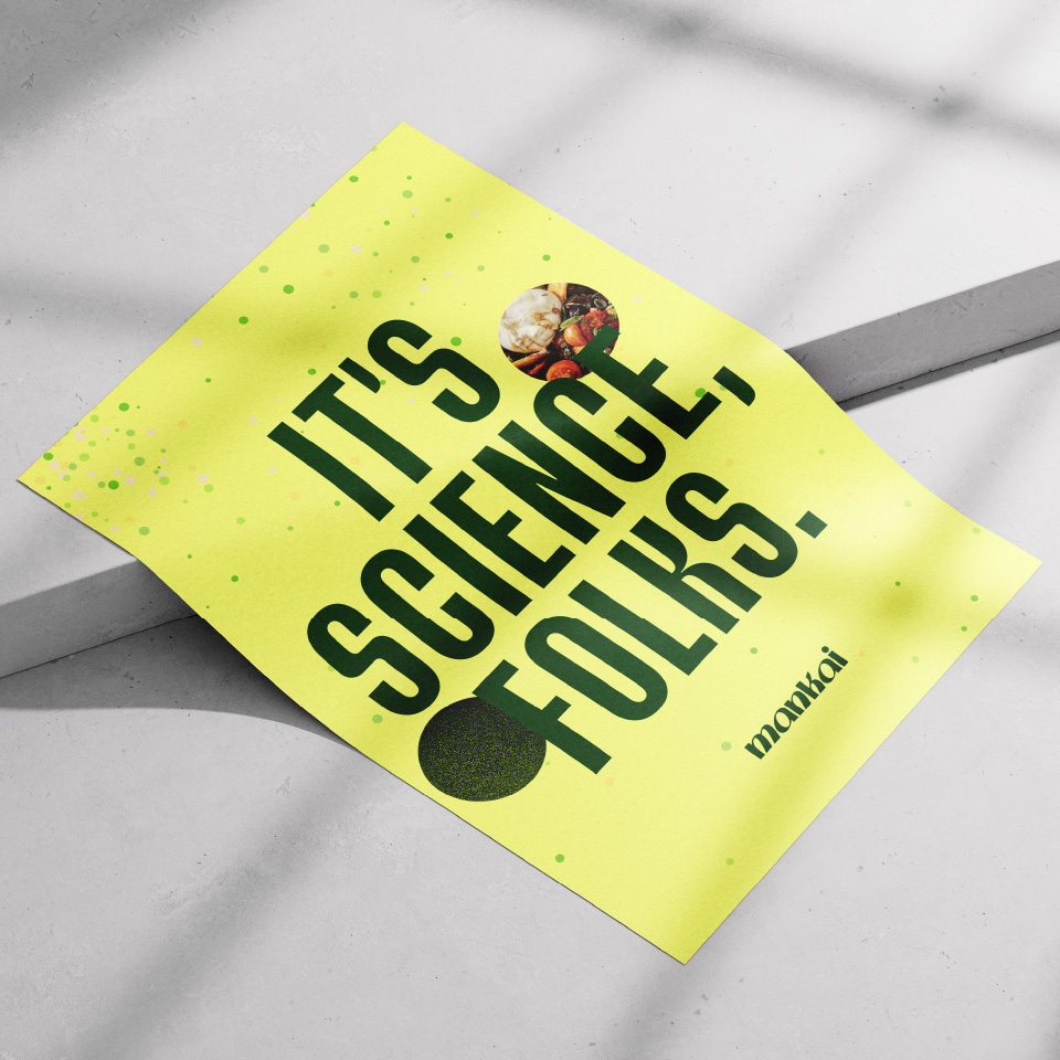
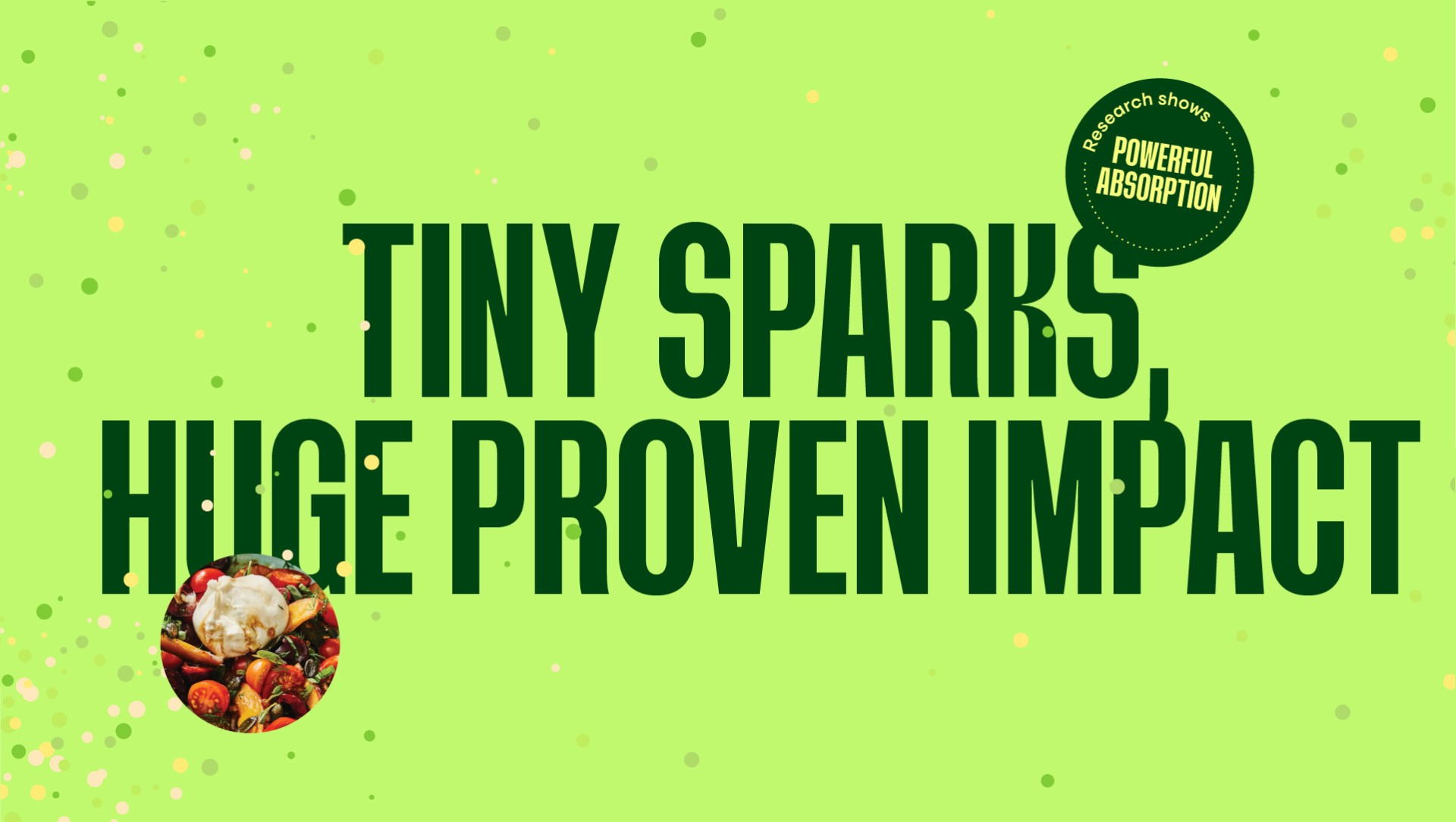
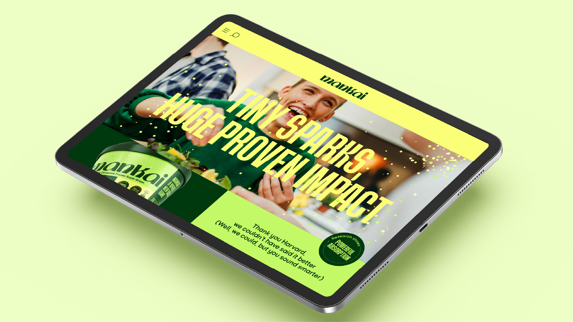
Clarity and market education were Mankai’s biggest challenges. The nutraceuticals market is chock full of superfoods and healthy greens, from Spirulina to an endless array of supplement, with health and wellness claims aplenty – that being said, Mankai isn’t in fact a supplement, rather. We had to craft a transparent brand that tells the uniqueness of the Mankai plant in a simple, accessible way, yet informative, differentiating, reliable and thrilling. Mankai’s new brand idea is TO SHAKE UP SUPERFOOD, BY SHAKING UP THE IMPACT AND THE EXPERIENCE, conveying the solution it offers to an overly-serious industry: REAL IMPACT, WITHOUT THE DRAG. Our goal was to tie Mankai with a fun self-care experience, without diminishing its wonderous, clinically proven properties.
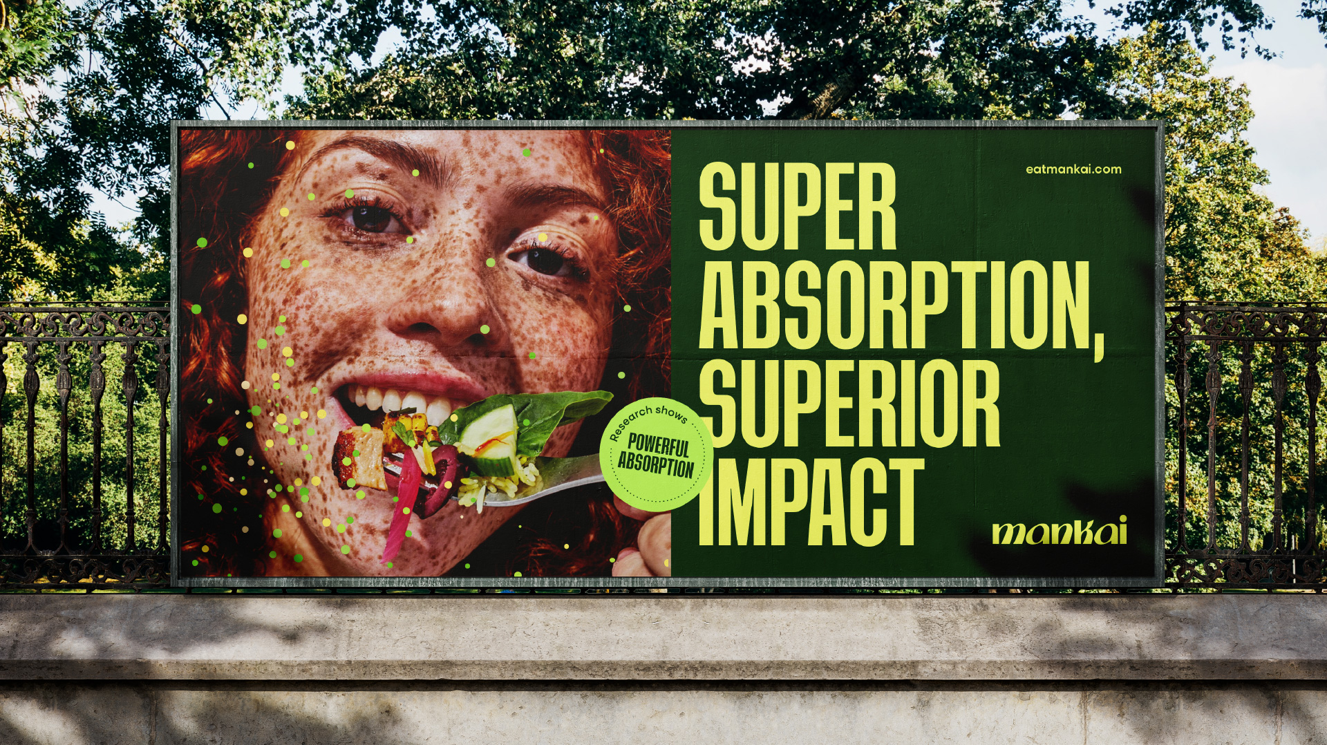
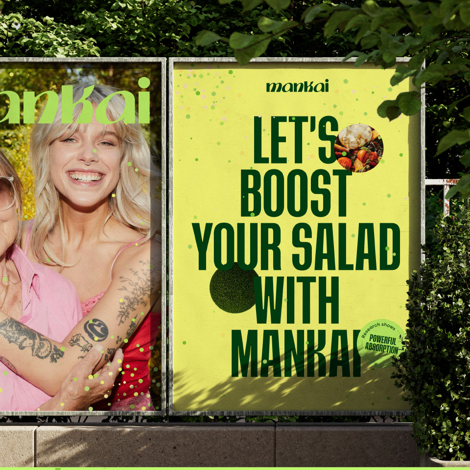
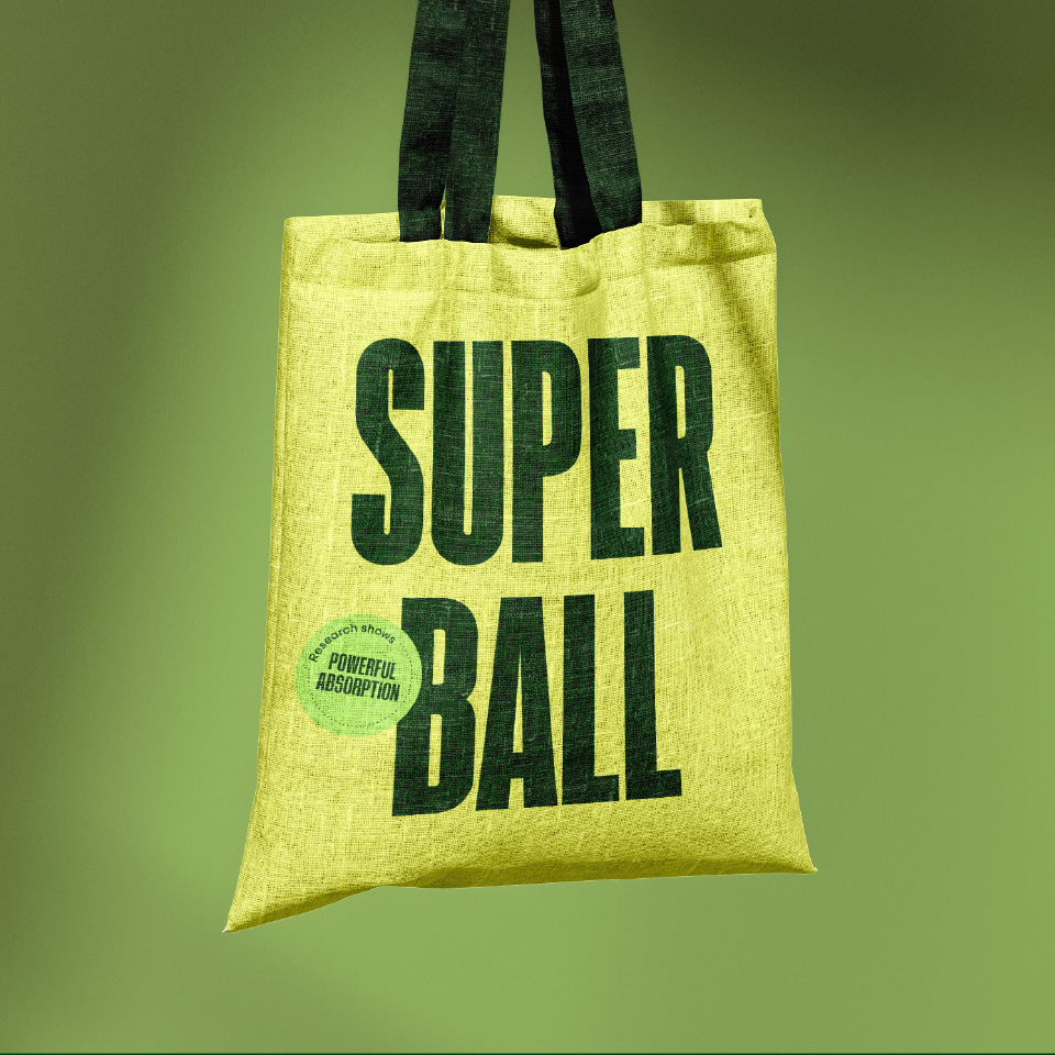
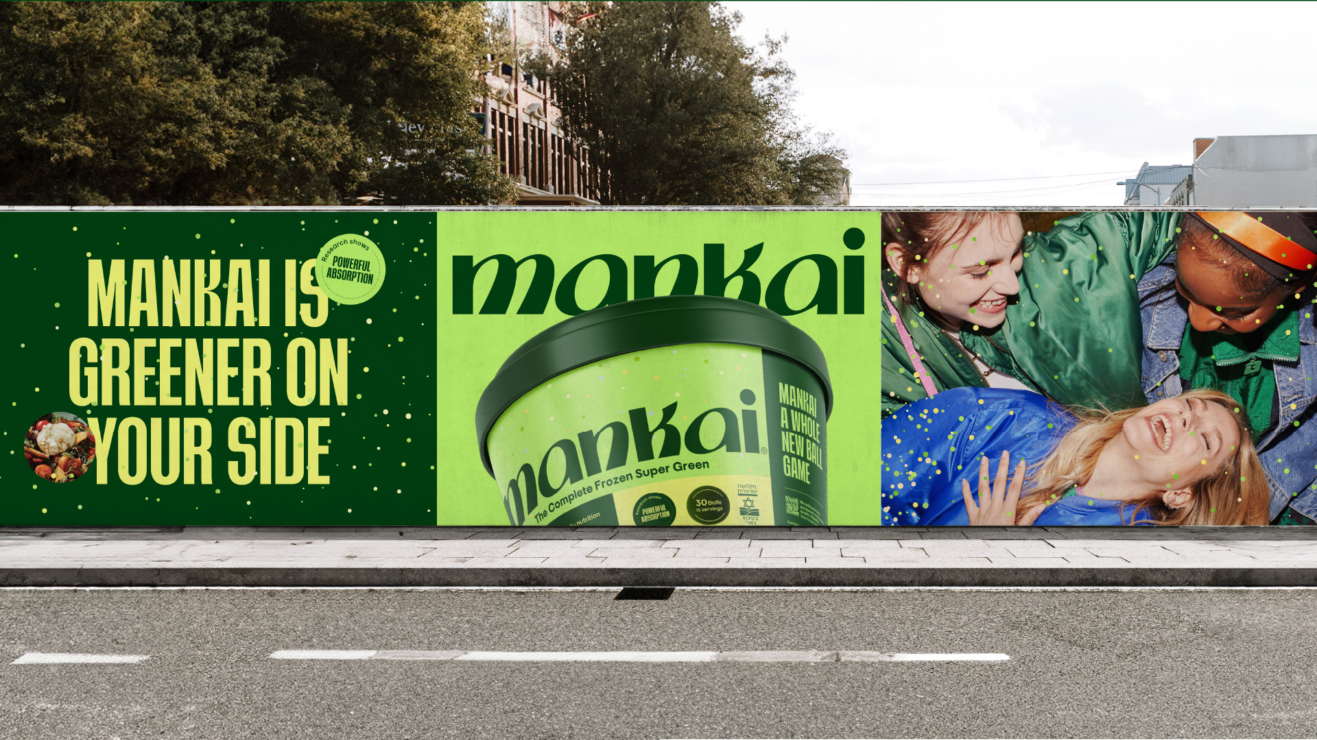
Superballs season
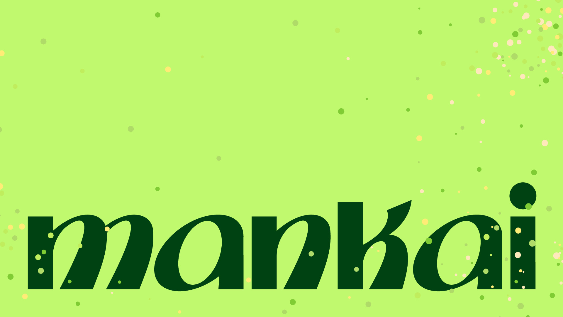
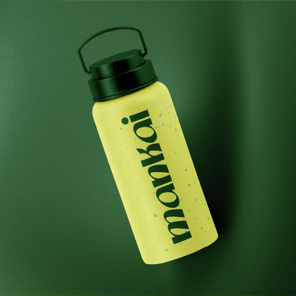
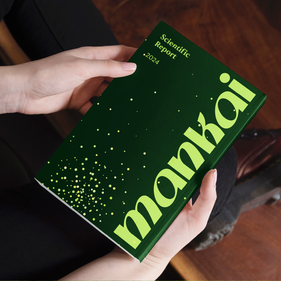
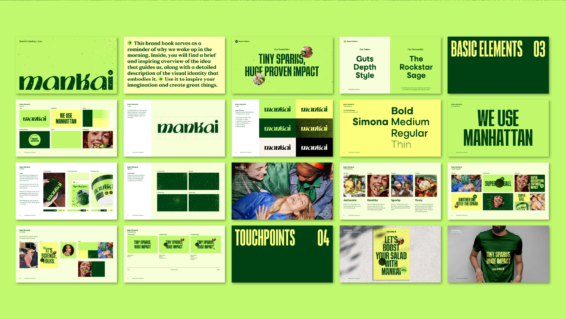
Moving on to visual identity, we stated with the package – as Mankai is sold in health markets and must steal the show on every shelf. We named the small Mankai balls SUPERBALLS, and referred to its frozen look as glittery. This, along with the strategy, helped set the tone for the visual language. While the brand colors, a green and yellow palette, adhere to health category norms to help base Mankai as a super-nutraceutical instead of frozen food – the logo gives it a fun twist, with round, funky lettering, adding movement and spirit. The box itself is designed as an ice cream pint – it’s giving snack. Vital information appears in fun superballs on the package. The photography language shows either the SUPERBALLS, or healthy, happy people enjoying different food and drinks to which they added Mankai. The brand new Mankai identity manages to stand out beyond its category, and while offering real, substantial nutritional value – it also looks and feels absolutely SUPER!

