

Client
Assuta Ashdod
Industry
Health | Public Sector
Skills
brand_strategy | visual_identity | copywriting | environmental_design
Growing into something new
An additional public hospital wasn’t funded in Israel for 40 years – until Assuta Ashdod, once a private hospital under the Assuta brand, became public. The new medical center has deep ties with the city of Ashdod, and is meant primarily to serve its community and surroundings as both patients, receiving treatment, and professional staff, finding a new career path. Assuta unprecedently recruited its medical expert team from different medical centers around Israel, creating a diverse, multidisciplinary and most knowledgeable organization. Still, it was quite challenging to reestablish Assuta Ashdod as a public and accessible medical center while keeping its mother-brand name, Assuta. It was designed architecturally out of a people and community-first approach, with the most advanced technologies, pleasant and efficient décor, and its beautiful blooming garden. This is where we come in, to help Assuta Ashdod lead a change and find its relevant and unique brand identity.


Close care
Our mutual journey begins with people: Assuta Ashdod is a place for people and community. It serves as a melting pot, meeting different local cultures in every touch point. Closeness is an important principle here, present in everything Assuta Ashdod does, including its intimate, personal and empathetic care. Everything in it is executed based on this: interior design, technology, research. The new brand essence is CLOSE CARE, while the brand positioning is NEWLY GROWING MEDICAL SPACE, as Assuta Ashdod is committed to growth, of itself and its communities. Everything in it is executed based on this: interior design, technology, research. The new brand essence is CLOSE CARE, while the brand positioning is NEWLY GROWING MEDICAL SPACE, as Assuta Ashdod is committed to growth, of itself and its communities.

Medicine in bloom
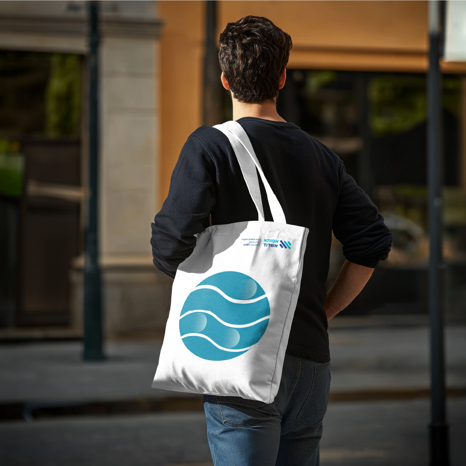
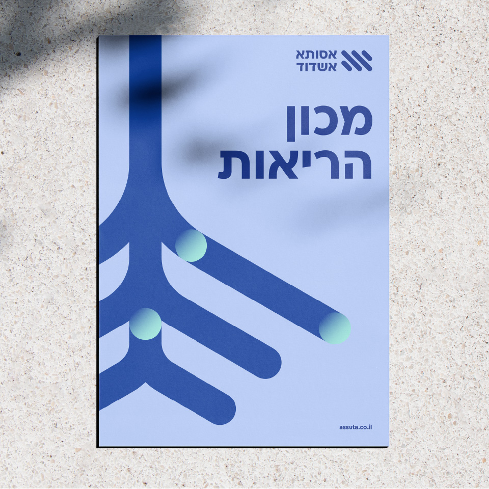
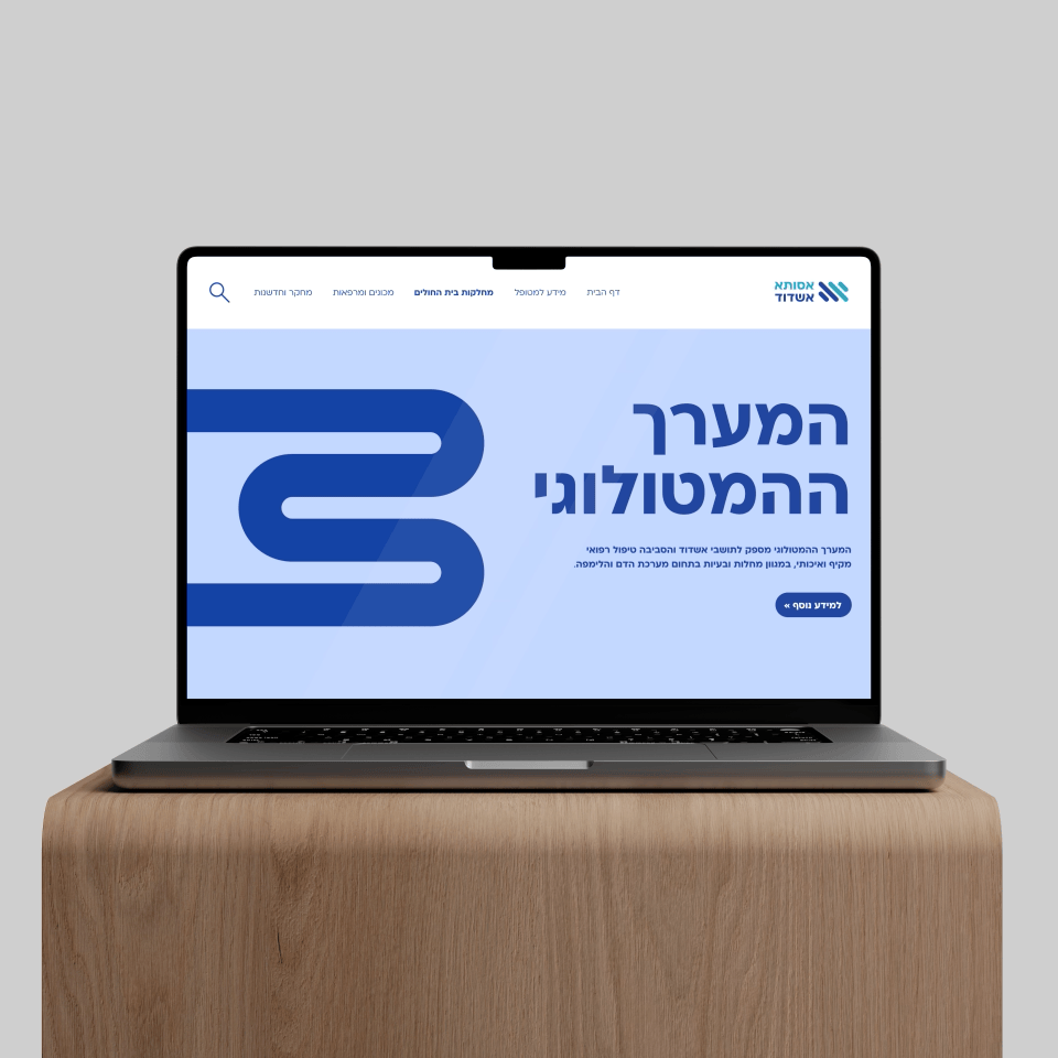
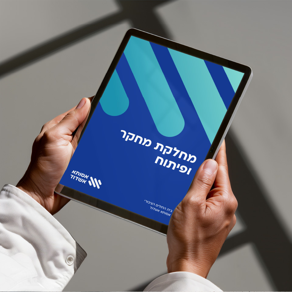
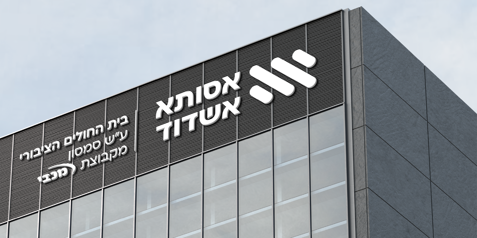
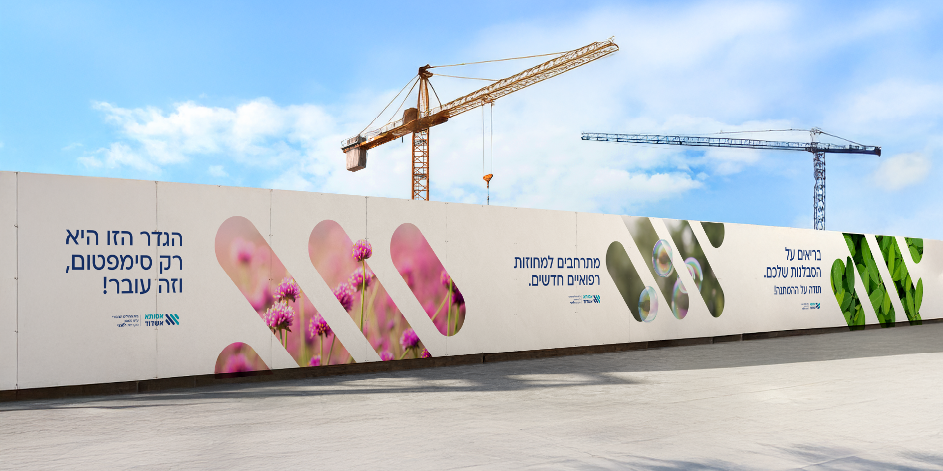
Assuta Ashdod’s visual language incorporates colors from its super-brands, using Macabi Care’s blue and light grey, and Assuta’s light blue and white – with its very own addition of a Cian gradient to the palette. The logo is made of 4 angled lines symbolizing growth, motion and closeness. The photography language shows pictures of optimistic people, professional and medical staff, and blooming shots of nature that reflect the medical center’s surroundings and its new positioning. We used Macabi Care’s icons to deepen the connection between the brands, while grids feature the line element from the logo with a slight curve, creating a soft window to an optimistic image. After the new brand language was warmly accepted, we moved on to implementation, making graphic and digital elements, and designing spaces and banners with new brand messaging, specified for medical staff and patients.
