
Client
Ashelon Academic College
Industry
Education
Skills
copywriting | visual_identity | brand_strategy
Relearn to grow
Academia had always stretched its roll much further than education: it was a social status, a professional must and a member-only knowledge club – but as we all know, change is the only constant. Careers have changed, knowledge is for everyone, and younger generations no longer appreciate gatekeeping, nor do they benefit from it – quite the opposite. The main shift is the human-focused era, instead of academia, studies and achievement focused. It isn’t about the shell anymore, rather the substance. And so, academia has found itself struggling to find its place in the new world. The smart ones discover newfound flexibility and can reinvent themselves and offer students an updated value proposition. Within these general challenges, Ashkelon Academic College (AAC) was facing its own conflicts: its religious and conservative reputation, peripheral perception as its located in the southern part of Israel, lack of awareness to its diverse and high-quality offerings, a stagnant feeling, etc. We embarked on a mutual journey to redefine their roll and unique value.
Breaking limits together
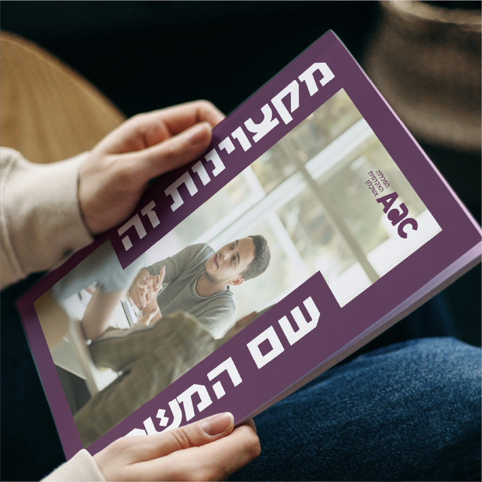
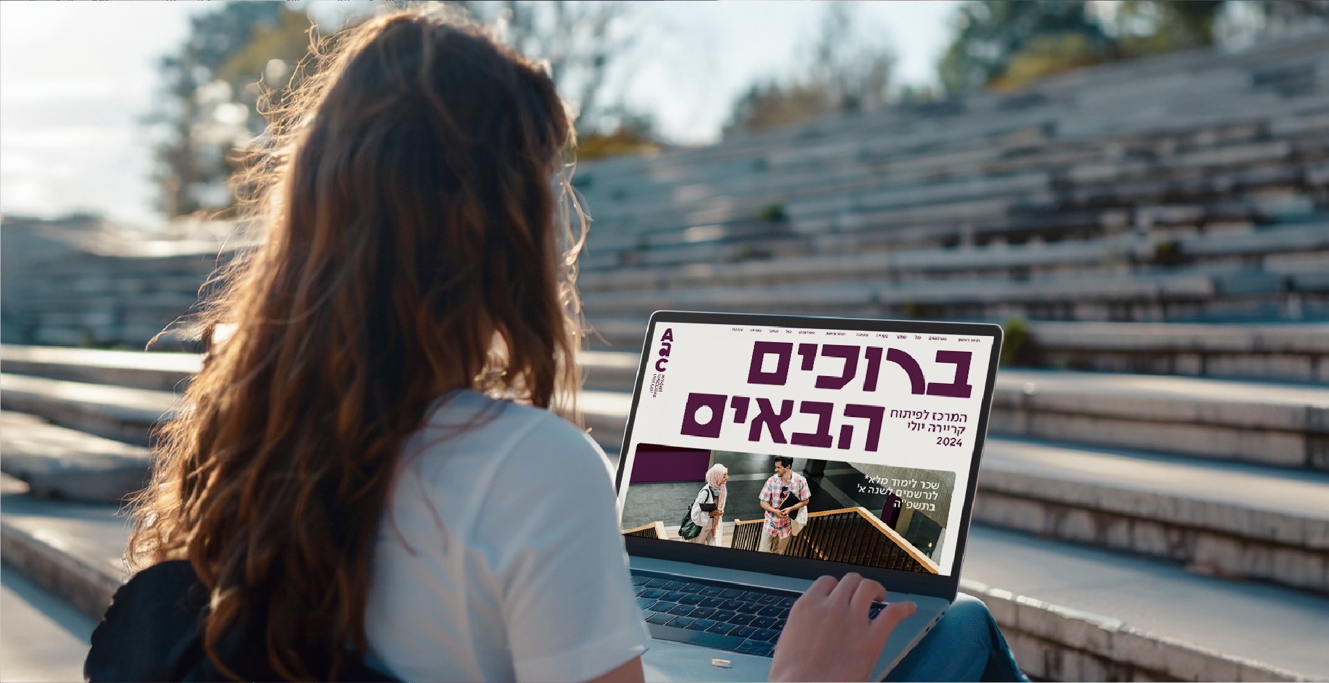
AAC was facing a double challenge: catering to a new generation of students who by now have gotten used to consuming short and fast content; and a busy academic field, where real differentiation is elusive. We’ve began our strategic research by interviewing staff and students, and then researching global and local shifts. We then found the unique advantage of AAC that truly makes a difference: it’s a place for groundbreaking connections. This has become its new positioning line: THE ACADEMIC CENTER FOR GROUNDBREAKING CONNECTIONS. The new brand essence is BREAKING LIMITS TOGETHER – socially, it is diverse, inclusive and mission-driven; and academically, it makes education accessible, raises the bar and breaks glass ceilings.
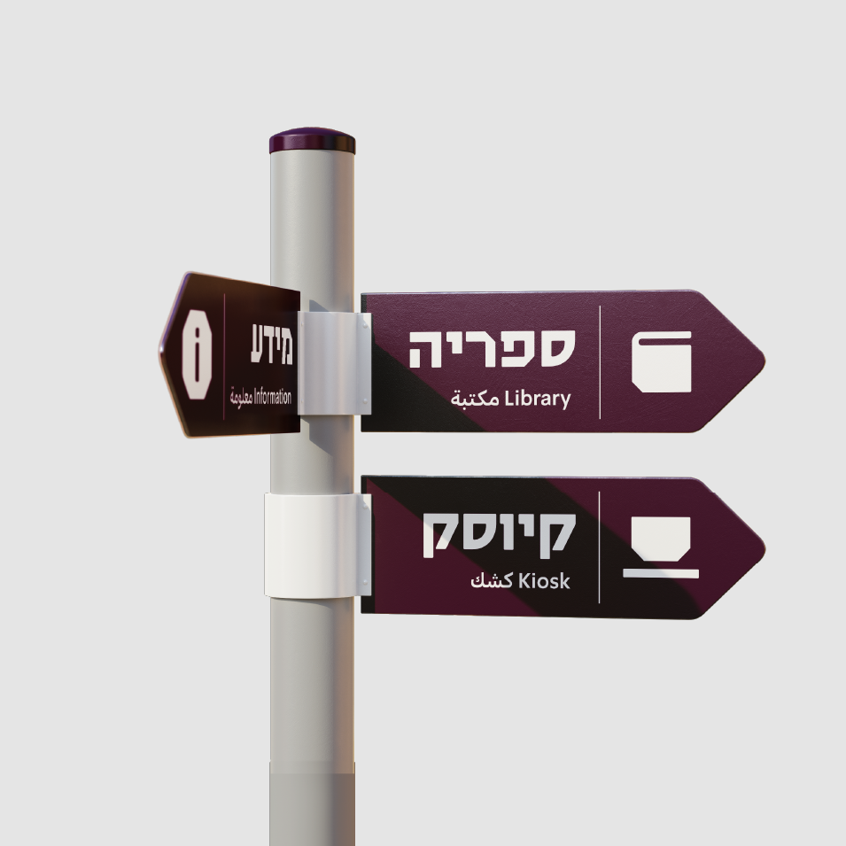
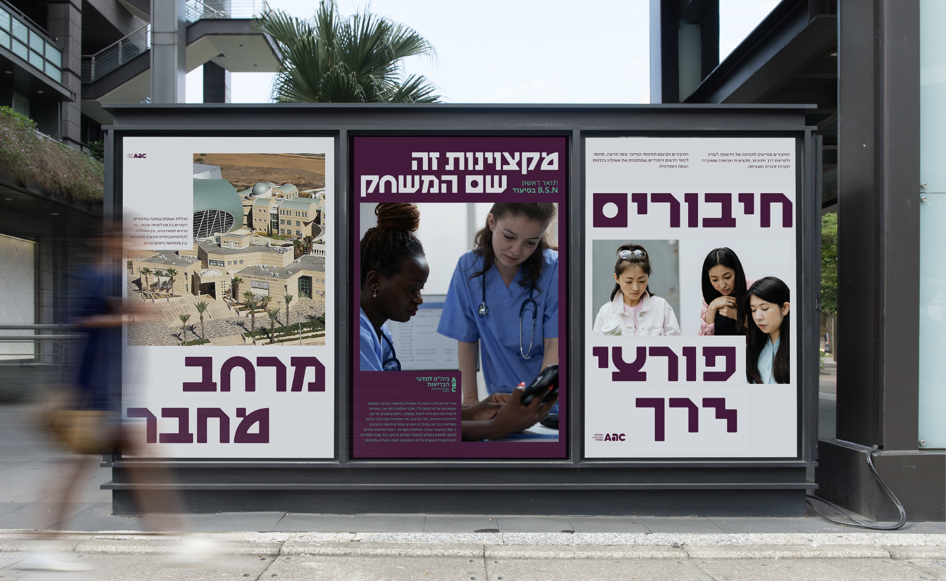
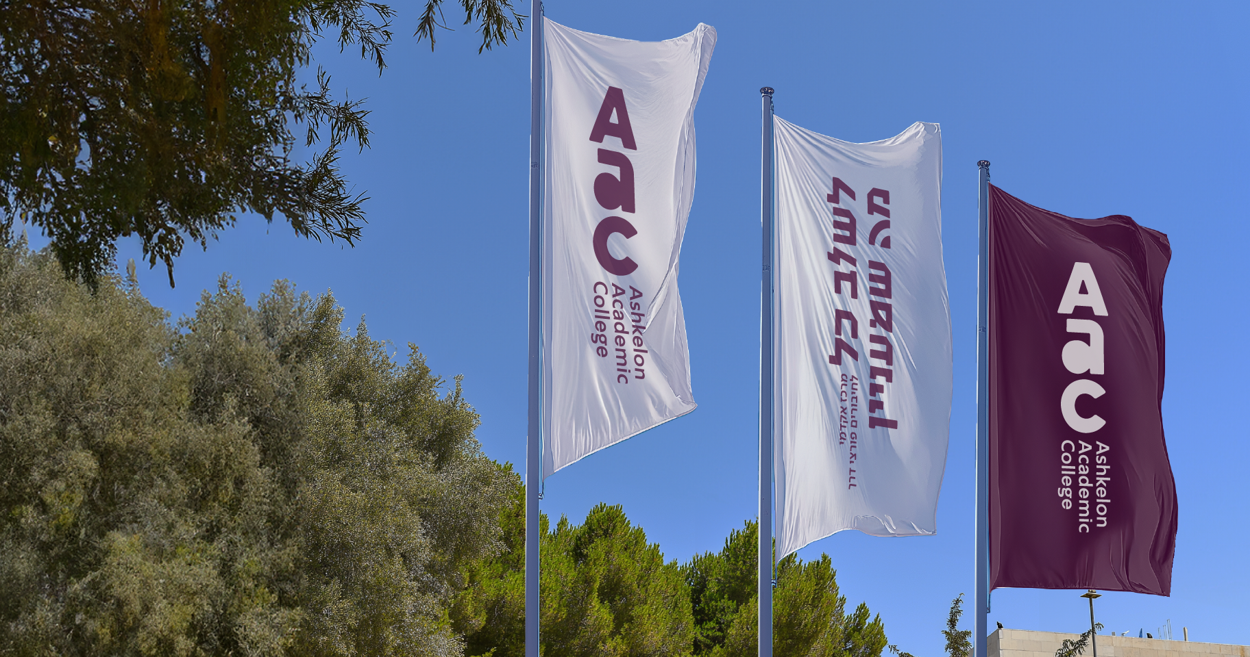
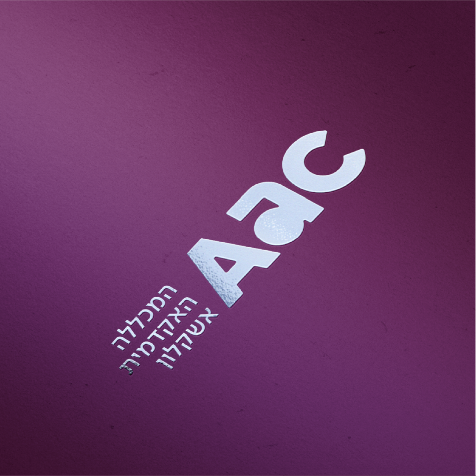
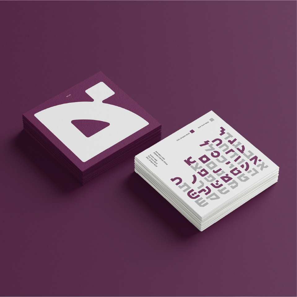
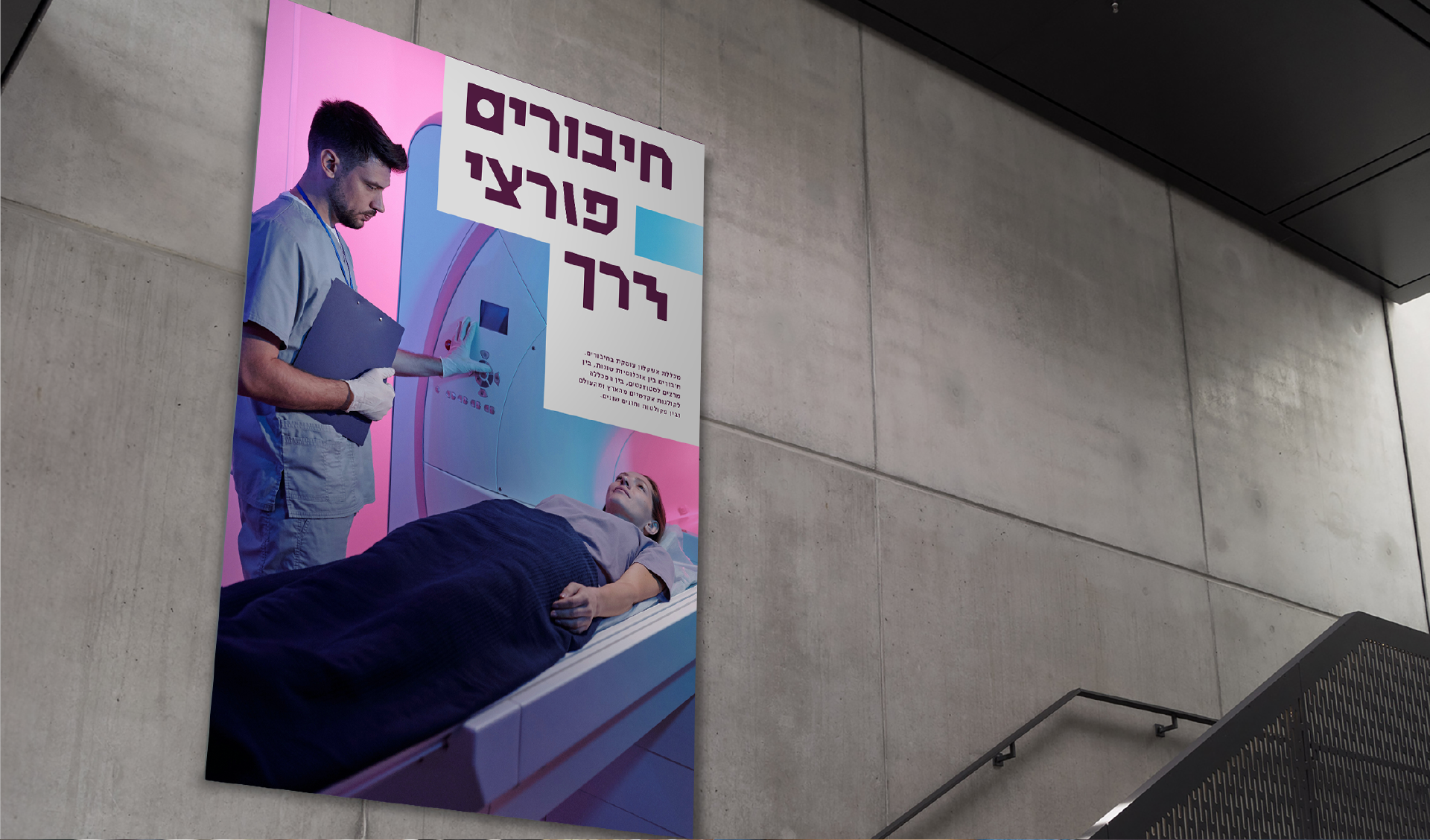
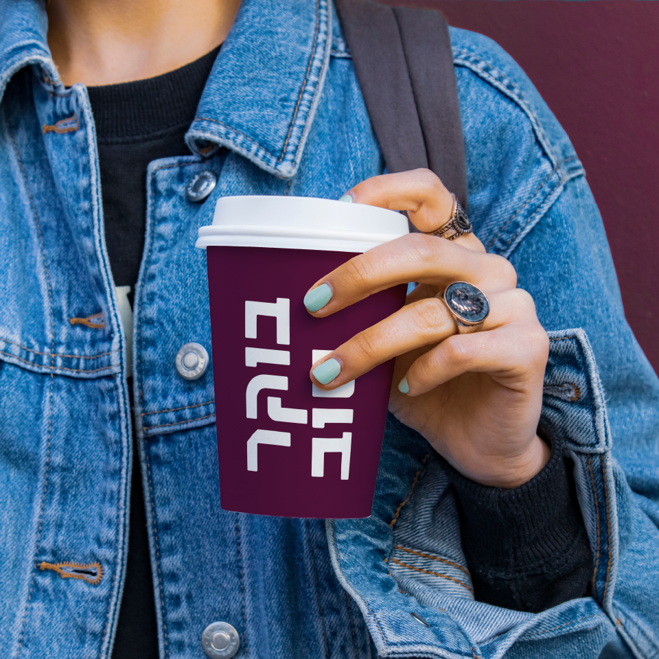
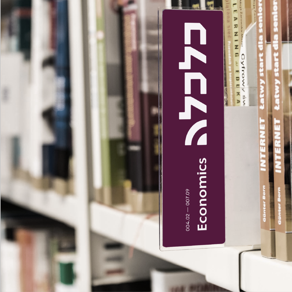
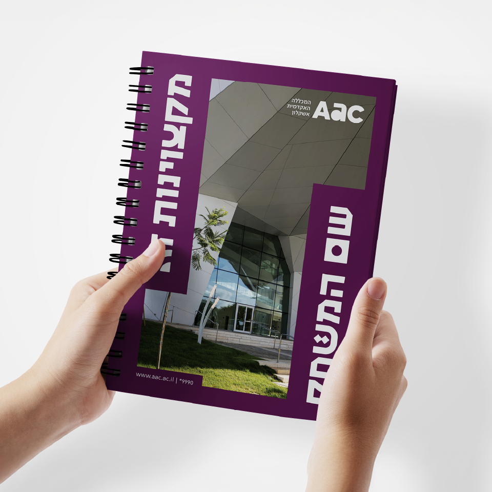
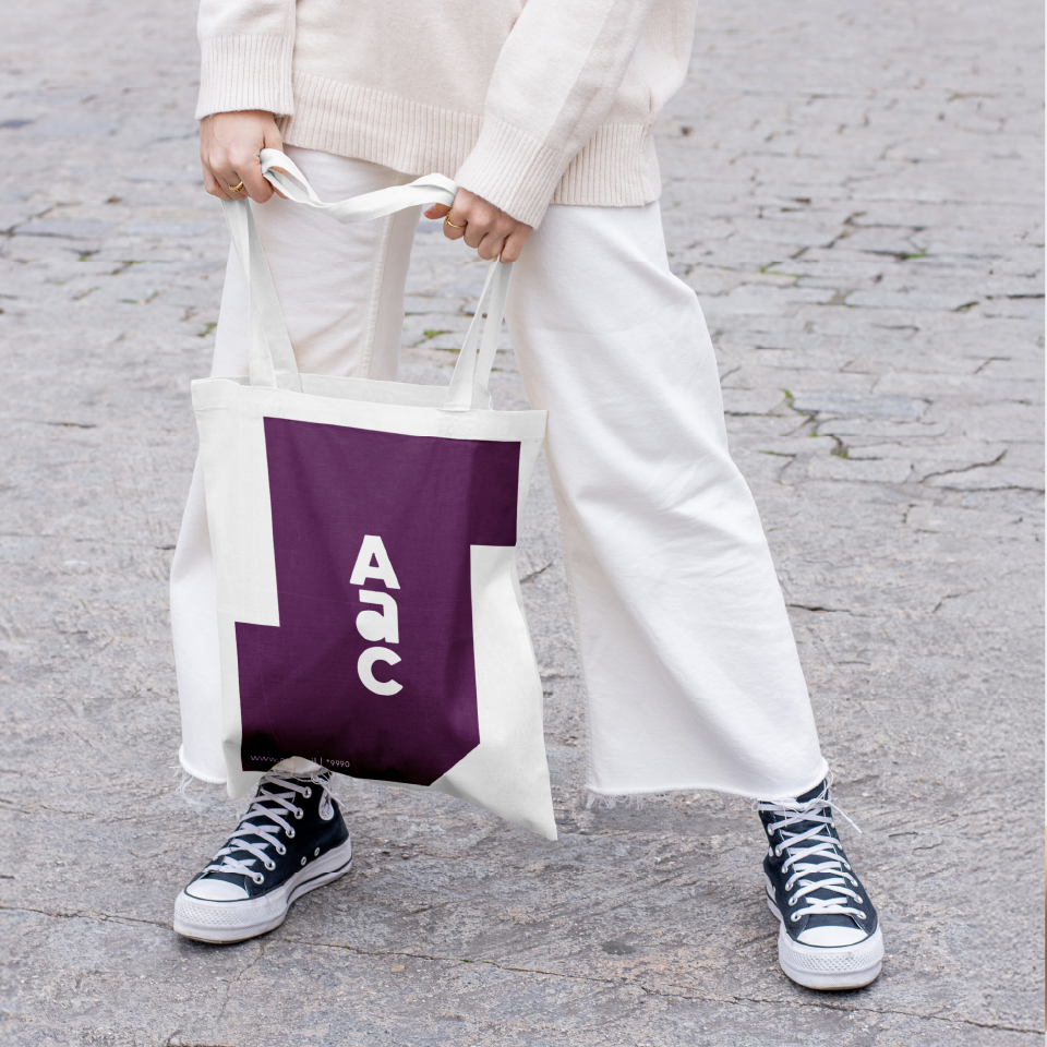
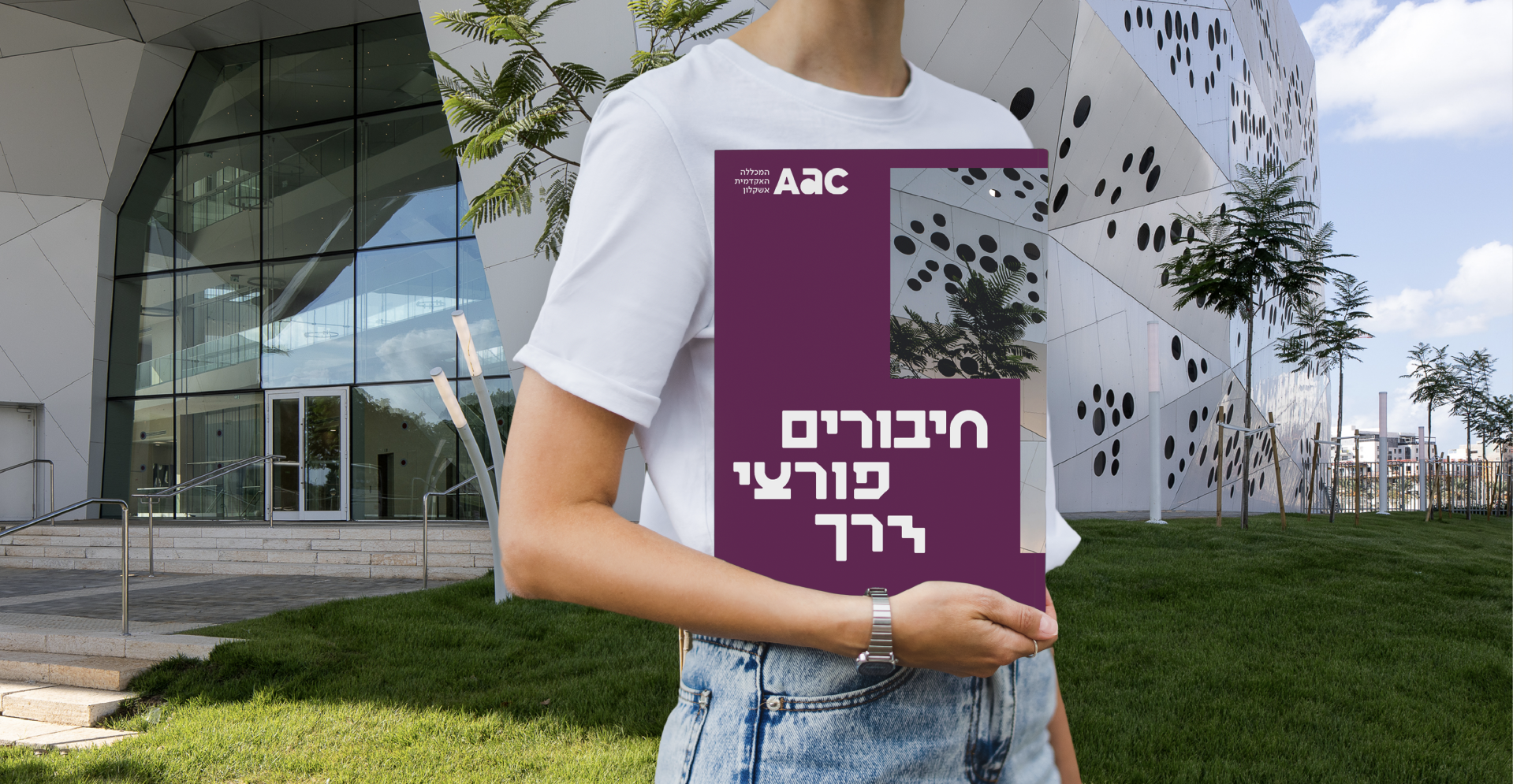
Letters and signs
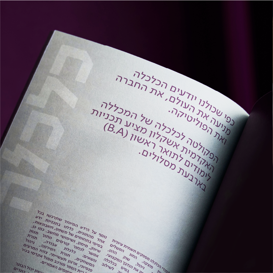
The new visual language for AAC is clean and minimalistic, to allow the rich substance of the brand to truly shine. The language is mostly typographic, with a hand designed innovative letter set that brings playfulness, motion and groundbreaking connections in text, as well. Every regular-length word will contain one innovative letter. The typography converses with a grid made for showing connections. For colors, we went for a dominant and memorable palette, with burgundy as main color, grey as a secondary color and turquoise as a pop color. Every faculty has its own color to visually distinguish it and still tie it with the mother brand. The verbal language includes fresh and interesting Hebrew impromptus, symbolizing and actualizing connections.
