Client
Paradive
Industry
Culture
Skills
brand_strategy | copywriting | illustration | visual_identity

Landing a change
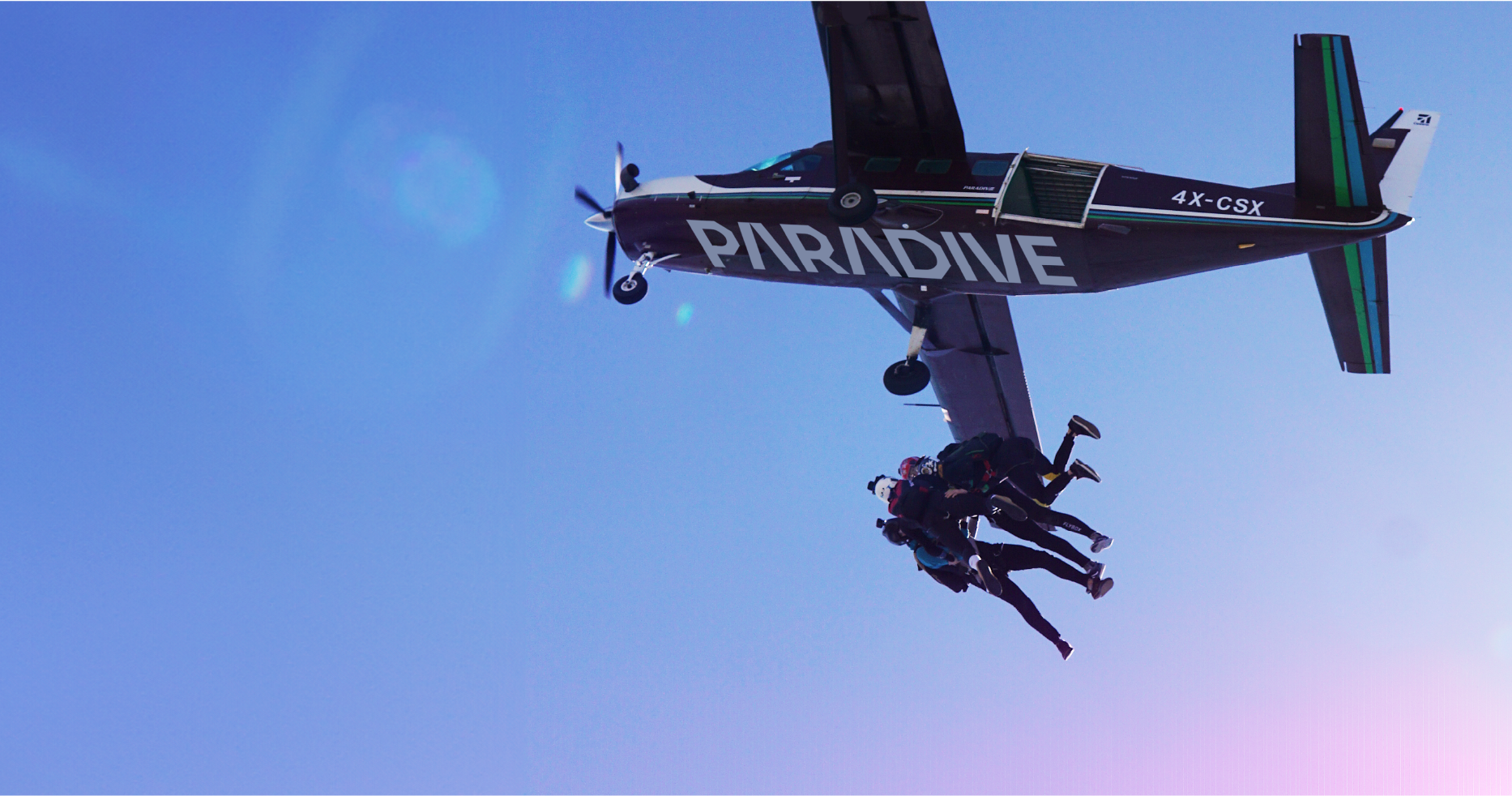
There’s a kind of people who, on a Saturday morning, instead of snacking and falling back sleep like most of us, decide to harness themselves to a parachute, fly to about 10,000 feet in an airplane – and jump out, willingly. We’re talking about skydiving. This has been the number one audience of Paradive, a long-standing skydiving club and commercial aviation company, but there is a bigger audience waiting.
Skydiving is just one touchpoint with a specific type of customer, but what about Paradive’s other value propositions and their potential to expand to greater audiences? We teamed up with them to build a brand strategy that drives change and creates alignment between the depth of the organization, its self-definition, and the way it’s perceived in the world. Are you ready? Is your parachute on? Let’s jump.
Spice it up
Being the extreme experience it is, skydiving takes most of the spotlight. The change we created sets out to expand the brand: while there are extreme value propositions, there is also a venue for private and business events. The focus shifts from just the jump to everything before and after it, and from a skydiving -focused business, to a human-focused one.
From extreme buffs to everyone, and from a one-time experience to a continuous one. This means Paradive’s main value proposition doesn’t revolve solely around the extreme but rather, it’s about being seen as a colorful and spicy break from routine. The new brand idea is SPICE UP YOUR LIFE, and the positioning is: "Skydiving and Unique Experiences Club." Once Paradive owns the category and leads it, it can expand it in its unique way.
From parachuting to prosperity
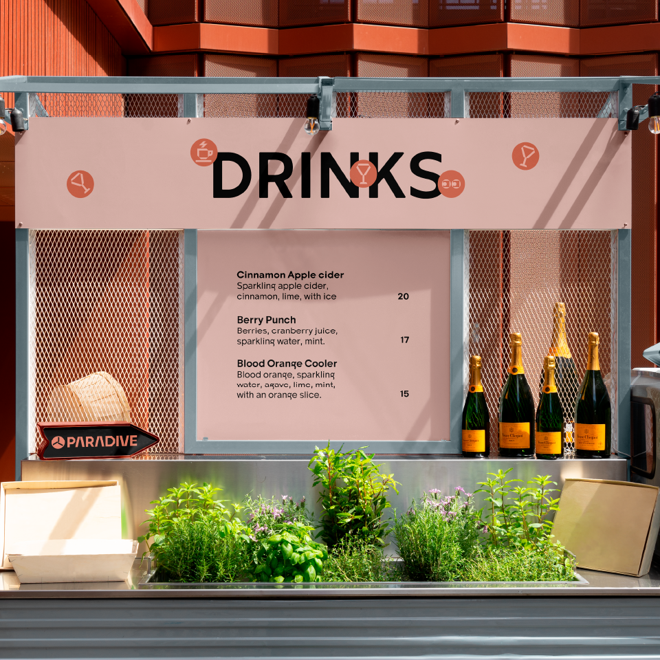
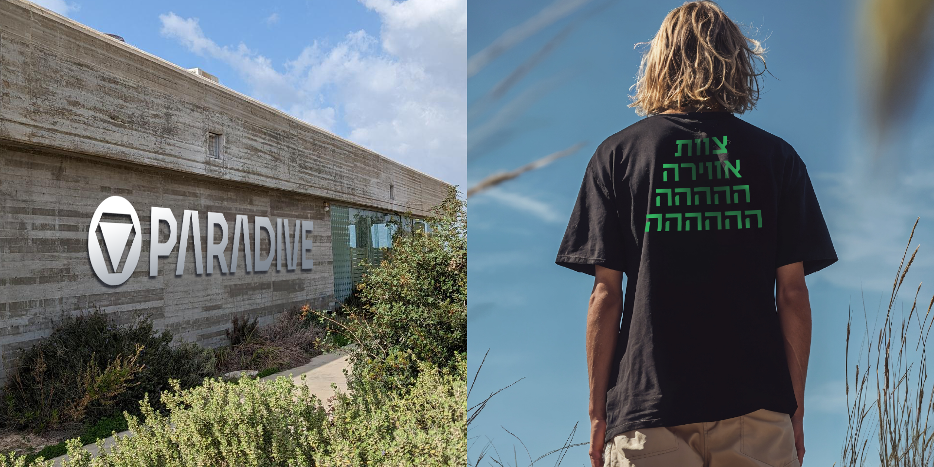
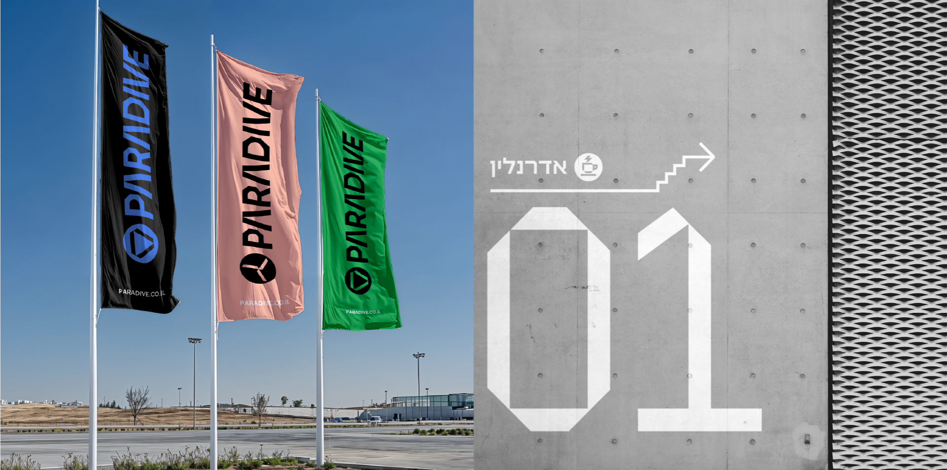
We designed a rich visual language for Paradive, as the spicy multi-layered brand it is. The logo consists of three lines forming a triangle, symbolizing the brand’s values: the confidence of a leader, the courage to go beyond the mundane, and freedom. We created a different logo for Paradive’s event center, which is uses the lines to form a different shape where they meet at the center. The brand’s color palette includes off-white and black as base colors, alongside colors inspired by the scenery: shades of blue, green, yellow, and purple in both saturated and lighter tones.
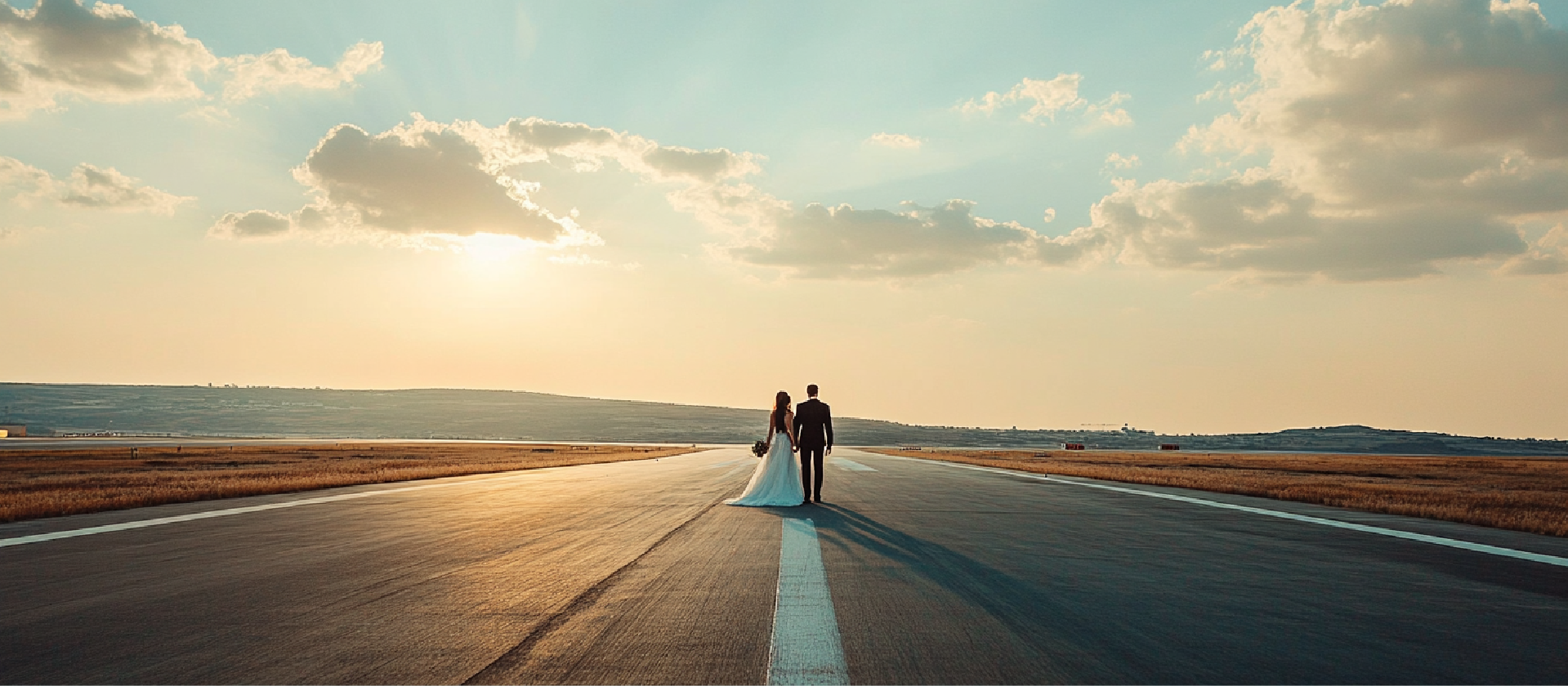
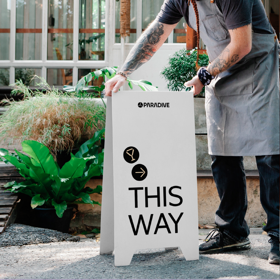
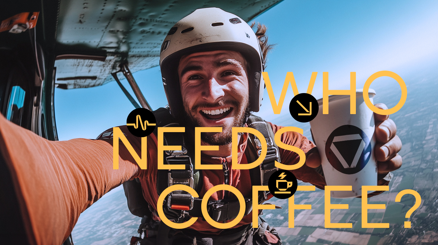
The photographic language is divided by purpose: the extreme activities language includes lively and authentic skydiving photos. Photos about human perspective feature images full of excitement and special moments, with sky and nature tones present. And event photos present a cleaner style with calmer colors. To spice up the brand further, we designed original icons and sticker-like elements with emojis, phrases, or short terms, integrating them into the graphic elements to create patterns, enhance messages, and grids. The result is a colorful, free, fun, and modular visual language that successfully expresses all of Paradive’s layers.
