

Client
Naot
Industry
Fashion | Retail
Skills
copywriting | marketing_materials | environmental_design | packaging | website_design
Naot to meet you
Teva Naot, also known as Naot, is a renowned brand born and raised in Israel, and famed everywhere. Naot are the kind of shoes you can count on – you know the character they encompass, how famously comfy they are, how well they are engineered and designed. It’s a symbol for the great Israeli spirit. We love collaborating with Naot and design its different touchpoints, based on their strategy and visual language – from packages, postcards and other products to campaigns and website, to copywriting and catalogues. As our collaboration deepens, we get to extend the brand languages, both visually and verbally, and offer different creative solutions to both Israeli and global Naot.


Walk colorful
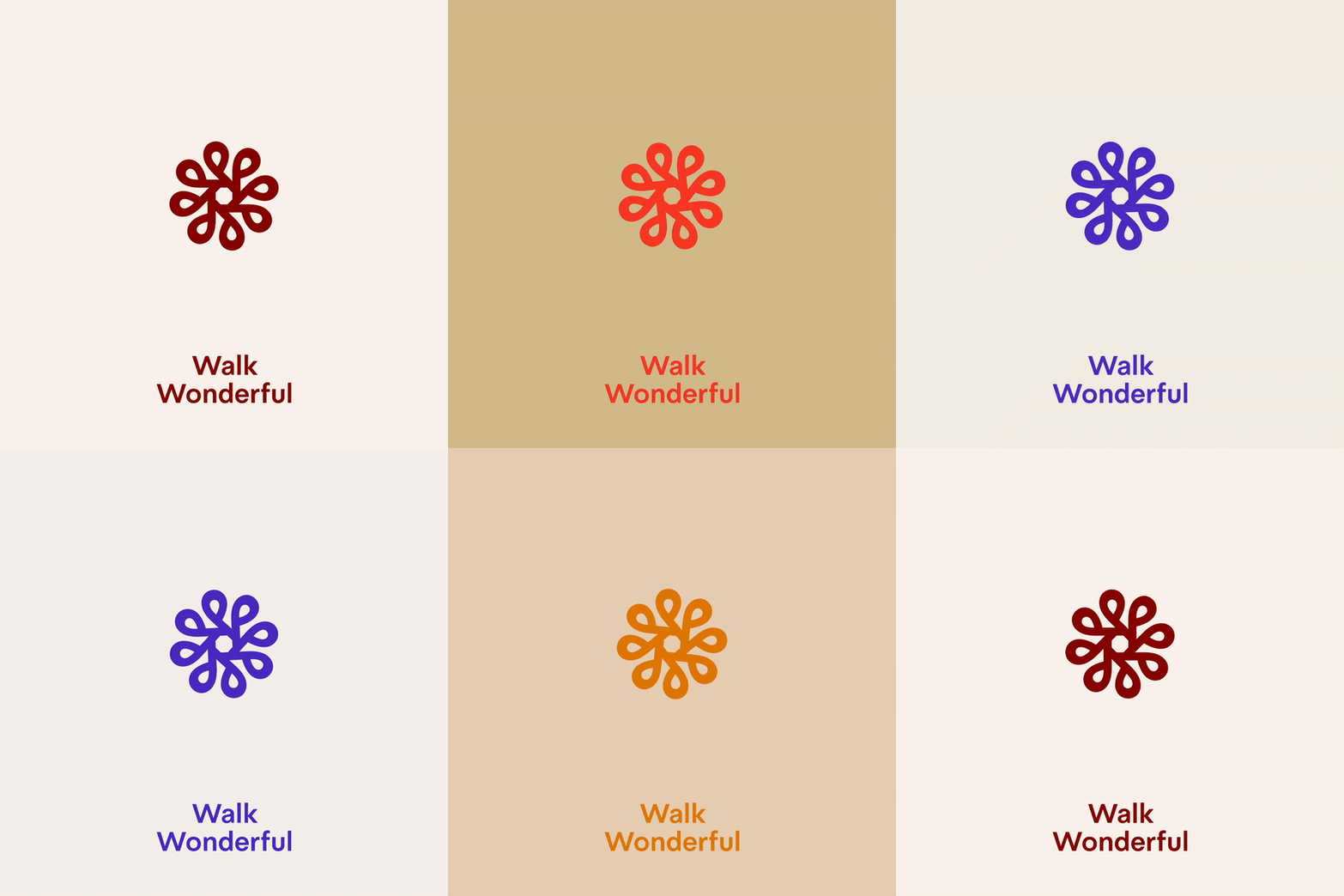
The brand’s color palette brings movement and life into every design. The brand uses two palettes meant to balance one another, and enable greater playfulness and uniqueness. One includes grey tones, aqua, sage, sand and apricot; and the other includes red tones, blue, honey, orange, olive, yellow, black and white.
Each application group has its leading color: sand is mainly for physical spaces; blue is for direct communication with clients; red tones are used in the website and for smaller packaging applications, and white is used in bigger packaging, wraps and bags. When these palettes meet, balance is created – with neutral backgrounds and bold colored fonts and elements.

