
Industry
Finance
Skills
ui_design | ux_design | website_design | app_design
Neema zone
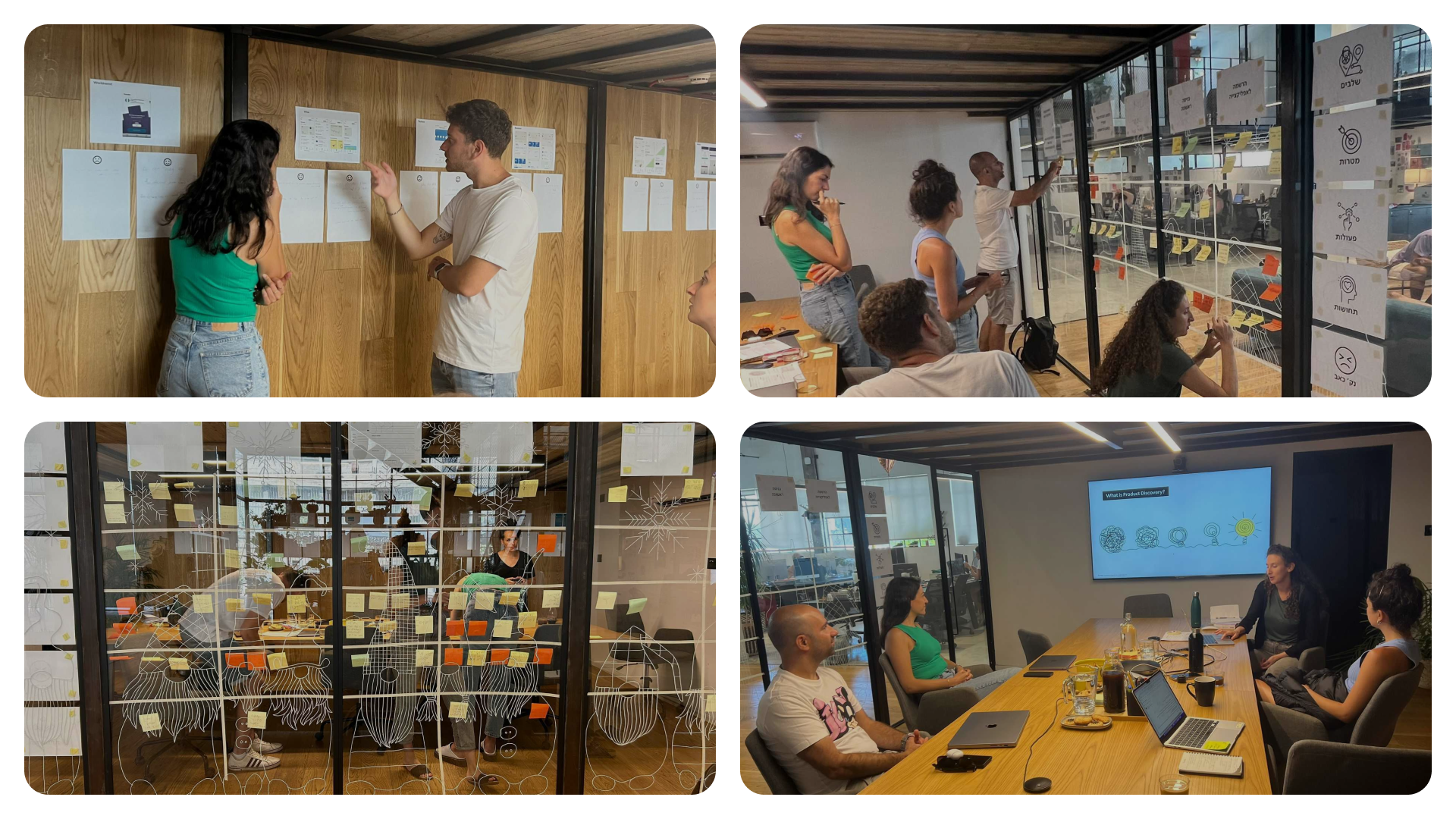
In the broad category of financial management, there are various audiences with specific needs. "Neema" is an Israeli startup that helps migrant workers transfer money back home. We met Neema’s team at a point where there was a need to refine the product and make its use smoother and more inviting. We began together with a product discovery workshop, defining the 'problem zones and the pain points of our customers.
From there, we moved on to the 'solution zones, which defined our process goal: simplifying the money transfer process and improving the user experience. To understand precisely where we could simplify and improve, we created a variety of personas and user journeys. While building these journeys, we managed to identify several more important points in the process that required recalibration. Together, we prioritized the personas and pain points and ventured into a world of new features.
Simplifying the Financial Welcome
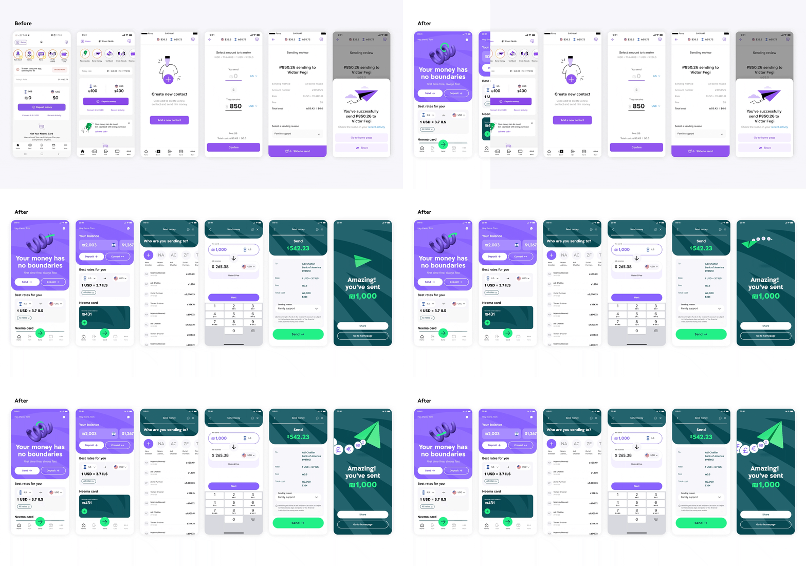
Now we're getting to the good stuff: cooking up a fresh UX concept for Neema's features and design. We're building on all those lightbulb moments from our workshop and initial research. Our UX wizards teamed up with Neema's product managers, this collaboration contributed to efficiency and the selection of the best solutions.
KYC, which stands for "Know Your Customer," is a preliminary process that occurs mainly in financial products like Neema and banking applications. Its purpose is to verify the identity of potential customers before opening an account for them. Based on our insights, we managed to simplify the length of the process and reduce the bureaucratic intensity that was previously as sociated with onboarding and account opening.
Pass It On
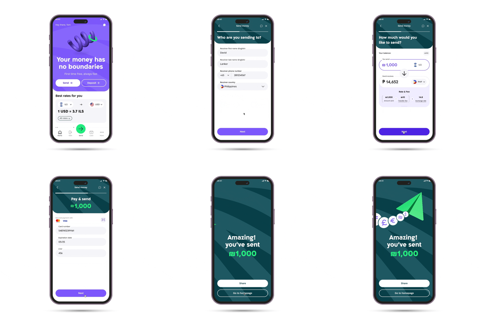
We revamped the app's user flow for a seamless experience, focusing on fast money transfers and highlighting Neema’s standout feature—low exchange rates. With plans to expand and reach new users, we built flexibility into the design, ensuring it can adapt to diverse needs in the future. It’s all about preparing for growth while perfecting the basics now.

Brand Currency
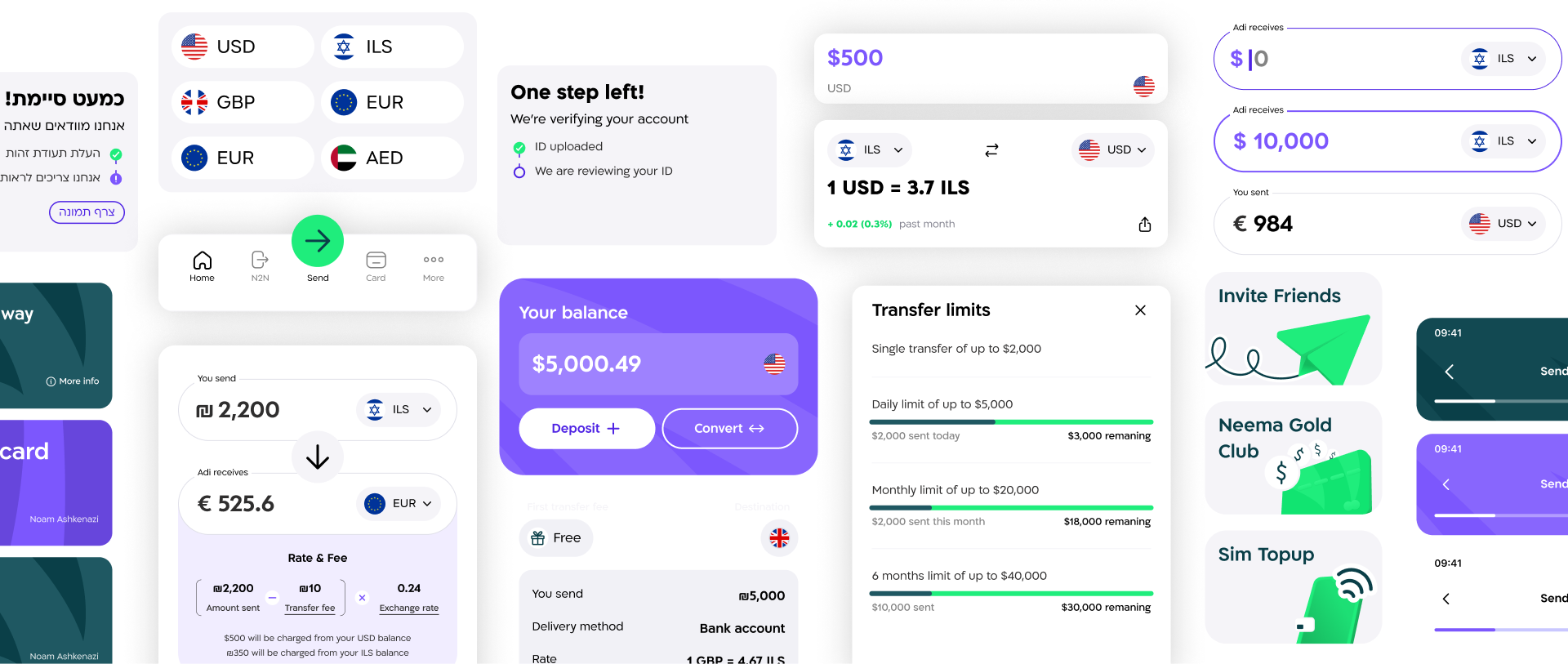
Next, we dove into the design phase, crafting a unique visual language for Neema to shine in the app and across all channels. We expanded Neema’s brand colors to better resonate with the finance and fintech worlds. To bring this to life, we developed micro-animations and a 3D vector visual universe, creating a tangible, three-dimensional feel that captures the essence of making transactions happen.
