Client
Doral
Industry
Industry
Skills
visual_identity | brand_strategy | copywriting
The Green Age
Energy is undergoing a revolution. It is a revolution that is everywhere and affects us all. The idea of other energy, electric vehicles, solar farms that would supply energy to a large city used to seem like a pipe dream of staunch optimists. However, a revolution is happening in these moments.We are moving towards a cleaner, more efficient world primarily because there is no other way. Together with the Doral company, we embarked on a strategic process to find the brand differentiation that would break the conventions of the green energy world and help them grow in a rapidly growing ecosystem in which everyone is good, everyone is green, and everyone cares about the planet.
The Power of Human Energy
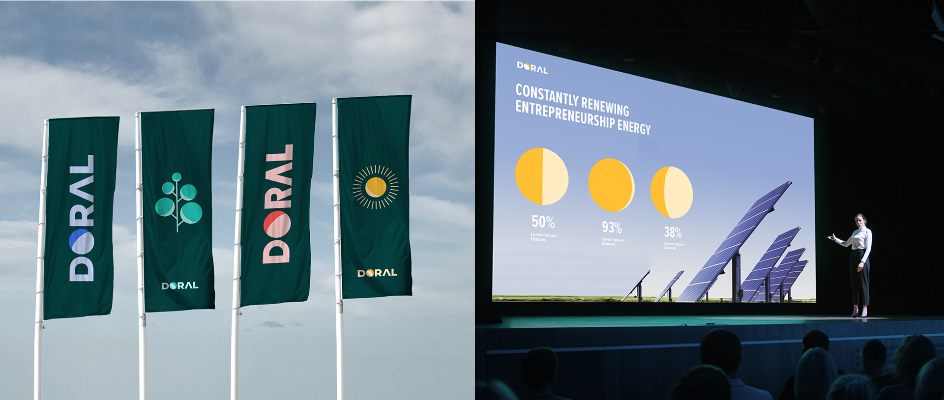
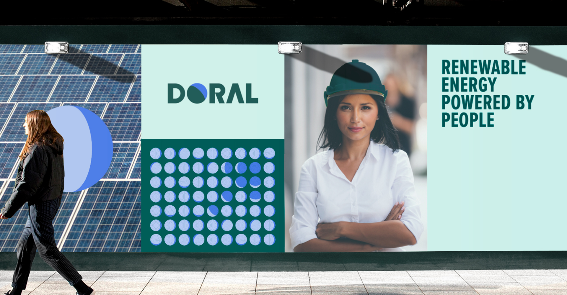
Doral's story begins with early identification. A company that doesn't stop, even during Corona times when it IPOs. Since Doral is a global leader in renewable energy, finding the essence makes sense - "Constantly renewing entrepreneurship energy". In order to lead the world of renewable energies, it's important to have vision and innovation, partners, technical tools, roofs, panels, turbines, biomass, storage capabilities... However, the human drive is the most important factor. What makes Doral what it is is the DNA of the people who make it up. This is the new positioning for Doral - "Renewable energy powered by people".
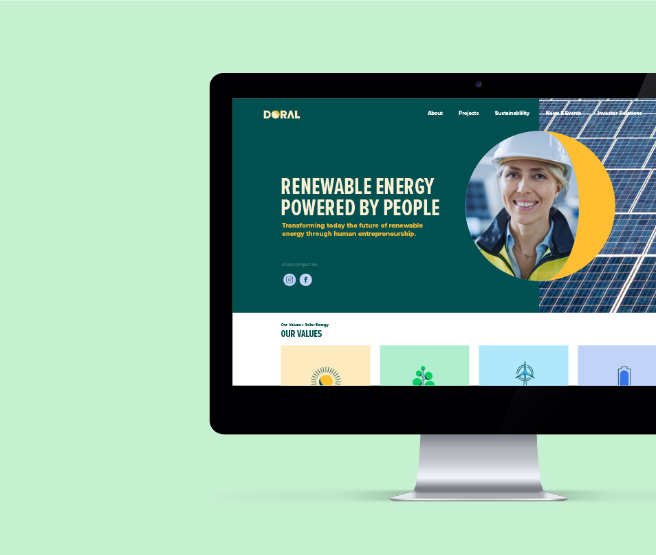
Energy (R)evolution
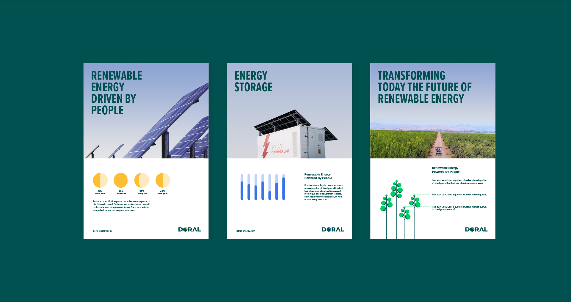
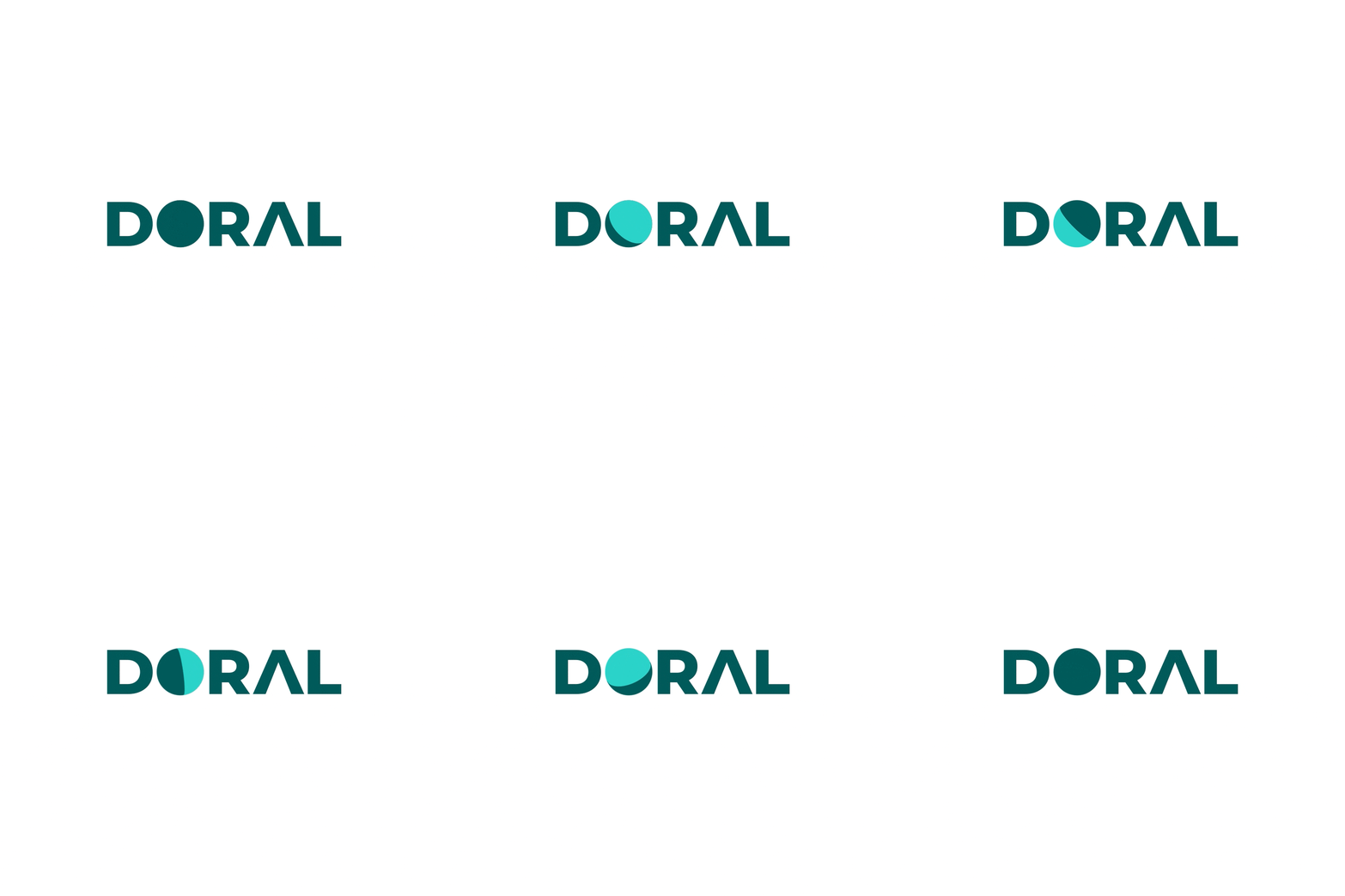
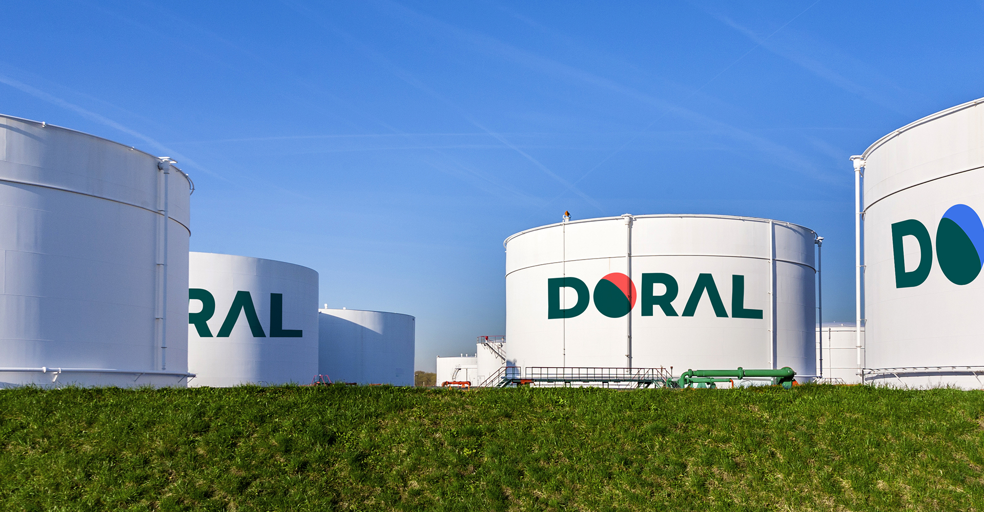
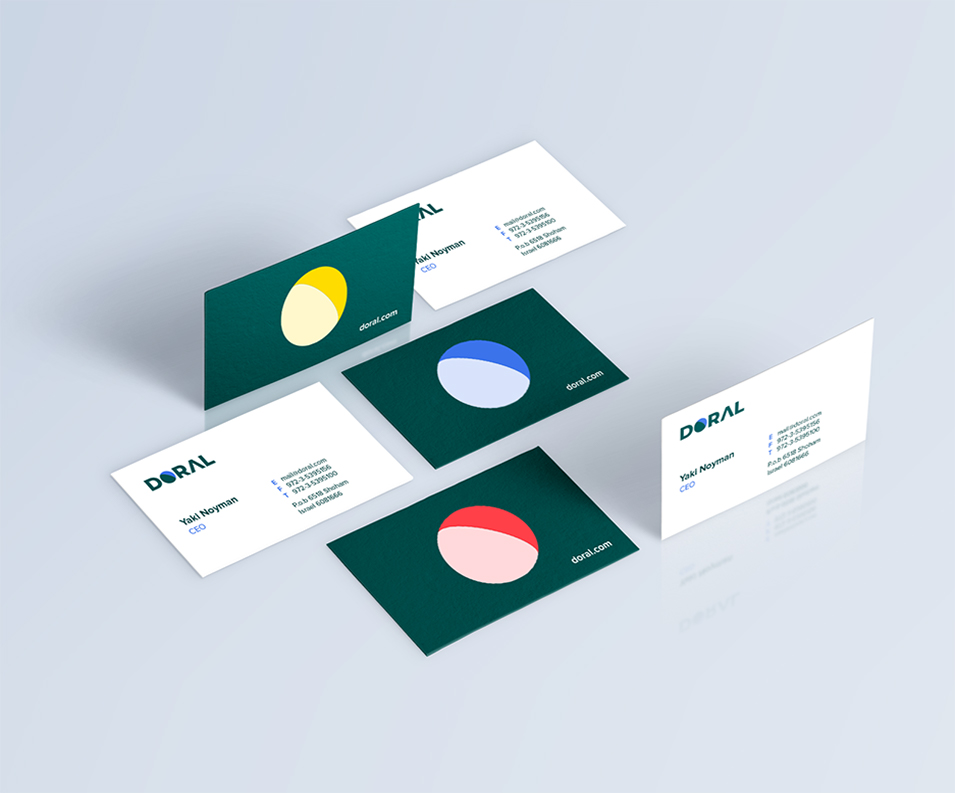
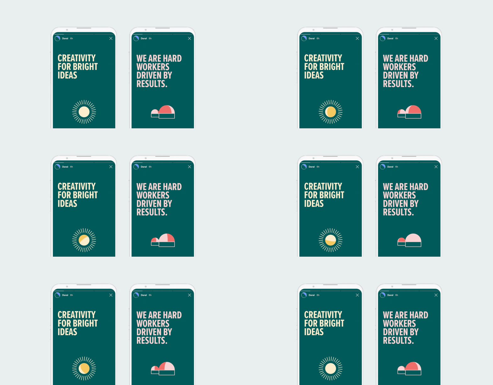
Using Heraclitus' famous quote "The only constant is change", the new brand language emphasizes Doral's commitment to innovation. With the new logo, the letter O comes to life and has a sense of mobility, reflecting Doral's commitment to renewable energy. Based on the letter O, we designed a variable background filled with different parts and different colors that continue the movement. The color palette consists of three shades of green - Leaf Green, Turquoise and Light Turquoise along with a secondary color palette consisting of shades of yellow, purple, blue and green.
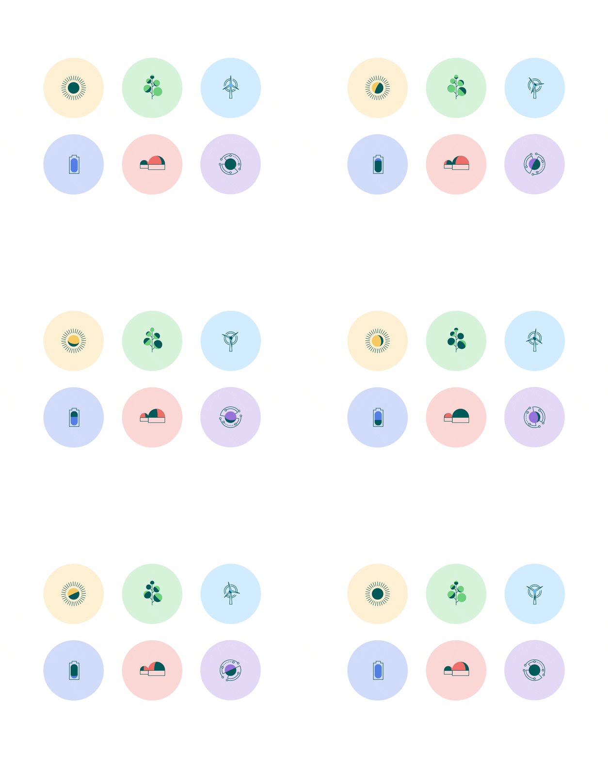
The photographic language has been divided into two categories. The first shows the work facilities for green energy, while the second category emphasizes the people of Doral, places them at the center, and emphasizes that none of this would have been possible without their commitment. Specifically for Doral, we designed icons based on the O motif, which appears in different ways in each of Doral's areas of operation.
