Client
AposHealth
Industry
Health
Skills
product_strategy | app_design | ui_design | ux_design
Moving is living
Movement is tightly connected with physical health and mental wellness. Musculoskeletal conditions compromise quality and range of movement, with a growing number of surgeries each year. Apos is CE-marked and FDA-cleared to temporarily reduce knee pain caused by osteoarthritis and has been used by over 120,000 patients. It can also be used as a general wellness device to help patients live well with chronic lower back and hip pain, and get them moving and thriving again. We’ve teamed up with AposHealth , the company behind this brilliant solution, to create the digital product that connects therapists and patients, and allows both sides the best user experience. Our main challenge was designing the right and bright digital product for a physical product.
What is Apos®?
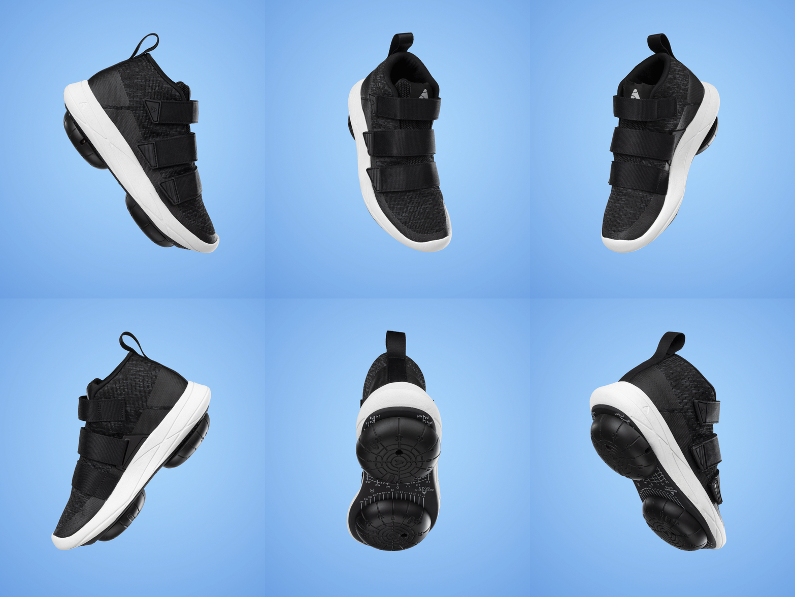
Before we dive foot-first (see what we did there?) into our process, let’s look at Apos – what is it and how does it work? Apos works on biomechanics and neuromuscular levels. Using a patented, foot-worn device as part of a daily treatment program, Apos is designed to address the underlying causes of pain by temporarily shifting pressure from affected areas. The neuromuscular re-education of the muscles results in a healthier walking pattern, even when not actively wearing the device. Both problem and treatment are physical and highly sensory. We knew we had to find the key insight through which we can design the right digital solution.

Challenges
The main challenges we’ve faced when working on a digital solution for a physical product:
• The app is used during a physical process at the clinic.
• There are two main user personas: one is the patient and one is the clinician.
• There are two regions of use: the United States and the United Kingdom.
• One of the main patient personas is elderly users.
Our insight: two users, two interfaces
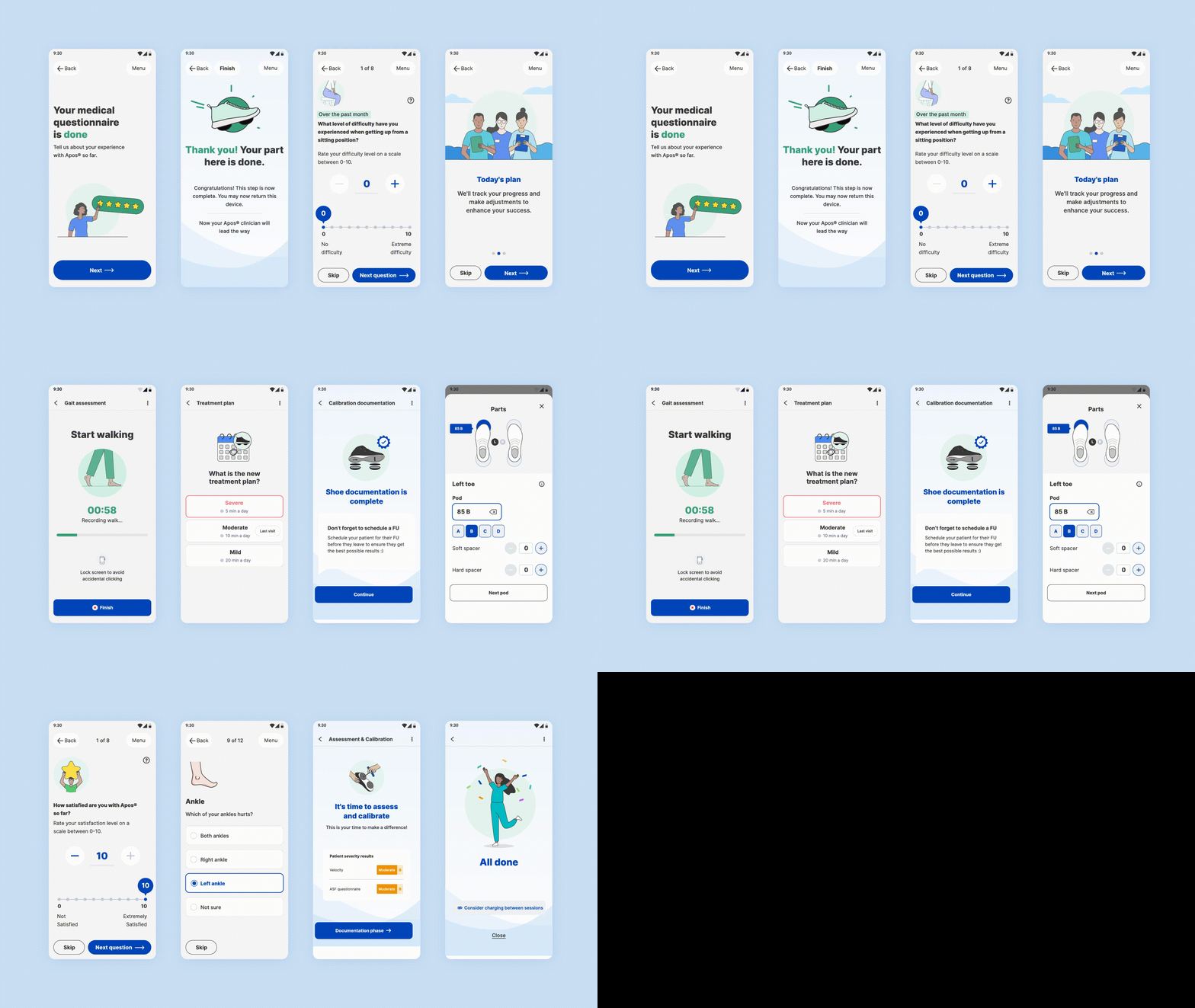
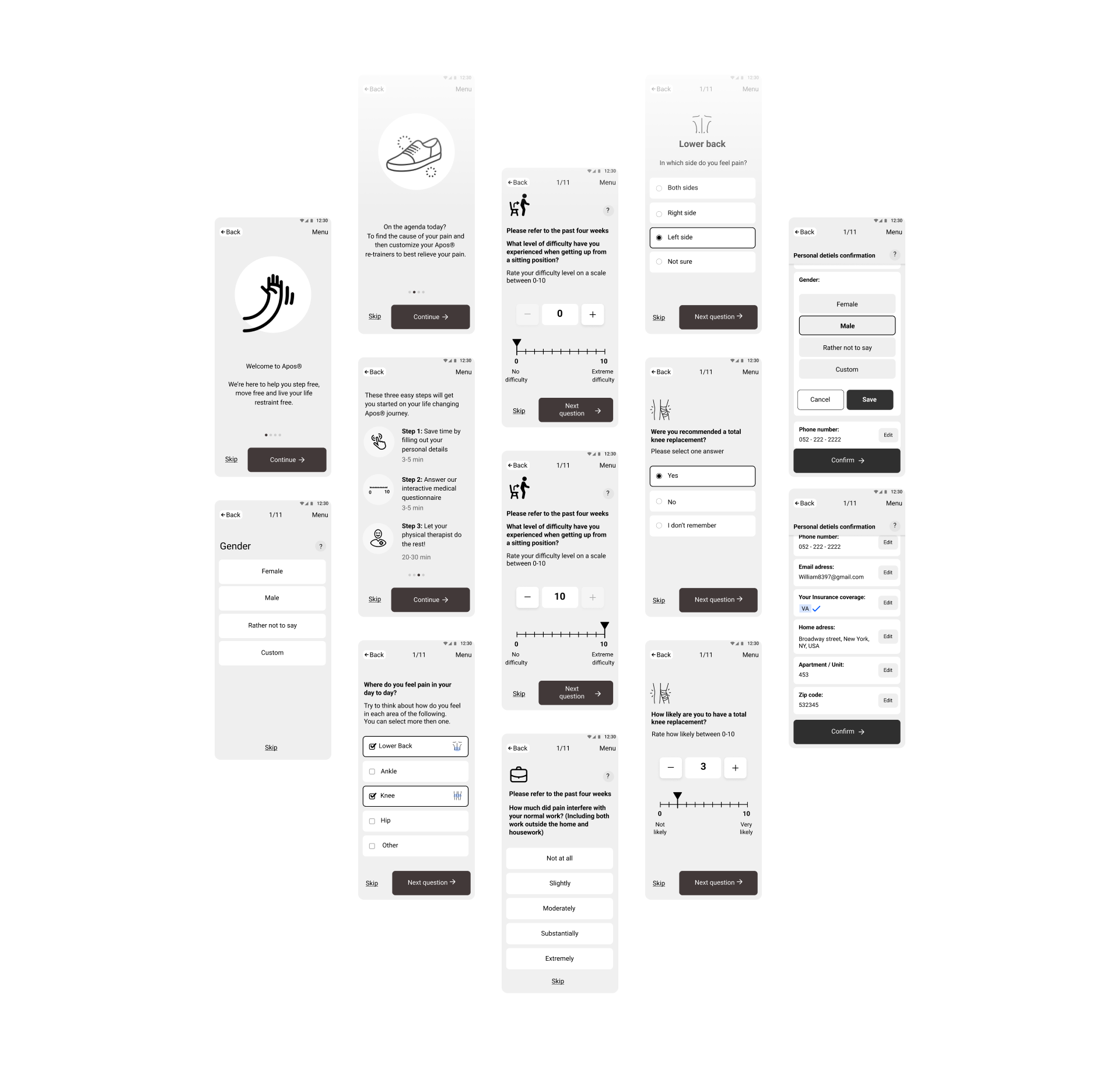
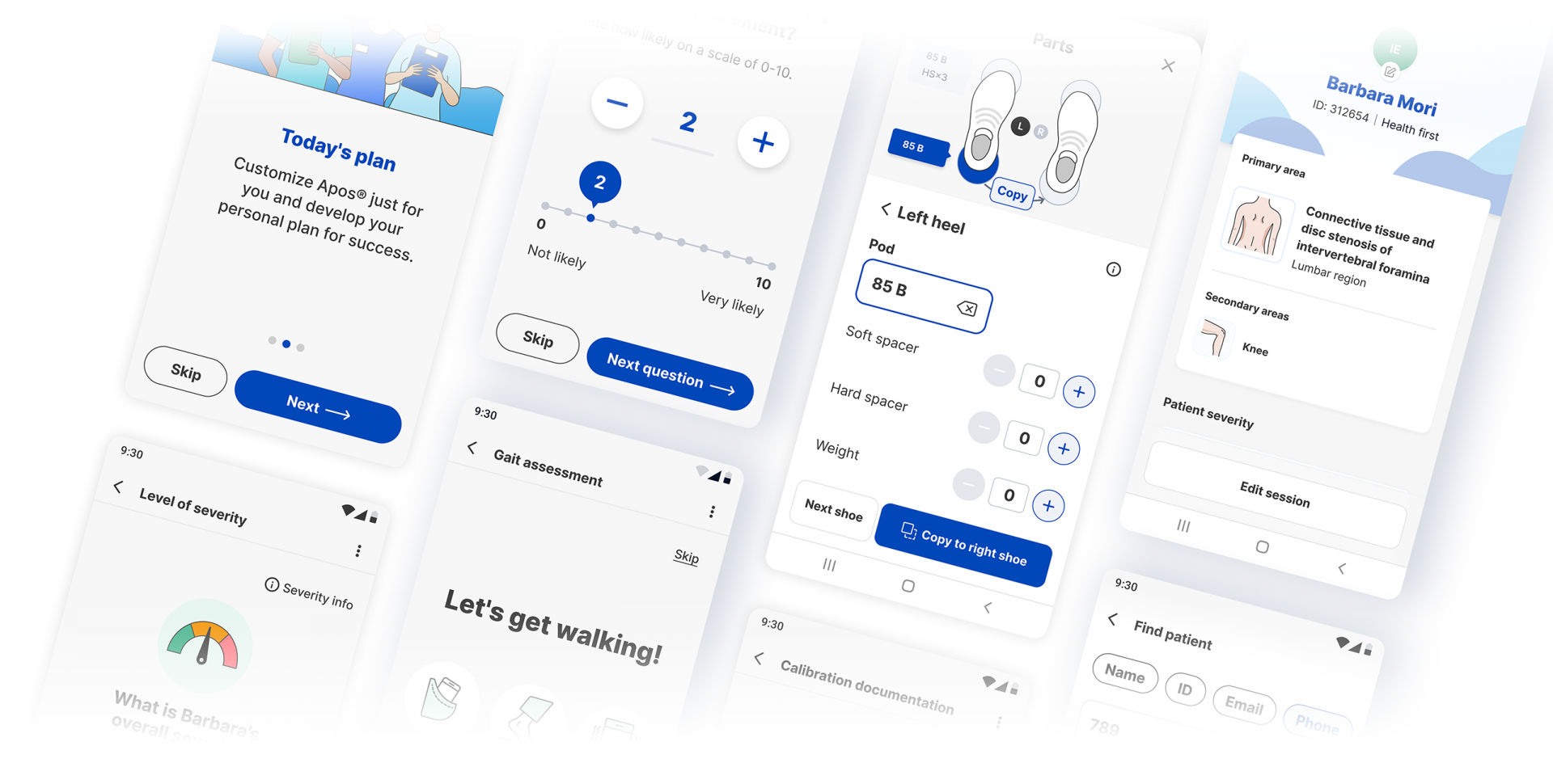
Following our mutual process with Apos, we figured out the way to go about this digital product and design a solution that can fit both user personas, in every location and stage of treatment: we’ve designed two digital products – a mobile app to be used during the treatment process at the clinics, and a desktop dashboard interface to manage and collect patient data.
The solutions we’ve come up with
The Apos mobile app combines two platforms, each with an interface designed and personalized for each of the two main personas: patients and clinicians. For we’ve kept the app flexible to allow therapists to adjust the treatment program patients, the design prioritizes accessibility and convenience. For clinicians, and meet specific needs.
Visual Design
The Apos app was designed with accessibility and clarity in mind, to allow users an empathetic experience. Its visuality integrates innovation and logic in a way that caters to both user personas: clinicians and patients. The general scheme – from font size to buttons – we all designed to be accessible, especially for most patients, who are elderly. The color palette suits the clinical industry – it conveys security and safety, clinical vibes, something neat and clear. It’s evokes a therapeutic and professional association, and strengthens trust between elderly patients, busy therapists and the digital platform that meets them together.
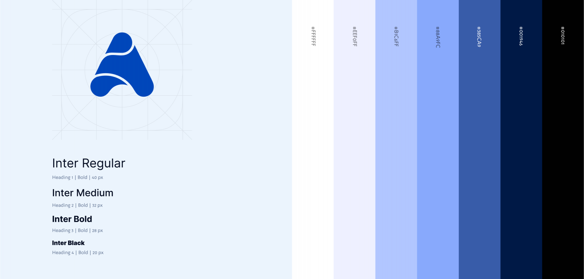
Illustration Language

An iterative process
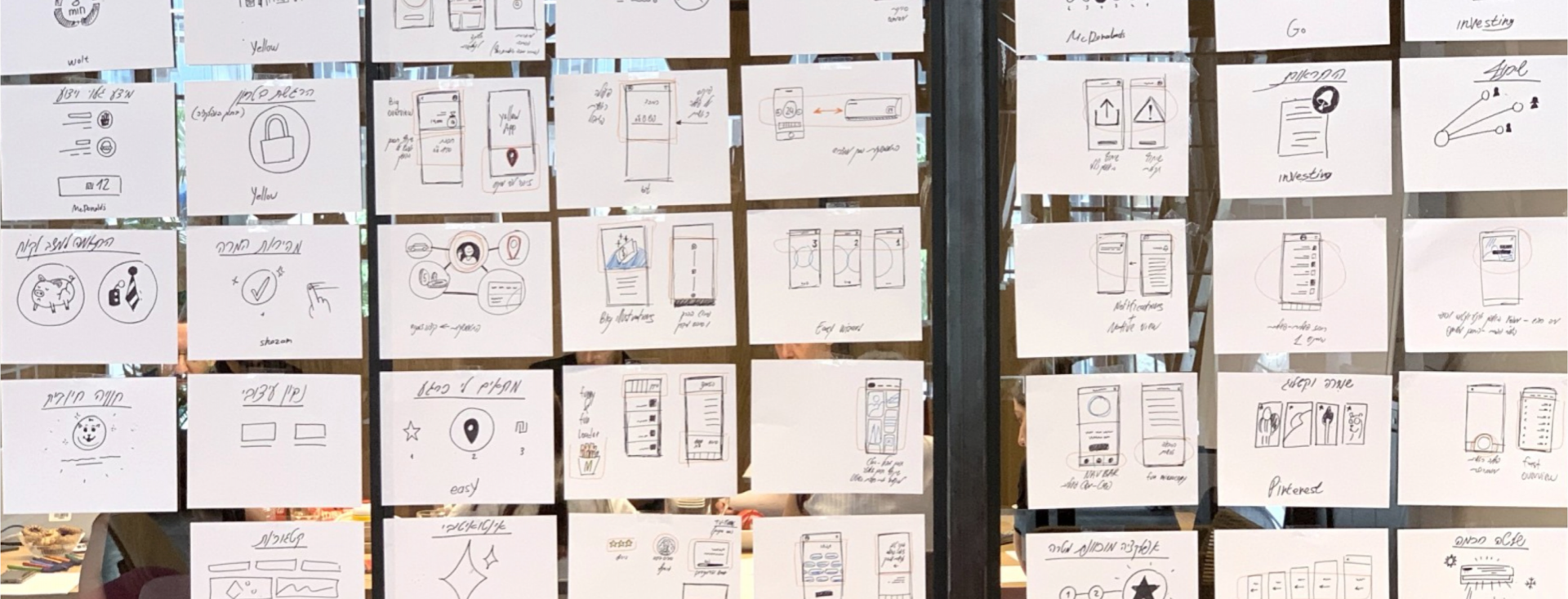
We followed an agile process that had begun with in-depth research to gain An iterative process a thorough understanding of the users' needs, pain point, behaviors and motivations. We then defined the problems the product might face, designed a prototype and conducted user testing, while meeting with clinicians on weekly basis for additional feedback. Lastly, we analyzed our findings, refined the design and repeated the process until we achieved an optimal user experience.
