Client
5 Fingers
Industry
Education
Skills
brand_strategy | visual_identity | copywriting

Put a finger on it
We live in dynamic, confusing times. Seems as though the faster the world moves, the less we do. With most of our time spent on computers and smartphones, the once limited “screen time” has become a way of life. Gen-Zers, who’re currently in their preteens and teens, are especially prone to spend most of their time on screens – as a generation that was born into a world already flowing with apps, smart products, digital experiences, connected life, online presence, influencers, fake news and constant info bombardment. Even though this rather new era creates new lifestyles and needs, some truths stand strong: we need to socialize, move, and live fully to maintain our human, social core, our health, our present and future. 5 Fingers, an educational movement for teens, has set out to make a difference and help them connect – to the world and each other, through physical activity and real conversations. We’ve teamed up and went on to design their brand identity.



Reach out and touch real
Truth spoiler: 5 Fingers’ physical activities and gatherings are shockingly popular with teens. As soon as we kicked off our strategic research, we’ve discovered unwavering loyalty and enthusiasm. This was a great starting point, and a key step to our brand strategy was figuring out the magic behind 5 Fingers and verbalize it. The magic is a part of the complex, rich experience 5 Fingers hold together –physical challenges and honest conversations; national mission and private goals; authoritative approach and collaborative attitude; discipline and empathetic flexibility, and more. The main strategic insight is that working with these complexities will free 5 Fingers from constantly trying to explain them or feel as if they’re in the way, and will create a disruptive brand and a meaningful organization. And so, the brand positioning is SOCIAL PRACTICE, referring to both working out as a group, and practicing socializing on various levels – with the vision of BEING THE INDIVIDUAL-SOCIAL REVOLUSION.


Hand in hand
The brand essence is IT’S IN OUR HANDS, to emphasize the social power to make both individual and social changes. Its values encourage the brand to strive for meaning, discipline, tolerance, accountability and resilience, while its tone of voice focuses on grit – STRONG BACKS, OPEN HEARTS, SHINING EYES, deep and eye level. The visual language then took the strategy a few steps further, finalizing it into a unique and powerful look.
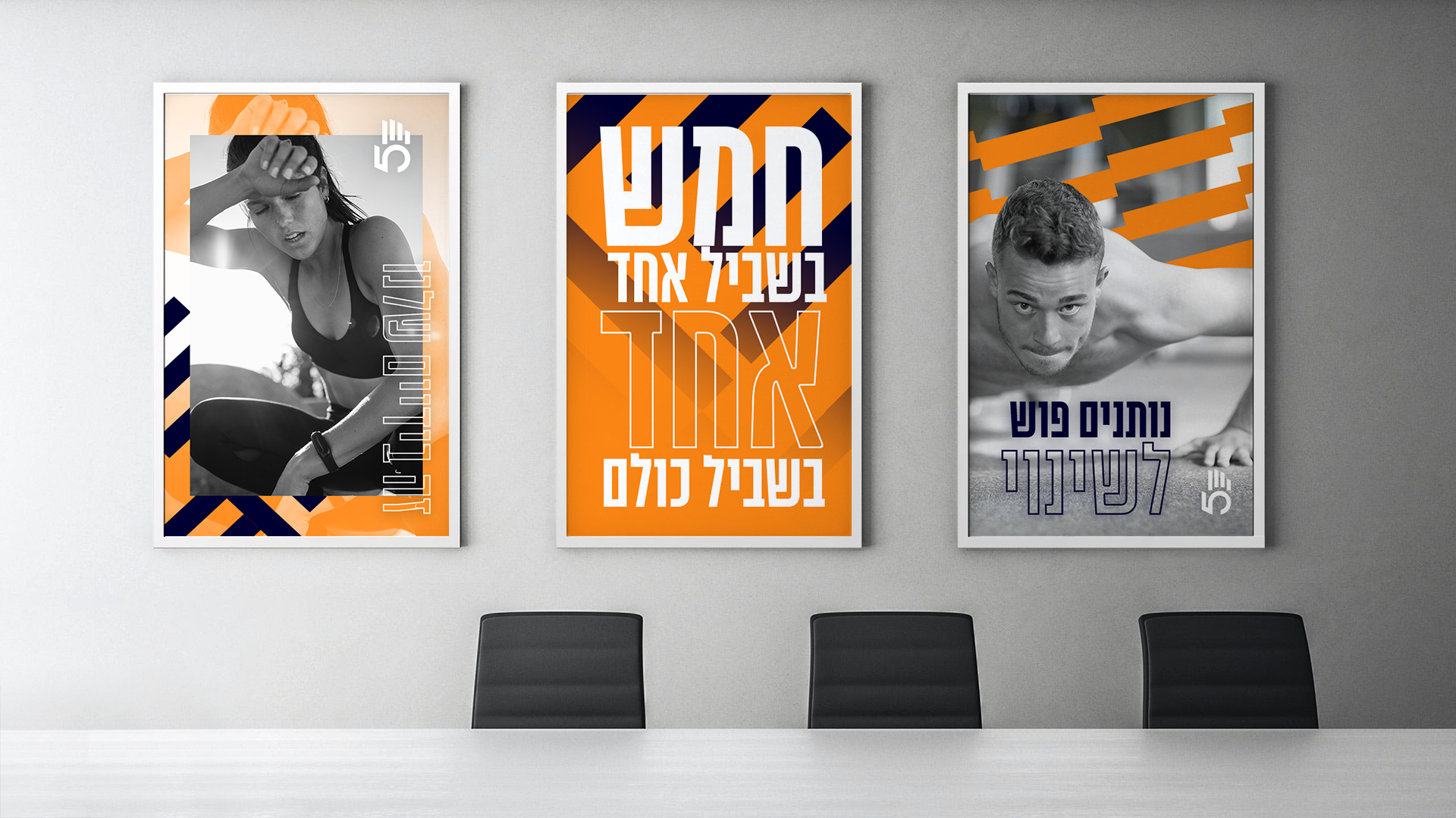
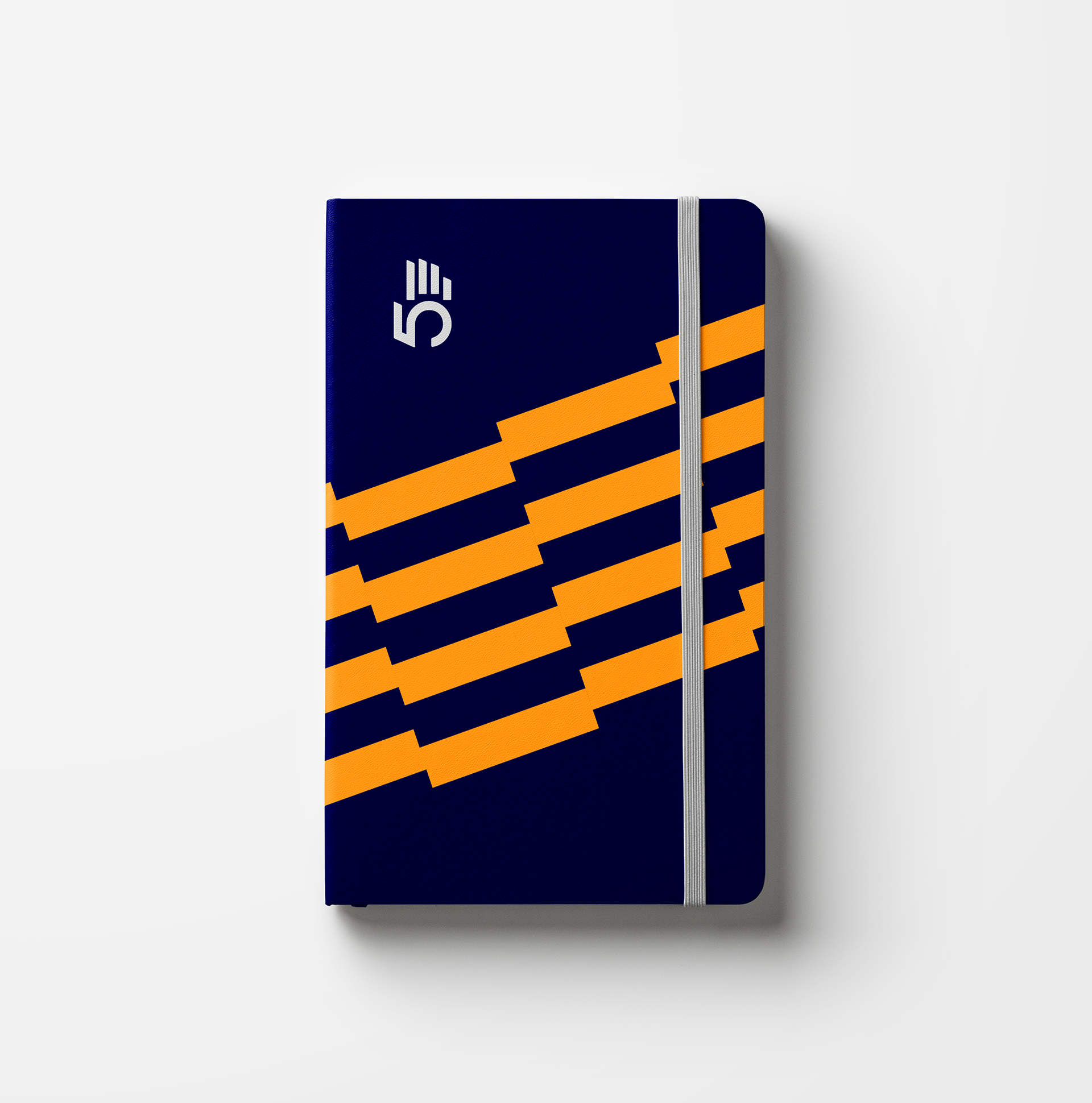
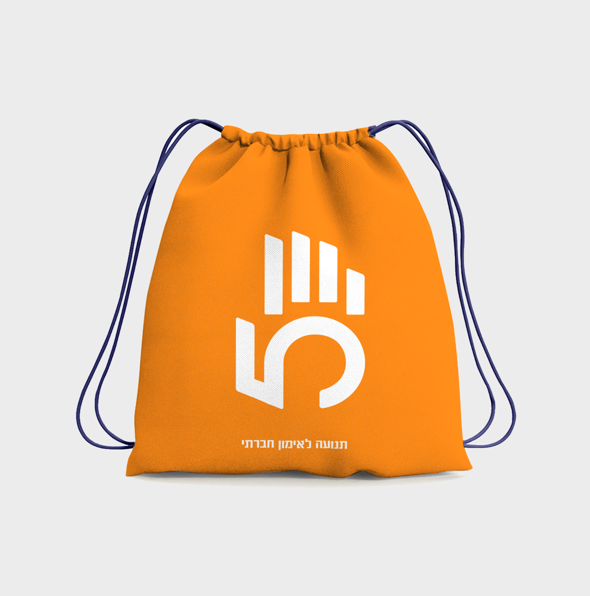
The brand logo is made of the number 5, designed to simulate a palm. There are three main brand colors, blue, orange and white, and the logo lines can be used to create grids and patterns with these colors. 5 Fingers’ photography language focuses on young people in candid, dynamic frames, appearing in full color or in black and white backed by brand colors. Every element supports the brand strategy, and most importantly – empowers 5 Fingers and carries it forward.
