Client
Roligo
Industry
Finance
Skills
brand_strategy | visual_identity | naming

Regroup
Having a united front for a company is part of the things that turn businesses into brands – and this process begins with brand strategy. This provides a mutual backbone that holds all its assets to the same values, standards, vision and goals. This is where we met The Group, an extensive investments group lead by Roni Biram and Gil Deutsch, two of Israel’s most powerful investment experts. After founding and successfully selling Excellence Investment House, the duo pressed on and assembled The Group, an octopus holdings company for alternative investments operating in a myriad of fields. Turning this business into a brand ensures The Group can position and locate itself better in its field of operation – and push it forward.
Ingenius balance
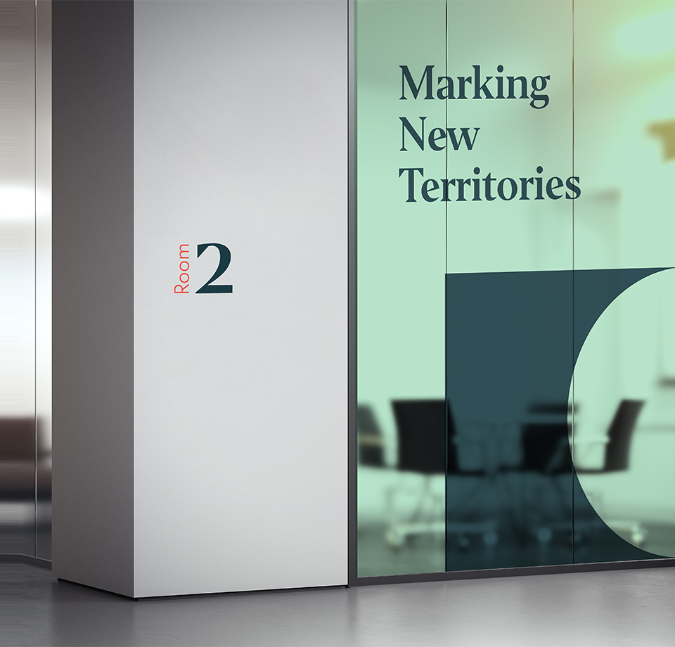
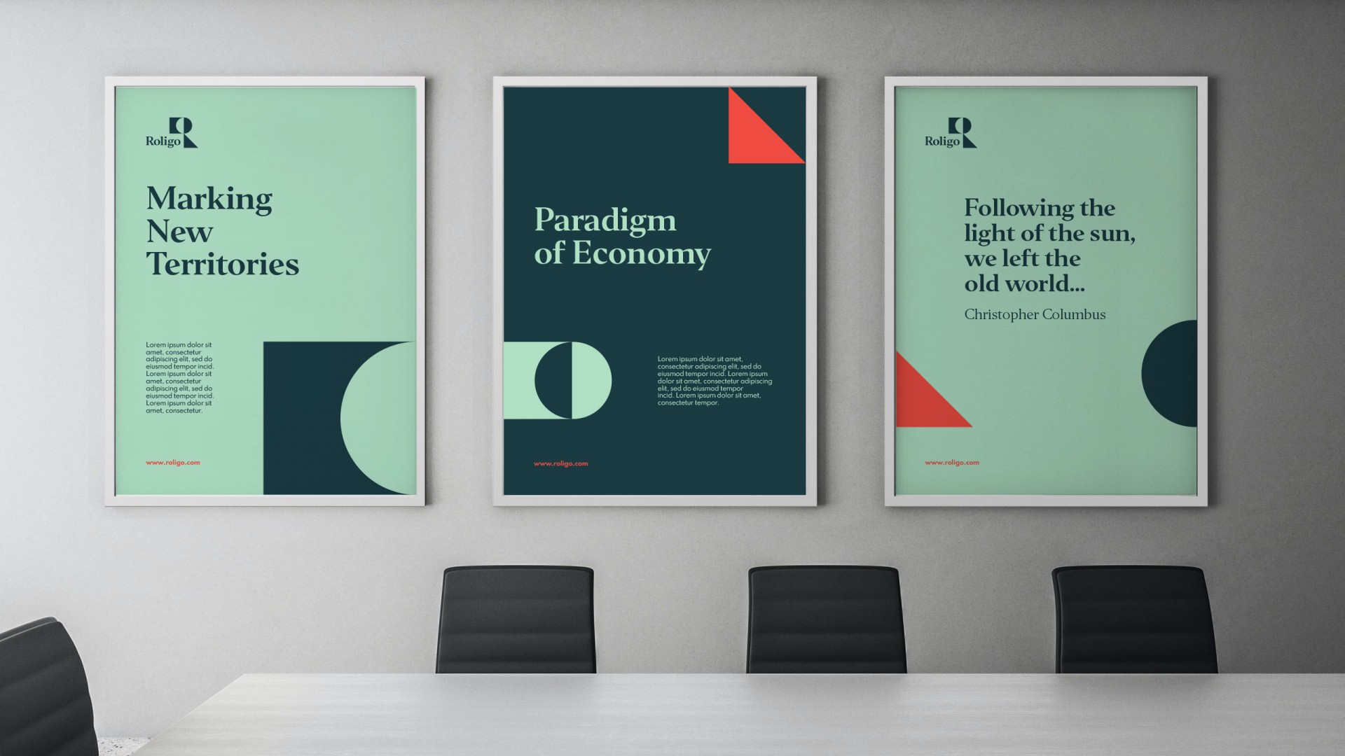
The main strategic challenge we were facing was creating a unified identity that would gracefully and wisely contain its sub-brands with concealing them – and lays the foundations for future growth. Maintaining the balance between Biram and Deutsch’s reputation and experience, and the independent gravitas each company director carries. The Group’s main advantage and the business engine behind its activity, is its ingenuity within the alternative investment world. This also serves as a litmus paper for The Group’s partners. We used it to position The Group as LEADING CAPITAL MARKET ENTREPRENEURSHIP. The brand essence is MARKING NEW TERRITORIES, and its character always expresses THE MODERN FINANCIER. The values that represent it best and allow continuous evolution are Independence, Progression and Business Innovation. Lastly, we named it Roligo, a name that both contains Roni and Gil, but suggests a different perspective and conveys momentum, drive and movement.



From business to brand
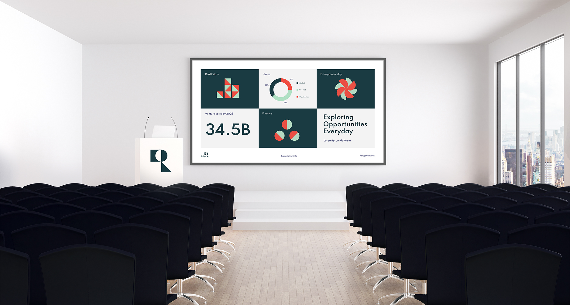
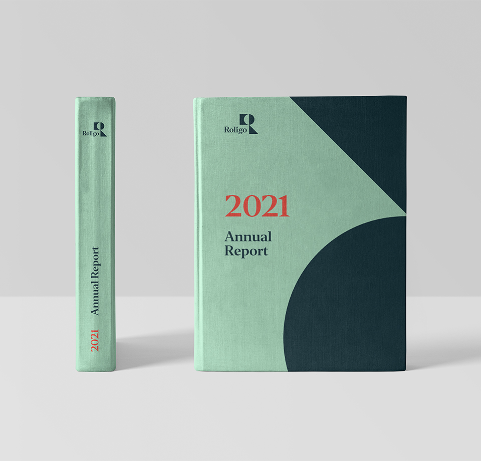
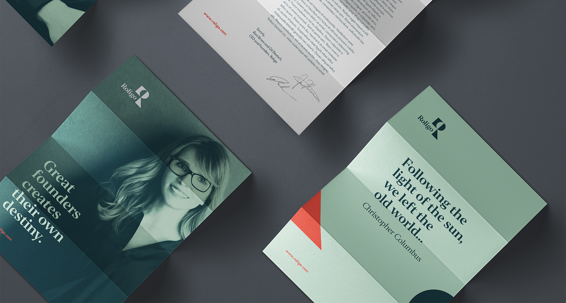
Some of the most important elements of a brand are the logo and symbol, and so we moved forward with creating a smart, corporate and powerful logo symbol, with a slick visual language. The logo symbol is the letter R assembled with three geometric shapes that symbolize the different and varied sub-brands, their unique character and independence. For brand colors, we went for two shades of green, forest and jade, added a ceramic orange for some oomph, and white for a lighter, airier feeling. The photographic language presents images of growth,
movement both focused and in a bigger perspective, and people in familiar and collaborative positions. For big headlines and texts, we chose Editor, an accessible yet present and powerful font. We’ve created icons to represent the brand values, and used the geometric shapes to demonstrate pattern and element options – and they are as varied as Roligo itself. To us, Roligo is an excellent example for both the human and business value of branding: turning a brand-holding company into a multi-brand within itself allows it to expand professionally under a unified identity, thus strengthening its name and people, and dominate new territories.
