Client
Sisram
Industry
Health | Tech
Skills
brand_strategy | visual_identity | ux_design | ui_design | copywriting
Big to bigger
Even big companies with numerous assets need a change that will allow growth. Rebranding can serve as a kickstart or a compass when businesses in any size want to move forward. Sisram, a technological holdings company with a powerful medical aesthetics brand, Alma, wanted to strengthen the connection with its ace brand to make the creation of further sub-brands and eventually an ecosystem, smarter and easier. We kicked off the mutual process that’ll help Sisram transform from a holdings company and a financial entity to a synergetic entity and a brand in its own.
Define your brand cosmos
One of our main missions in this process was helping Sisram find the right brand architecture: it has to include Alma, home-use devices, the plethora of dental devices, and leave enough space for Sisram to continue growing in varying markets and countries, and with different audiences. We offered the ecosystem approach, with a definition that’ll exist alongside the brand positioning. You might be wondering what’s the difference between the definition and the brand positioning. In this case, the definition is an outer stamp gracing Sisram’s plethora of products, while its brand definition serves as an inner engine that drives it forward. The definition we came up with is MEDICAL GRADE WELLNESS, while the brand positioning is THE BACKBONE FOR QUALITY OF LIFE, which tells a double story: one of a premium care powerhouse, and another of different vertebrae that are all connected. The brand essence is ALWAYS PREPARED, which refers to client’s main pain point and positions Sisram as a smart, direct and connected problem solver.

Flex the new you
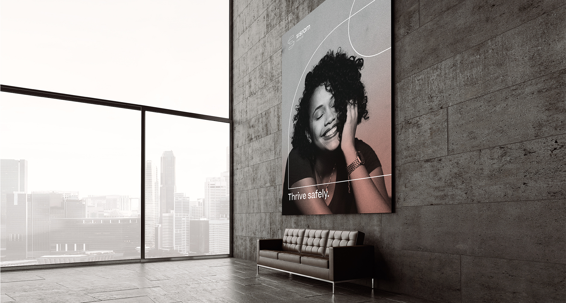
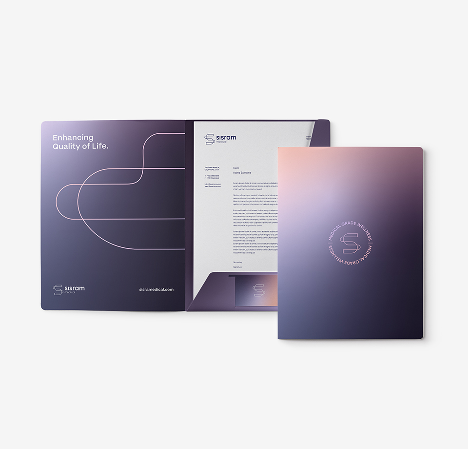
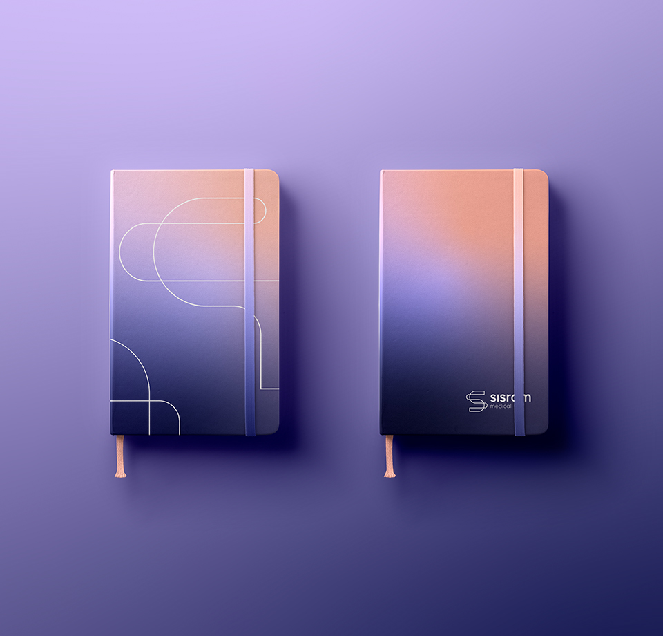
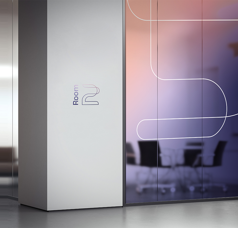
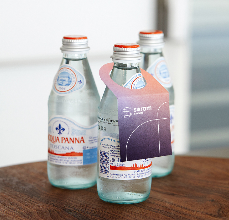
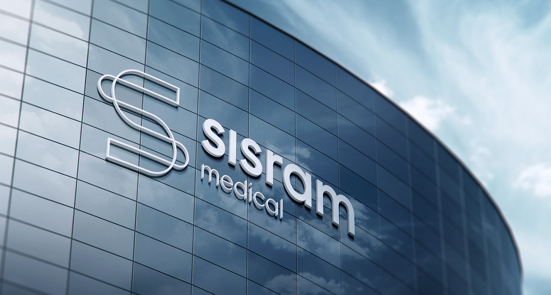
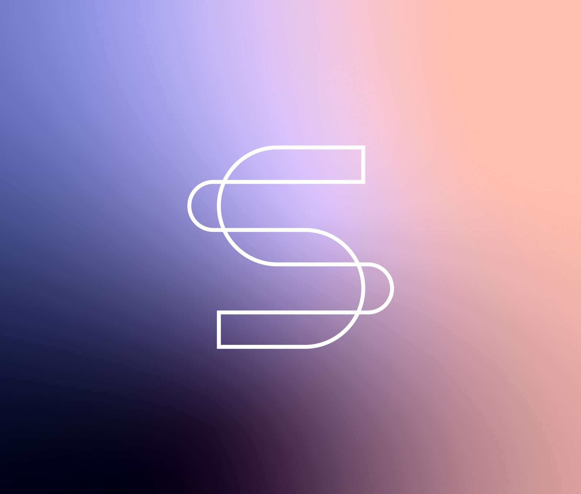
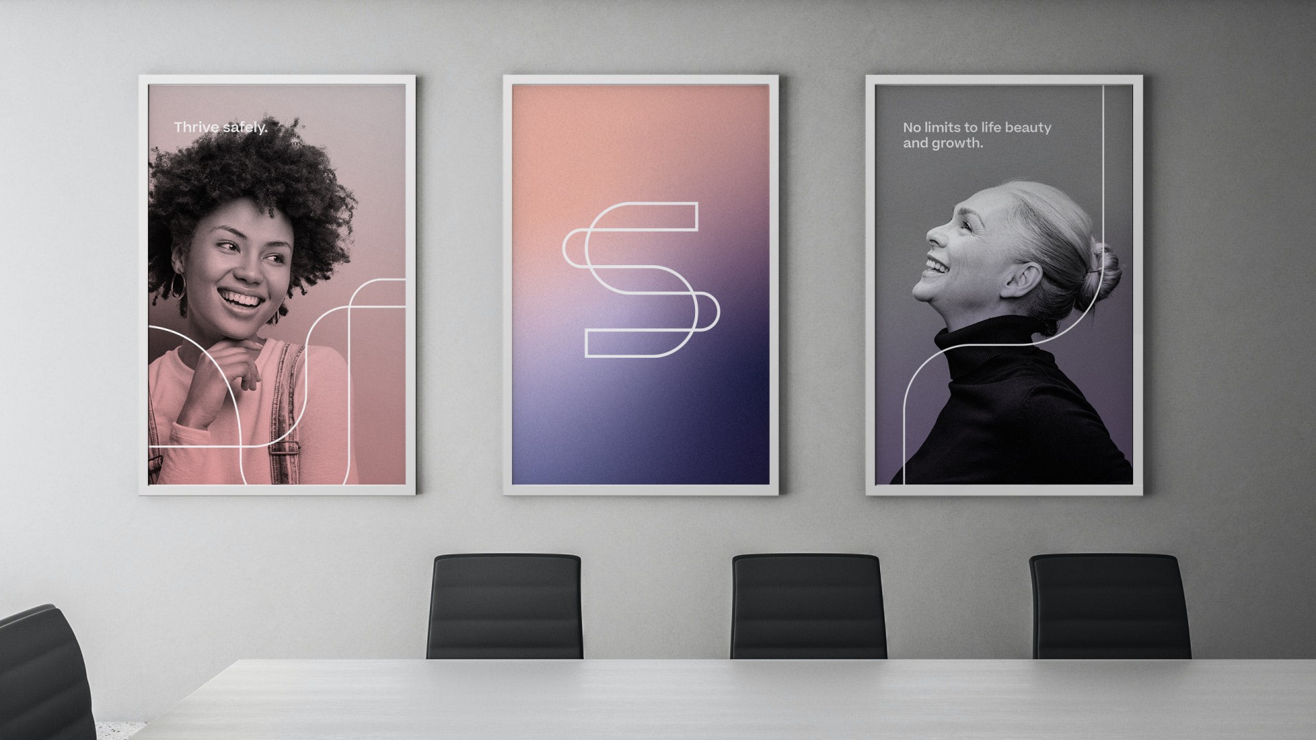
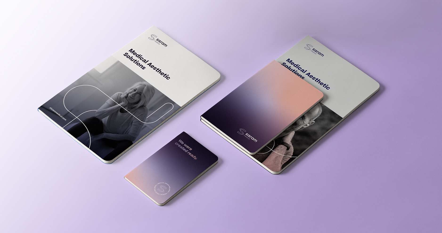
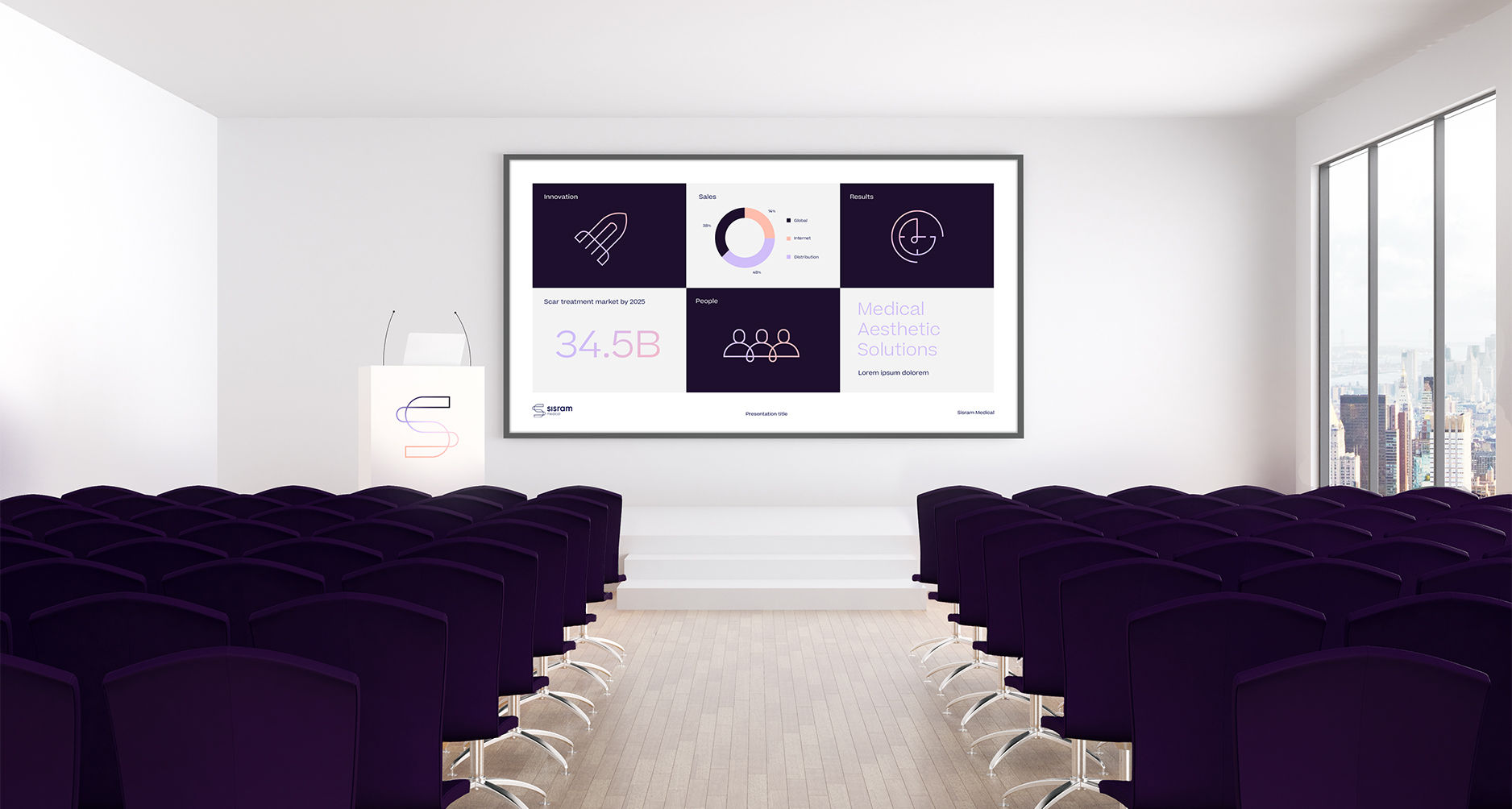
Sisram’s new visual language started from the logo, which depicts the letter S as a flexible spine with two lines that create connecting vertebrae. The new brand colors combine technological excellency and wellness, with a palette composed of blue and purple shades, brightening up to pastels with lilac, light mauve, and soft pink. We use them in gradients for backgrounds, while the logo shape appears largely in different grids.
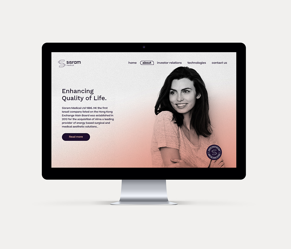
We’ve also designed icons for the Sisram’s main values: connection, daily life, forward and awareness. The visual language connects directly to the brand’s tone of voice, KIND AND RESILIENT, and demonstrates movement and adaptivity that allows the parent brand grow above and alongside its existing assets and upcoming sub-brands. Lastly, we've desgined a commercial website that reaches out mainly to the Chinese market, promoting Sisram as a B2E (business to everyone) brand house.
