Client
BWR
Industry
Tech
Skills
visual_identity
Independence way
Industries have been gradually automizing their operations, relying mostly on autonomous vehicles of sorts. This category contains a myriad of robotic solutions and while it may smooth out different processes, the amassment of devices and functions creates a different kind of complexity. The need for practical ease and wisdom is in constant rise. Blue White Robotics is here to revolutionize industries, mainly agriculture, by allowing a seamless adoption and management of autonomous technology.

Tech connection
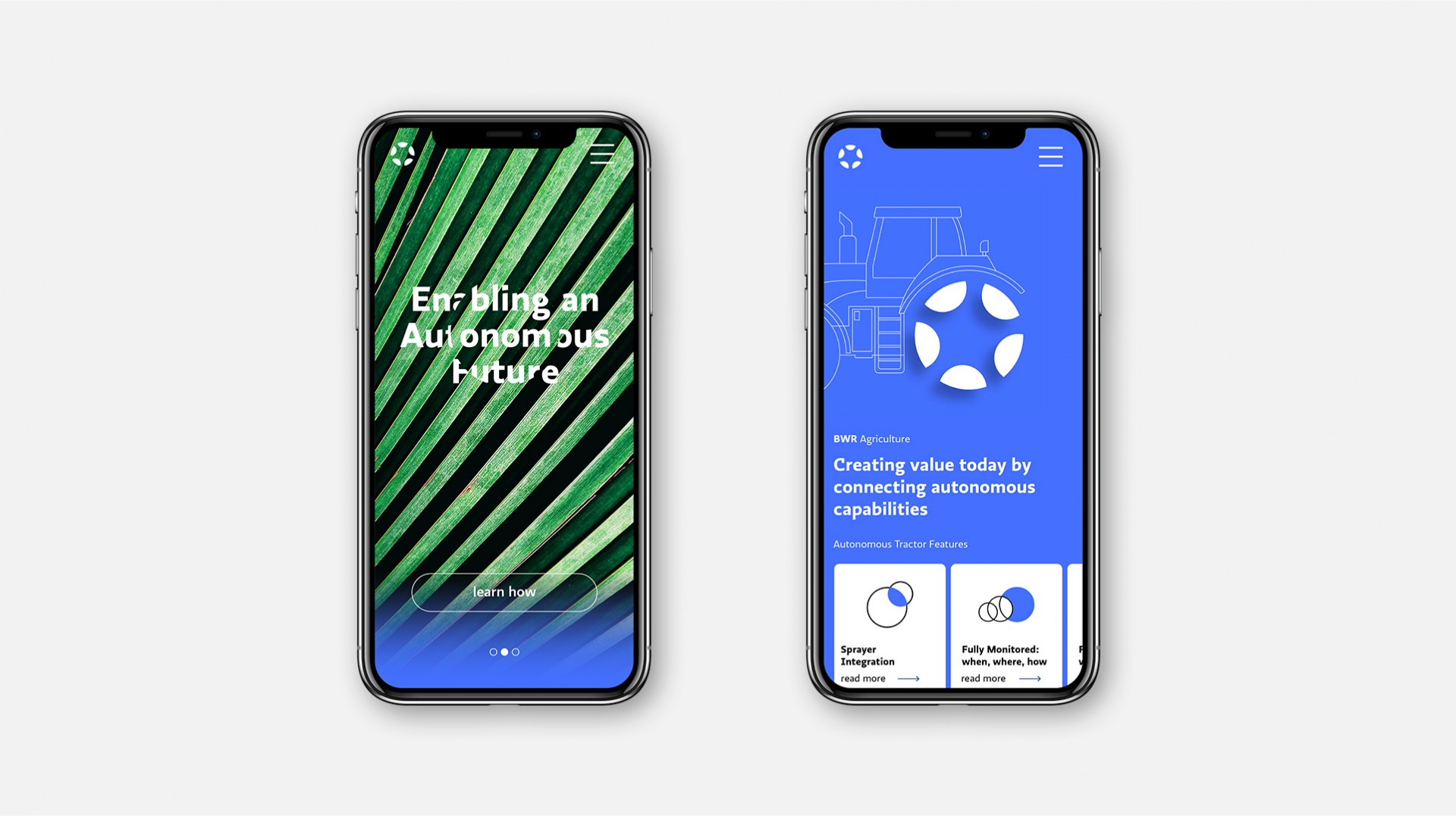
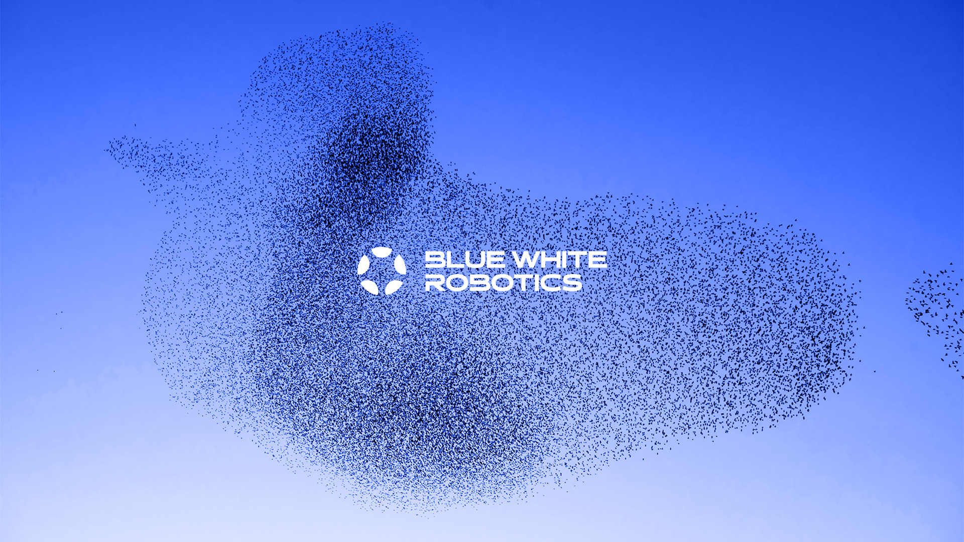
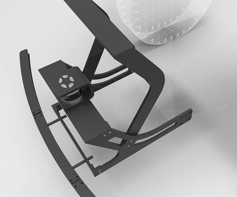
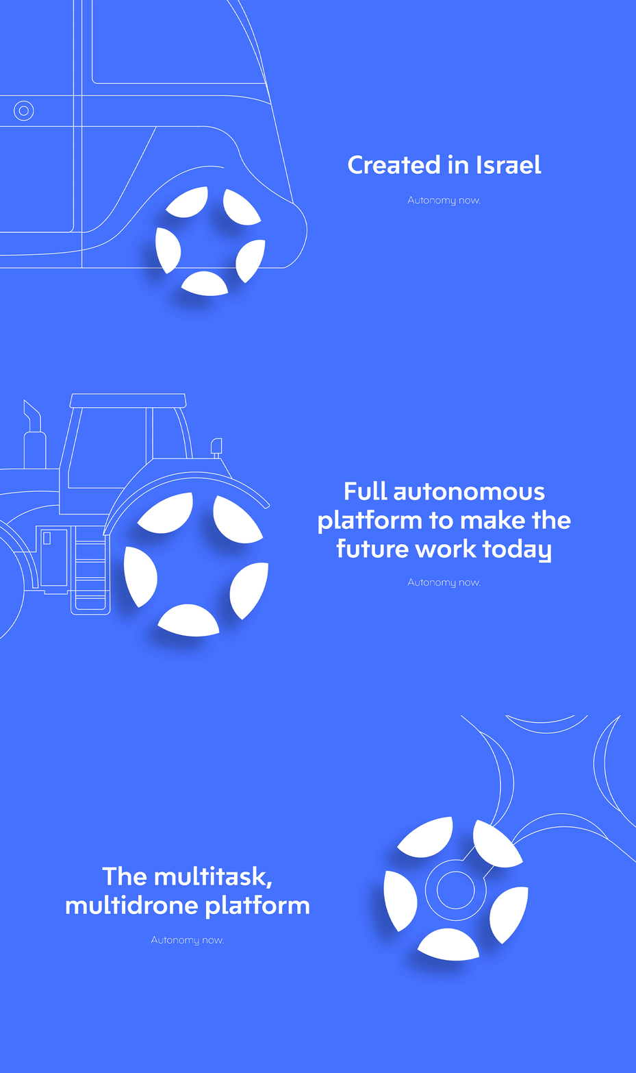
Blue White Robotics came to us following a strategy process that helped them focus their operations. It was time to visually craft an accurate brand to match the smart, advanced company. We’ve analyzed the strategy and broke it down to pillars, from which we extracted essence that helped us move forward. Starting with the logo, we wanted to convey the idea of robotics as a service, a platform that connects new systems to apps, enabling an autonomous future. The logo shows smaller circles in a bigger circle, referring to BWR’s versatility and ability to connect technologies together. The smaller circles are cut in a way that helps shape the bigger circle in a clear way – the platform. It also conveys movement, action, tech and ongoing thought.
Free the future
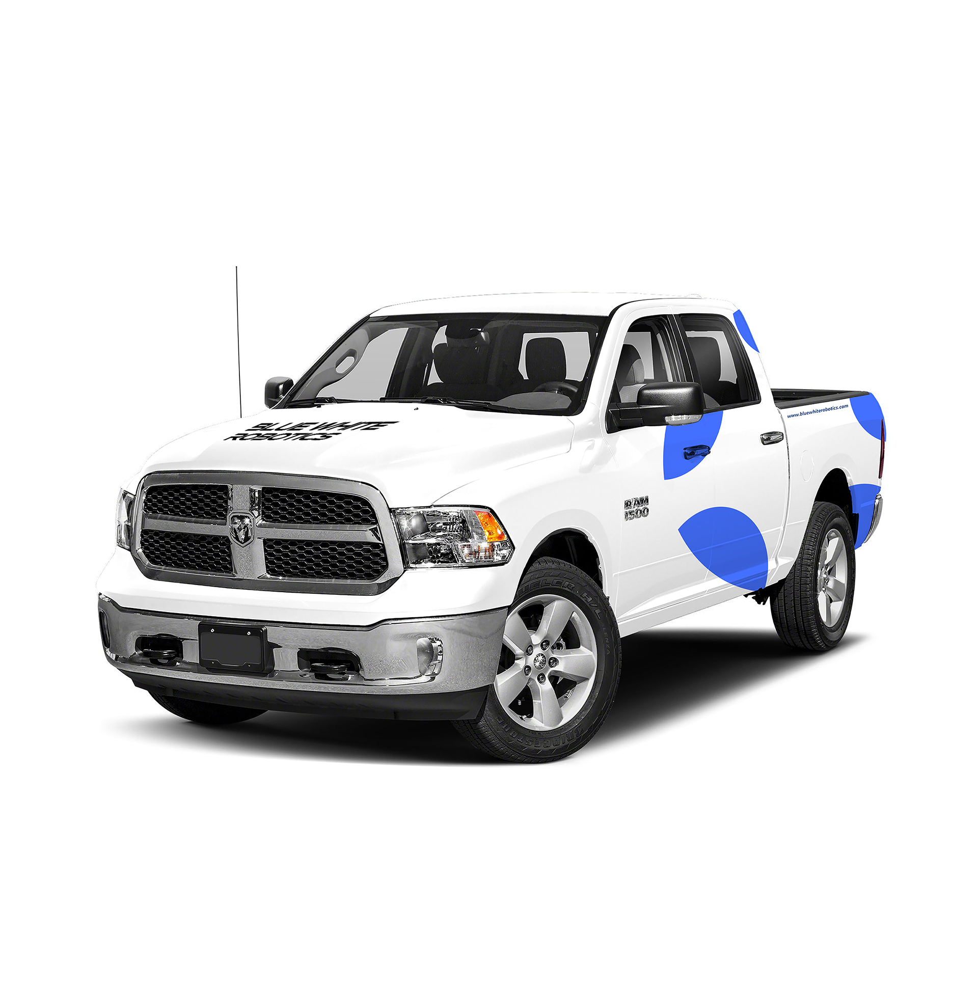
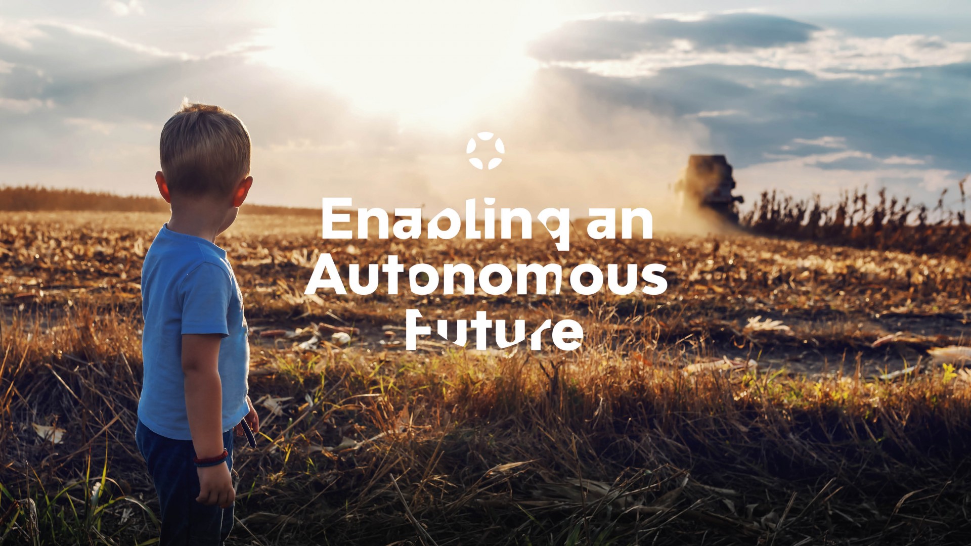
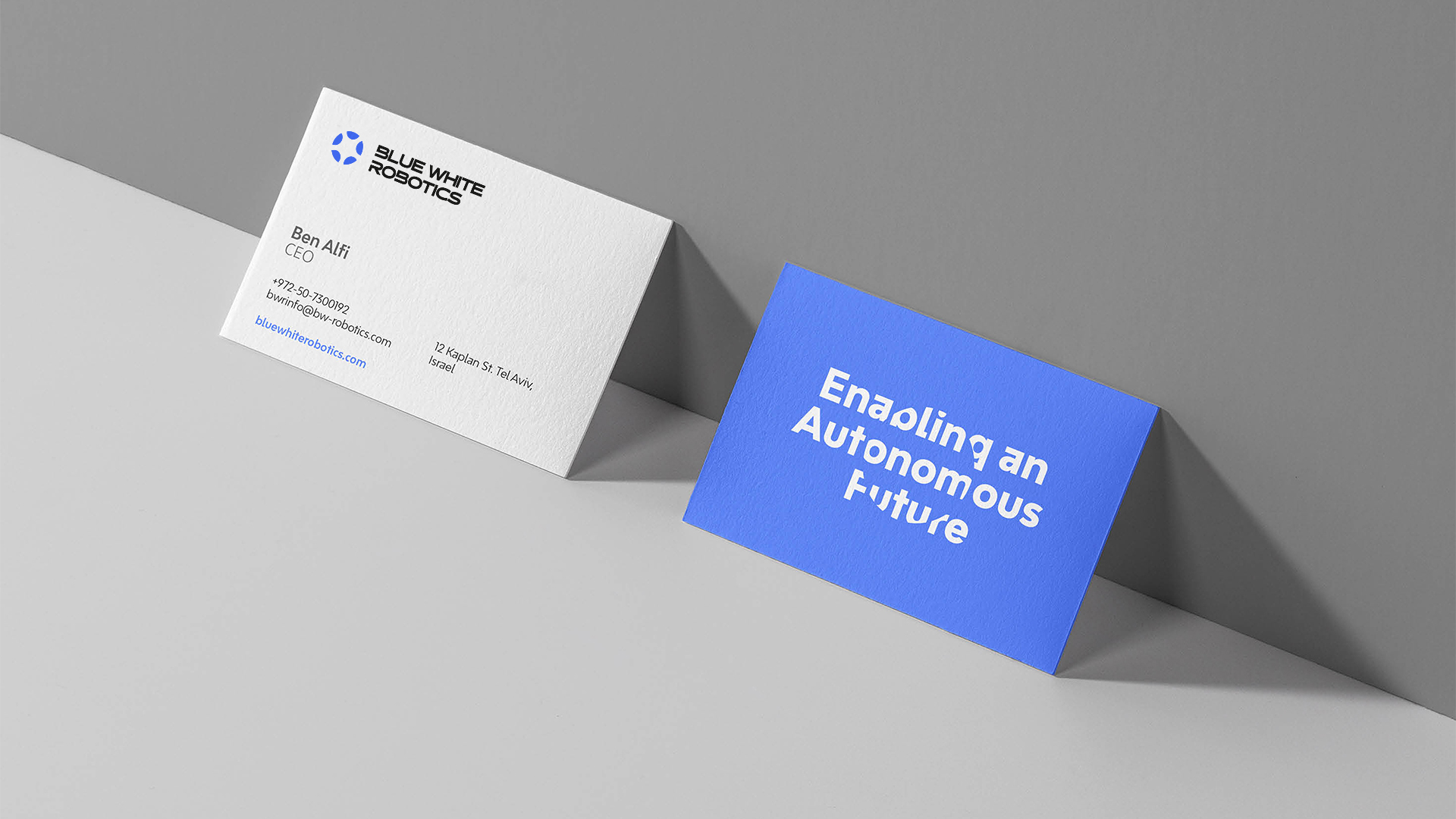
BWR’s visual language supports that same idea of enabling an autonomous future, using slick and clean ideas. The brand’s main color are, as it says on the tin, blue and white – and black and gray, for contrast and balance. We’ve added a lighter palette which we’ve mostly used in the photographic language. This mainly consists of varied natural elements that express power,
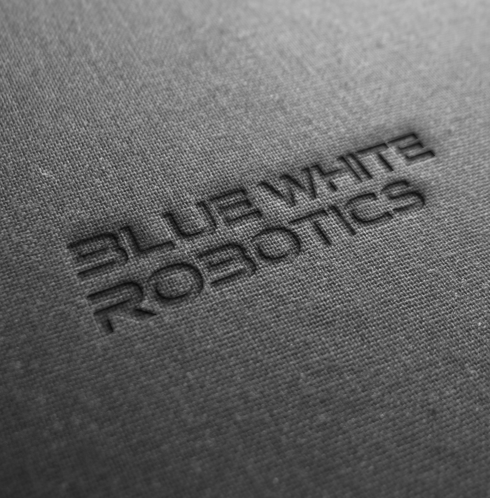
impact and a grand connection that can bring together anything, anywhere. The pictures all have a texture quality to them – even when presenting a bird’s eye view. We’ve also used an imprint effect that shows the logo on a smart fabric, and it gives all the cutting edge vibes. We created original and slick icons and illustrations, to neatly support the rest of the language. We’re ready – connect us the future!
