Client
Bank Leumi
Industry
Finance
Skills
digital_strategy | app_design | ux_design | ui_design | rebranding
New year, new ways
2019 introduced Israeli banks to a new financial reality: they were officially separated from credit companies. For clients, it meant greater competition and a healthier financial environment. For banks, it was an opportunity to redefine and refresh their services and means of communication with clients. In addition, the open banking era is beginning, which requires all banks to share their knowledge on the various platforms. Leumi bank, one of Israel’s biggest and popular banks, recognized a chance to boost and made a move: they turned to us rebrand their app. Our UX/UI teams went on a fascinating journey.

Research to upgrade
In fact, we inherited an existing app by Leumi. User reviews deemed it cluttered, text heavy and way too complex – considering how complicated money already is. Additionally, the new app had to be all about Leumi without previous credit companies involved. It was undoubtedly time to upgrade it from an intimidating data storage space to a communicative, informative and empowering tool.
Our UX team used various tools, including interviews with clients, bankers and consultants; market research to examine immediate competitors and an array of relevant apps for shopping, lifestyle and communication; and design thinking sprints that are meant for uncovering core ideas and reshape experiences accordingly, through design.
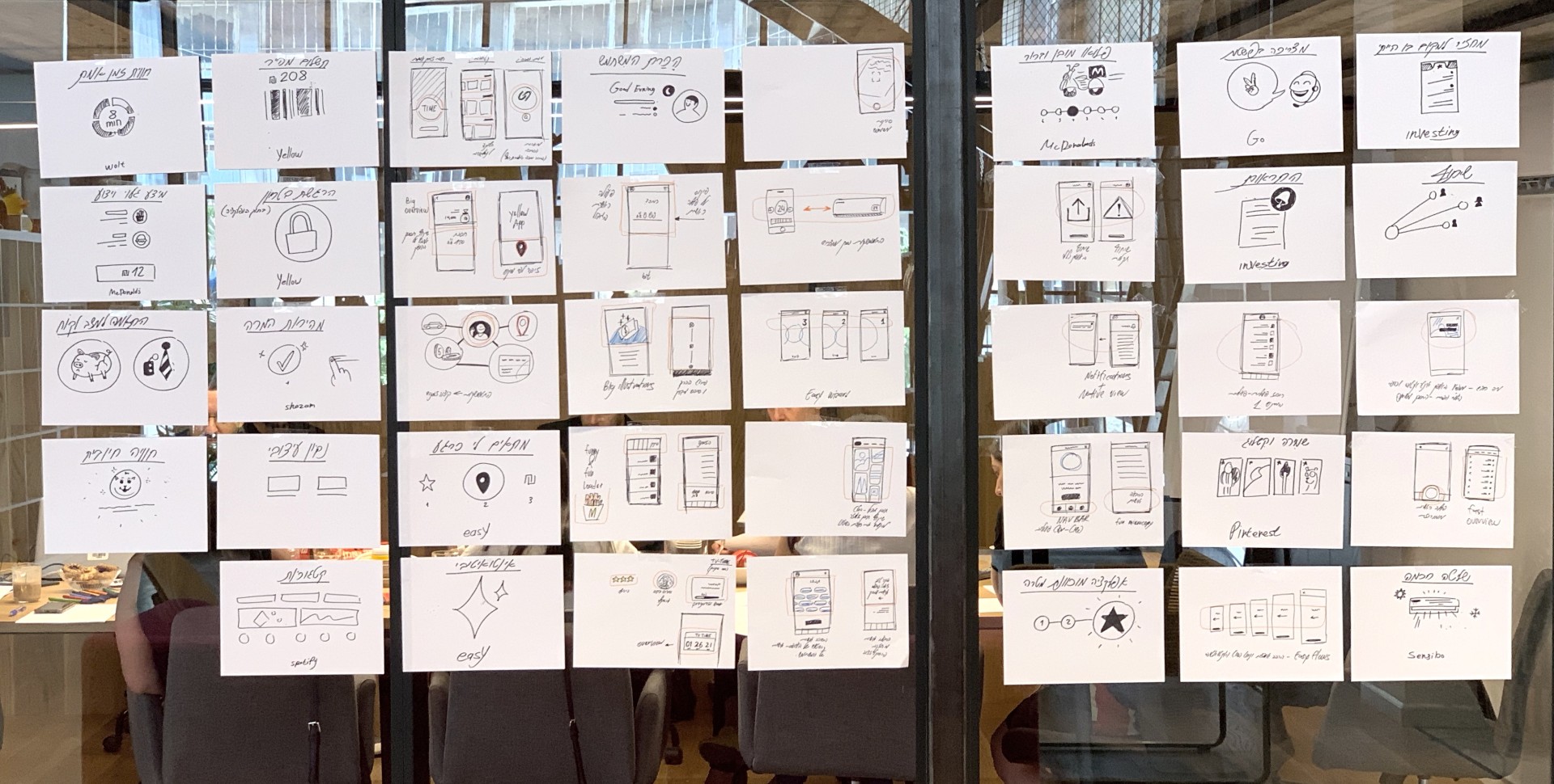
Journey insights
The challenge was digitizing a 20 year old brand language and an app with a complex structure, accessibility and clarity of content issues. The process included a professional and comprehensive research process with several research methods. The solution was to design an innovative and technologically leading app that empowers users.
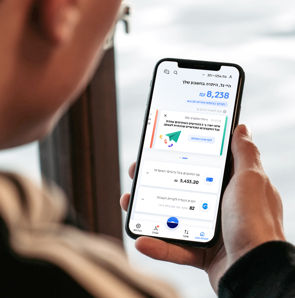
Banking with ease
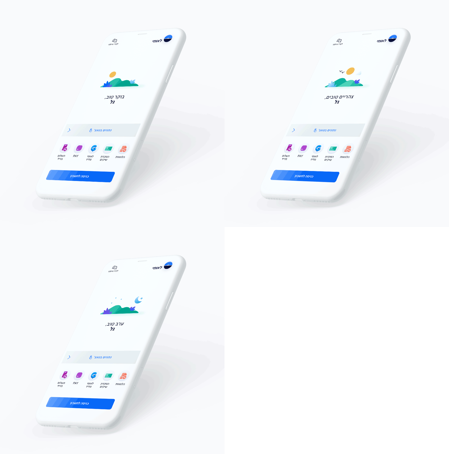
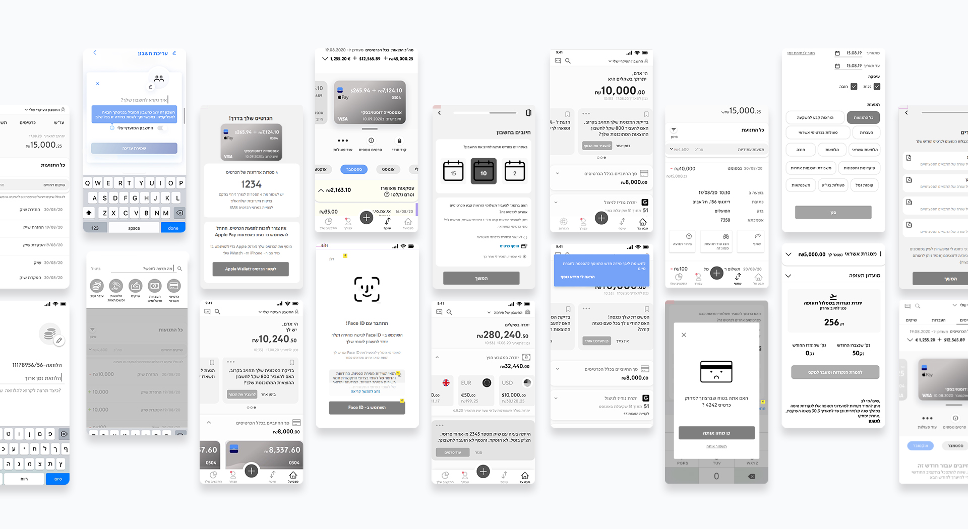
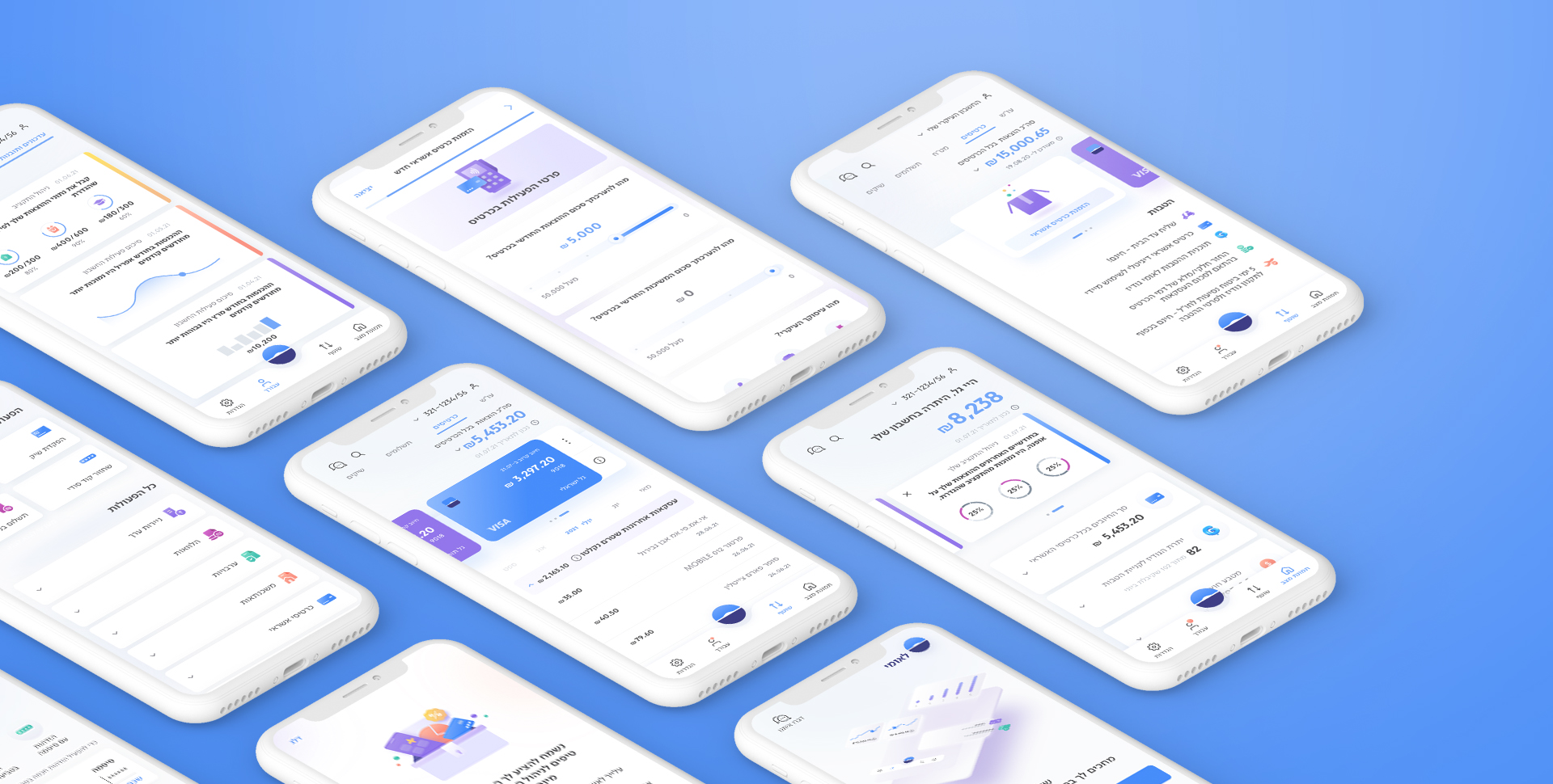
Our UX analysts worked closely with the Leumi product team, maintaining a proactive and effective relationship. We've developed a new app based on research findings: an empathetic, personalized and educational interface, that is insight based, with short and omnichannel flows, and that allows better managing of multiple accounts and budgeting. It’s accessible, flexible and empowering, helping users of every literacy level and financial background to get acquainted with their finances and feel in control and at ease. The most meaningful change for users is the insightful offerings the app extends to users: based on their finances and data, users get tips, advise and personal opportunities to learn about better account management, and develop trust in a complex system.
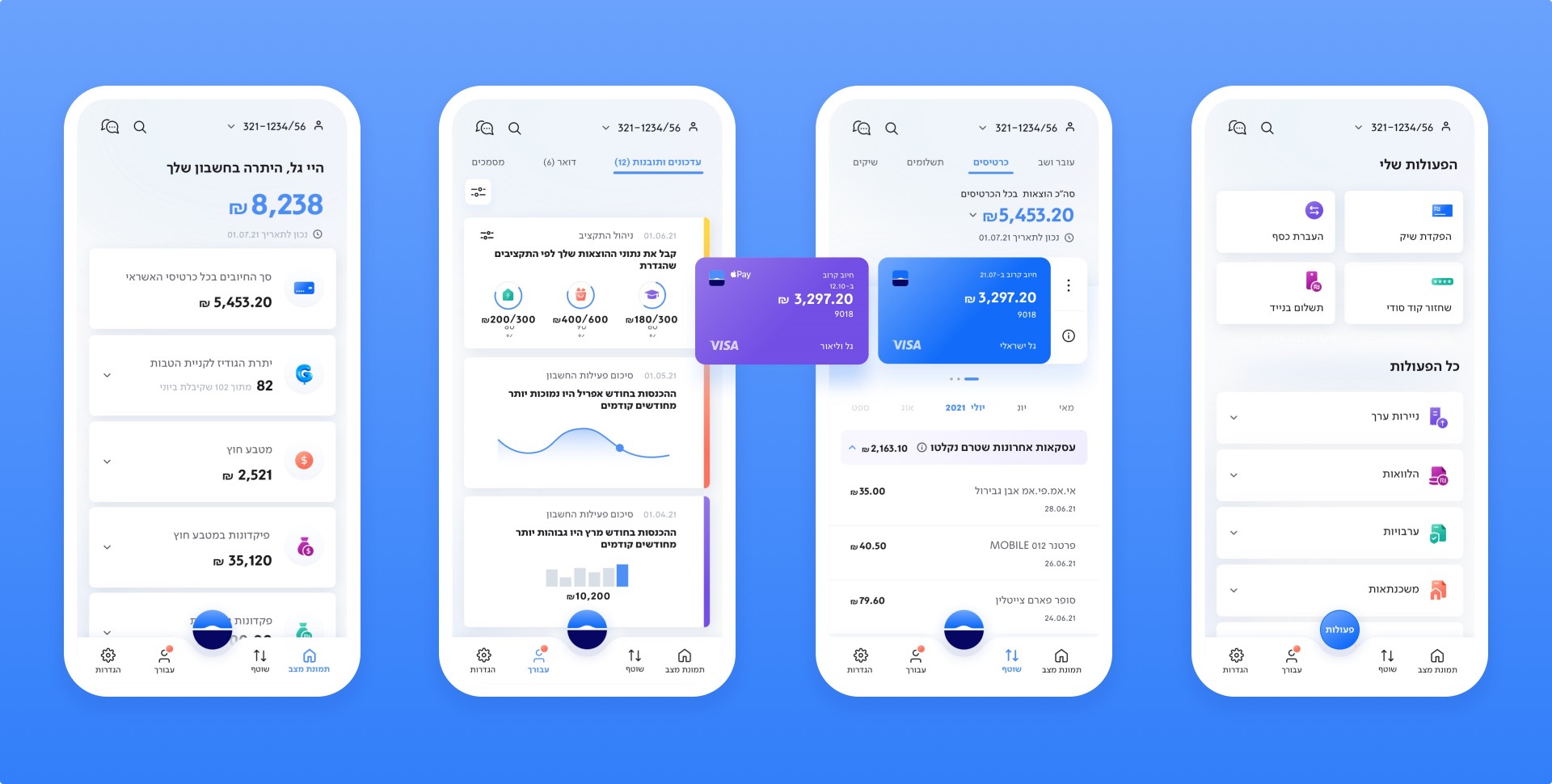
Intuitive and attractive
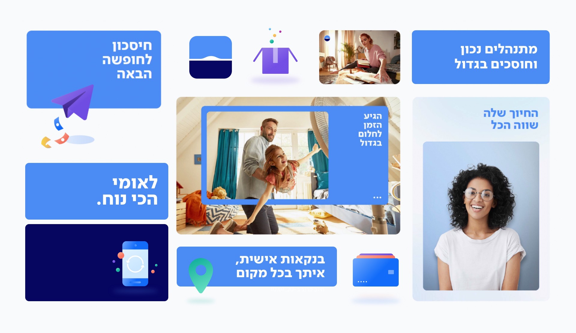
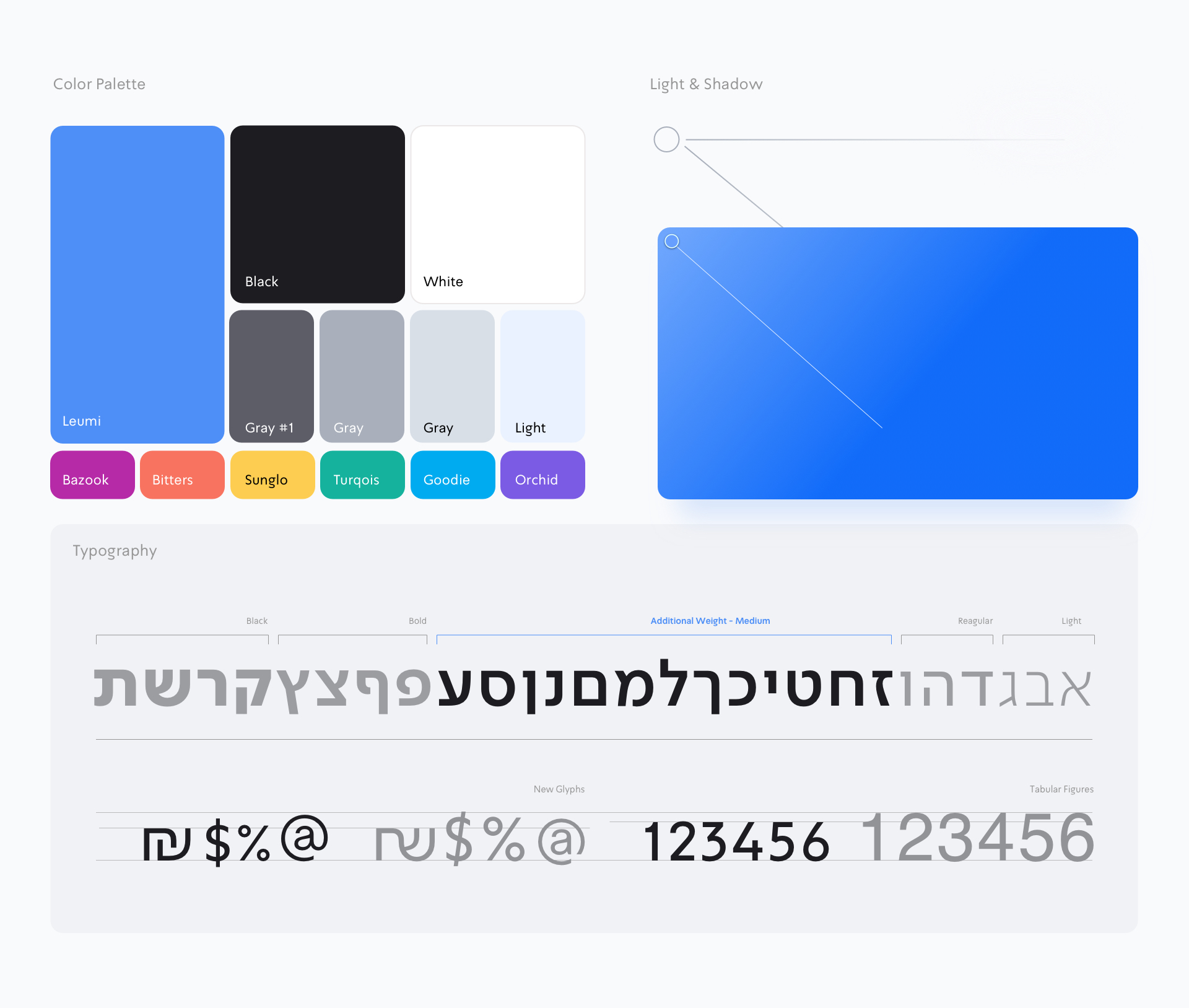
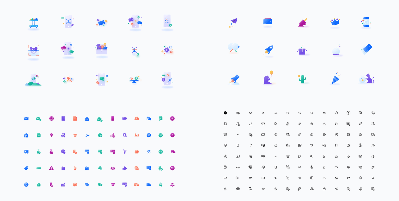
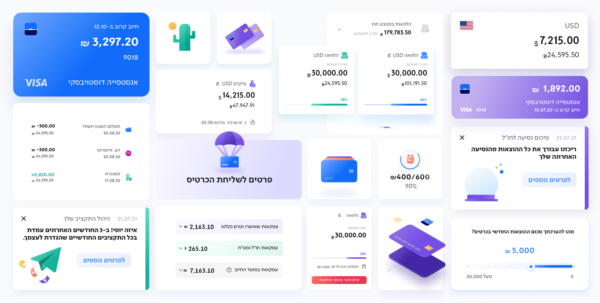
This was a unique process, as the branding grew out of product design. Our product designers gave life to the new interface and successfully made it super accessible. The digital face lift begun with a new app avatar and logo, that’ll eventually appear offline as well, and continued with a full upgrade of the brand toolbox: a rich brand font that fits the needs of a financial product, an optimistic color palette and light and shadow features. The new design is clean and minimalistic, to promote accessibility and coherence. We've created a dynamic and responsive design system,
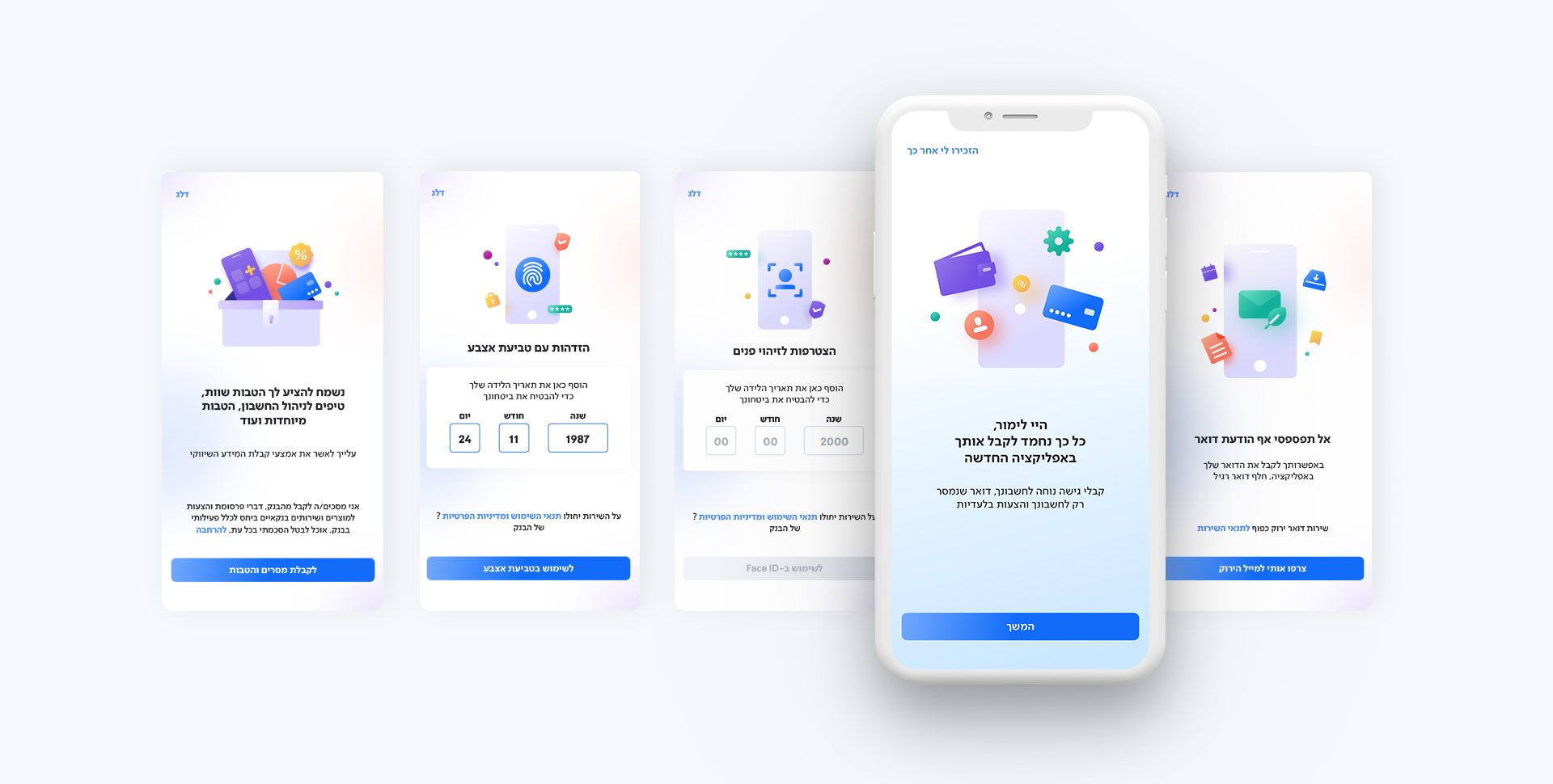
with a triple layer icon system featuring over 300 original icons for different actions, categories and content worlds. We've created a rich user experience with illustrations that give moments of delight when interacting with a financial product. The app’s tone of voice and microcopy are more human, straightforward and transparent. It explains and suggests, never instructs. Leumi’s new app brings beauty, usability and human connection to an area that seems inaccessible – and you can definitely take that to the bank.
New product, new language
While working on the new Leumi app, we had to fully digitize a 20 year old brand language. Following the visual makeover, Leumi embraced the new digital design and made it their official brand visual identity. We’ve developed Leumi’s social look and tone into a responsive and flexible grid that redefines and expresses ease above all. The new language was successfully implemented in Leumi’s communications, and will eventually be fully used in every touchpoint and interface of Leumi’s brand.
