Client
One
Industry
Professional Services | Tech
Skills
Brand Strategy | Visual Identity | Marketing Website
The one and only
Sometimes, a company can be successful business wise– but its image, the brand itself, may suffer a gap and trail behind. This usually has to do with a wide, varied range of services, and a big business that is made of few smaller companies. It’s quite a challenge to keep a sweep motion with such a big body of work. This was the case with One, a powerhouse of tech integrations. Starting off, we were facing a dual challenge: we had to come up with a brand strategy that’ll unite and empower it internally, while also changing the outer perspective on the company by redefining its essence, and help it move forward.
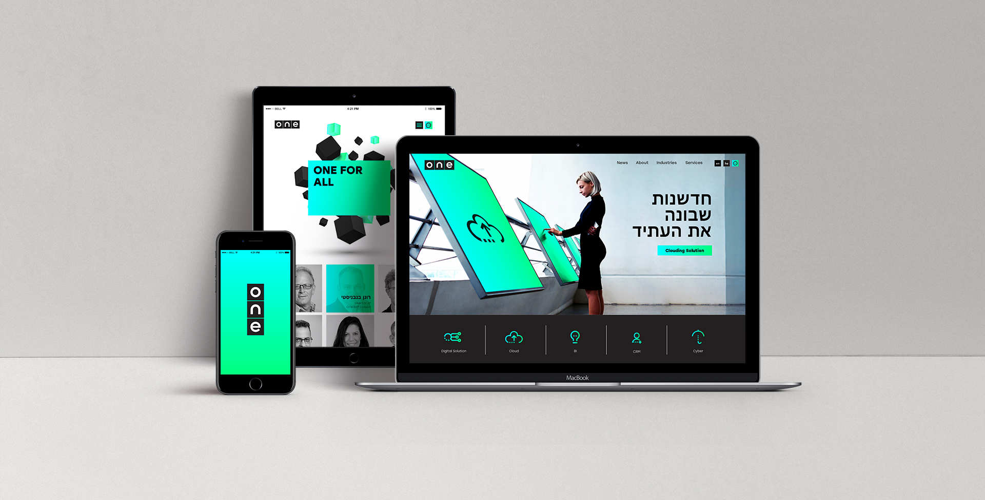

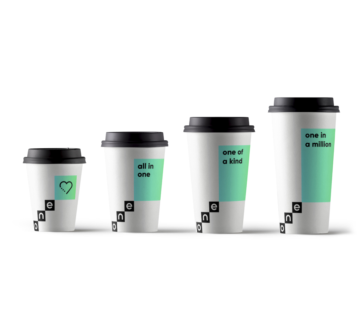
All for one
Frist thing first, we knew we had to resolve One’s inner perspective. On the business level, competition drives accomplishments. But what happens when the rivalry inside a firm overshadows its outer competition, and creates ambiguity regarding the company’s array of benefits? From interviews we conducted, the main three elements that guide One are collaboration, innovation and future – that was consensus. So the new definition for the upgraded One brand is, Future Building Blocks. The next step was to turn the conversation around, and focus on the client: it isn’t just about One’s abilities, but rather about the exclusive gains the client gets when collaborating with One. A brand idea that fits perfectly is, Technology integration for future needs.
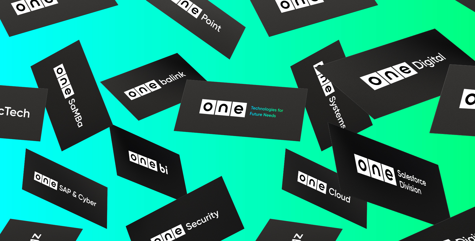

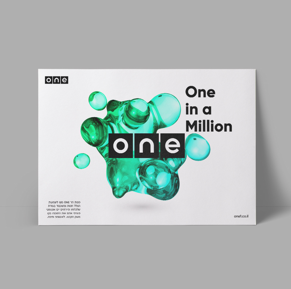

And one for all
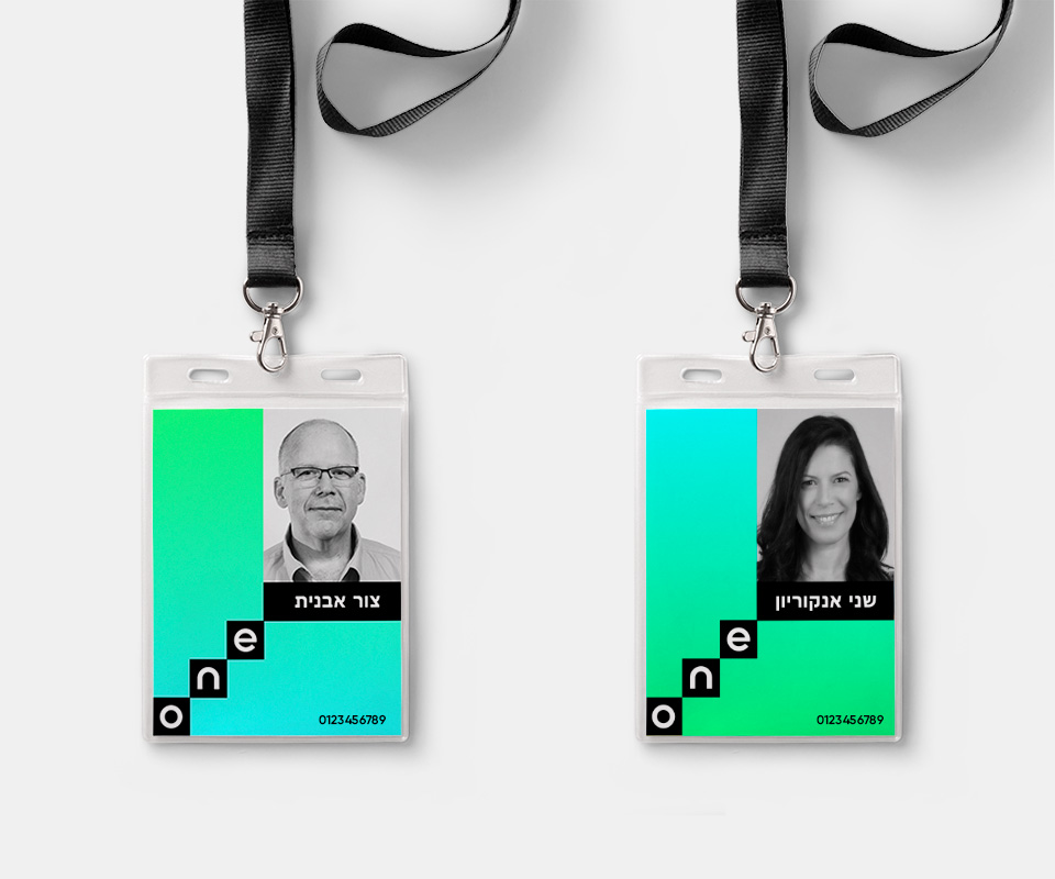
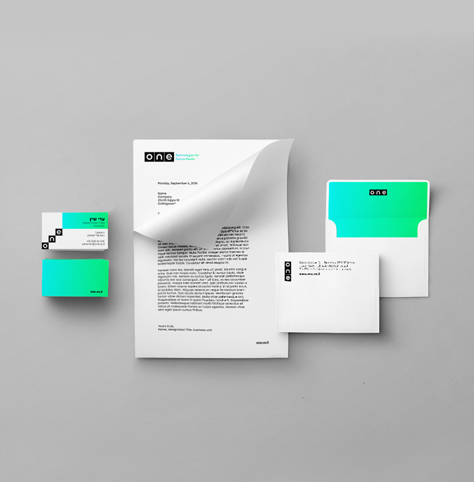
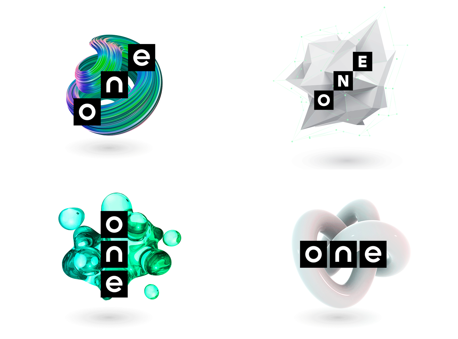
The elements, building blocks and the passion for innovation, inspired the new logo we created for the brand. Assembled by three cubes that go up diagonally, it shines with novelty, and transcends any confusion as for what One is all about. It’s playful and relevant, consensual and unique. We chose to use black and yellow for our design, positioning One as a shining beacon of the future in the present, and having a balanced vibe of both savvy professionals, and playful leaders.
