Client
Reinhold Cohn
Industry
Professional Services
Skills
Brand Strategy | Visual Identity
Care to share
As we down more info, we create further info: this is the vivacious circle of current intellect. This new form of communication calls for a review on the worth of an idea, or a theoretical thought on concrete life, also known as Intellectual property. The process of actualizing a thought is human-centric and begins from the inside out: we have to deliver the thought into being, in ways that are hard to quantify. Intellectual property actualizes knowledge as a mean of keeping it safe and copyrighted. And nowadays, humanity is at the era of knowledge: we’re bombarded daily and consume it incessantly.

The big idea
As modern challenges go, sharing insight is somewhere at the top. Sharing is inevitable and protecting is a must. In this tension lies the work of Reinhold Cohn. It has been a steady, credible authority in IP management and protection. Dating back as early as 1933, RC have been around for a long enough to become the biggest and best at what they do; and quite enough to notice the immense change humanity has been facing, and to rethink RC’s place amidst it. Our mutual challenge was to revive an IP veteran with both the business strategy and a visual language the honors its experience, while pushing it into the future.


Collaboration
is key
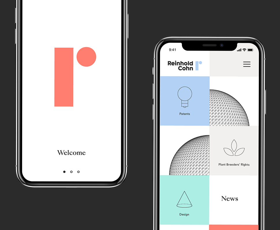
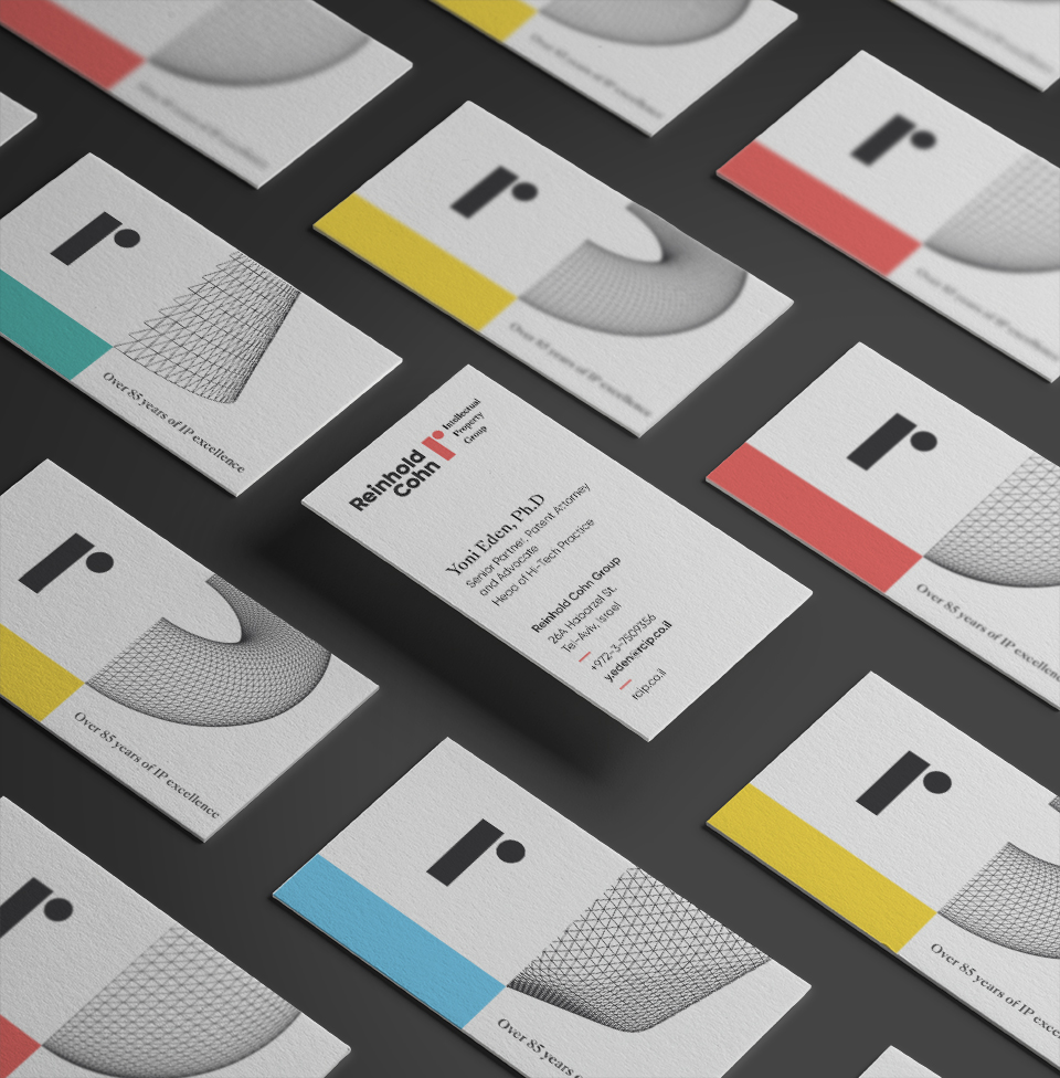
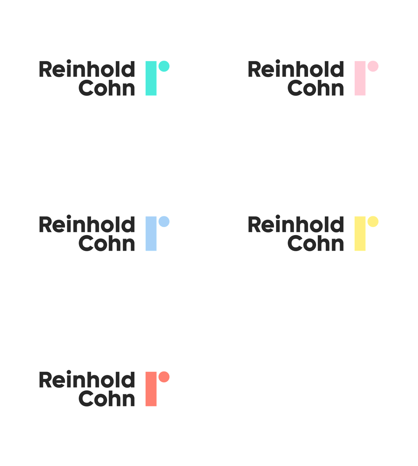
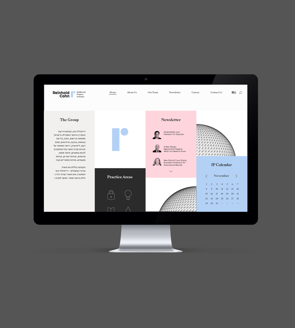
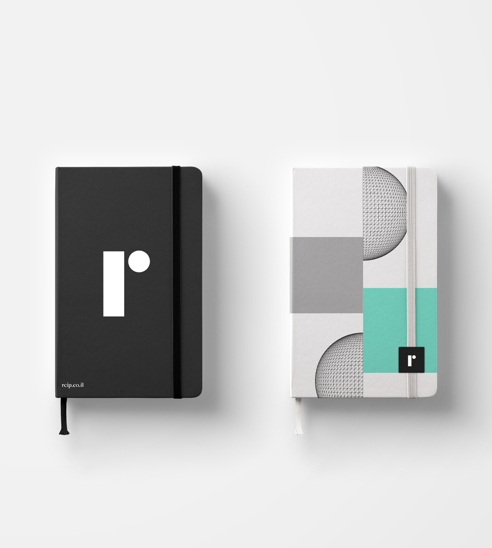
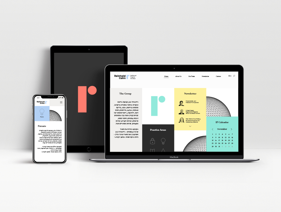
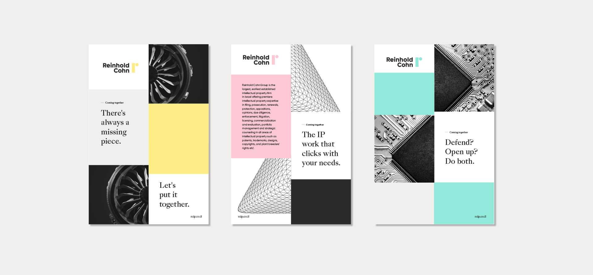
At the heart of Reinhold Cohn’s new business vision, is their identity as a collaborative IP firm. We figured that nowadays, managing and maintaining the ideal ratio between holding back and sharing, is the way to not only accommodate your clients, but to create new opportunities, and spread motivation for mutual evolvement. RC is a multidisciplinary meeting point and a mentor that allows expansion when needed. The visual language we designed for both Reinhold Cohn and its inhouse legal firm, Gilat Bareket & Co, includes a new logo and symbol, with a classic line and a modern twist. To marry the professional, astute character with a fresh and light attitude, we used light colors, getting the best of both worlds and tying legacy with future.
