Client
Rafael
Industry
Security
Skills
visual_identity | brand_architecture | brand_strategy | environmental_design | marketing_materials | website_design | digital_strategy

Be one
with yourself
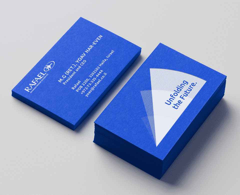
Rafael has been a government owned company since 2002, but was actually founded in 1948 as an extension of the ministry of defense. Over the years it had developed numerous effective and significant technologies, the most renowned of which is the Iron Dome, a missile defense system. This sets the starting point of our mutual process with Rafael. The main challenge was to first help Rafael realize its own value which leads to their extraordinary technology, and in turn change its public identity. We realized Rafael must shift from an array of leading products, to one solid brand system. This will allow the company to reclaim self perspective, truly own its wide range of products and be known for its unique set of qualities.
Stay ahead
of time
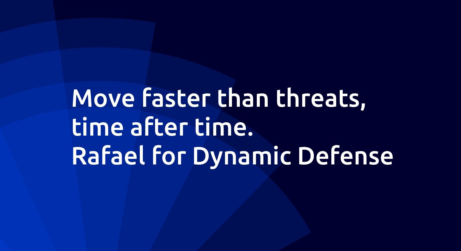
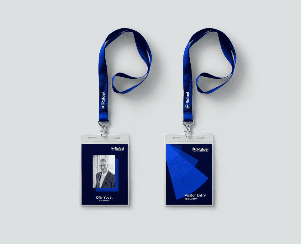
We set out to capture Rafael’s becoming essence, and began by positioning it as a dynamic defense company. This definition honours its diverse legacy and at the same time, presents Rafael to the world as the groundbreaking visionary they are - Rafael knows that innovation comes to those who do. Therefore, we decided the main idea that serves them best captures their ability to always reinvent themselves and keep a fresh entrepreneurial point of view. We called it Ahead of Time. But how should we promote these ideas concretely and complete Rafael’s process of becoming a united body of tech defense? We then moved on to take care of a valuable asset: their online presence. Enter our brilliant UI/UX teams.
Make it a show
you’d want to watch
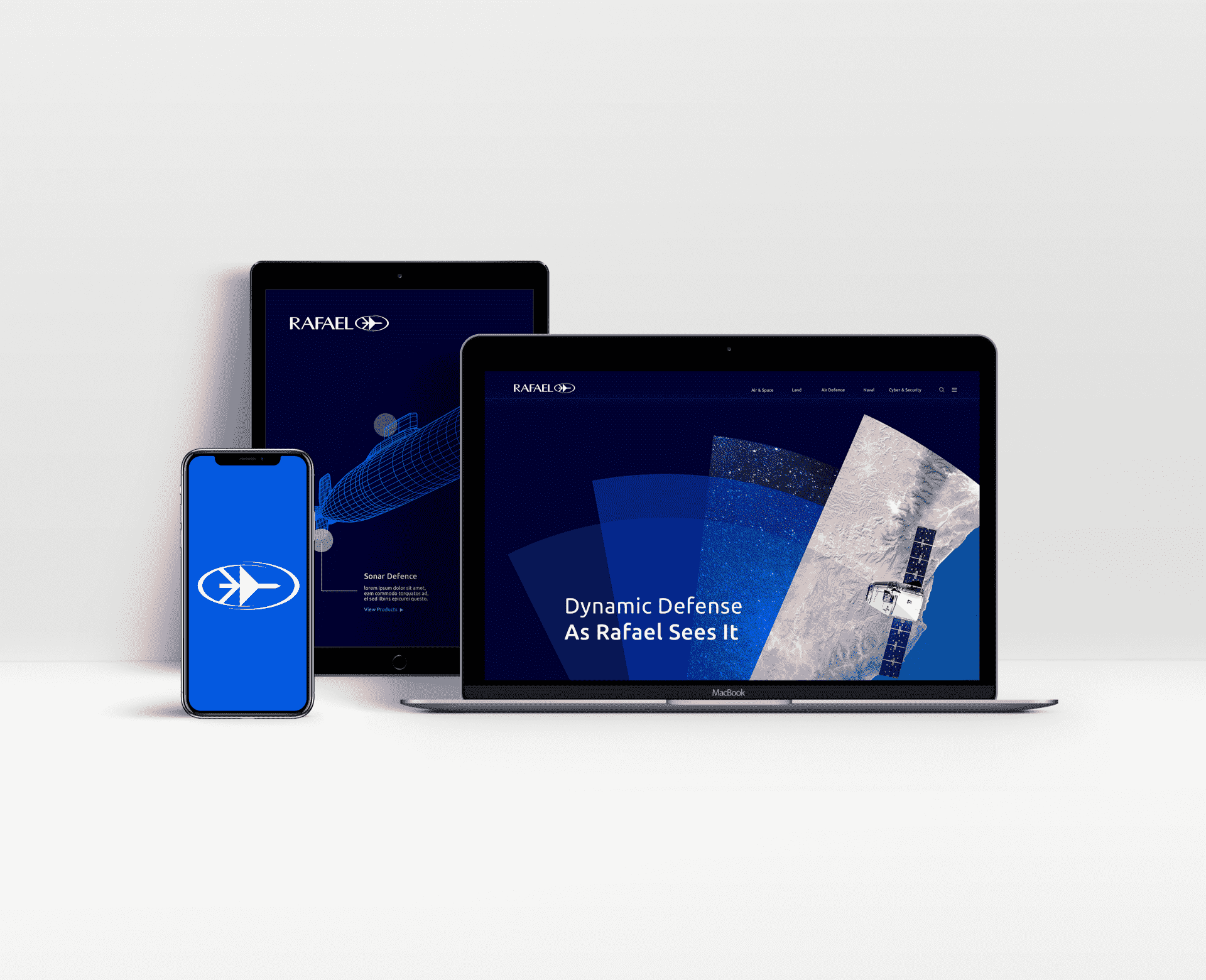
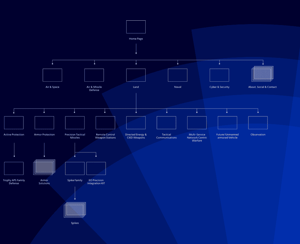
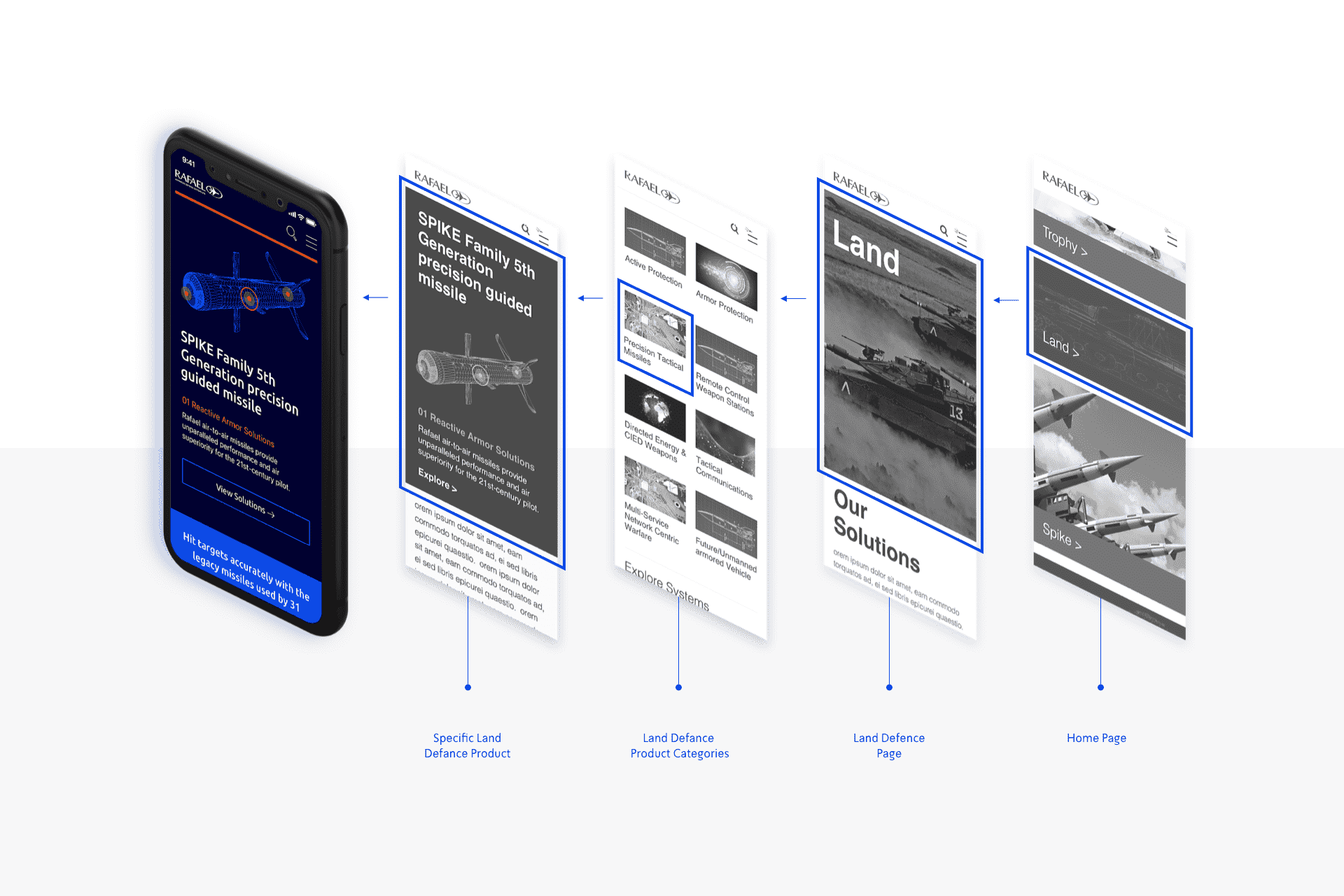
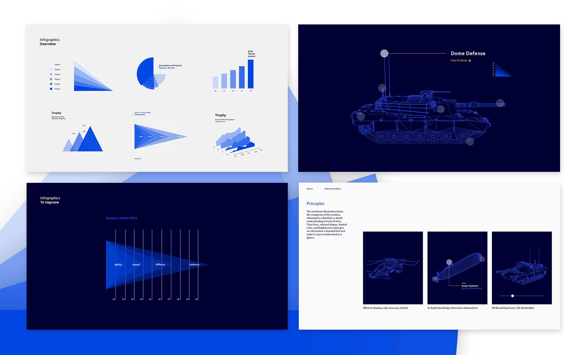
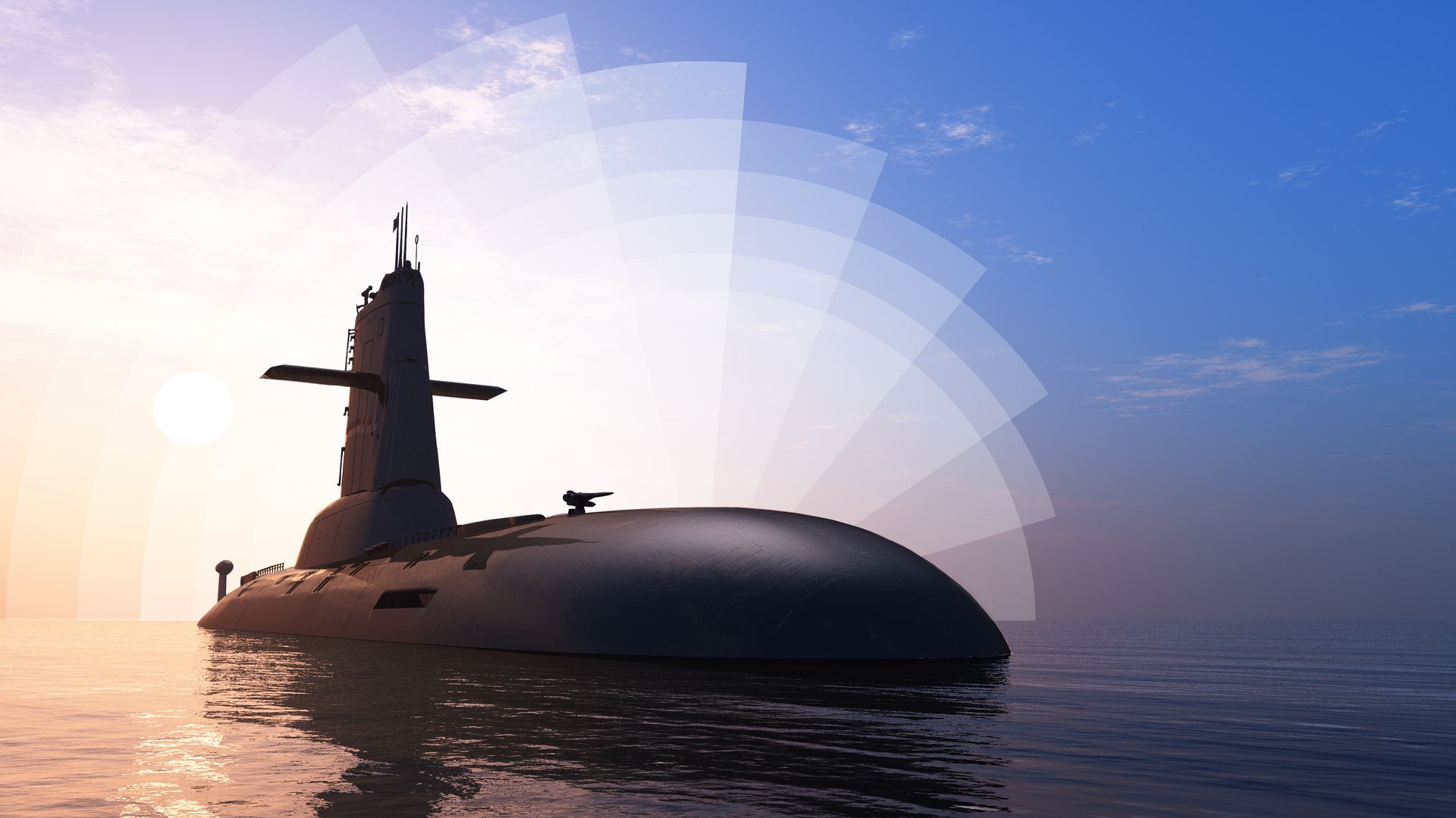
In a mutual process of both our brand strategists, UX designers and Rafael’s team, the company’s point of view had changed from within to outside, focusing on client needs and considering how Rafael’s online assets can serve them best. In a sweeping comprehensive process, Rafael’s entire set of services were strategically mapped and put under clear categories, so anyone can navigate easily. Now, Rafael’s new website is more than an online inventory: it’s an abundant magazine that presents and promotes the company’s grand variety. The smart, dynamic homage assembled of tiles, speaks Rafael’s positioning and invites users to explore, discover and roam. It’s designed to elongate their sessions and interactions with the system, based on naturally occurring curiosity, hence it’s super clean and intuitive. Additionally to helping users meet their existing needs, the interface also introduces them to new ones by presenting new solutions. The visual language is dynamic and multilayered, its main element being the bows that move, interface and describe the force and impact of Rafael’s activity. Considering every aspect, our teams had also designed a separate smartphone interface functions just like the one on the desktop, but isn’t a small representation of it. This allows Rafael’s sales teams present their product better, anytime, anywhere.
