
Client
ORT
Industry
Education
Skills
visual_identity | brand_architecture | brand_strategy | marketing_materials
Network with a History
What happens when a venerable education network needs a strategic makeover?
ORT was founded in the late 19th century to improve the lives of impoverished Russian Jewish peasants by teaching them trades such as carpentry and sewing. Today, ORT’s non-profit educational network spans five continents and 37 countries, teaching students of all backgrounds robotics and computer science.


Next Gen Relevance
But ORT’s visibility didn’t match its long history and global impact. Part of the reason is that ORT is in a competitive and dynamic non-profit landscape.
To keep ORT relevant for a new generation, we helped craft a new strategy that crystalized and modernized a single brand identity for a far-flung network of country-based affiliates. The strategy would help ORT to stand out in the education and Jewish non-profit universe. The new identity would also generate loyalty among ORT’s target audience: students, donors, staff and alumni.


Connecting Past and Future
We helped ORT focus on the core values and goals that form a common DNA for all its affiliates: “Placing the future in a new generation’s hands.” ORT’s network aspires to form connections between past and future, vision and reality, and among different generations and people. Underlying it all are progressive Jewish values like knowledge, pluralism, and healing the world.
The Circle of Ort
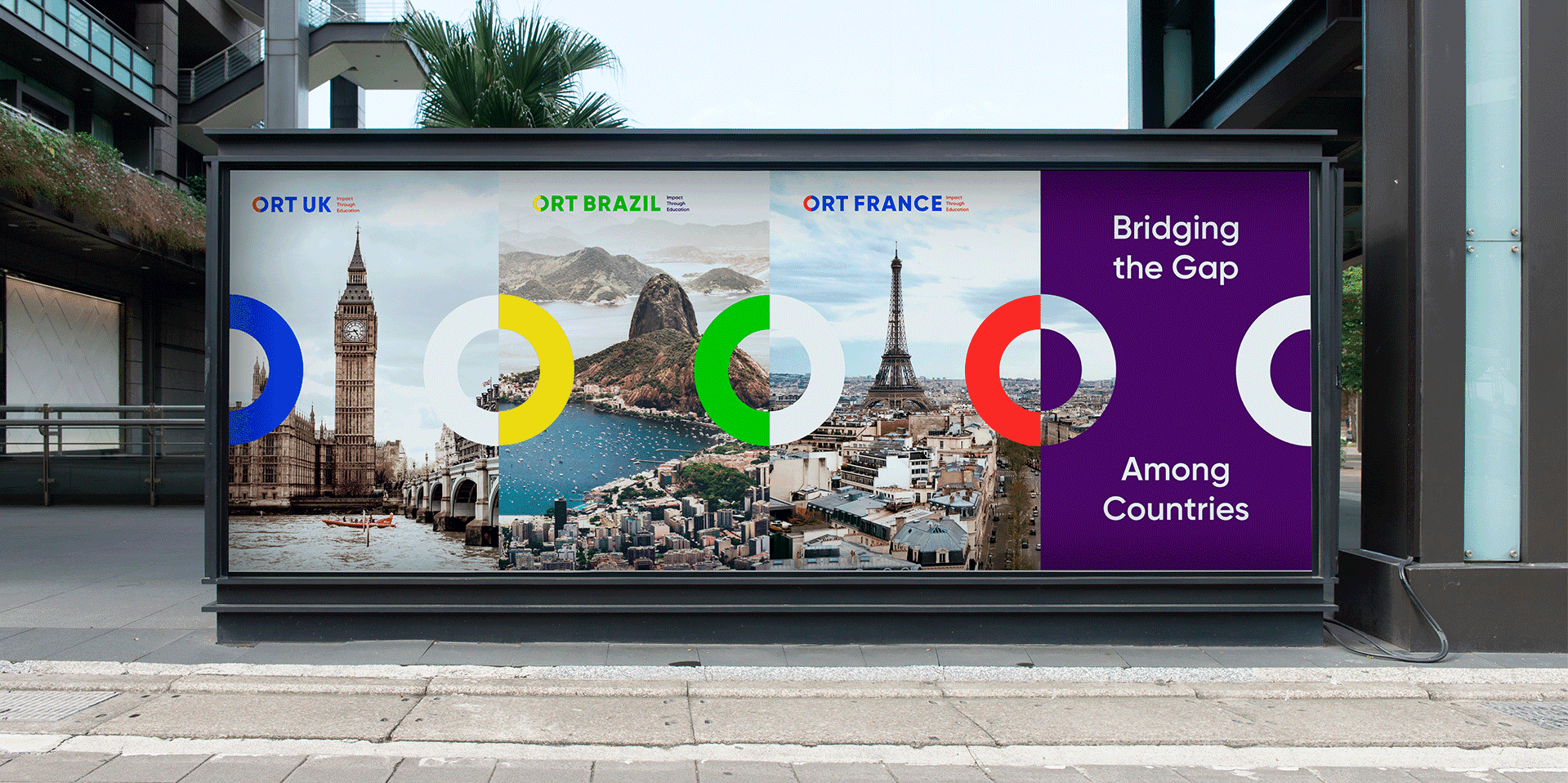
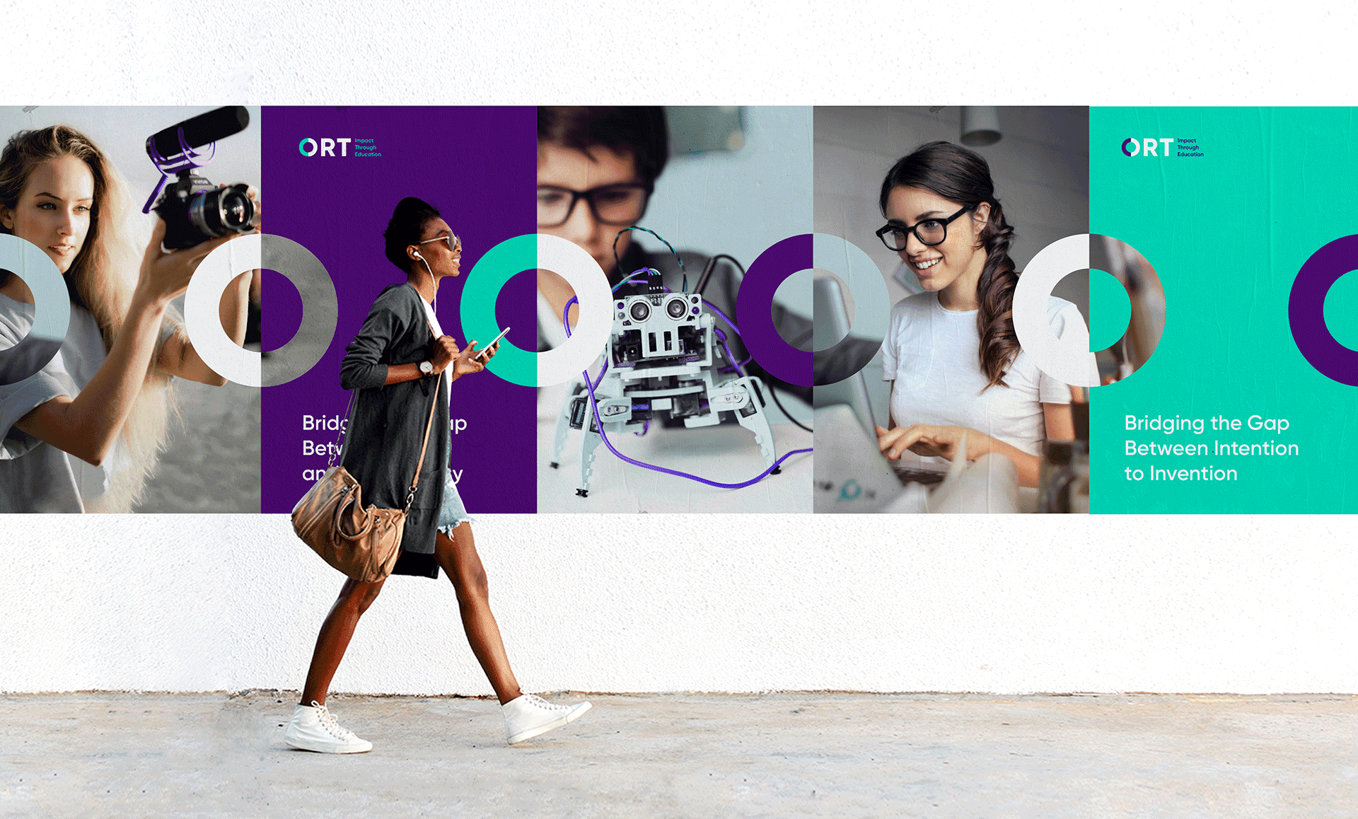
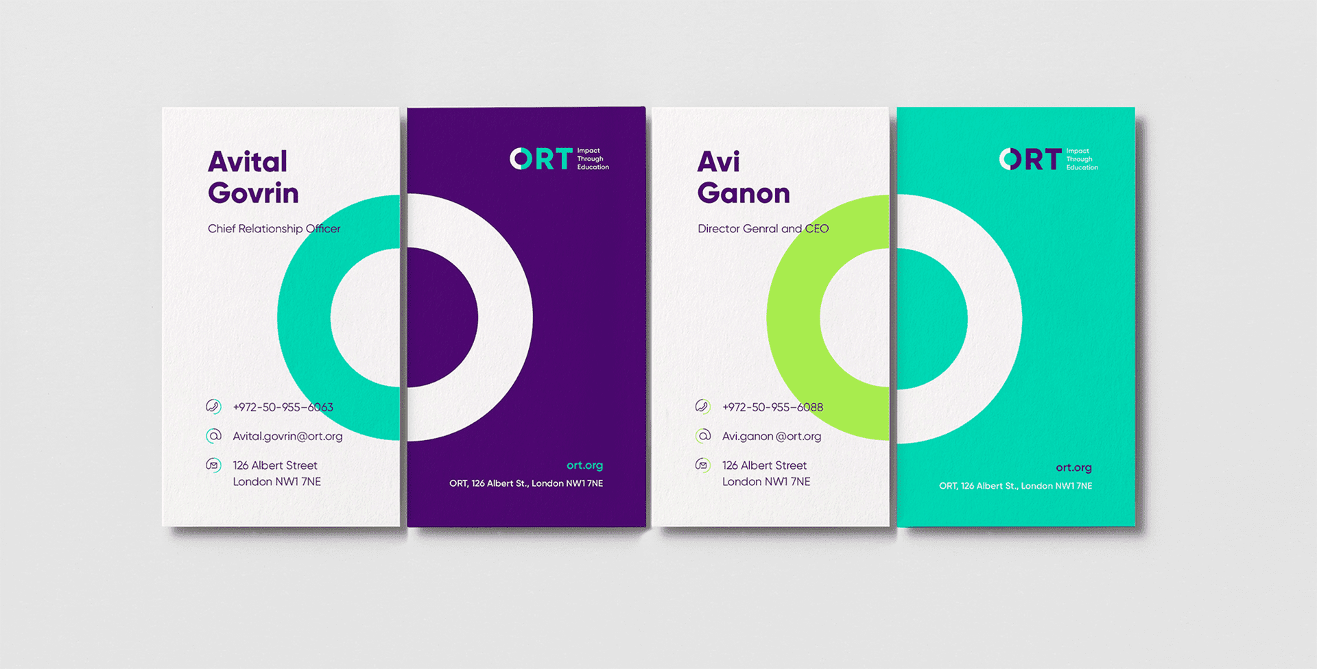
Those concepts formed the guiding principles for a new organization logo. The “Circle of ORT” is formed through a combination of two semi-circles coming together to complete each other. The shape represents human connection, global universality, and people coming together for a larger good. The circle brought to life with images of the joined hands of two different people to form a circle. Alongside the “O” is a new slogan that neatly distills exactly what the network does: “Impact Through Education.”


The Visual Language
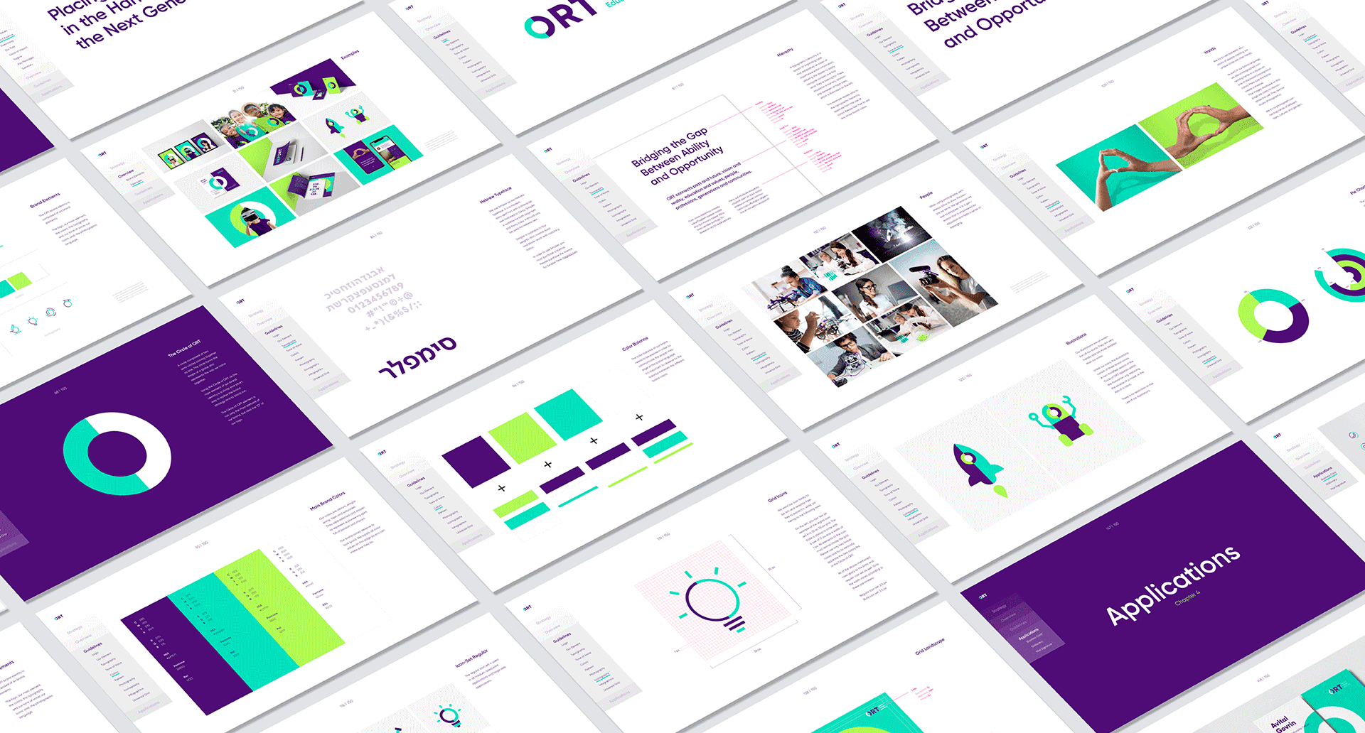
To express ORT’s pioneering spirit, we selected a palette of vibrant and fresh colors. The Circle of ORT is composed of two of those colors, and serves as a basis for the organization’s illustrative language and icons. The typography is clean, modern, crisp, and confident — yet friendly.

The Country System
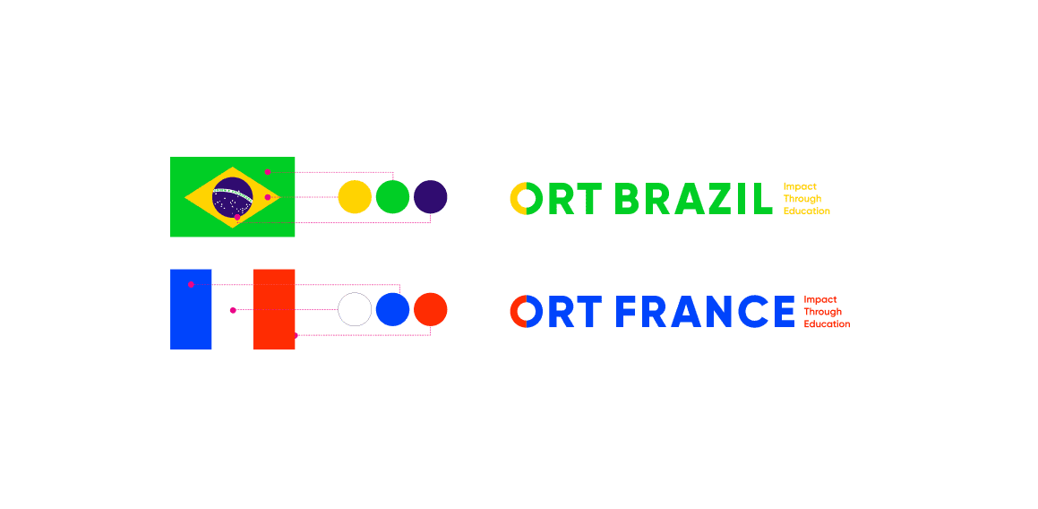
To reflect ORT’s unique network of country affiliates, we created a visual system that allows each locality to express its unique character and select their own national colors for the logo. All of the elements combine to create a distinctive, unified and modern identity for ORT, ensuring that it continues its mission well into a third century of activity.
