Client
Yes
Industry
Media
Skills
visual_identity | brand_architecture | brand_strategy | environmental_design
Israel’s Premium TV
“Yes” is Israel’s sole satellite television broadcaster and one of the country’s leading media brands. It provides multi-channel television services to more than a half million subscribers, and also produces original broadcast content.
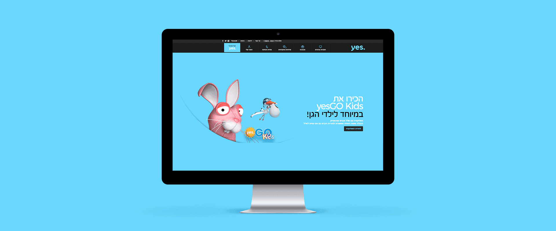
In a television market overflowing with content, Yes had managed to maintain its position as the country’s leading provider of premium content. It starts with the programming content, continues with a customer experience which is constantly being updated, and wrapped in a high-end sensibility with a worldly look and feel.

The Ultimate Look
But heading into 2018, Yes wanted to update its viewer experience and visual language. It was a challenging project. Yes operated multiple content channels, but needed to maintain a consistent appearance: clean, refined, rich, and deep. It sought to be new and cutting edge, while preserving continuity and stability for its core audience. In a word: Ultimate.

Liberating the Logo
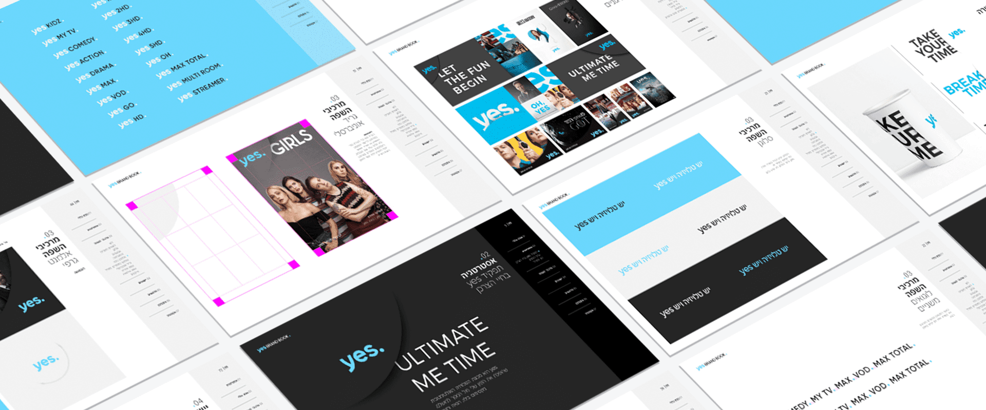
We crafted a visual language that refreshes, intensifies, and optimizes Yes’ existing design elements.
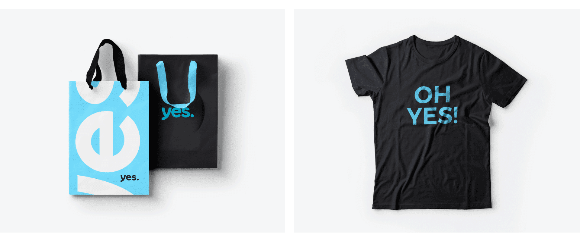
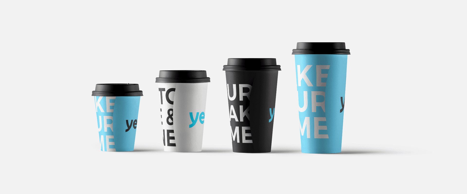
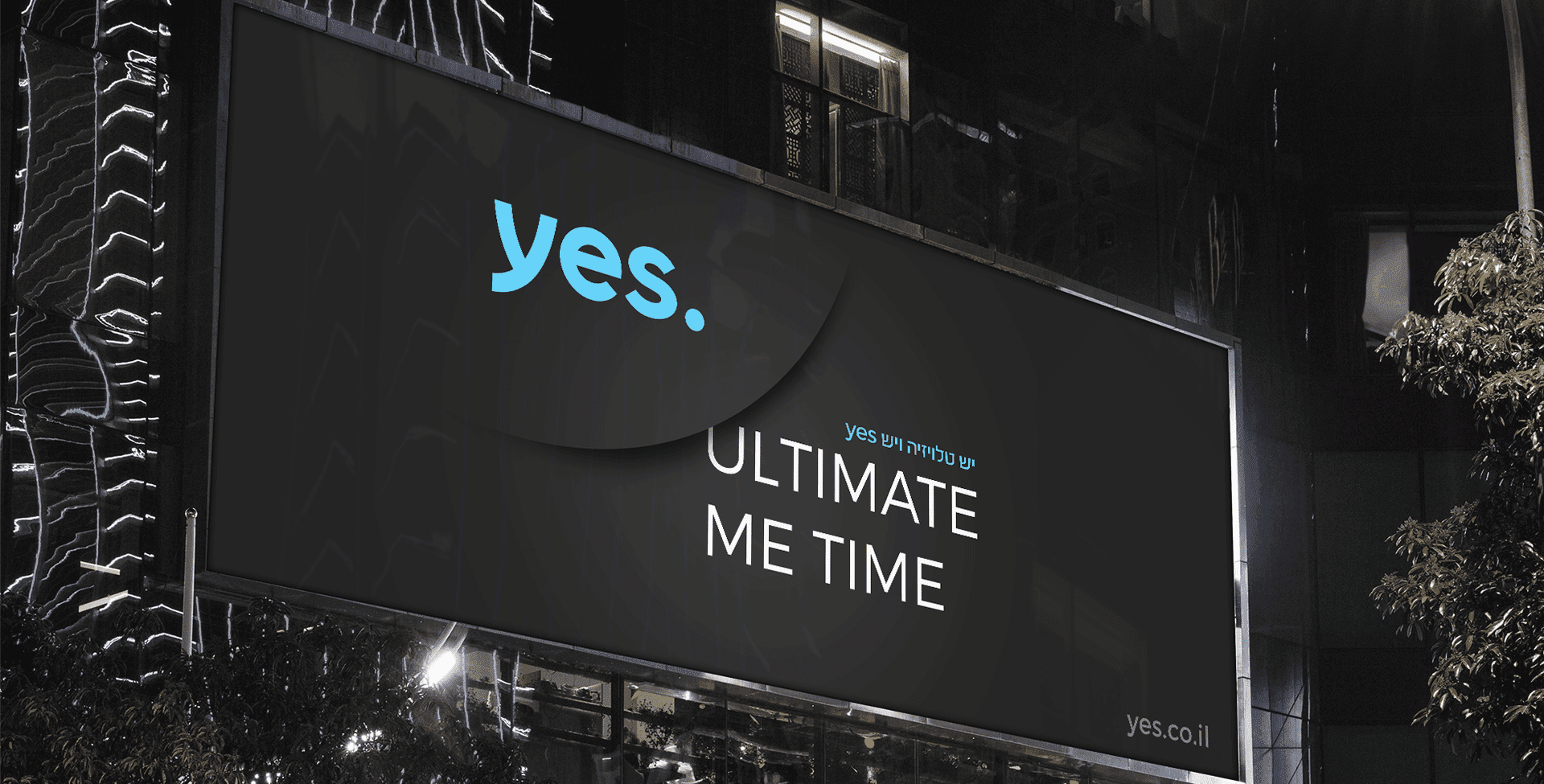
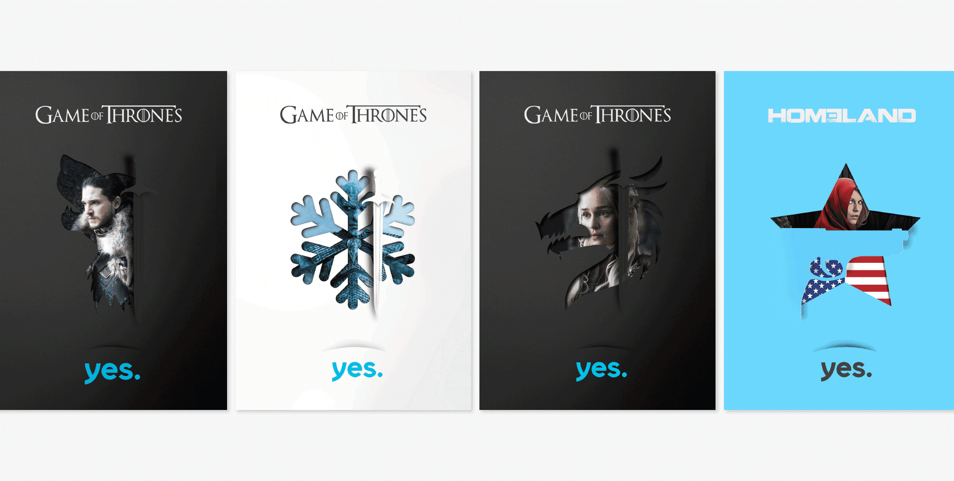
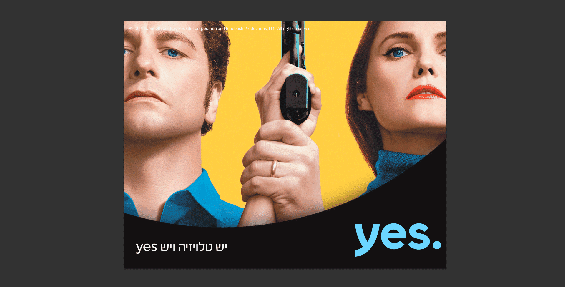
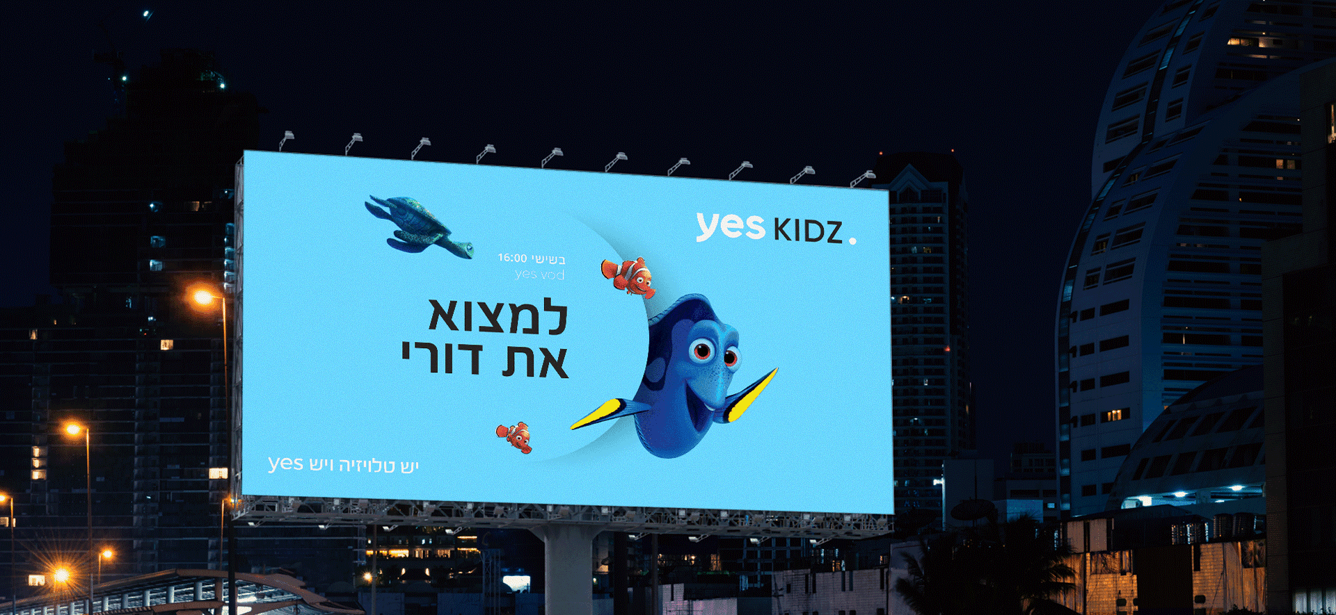
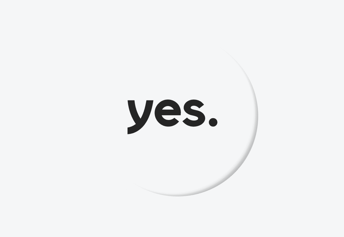
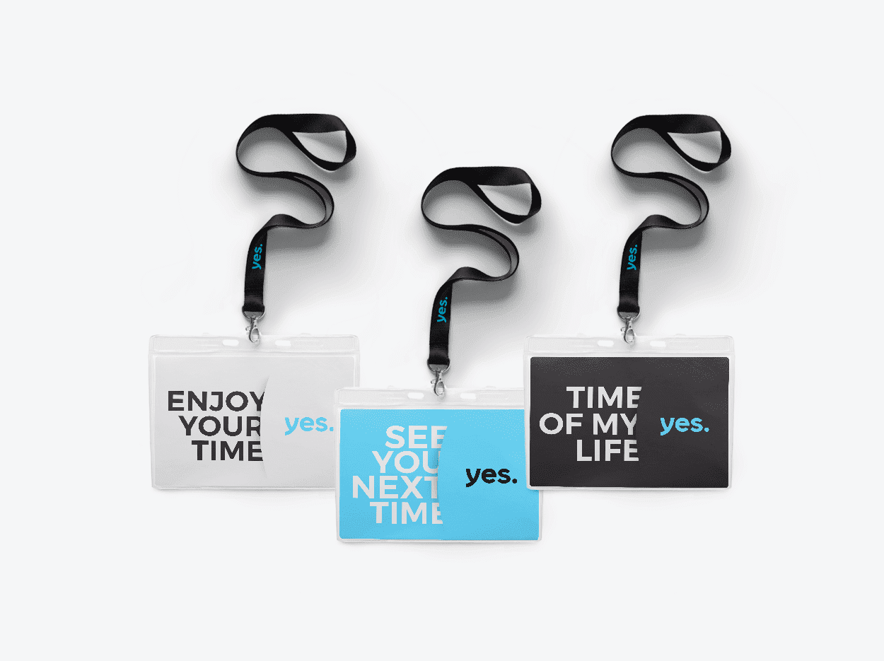
The "Yes" in the logo was released from a surrounding circle and the colors were deepened. From the old circle we created a new method. It has become a visual tool, a dimension of depth expressed in cuts: it can reveal or hide, emphasize or obscure, seperate or unite.
It all begins with content and continues with the experience, but the language holds everything together and keeps the Yes brand as it is: new, spectacular, high culture, and contemporary.
