
Client
Pepper
Industry
Finance | Tech
Skills
app_design | copywriting | product_strategy | ux_design | ui_design
Do you bank often?
When was the last time you physically visited your bank? By now, it's clear that physical banks are completely digitized, and every action can be done online, through the app. This proves itself, as processes become shorter, more accessible, without biting off free time or compromise reliability. Digital banks have risen to the occasion, and succeeded in offering banking services without the need for physical locations. Pepper was ahead of the curve to begin with, being the first digital bank. Audiences remember the brand that had managed to change the banking standard and communicated in simple, eye-level language. Since Pepper was created for young audiences, it worked well - until it was finally time to take another step forward. Our mutual mission was taking Pepper to its next level, with updated features and offerings, making it compatible with adult audiences.
Bank it yourself
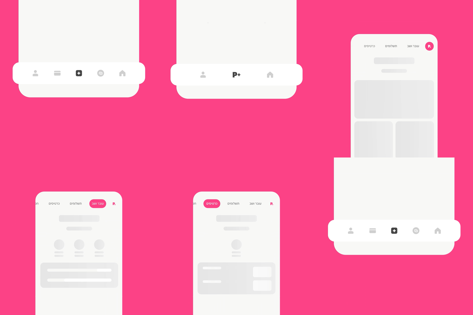
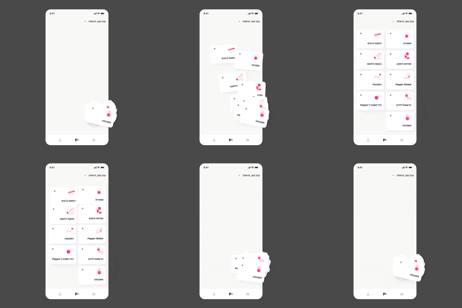
The app includes three main sections: homepage, profile and P+, the actions, services, products and offerings hub. The user experience was created to empower users and hand the control over to them, encouraging them to take action, experiment, manage processes, reconnect with their money and feel confident and independent.
Personalized homepage
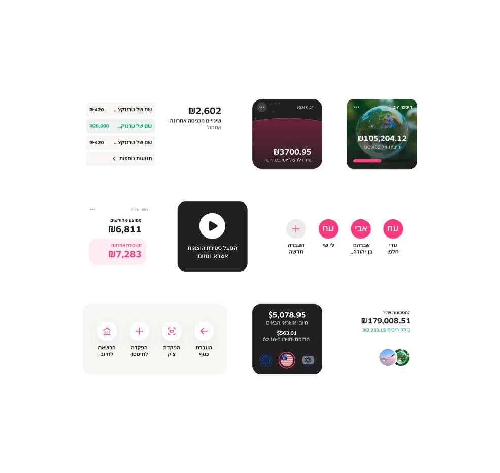
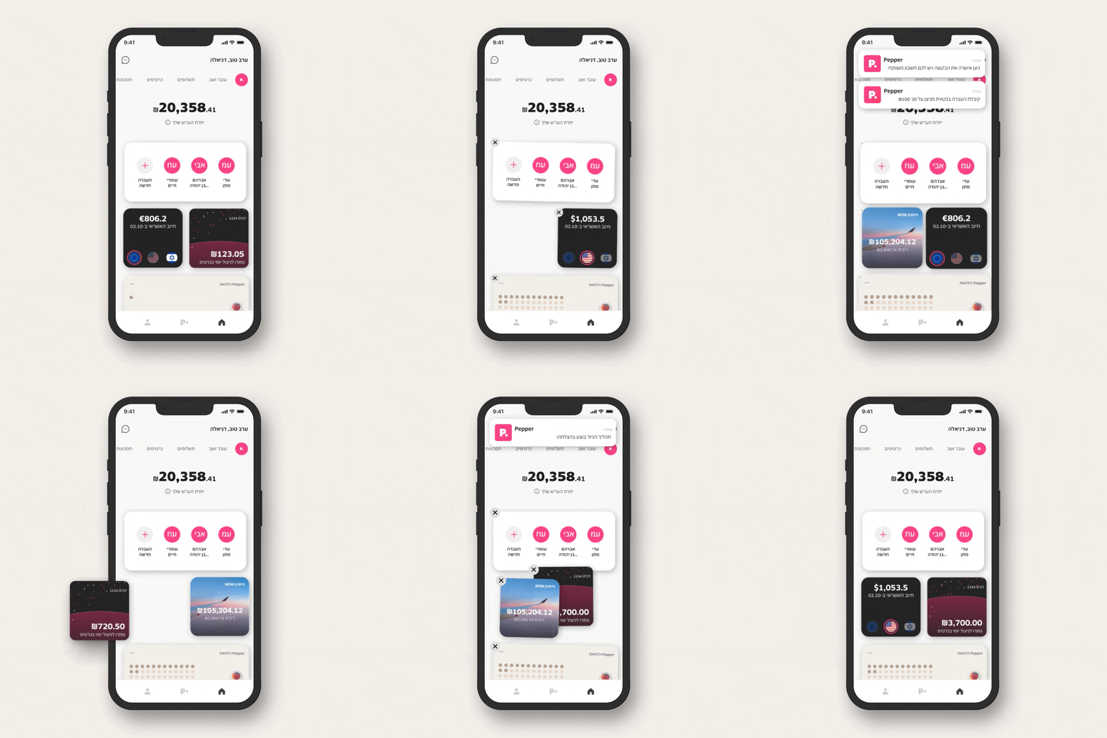
Pepper's homepage screen is modular, enabling users to choose the most relevant information they'd like to receive in real time, and place it in smart widgets however they like. Alongside Pepper's flagship products, new ones were added - such as a mutual account and a foreign exchange account. Each product has its own lobby, showing updated info. The widget store presents familiar features, like current account details, with some new surprising ones - like the spending stopwatch, which helps follow spendings within a defined timeline.

Welcome to the new Pepper
Pepper's visual language is solid, grownup, featuring circles that convey motion and play well cross-app. They refer to coins and commerce, while balancing ease, and a round, soft feeling. The dominant pink was slightly adapted. Every product and service has a welcome screen, with soft colors, while flow screens are in white, pink and black. The new verbal language is still eye-level, welcoming and accessible, yet grown to match audiences - Digital Natives was once a young community that now includes people of all ages: digital citizens, who live online just as much. The language includes text messages on different matters, push notifications and in-app status messages. It was important to develop the language while still keeping the Pepper identity, and help the brand grow without losing itself.

Design System
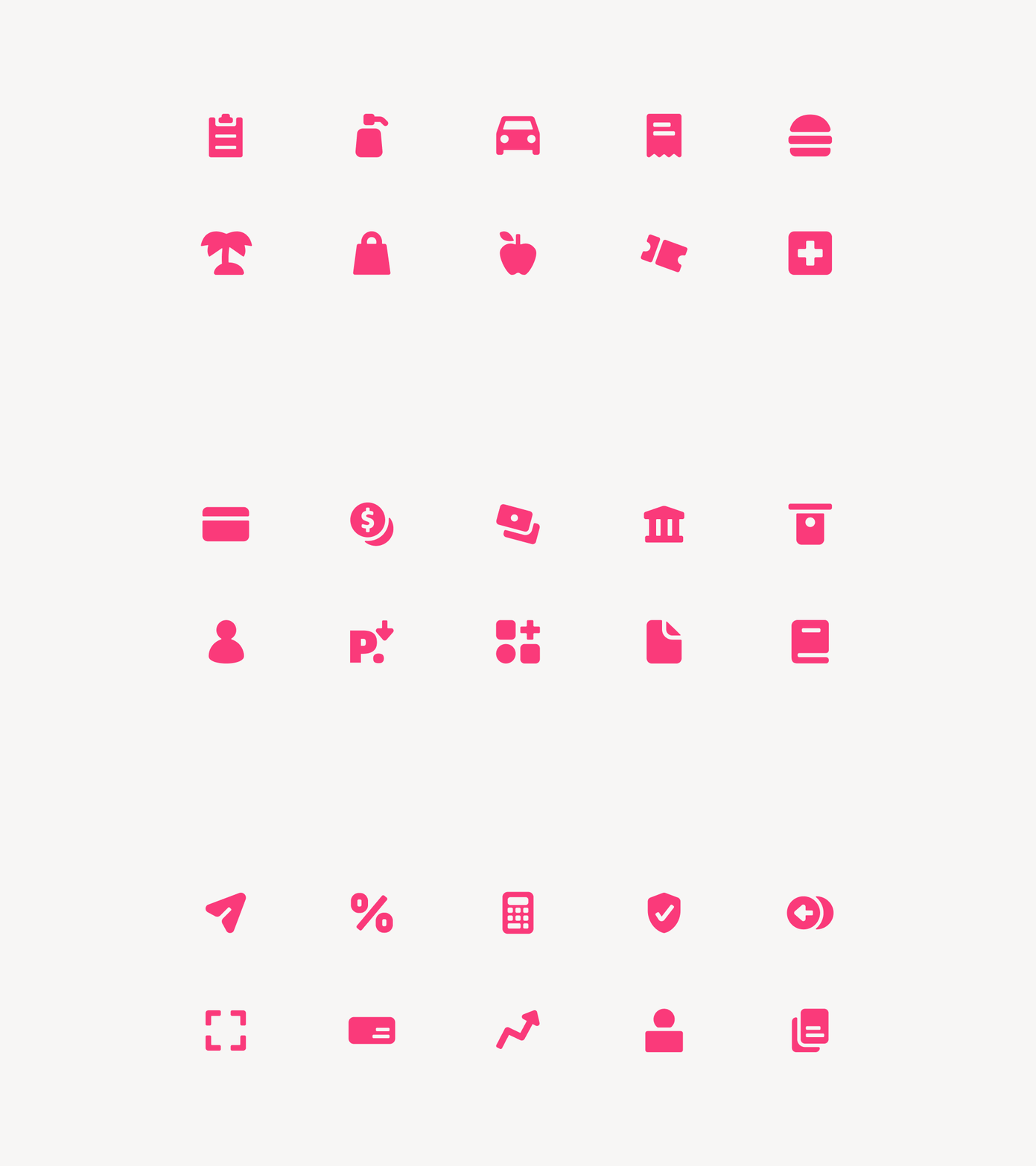
Pepper's new visual language is vast, and using it correctly ensures the brand shines on. We created a design system that keeps all language information neat and tidy, making usage smart, easy and accessible. The library has everything, from icons to colors, with clear principles and explanations on how to use each component. When it comes to digital brands that grow fast and have multiple owners, creating an updated corpus to make work unified and easy, is crucial.
