
Client
The Revolution Orchestra
Industry
Culture
Skills
visual_identity
Disrupting forward
Some brands are born from emotion. Take The Revolution Orchestra, for example—born from a deep passion for music and performance, and the shared, somewhat rebellious vision of Zohar Sharon and Dr. Roy Oppenheim. At its core, the orchestra is a musical ensemble, but depending on the project, it collaborates with other forms of performance, such as theater or dance. Beethoven’s Eighth Symphony and Chopin’s sonatas certainly have their place, but The Revolution Orchestra thrives on surprises, keeping both itself and its audience curious, with a touch of artistic disruption. But here’s the thing about disruption—it works best as a means, not an end. When an ensemble born from passion aspires to grow into a brand, it requires a clear, refined process and a visual language that can propel it onto the grandest stages.


A revolution in every home
We began our journey with research, interviewing members of the orchestra to capture both their current reality and their vision for the future. We then mapped the professional landscape—looking at competitors and inspirational entities. How do they present themselves? What values, stories, and energy come through in their visual language, and how does all this contribute to shaping the orchestra’s brand evolution? Later, we defined the core values that guide the brand: Creative, constantly reinventing itself. Innovative, self-aware, and always in motion. Multidisciplinary, seamlessly blending art forms. Playful, never taking itself too seriously. Eye-level, engaging and accessible. Bold, unapologetically standing out. Versatile, embracing diversity. We then outlined a vision for the next year, five years, and decade—centered on making The Revolution Orchestra a household name in Israel, expanding its reach, and focusing on international performances.
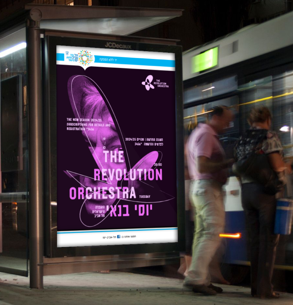
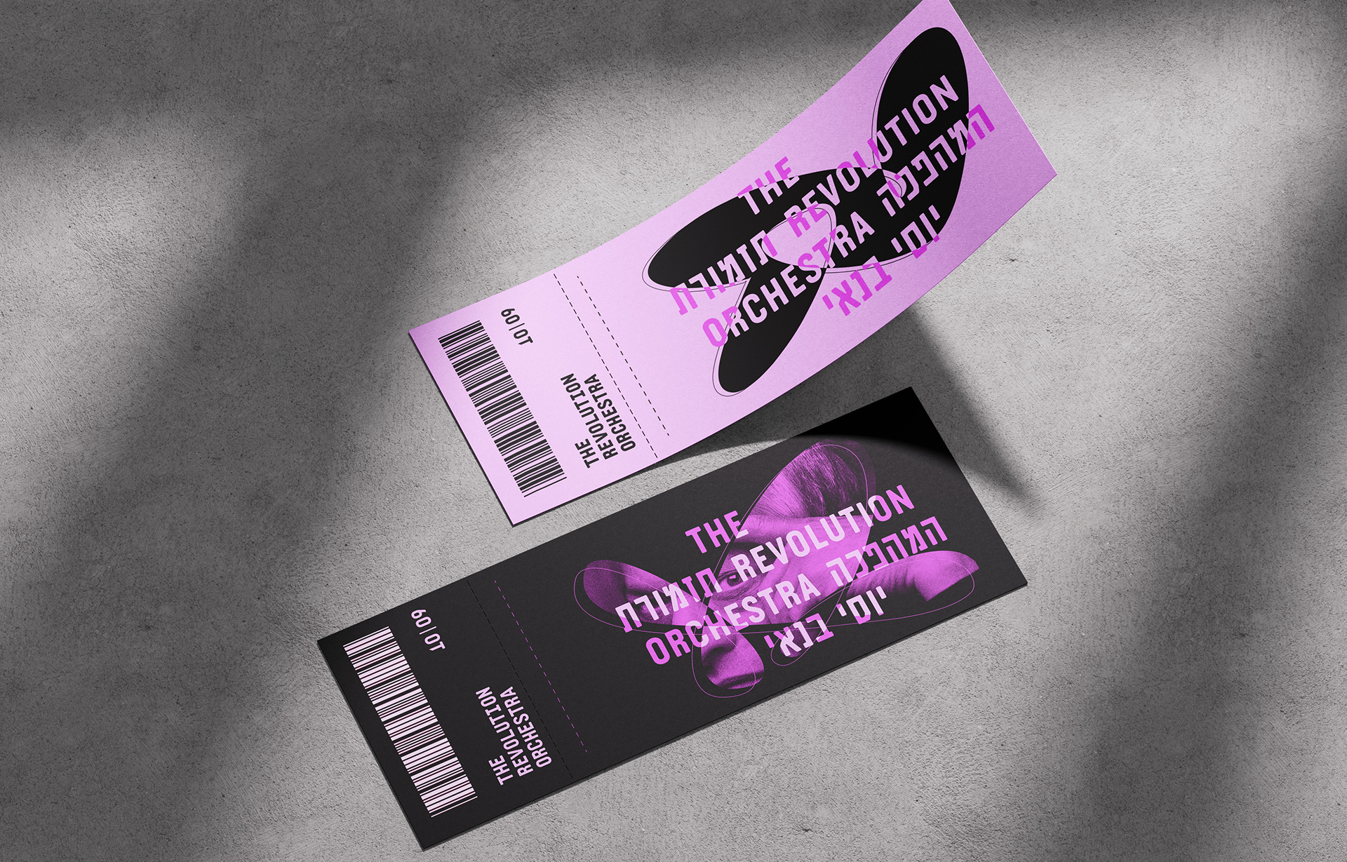
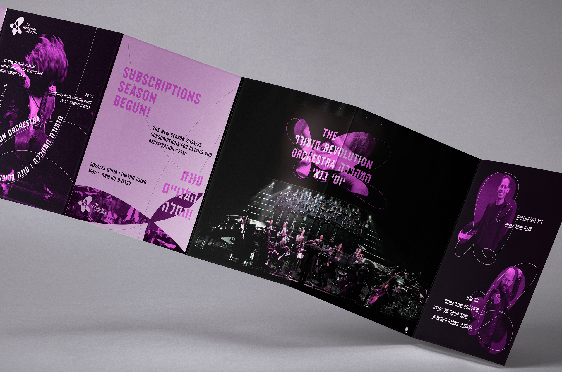
Curiousity on stage
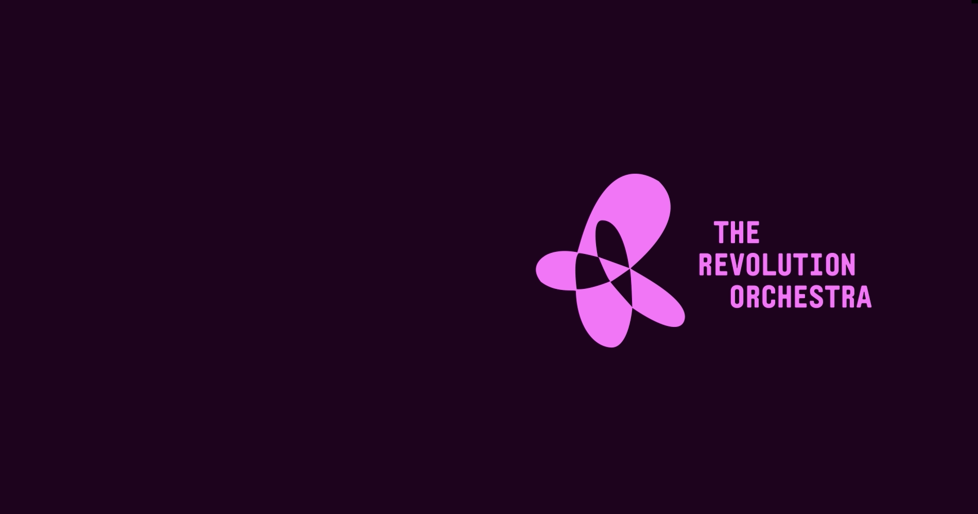
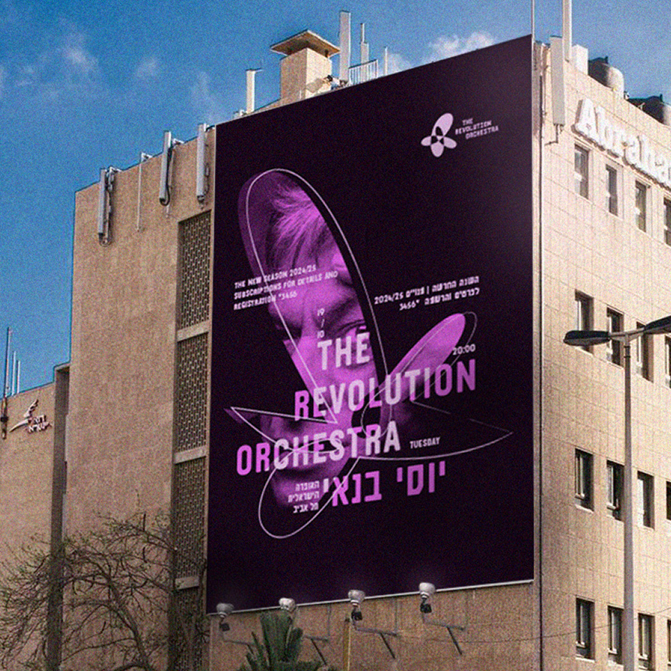
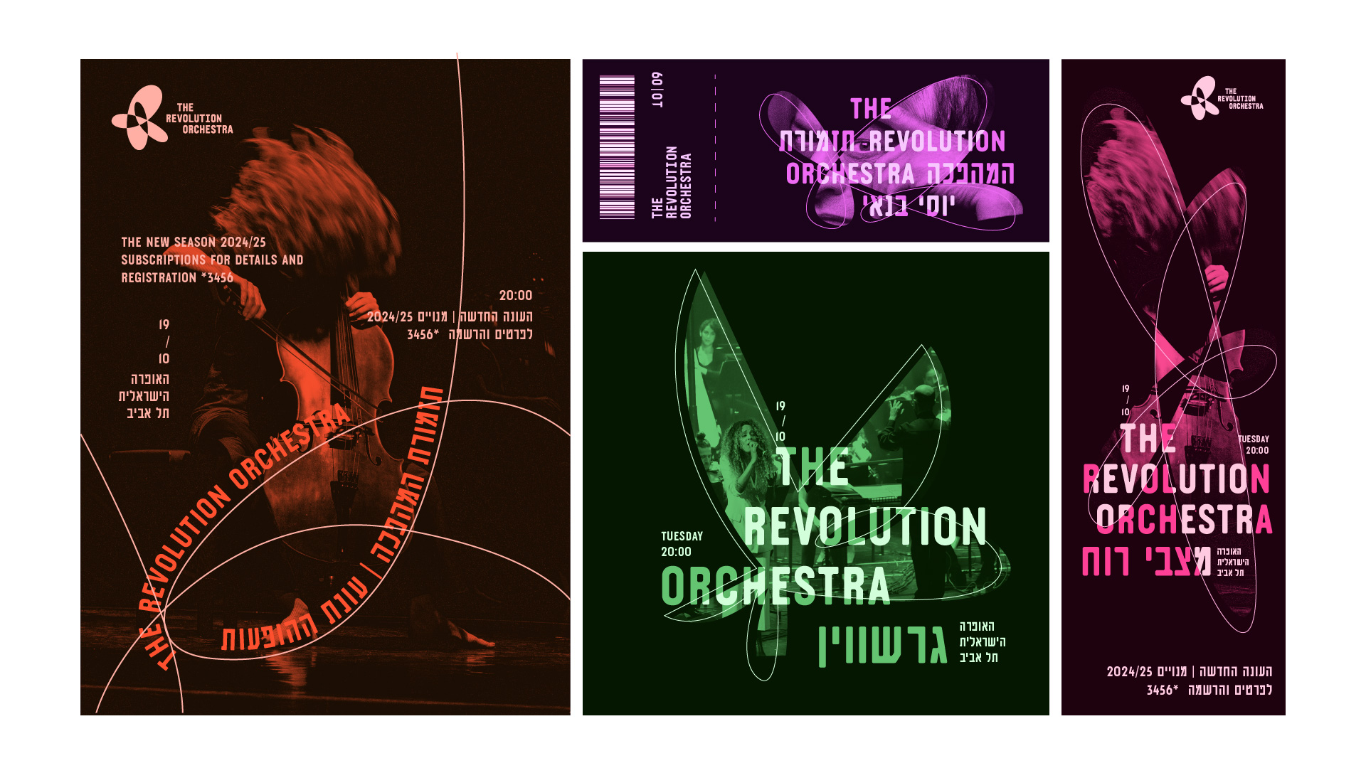
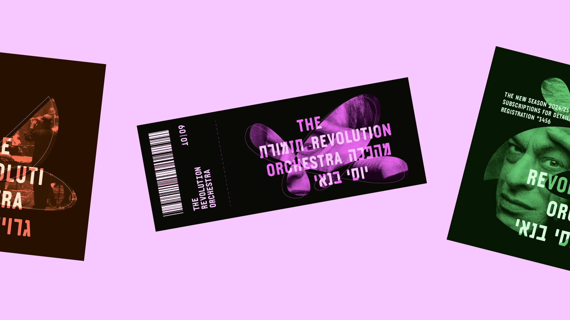
At the heart of the new visual language is curiosity—a driving force of the brand’s identity. The orchestra is all about creating surprising performances and leaving audiences eager for more. Combined with its playfulness, boldness, and multidisciplinary nature, we developed a dynamic, flexible concept with a free-form symbolic logo. This logo contains abstract internal cut-outs, evoking glimpses, surprises, discovery, perspective, and innovation. These shapes branch out into additional graphic elements, balancing hidden and revealed parts—creating unique grids and compositions. The brand name appears in both Hebrew and English, intertwined. The primary color palette features dark purple, neon purple, and lilac, while the secondary palette includes three sets—dark, bold, and pastel tones—to provide different layers of depth. The photography style distinguishes between in-house brand imagery and collaboration visuals: brand photos are enhanced with a gradient overlay and placed within the brand grid, while external photos remain clean and unfiltered. With a fresh, flexible, and forward-thinking brand identity, The Revolution Orchestra is ready to take on the world’s biggest stages.