
Client
Ayalon Insurance
Industry
Finance | Insurance
Skills
brand_strategy | visual_identity | copywriting | illustration | motion_design
Feel the vibe
Here’s something we can all agree on: you’ve never met an insurance company and had no idea what they’e business is – because all insurance companies are working in the same field, with the same models, offering similar products. That’s just the thing: security in this sense looks the same. When it comes to business design, finding the differentiating factor of such companies is the main challenge.
Ayalon Insurace came to us to find the unique cloth it’s cut from, that sets it apart – making stand out in the Israeli insurance and finance industry, with a unique value proposition for its clients. We’ll let you in the on the important takeaway from this case study: sometimes, the most meaningful differentiation isn’t in product variety or groundbraking service – rather, it’s the energy that makes all the difference.


Personal, creative, advanced
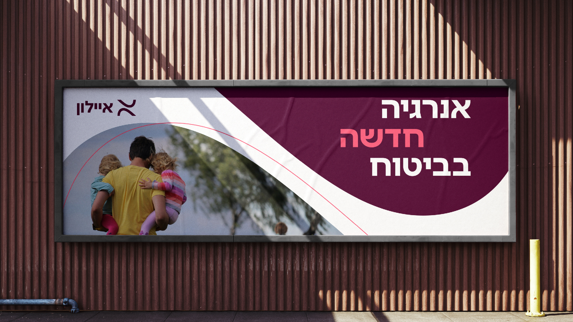
We started out with strategic research, collaborating the Ayalon team, to soon find its forte: the people and the energy they bring into anything they do – that’s a great differentiation point, always. Designers can get the same brief and answer it differently, using unique traits and methods, come up with completely different solutions, and offer unique value with their own energy and personal mission.
Same thing goes for insurance companies, and specifically for Ayalon: they have immense energy of renewal and innovation, creating award winning products and services and dealing with the most complex cases. We’ve extracted this into the new brand idea, INSURANCE ENERGIZER: Ayalon is here to give a boost of fresh energy to the entire category with new products and services, while constantly offering more. The new positioning, PERSONAL CREATIVE AND ADVANCED INSURANCE, shows how the energetic boost carries an impact, along with the company’s values: creativity, can-do attitude, optimism, mission, compassion and passion.
The right boost
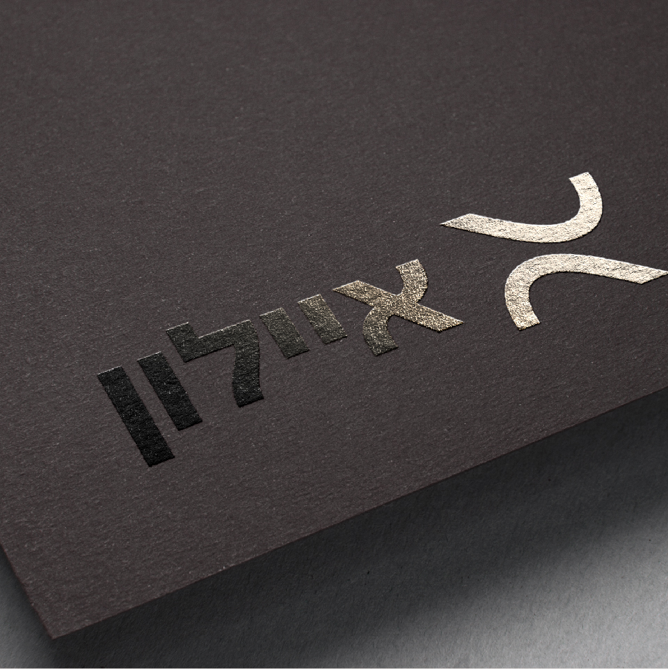
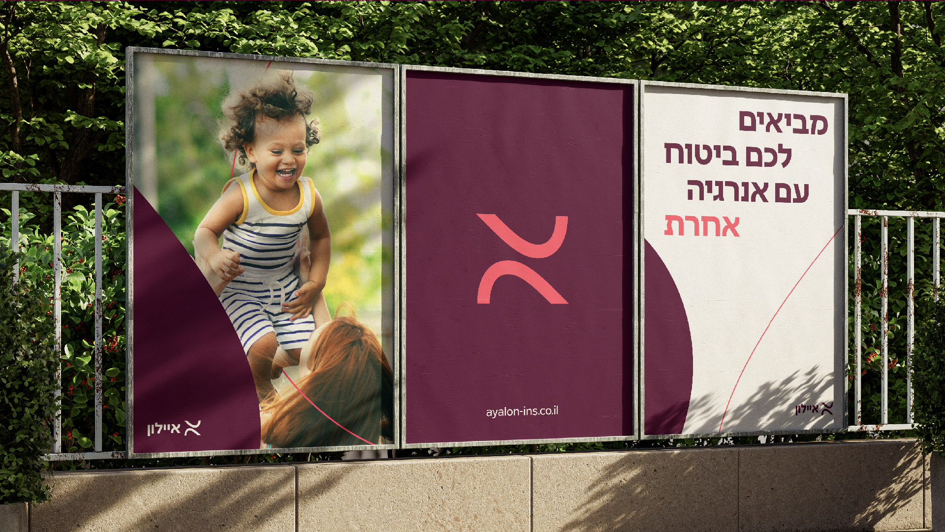
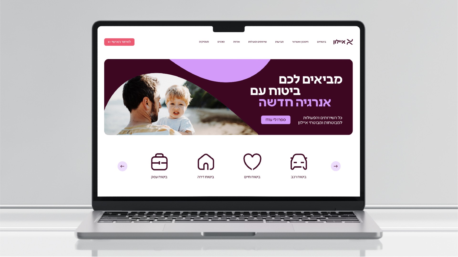
Ayalon’s new visual language continues the energetic wave, with wavey, flowing look. The new logo is made of two energy waves, forming the Hebrew letter Aleph, the first letter of Ayalon. This somatic marker is placed next to the logo and can form different grids. The logotype is Leon Product. We’ve also created new graphic icons based on the somatic marker wavey shape – round, flowy, light and full of energy – and an illustrative language to go with it and communicate insurance more accessibly and pleasantly.
The color pallete balances depth and seriousness, with optimism, lightness and of course, energy. It features a deep and honorable burgundy, with subcolors lilac and lavender, and coral and white. The new photographic language presents people in lively, animatic, lighted, professional (for agents) moments, emmiting a boost of fresh energy.


