Client
Recanati
Industry
Culture | Retail
Skills
brand_strategy | brand_architecture | copywriting | illustration | visual_identity

Wine not?
The Israeli terroir is packed with wineries. Ask any Israeli and they’ll tell you that the food here is the best – and seems like local wines are keeping up. Within this vast sector is a noticeable dichotomy between boutique wineries, who often pride themselves on making experimental and avant-garde wines, kept secret by real wine aficionados; and big, commercial wineries we all know from supermarket isles, Shabbat dinners and the occasional wine sipping at a friend’s house. These wines are considered pretty standard.
When we first visited Recanati, one of Israel’s known wineries, we discovered a surprising winery that manages to effortlessly break the dichotomy, by just doing what they do best – we’ll get to that. Our mission was helping them use their entire array of abilities, approaches, work and real uniqueness, to create a compelling and clear brand story, a coherent method – and of course, new visual brand language that’ll make Recanati more present and favorable (plus, we know you love buying pretty wine bottles. We do too!).
Picking the precise tone
We started our strategic process with a customer survey, revealing low brand awareness. Although Recanati is considered boutique on a commercial scale, its brand markers remained disregarded. Generally, our research had shown that standing out is quite difficult in our local wine industry, because the story of “quality” is already told by many – Recanati, with its story of excellence, among them. But during our mutual work, we came across a winery that is so much more than that: they know how to balance prestige with pleasant simplicity; curious varieties with common ones; bravery and conformity. Essentially, Recanati balances boutique and commercial. It’s impressive but also a classic case of jack of all trades, master of none.
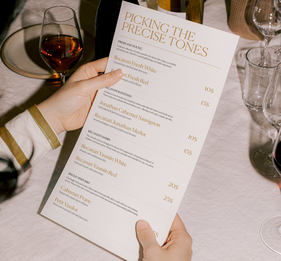
The winery was founded by the Recanati family and collaborates with big alcohol distributer Sha’ked – it is powerful, but the balance between boutique and commercial is delicate, and easily disrupted once size, splendor and huge selection come into play. Given its diversity, the new brand essence is PICKING THE PRECISE TONE: the ability to pick, choose, experiment, dare and refine out of great variety.
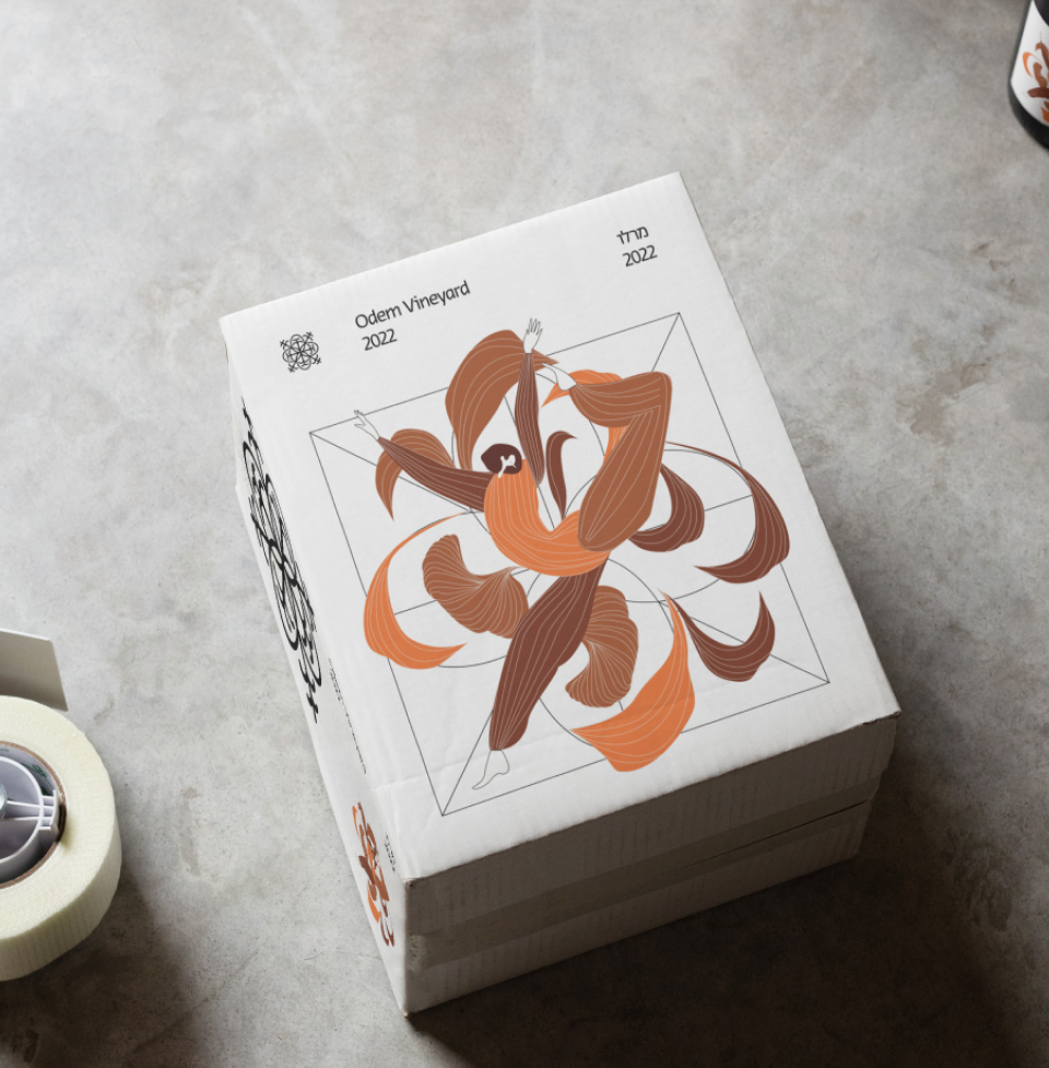
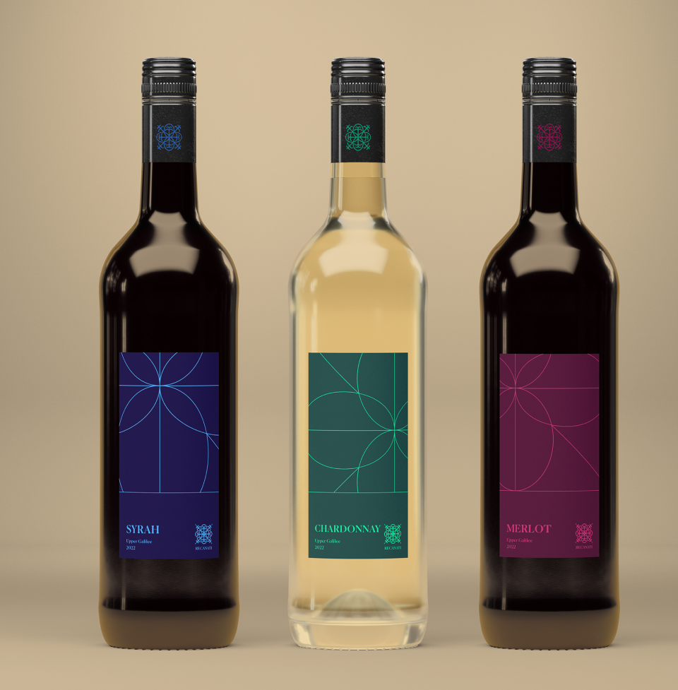
Cheers for the best
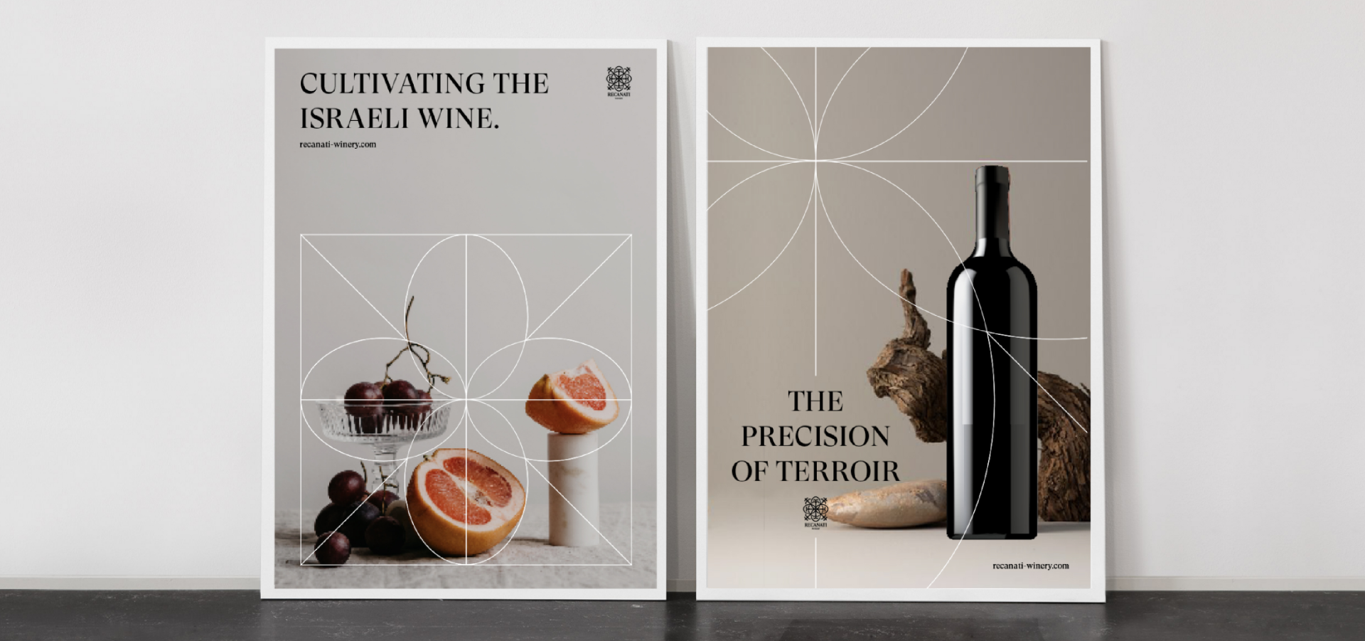
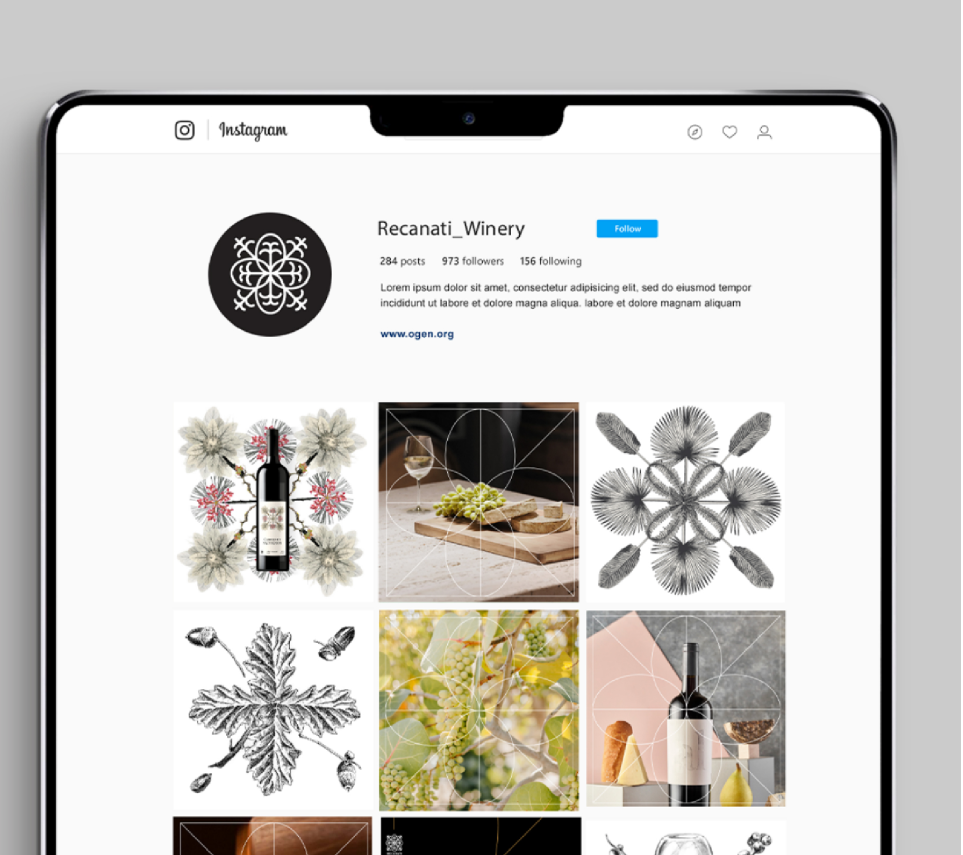
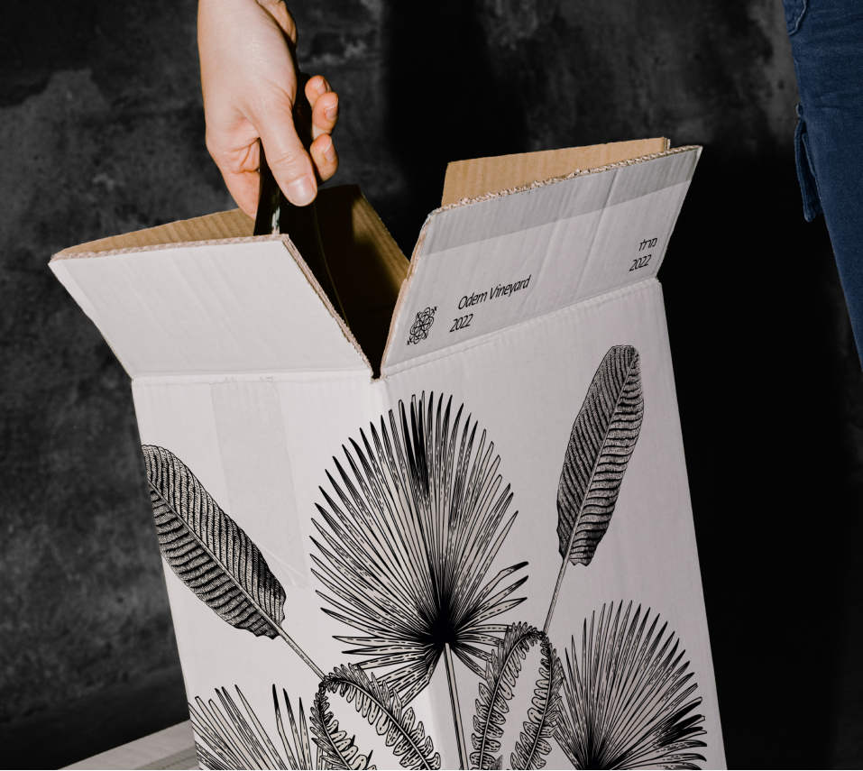
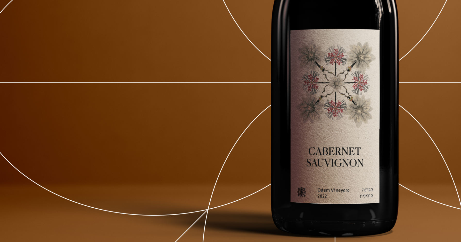
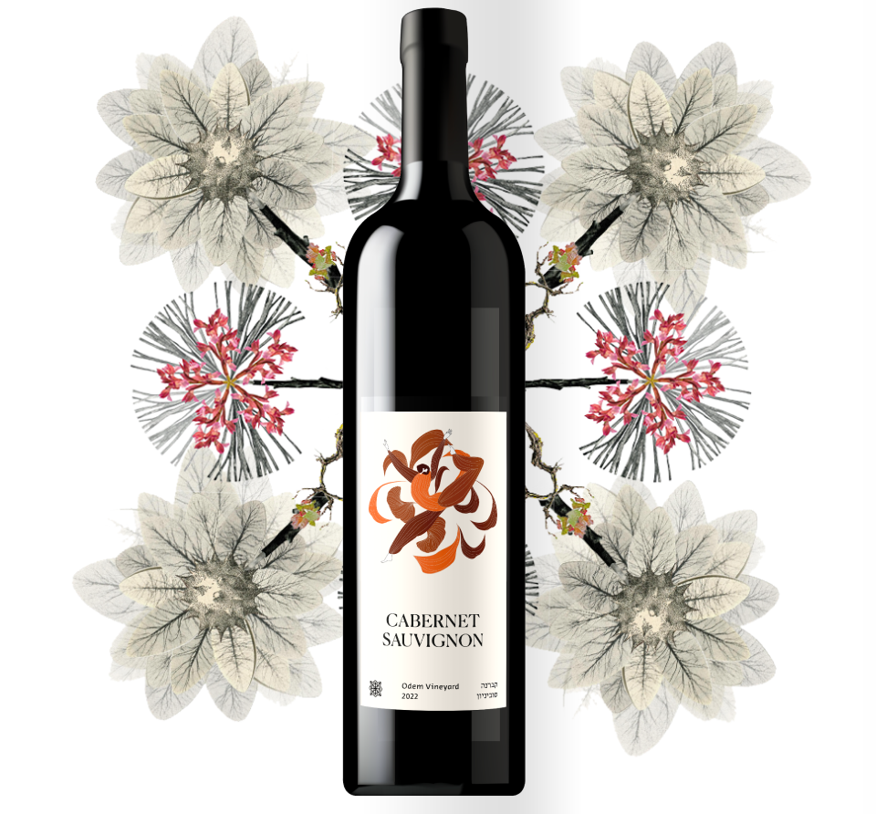
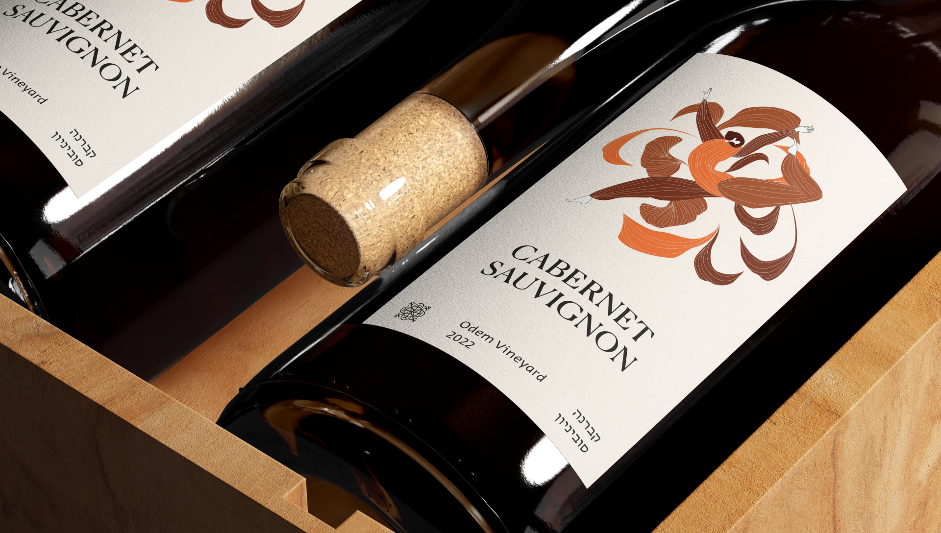
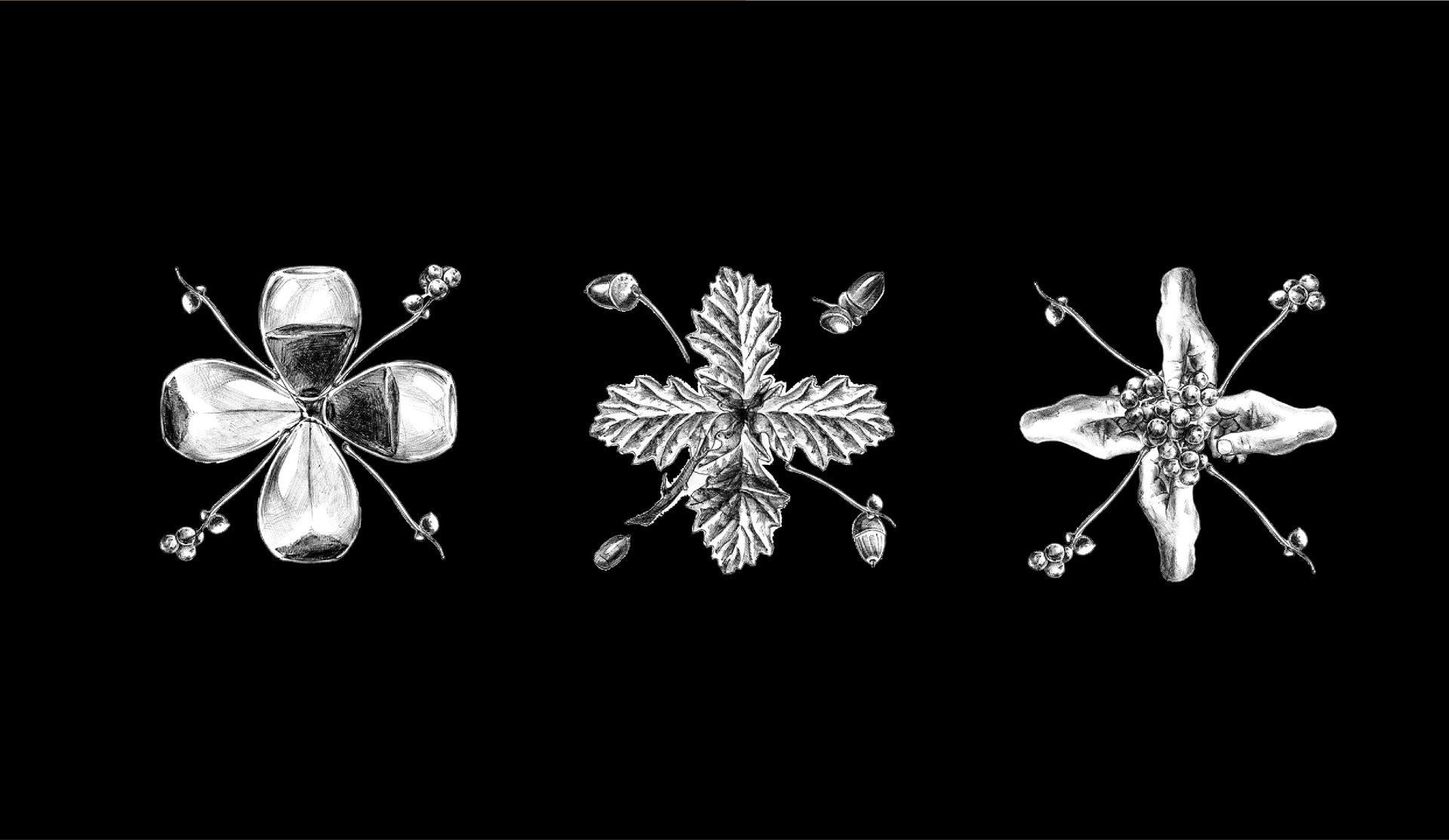
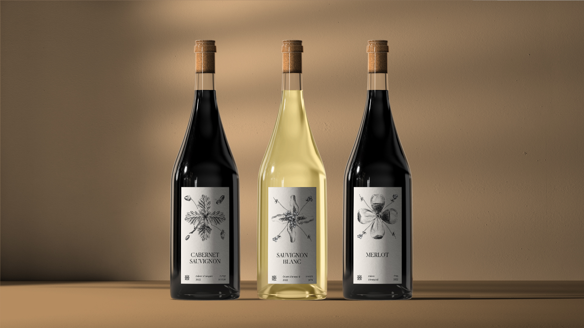
At the heart of Recanati’s new visual language, is the Trellis: the winery’s known somatic marker, which we renewed and refined, and is now used for all grids and labels, under a black, white and gold color palette. Next, we illustrated delicate images from the winemaking world: terroir, plants, fruit, etc. The Trellis-based illustrative language appears in most brand touch points. But our work here wasn’t just about creating a new brand language – rather, helping Recanati recreate its brand hierarchy. During our strategy process, two main series were defined: Atelier, the boutique, unique and prestigious; and Domaine, the daily, fun and accessible. Each features the Trellis a little different.
Domaine’s color palette already exists in Recanati’s brand language – basic, whole colors, some dark and others light, with the Trellis as a grid element. Atelier features artistic, illustrated labels, and a black, white and gold palette. Each is a unique piece, with a full range of colors, presenting scenes or objects that describe the creative winemaking process, or drinking experience. These days, Recanati continues creating, hosting, supporting the Israeli economy and our general moral during times of war. May we raise our glasses in better times.
