Client
Neviot
Industry
Food/Beverages
Skills
visual_identity
Hold water
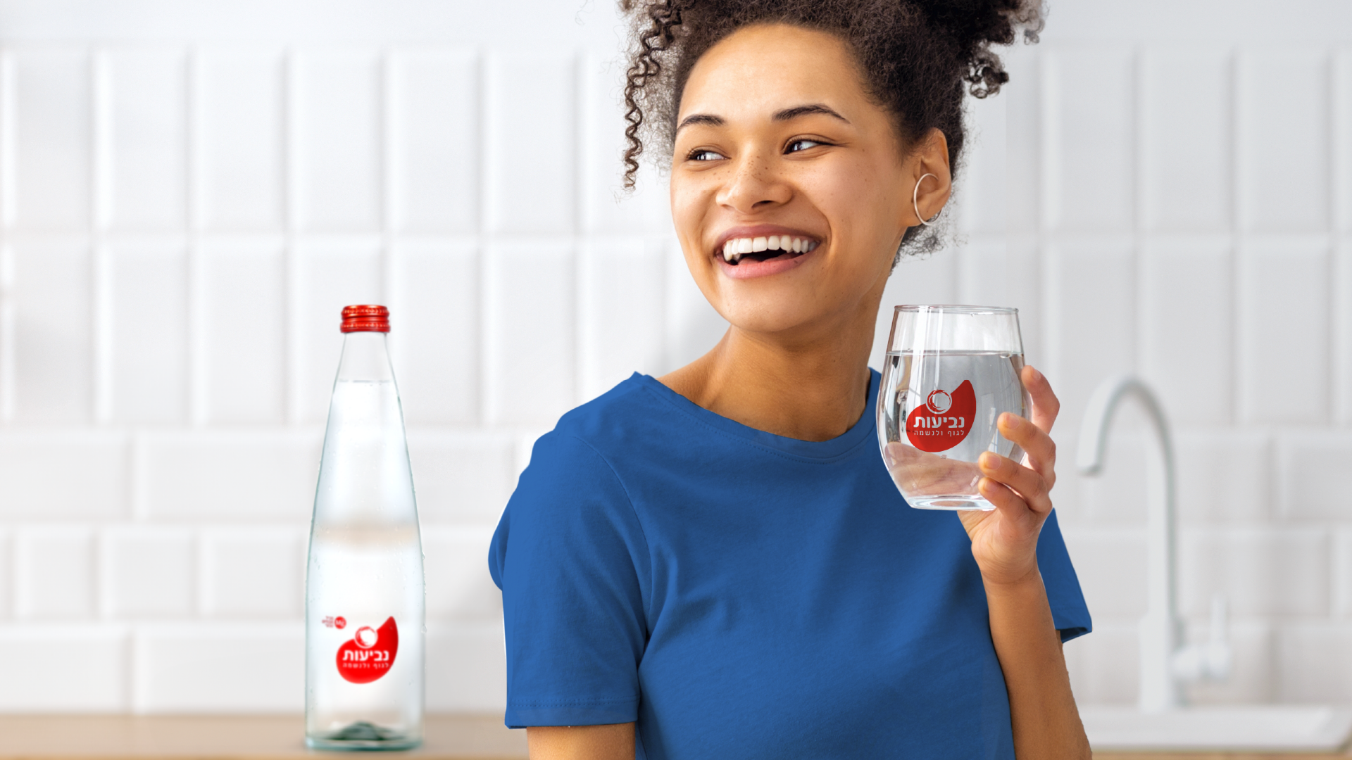
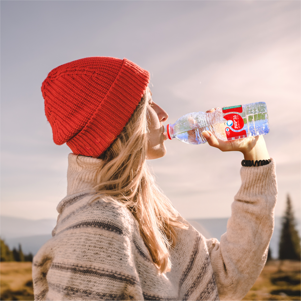
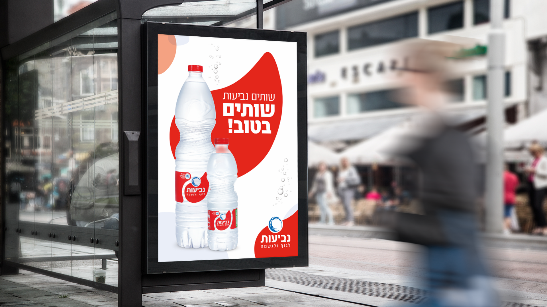
Each of us has their own favorite water brand – and there are so many of them. Market shelves are packed full of options well recognized by their design, from bottle to cap. Neviot is one of the most recognized brands in Israel, and as such, they know rejuvenation is key for longevity. Neviot came to us to update its brand language and create a united front – in addition to their classic mineral water bottles, Neviot also rules the Near Water category, which includes flavored water. Our task is to help Neviot stand out, shine and live better on any shelf.
Flow like water
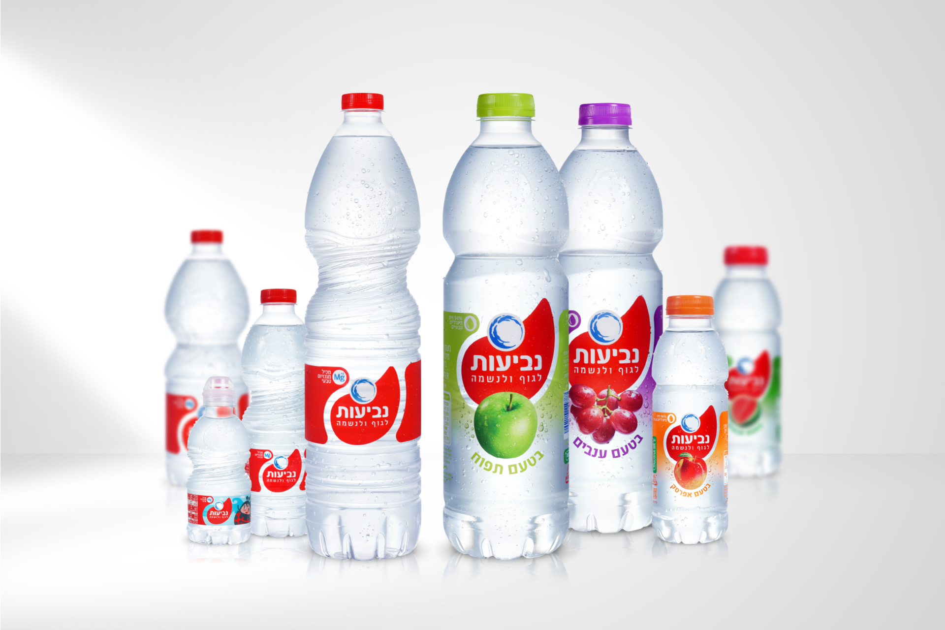
As we approached design, we made two important decisions and faced one term: Neviot’s red is well recognized with the brand and is a must-keep, and the same goes for the round water stamp, which we’ll refer to as the Neviot watermark – while the logo remains the same. These are the brand’s somatic markers. The bottle features some vital info – this is Neviot’s RTB: naturally sourced water containing nature’s best. It was as clear as water (lol) that the new label has to support important information and help deliver it through thoughtful and coherent hierarchy. Finally, we presented Neviot with a few options. You can find the chosen design in stores.

Where there's water, there's life
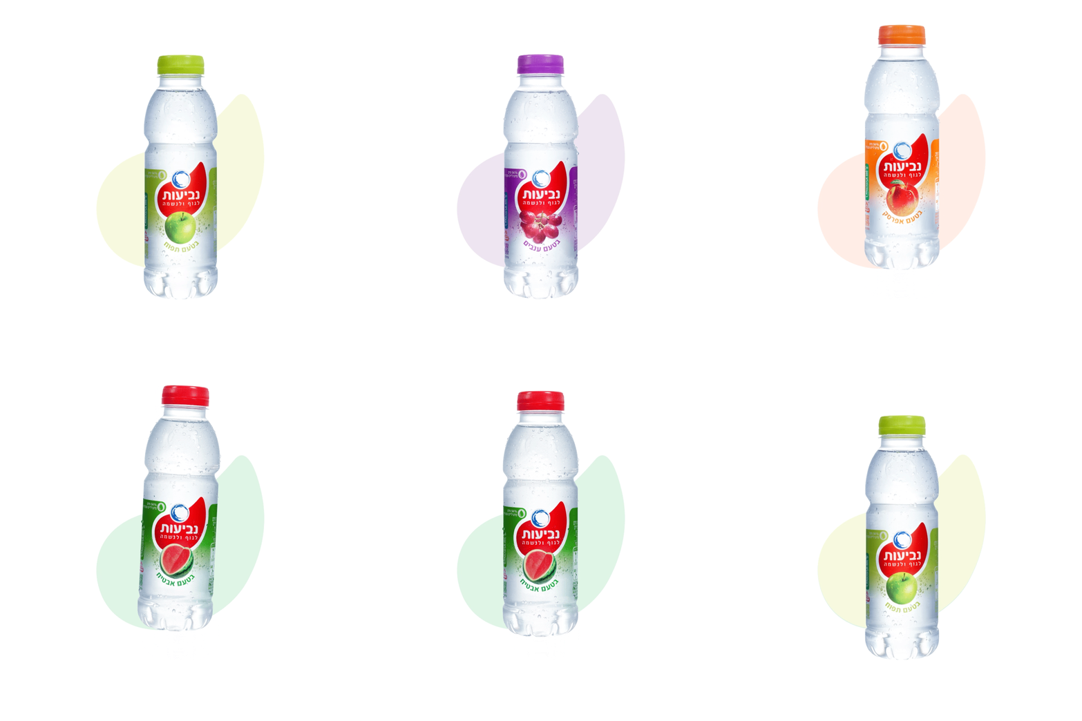
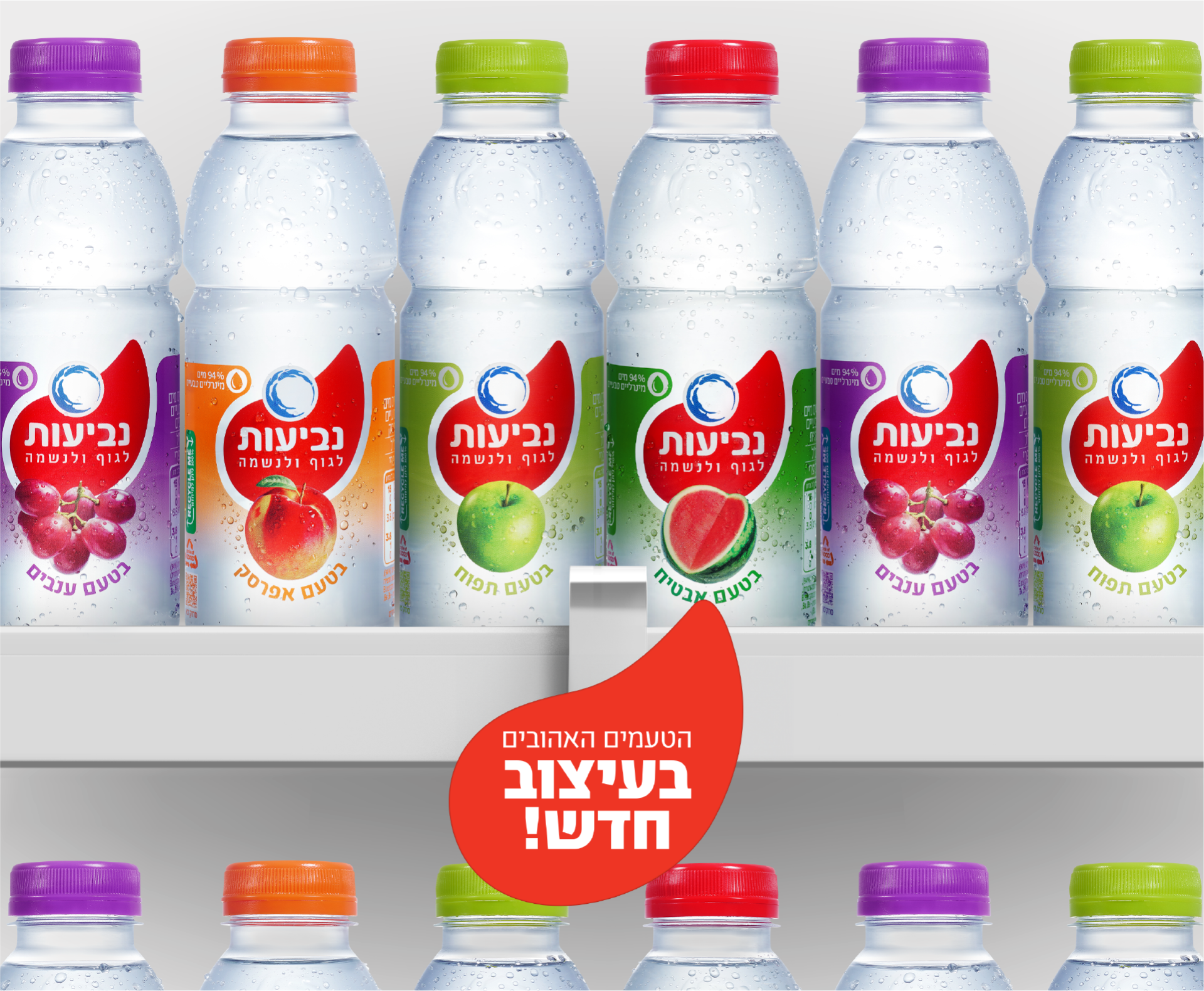
Neviot’s new visual language celebrates the brand’s existing assets while using them in a new, clear and iconic way. The label’s front features a red droplet that symbolizes water and flow, but is also surrounded by a clear field, allowing the real water in the bottle to show. The water bottles’ leading color is still red, while the Near-Water category presents the red droplet next to a flavor-indicating color and a fruit image. This makes a flavorful and nature-based product seem more appealing and communicative. With gallons of refreshing visuals, Neviot already lights up the shelves and gulps a mouthful of rejuvenation.
Nevi by Neviot
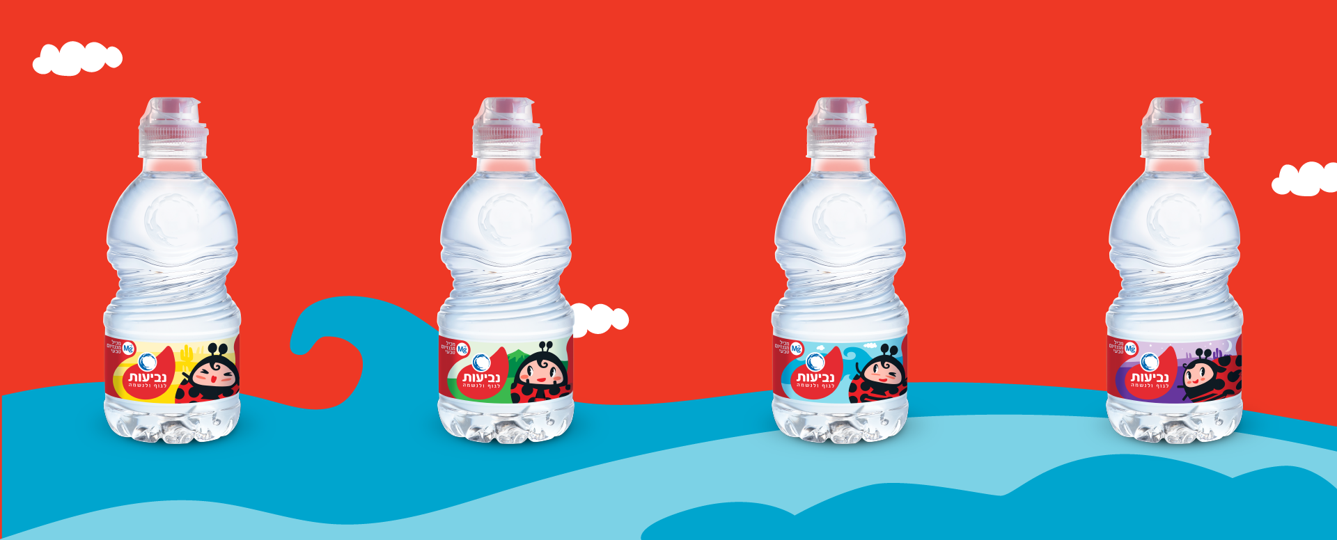
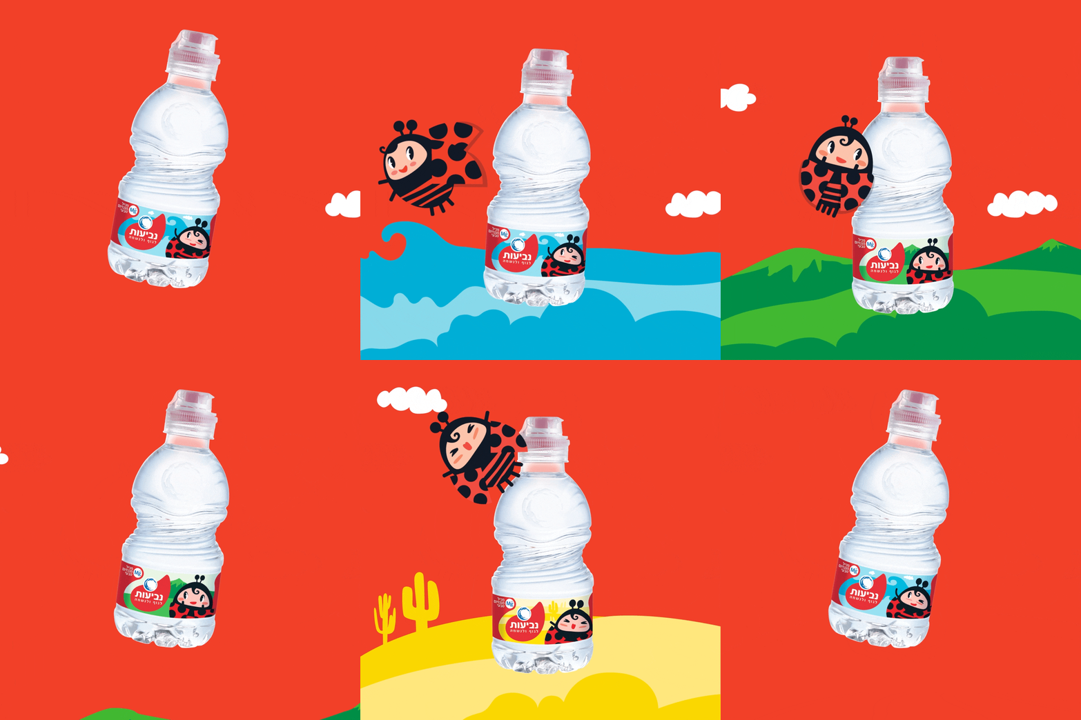
The thing about mineral water is that its audience is, well - everyone, including children. We decided to create a leading brand character that sparks imagination, affection and draw kids closer to the brand. We're happy and proud to present Nevi, the sweet little ladybird. We chose a ladybird because her natural colors suit the brand's colors, and also because of the innocence and positivity it conveys. It's shapes are interesting for kids, and the cartoon are lovable by all.
Nevi, a short of Neviot, give an extra layer to the brand and while we created a united brand frot with the rest of the design, we managed to differenciate a specific audience in a natural, gentle and likable way. With gallons of refreshing visuals, Neviot already lights up the shelves and gulps a mouthful of rejuvenation.
