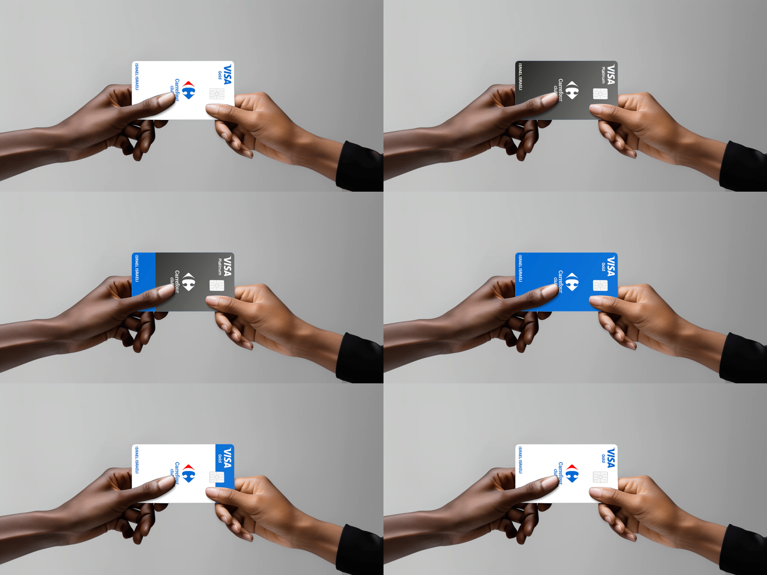

Client
Electra Group
Industry
Finance | Food/Beverages | Retail
Skills
brand_strategy | visual_identity
The Reward System
Seems like as long as there are businesses and products, both physical and digital, there will be membership clubs – and rightfully perhaps, as everyone benefit: it allows businesses to form a relationship with their customers, while offering a trusted, gratifying experience for consumers, especially with a business they know and appreciate. In Israel, the popularity of big retailer membership cards has been on the rise. Each of them is connected to different market sectors and caters to different audiences: some are high-end and can be viewed as a reward system, while others are budget brands that accommodate everyday needs. Carrefour, the successful European chain, opened its first Israeli branches and wanted to create a unique membership card. We teamed up to make it happen.
The Best of all Worlds
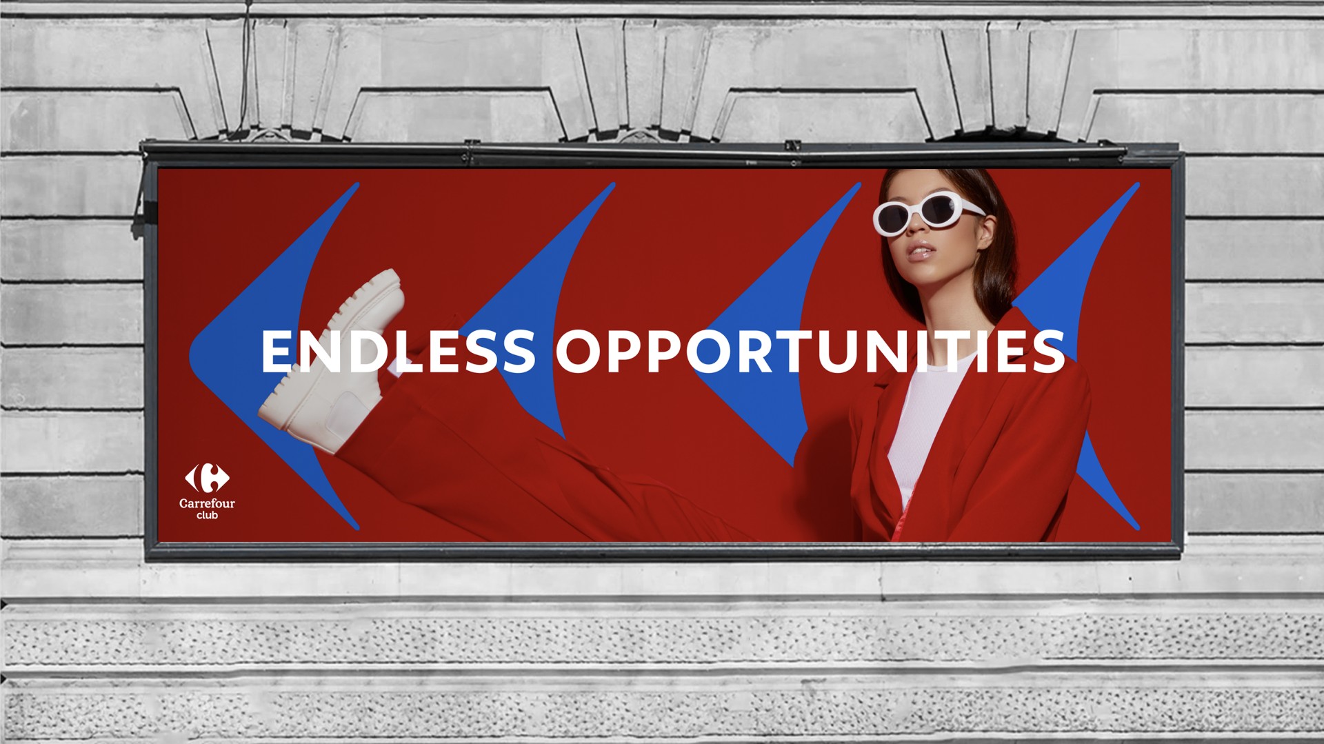
Carrefour joined forces with several local powerhouses to create a powerful membership card. During strategic research and interviews, it became clear that the most unique value proposition was variety. The essence we came up with for Carrefour’s membership card is BENEFITING FROM ALL WORLDS. Carrefour offers variety in itself, and after teaming up with its collaborators – Electra Consumer Products, Bit (by Poalim Bank) and Cal (Israel Credit Cards) – its value skyrockets.
Carrefour offers variety in itself, and after teaming up with its collaborators – Electra Consumer Products, Bit (by Poalim Bank) and Cal (Israel Credit Cards) – its value skyrockets. From everyday shopping to exclusive deals, from local to global, both a credit card and membership card – this club answers every need, creating a winning shopping experience. Thus, its positioning is WINNERS ONLY: THE NO.1 BENEFIT WORLD IN ISRAEL.


Prize Club
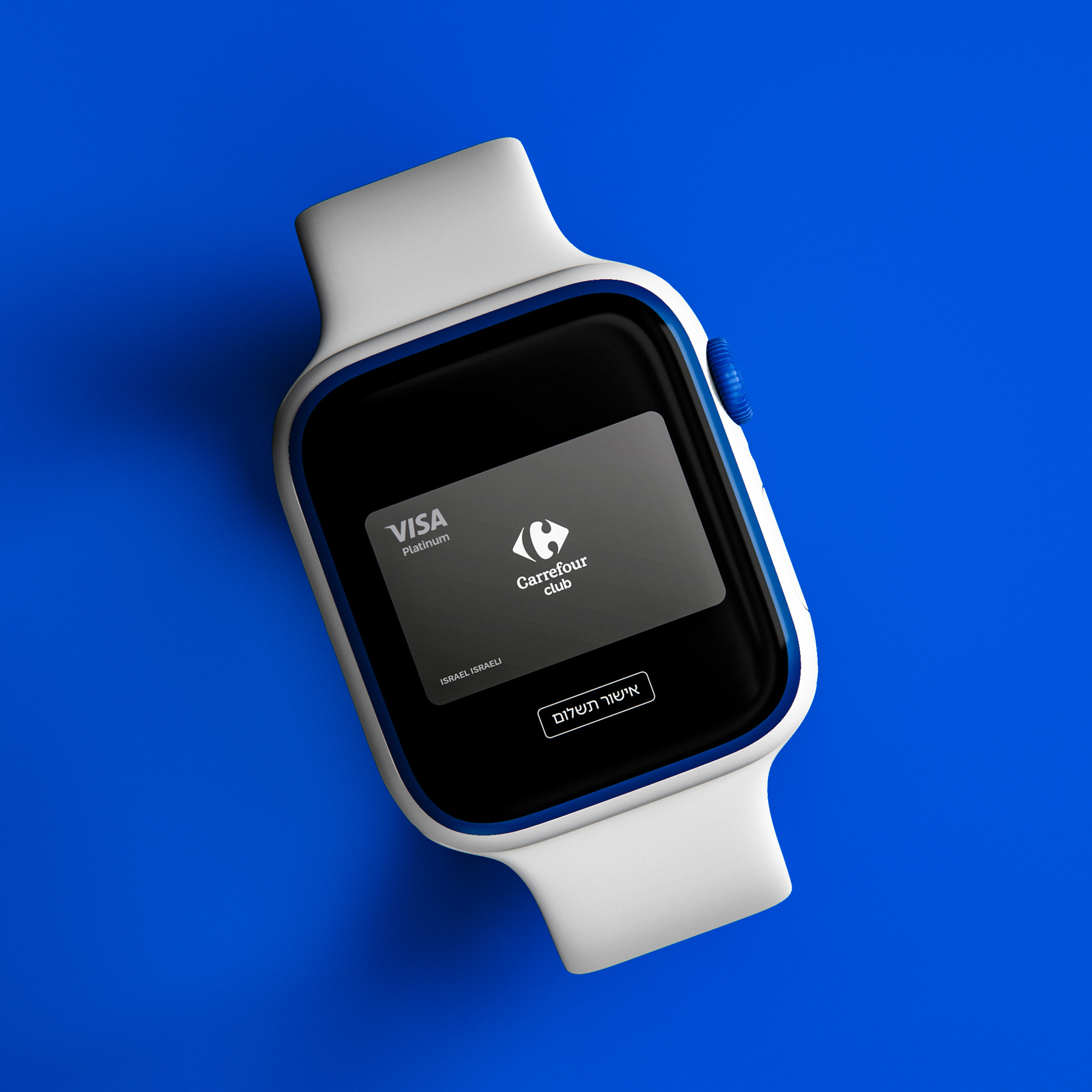
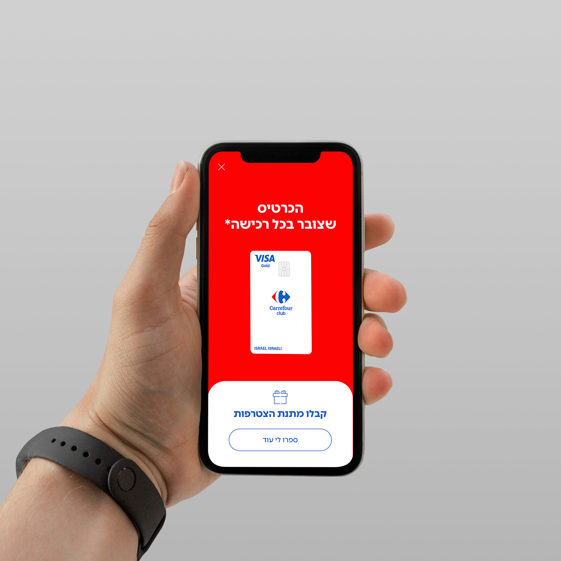
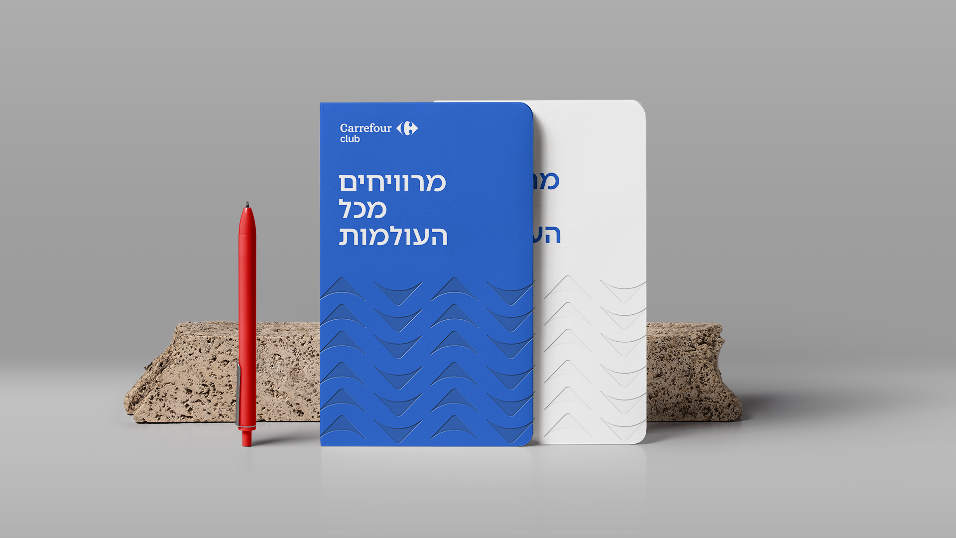
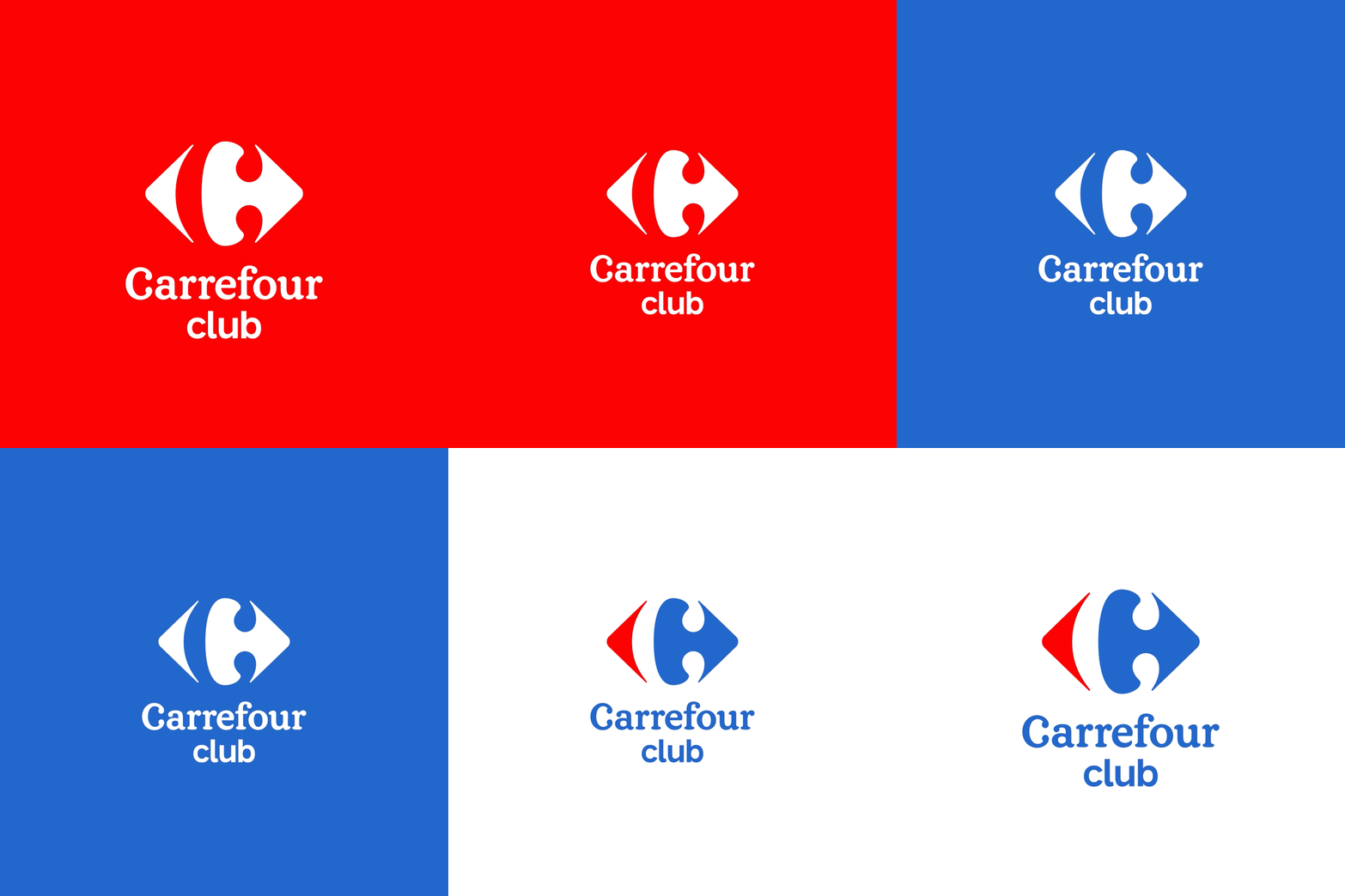
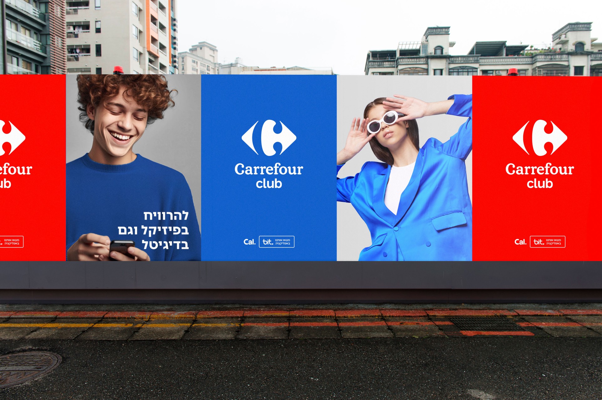
While every collaborator is equally powerful, Carrefour is the face and identity of the card, combining both a European look and feel and with local benefits and elements. Carrefour brand colors were used for the card – red, white and blue – coloring the membership club royal and powerful, a winner. We used the Carrefour logo to craft a visual language, using the two “arrows” created in the logo as frames that present winning, varied possibilities. The photography language is playful, artsy and colorful, setting a special and upscale vibe, meeting both credit card for everyday and “serious” shopping, and a fun benefit card that open doors to a worlds of goodness.
