
Client
Pelephone
Industry
communication | Media
Skills
visual_identity | brand_book | messaging

Ahead Of Everyone
Today, the pillars of the communication market are undergoing many technological changes: old infrastructure is being replaced by optical fibers, 5G is entering the cellular world, eSIM is entering the market, and smart TVs are on the rise. These factors lead to fundamental changes in how we consume media.

Nevertheless, Pelephone, a company whose DNA is dynamism and innovation, is unafraid to take advantage of these changes. We embarked on a process of refreshing the brand identity together. This will connect existing and potential customers to rapid changes and keep them connected at every interface point.


Need for speed
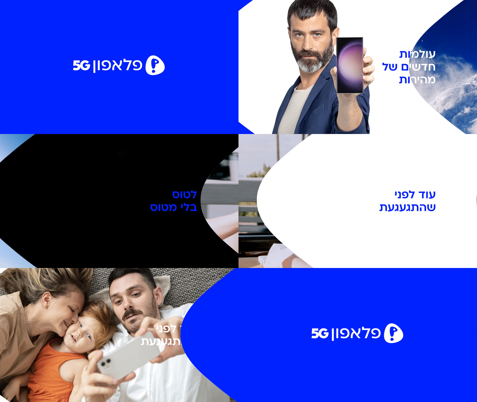
We based the updated brand visual language on mobility and speed. Its main element is the logo symbol. We changed the angle and size to emphasize speed and movement - the same speed that declares "Ahead of everyone." We charged the familiar logo with new energy and changed the font to a more modern one.

We also changed the brand's blue shade to a more relevant and digital neon blue. Using pink to complement the blue, we created a unique and different look, and using black and white, which are secondary colors, the brand can be more versatile.


Even before you even notice
Speed and dynamism also guided us in determining the photographic language of the brand and we created two sets of photographic language. In the first set, presenters are lit in studio lighting on simple, clean backgrounds that represent the brand's colors.The second set focuses on dynamism and shows people's mobility in action or pictures that emphasize the connection between people. We have created versatile and simple icons that also have emotional language. Each icon has two lines attached, indicating displacement and speed.


