Client
Leumi Mortgage
Industry
Finance | Tech
Skills
app_design | copywriting | digital_strategy | illustration | product_strategy | ui_design | ux_design
Getting a mortgage from your couch
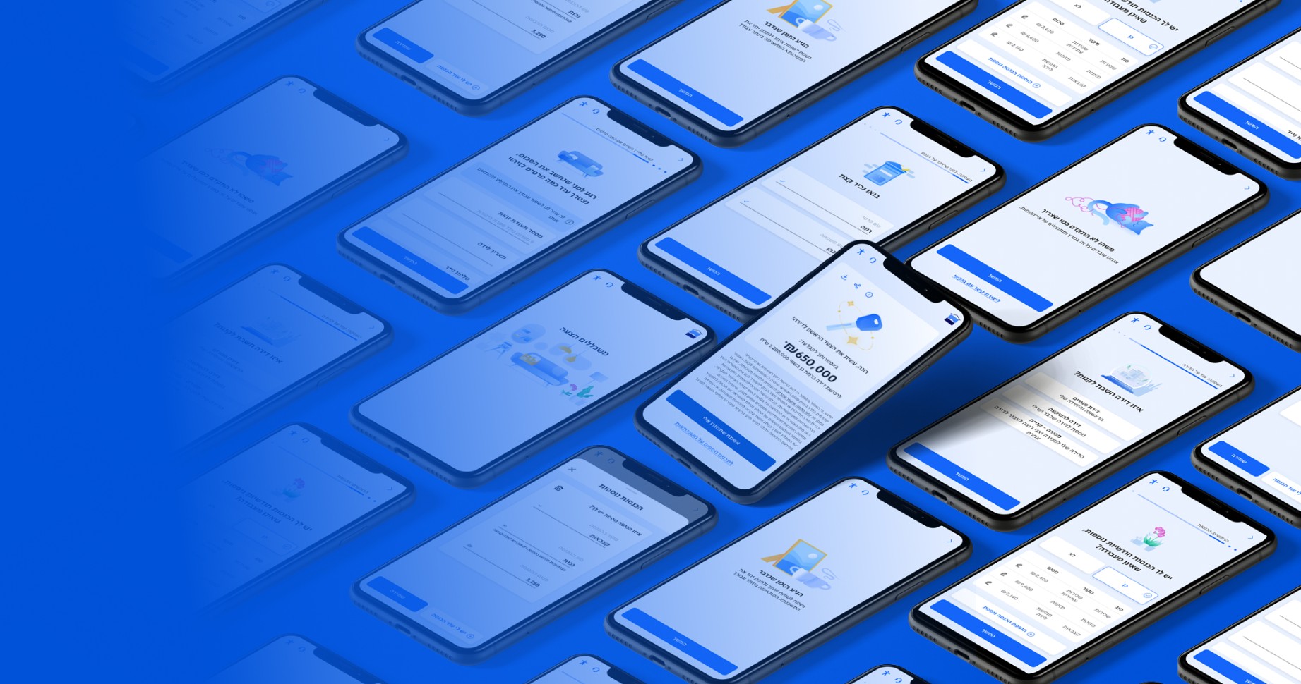
In recent years, digitalization has really kicked into high gear, and physical processes are now being digitized. It revolutionizes organizations' ability to make the most out of their client experience, and make products accessible for all considering different segments and journeys. Digitalization is an opportunity to promote innovation, and efficiency of solutions and processes. Together with the Leumi team, we've made mortgages - a process that mostly causes distress - into an efficicent and accessible digital process. We've crafted a new product in the Israel mortgage market, the first of its kind, delivering clients a fully digitized service without having to physically travel.
This project began with defining the client’s business goals, continued with a profound and comprehensive research of all parties involved in the physical process – clients and bankers. We’ve joined the Leumi team at the call center and closely listened and learned. We’ve also looked around on existing local and global solutions. We had then gathered some insights into smart, innovative UX and solutions, and together with the Leumi team, we’ve crafted a holistic, comprehensive product. Of course, our journey doesn’t end here: we user-tested the product, iterated and tested again – because at the end of the day, the product is made for the users!


Taking it easy, even if it’s a mortgage
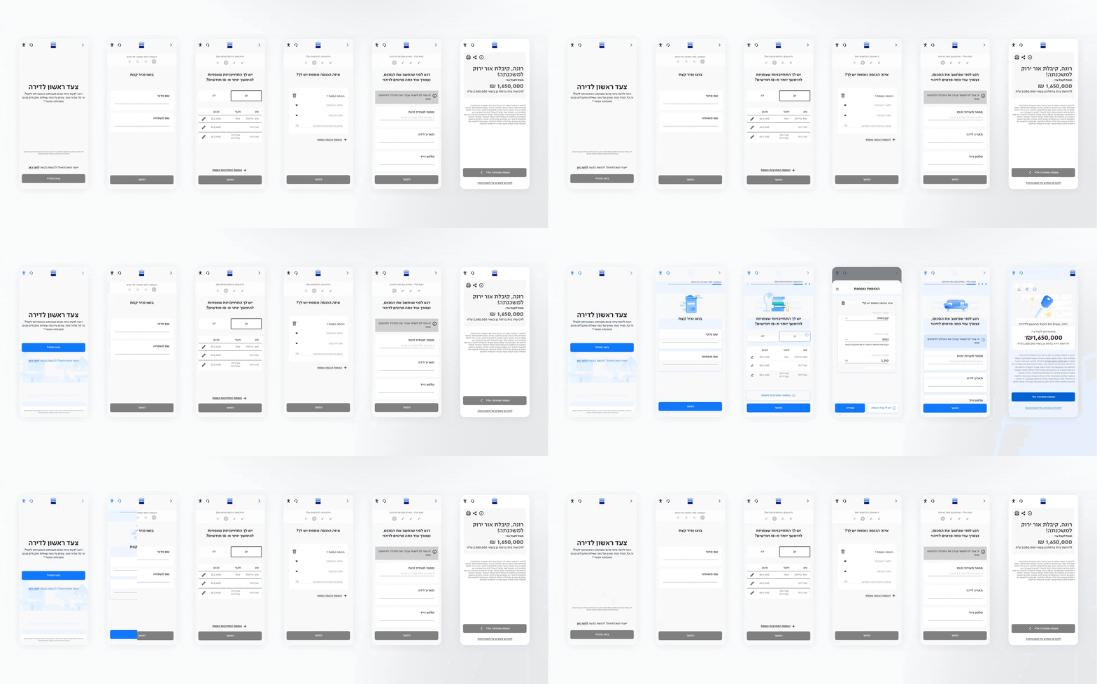
Getting a mortgage may be a positive step - however, the experience itself is often perceived as stressful, discouraging and confusing. In the small yet significant space between the clients' helplessness and the bank's lack of clarity - distrust slowly swells. It is a physical and emotional block that stands in the way. It was clear that a clever and sensitive solution was needed, to face the usual challenges of the mortgage experience. We began with a digital product strategy - in the heart of it are simplicity, friendliness, convenience and empowerment. How did we go about it? First and foremost: simplify, the more the better. We've mapped out the process, ditched whatever's unnecessary, matched our expectations and explained planely every step.
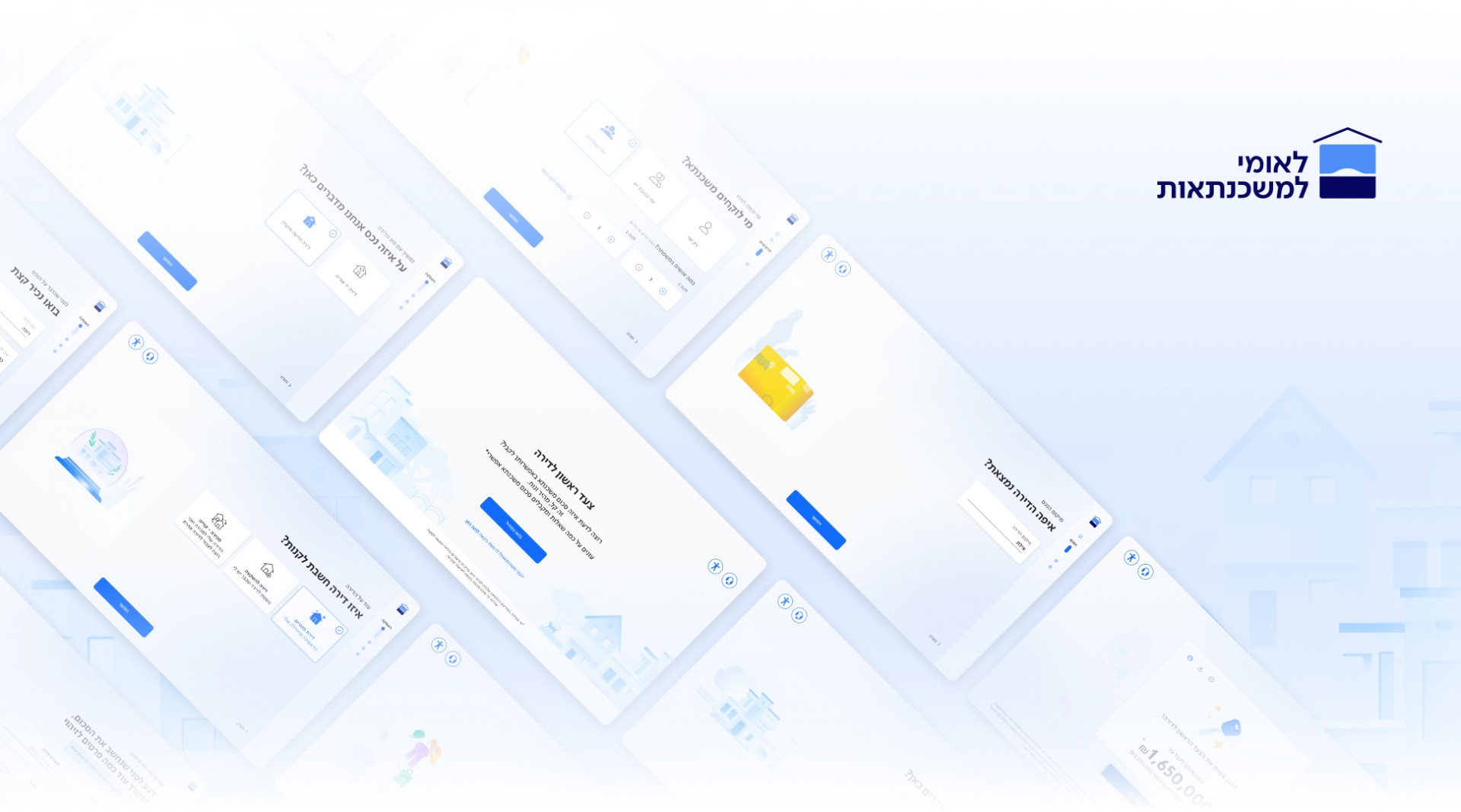
We’ve created an intuitive and clean interface, that allows users easy navigation and clear understanding of the process, now and later on. We’ve minimized the number of questions asked during the process, shortened waiting periods and strengthened users independence in the process instead of depending mostly on the call center – that’s the wonder of a fully digital processes. Since the mortgages are for pretty much everyone, the process has to be useful for every kind of user and every mortgage goal – so we’ve designed a modular flow that suits every use scenario, so users can navigate their own process.

The illustrations
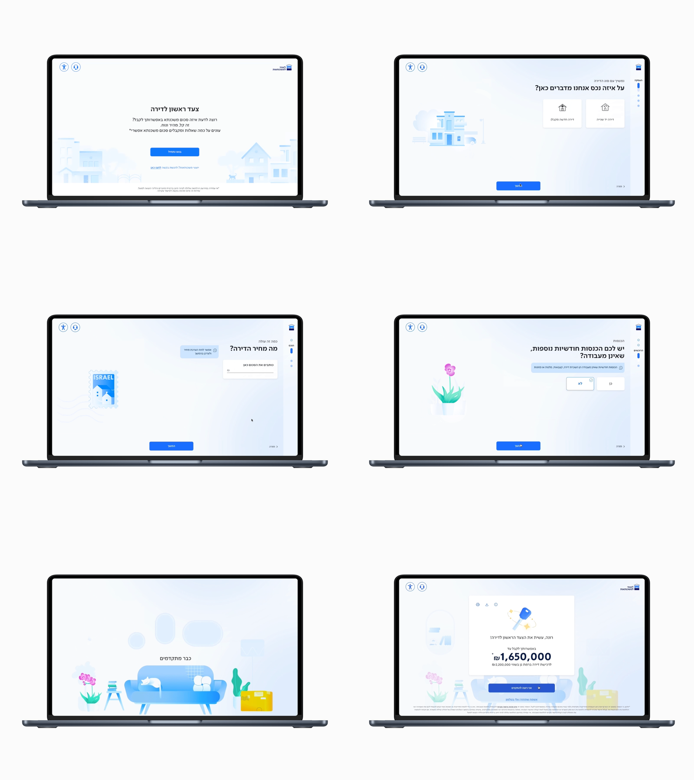
We always aim for a holistic and consistent experience. One way to do this is with illustrations. This process features interactive images of an Israeli home, and they change and respond depending on the users’ answers and choices. The story is moving around, zooms in and out and uses camera tilts that uncover more home images and objects, until finally we discover an entire living room – another step to our new home.

Cracking the banker-user code
Language is a key factor in making complex processes, with low trust levels, into accessible wonders. The language has to be right for everyone – the brand and its clients. Our work with Leumi Mortgages included a full verbal profile: we’ve met with the Leumi team and go to know their view of the brand, clients, needs and challenges better – legal disclaimers, for instance.
The verbal profile is a lingual bible for the brand – the team can use it to increase the efficiency of everyday communication in all areas. Verbal alignment is highly efficient: it creates equality of knowledge and communication between teams, and helps the bank communicate with its clients better.
When everyone understands what they’re expected to get and to give, everything runs smoother. Our goal was to make terminology clear for both bankers and users, especially in a complex system and a compelling process, where big decisions are made – it was crucial to make terms accessible so that no mistakes were made. Ultimately, language belongs to people. We’re here to simplify and help users make good decisions. Tone and style wise, we chose to speak in an eye-level, daily manner, while keeping a somewhat formal tone, to maintain the feeling of security while using a product of a leading Israeli bank.

The website
The process of designing the website was both challenging and interesting. It required a deep understanding of what customers want and need, while also considering all the bank's requirements and regulations. The research phase was crucial – it involved thoroughly learning banking terminology and understanding the complexities of the mortgage world. At the same time, we also explored what potential customers really care about and what they expect from a bank's website in the context of mortgages.
All of this helped us approach the design with a broader and more precise perspective, allowing us to tailor the website to best meet the bank customers' needs and expectations. The goal of the website design was to make the mortgage process, one of the most significant decisions in life, accessible and simple. We achieved this, among other things, by designing a key feature called the “Mortgage Calculator,” which helps users quickly understand their monthly repayment by entering a few parameters.

