Client
IRP
Industry
Industry | Tech
Skills
brand_strategy | visual_identity | messaging | digital_strategy | web_design

The best of both worlds
Electric vehicles have been revolutionizing the world, and considered a game-changer for the automotive industry. It has redefined our perception of what a car can be and inspired us to think deeply about the impact of our transportation choices. IRP Systems, a global leader in electric drive systems for the automotive market, faced us with the important task to revamp its brand identity. In a dichotomized industry divided into startups or dinosaur companies, ground-breaking innovation or reliability, IRP aspires to be renowned for getting the best of both worlds. Meanwhile, we’ve started a parallel process, of naming the company's main product, the six-string engine they created. With this engine, they are positioned at the forefront of electric vehicle technology.
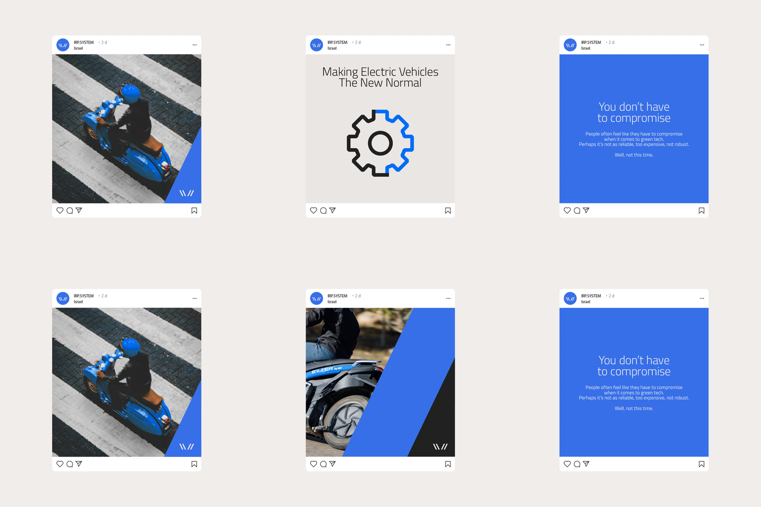


The new normal
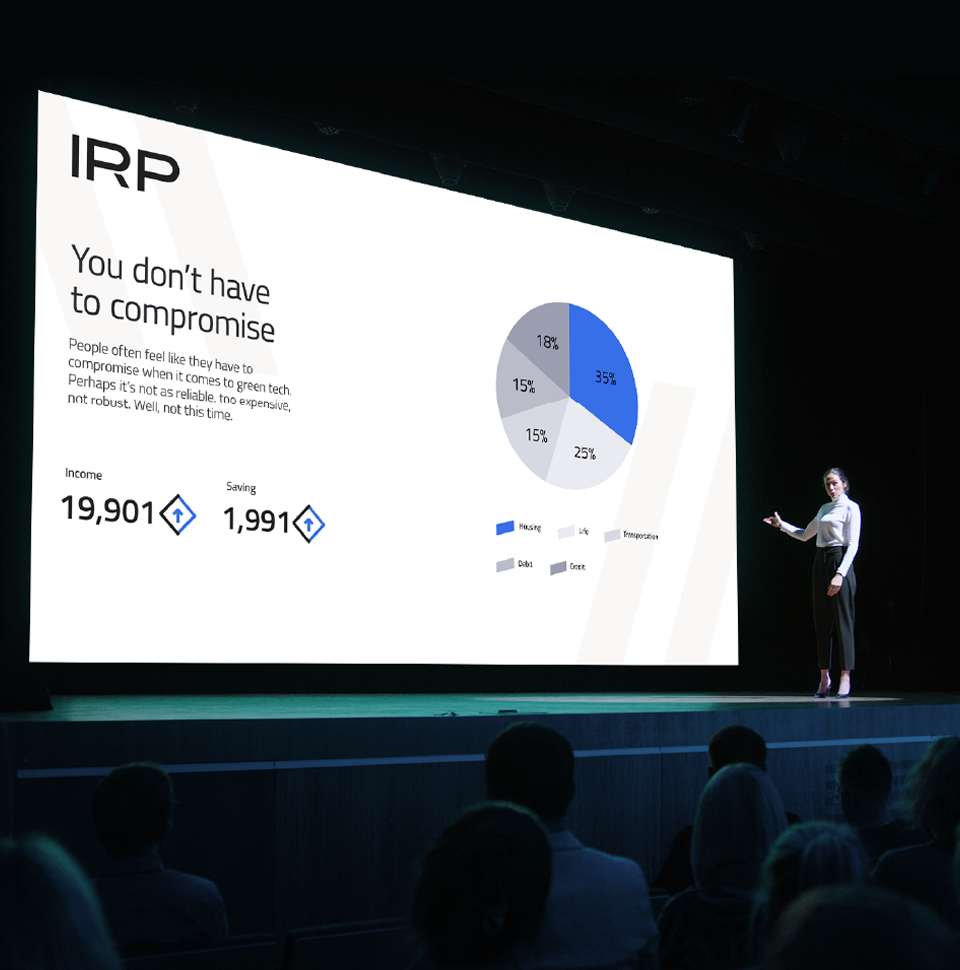
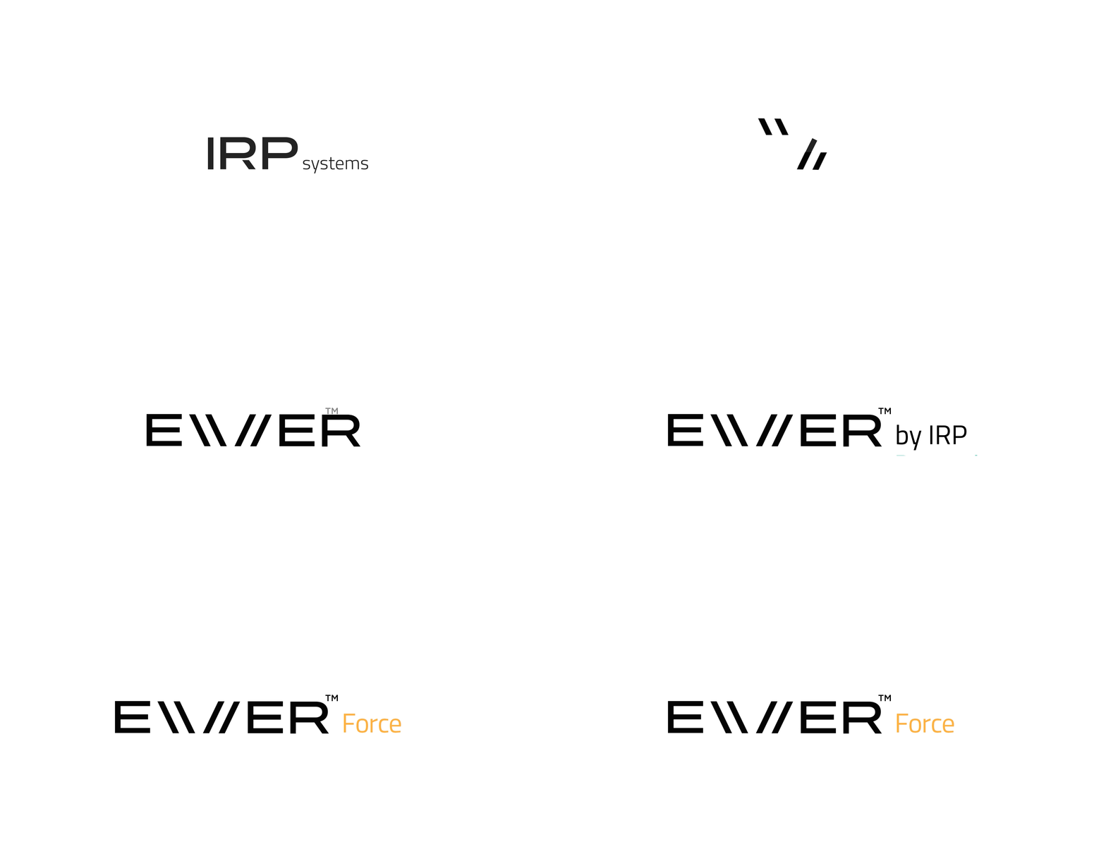
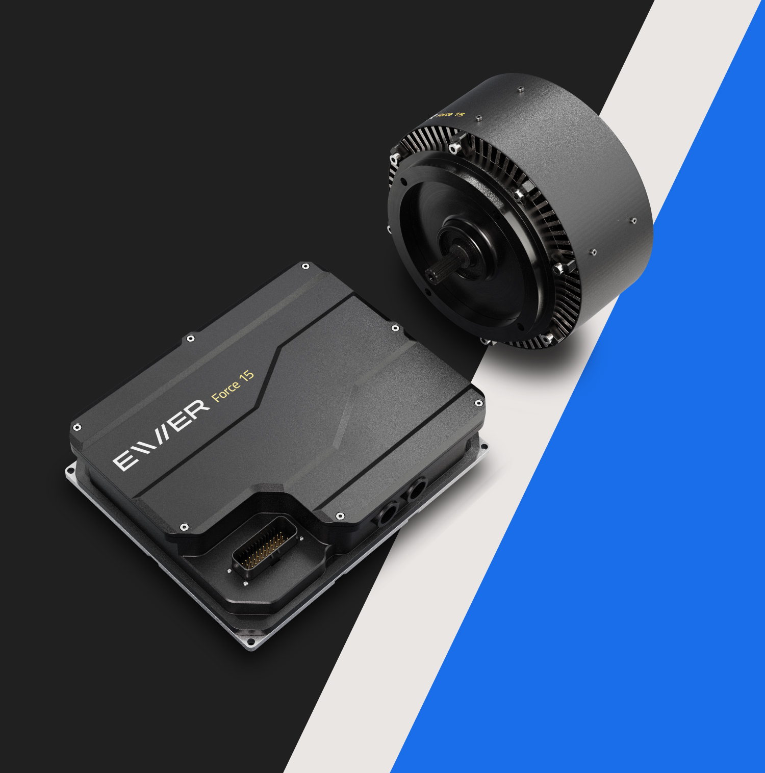
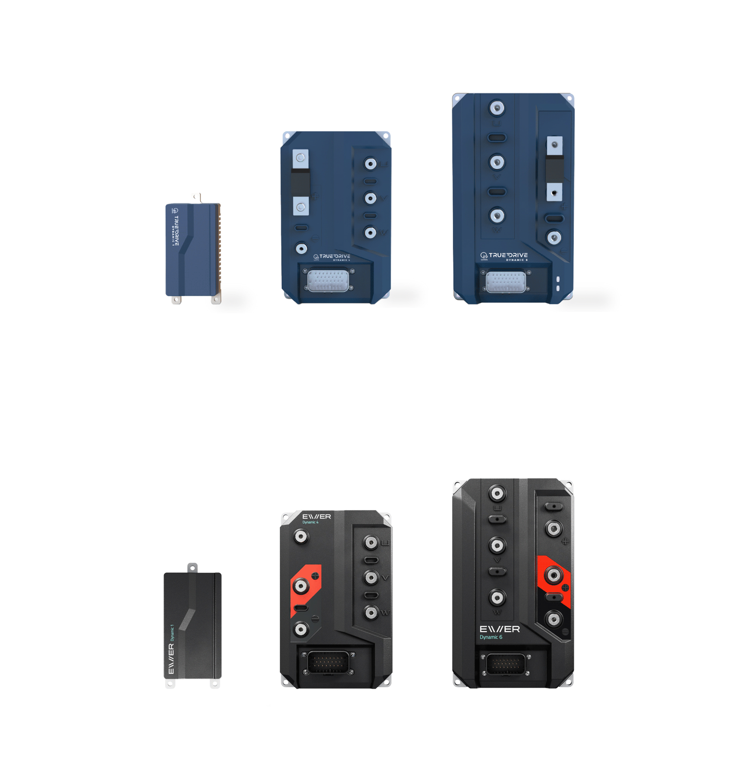
We started the project with strategic research to create distinctive identity. IRP Systems is known for its innovation and efficient approach. By developing a smart and efficient electric drive engine, the company aims to improve vehicle performance while reducing costs, and make technology more accessible. The brand positioning is "Delivering Smarter Electrification" positions it as a company that is not afraid to dare, to excel and above all to make technology accessible and scalable. The brand essence is "To make electric the new normal, using technology that is far from normal" and it places IRP in the sweet spot we wanted to aim for between innovation and reliability. The chosen name for their leading product is Evver, which includes the category (EV), the brand's attributes (ER), and the word Ever, which represents past and future in equal measure - it has a legacy and a future.
Connecting path
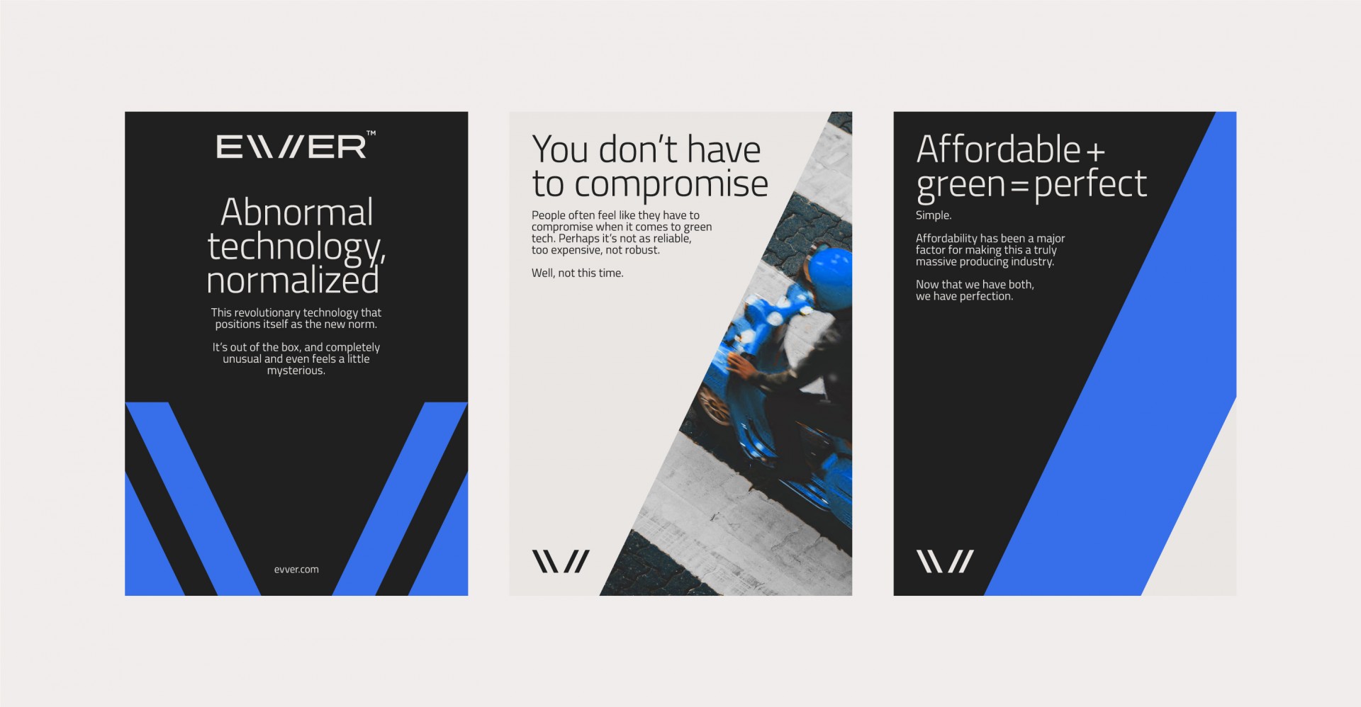
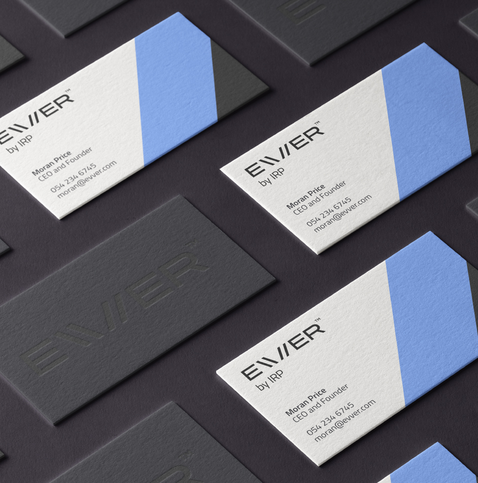
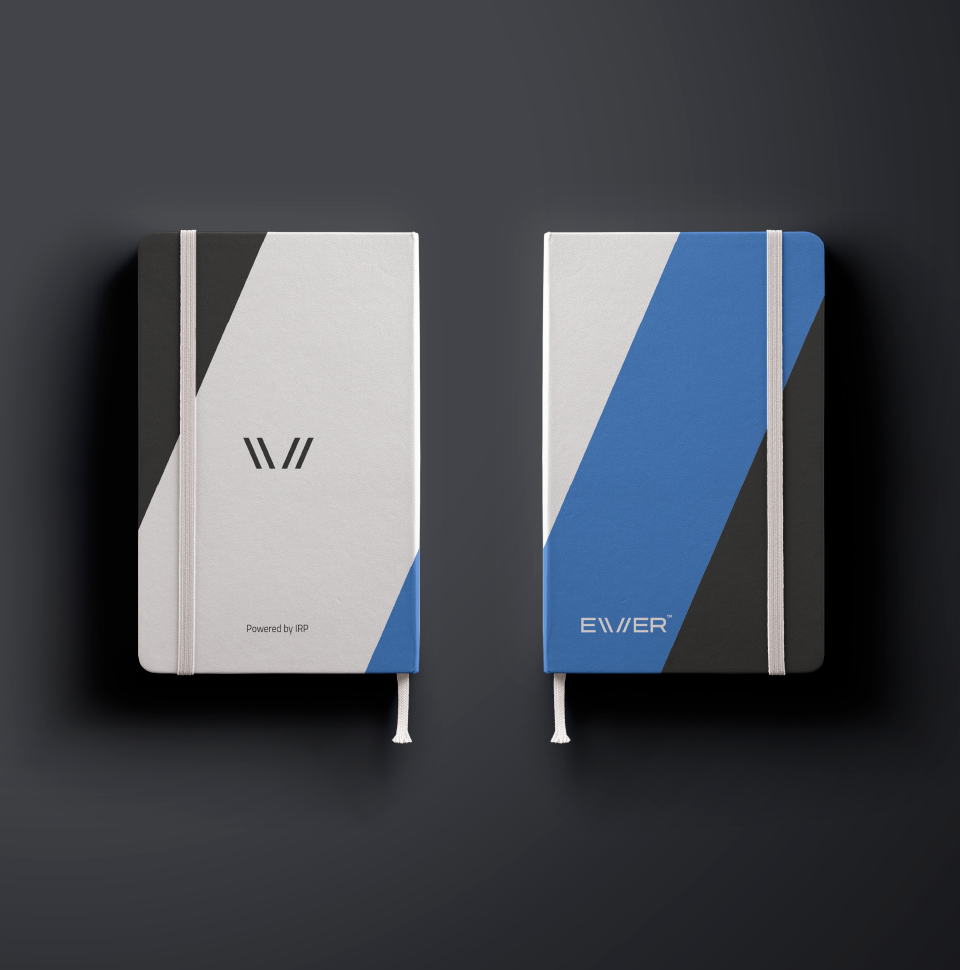
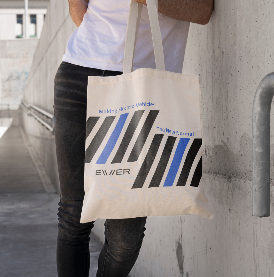
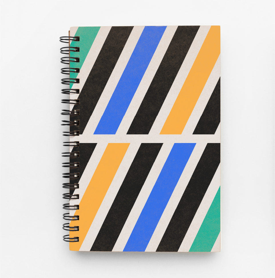
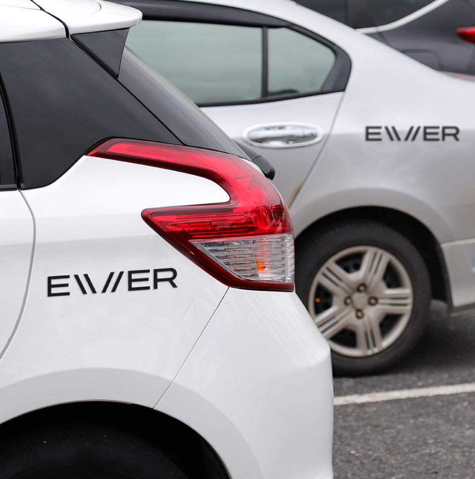
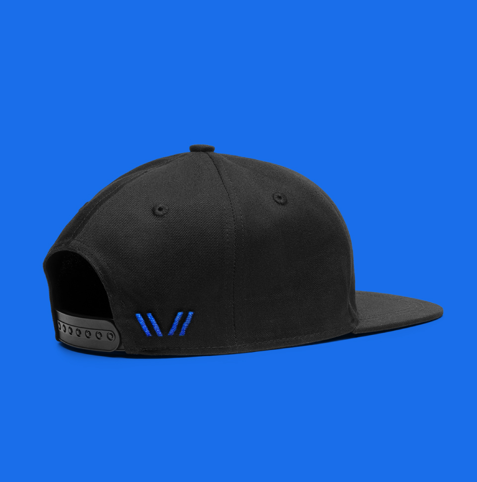
Evver, a product but a brand nonetheless, was our starting point for designing the brand identity. The doubled V represents the duality between nature and technology and have created two paths that create a visual balance. Brand colors include graphite, which represents strength and stability, blue, to convey innovation and freedom, and ivory, which instills security. We added green and yellow to the palette to express Evver's product sub-brands. Through the diagonal path formed by the letter V, we are able to create a moving and dynamic visual language that naturally encapsulates the brand's essence.
Travel close, travel far
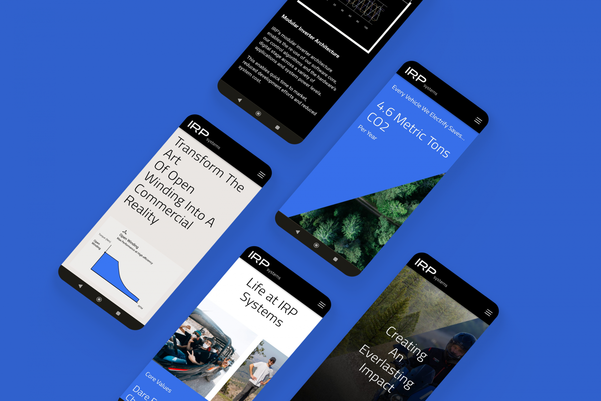
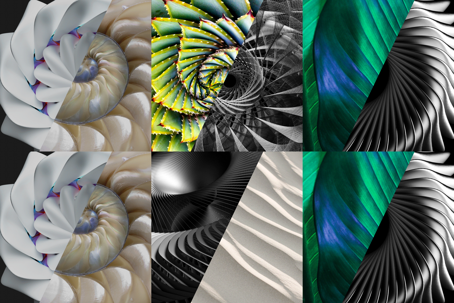
The work process on the IRP Systems website required full adaptation to the new design language. The duality between nature and technology is emphasized in the photographic language and aims to inspire as Evver's technology does. IRP sees way beyond the bigger picture and into the landscape surrounding us.
We designed the site that allows users to zoom in and out at different levels. The site transmits movement and agility and is adapted to a world that is changing at a fast pace. IRP is much more than technology: it’s a spirited team player with a mission, and so it’s the people and the team at IRP who create the real experience. The new site spotlights the team and their stories. With this new brand identity and a leading product identity, IRP is ready to bring about the biggest changes Evver.

