Client
Finteka
Industry
Finance | Tech
Skills
ui_design | naming

Fintech Foundations
When Bank Leumi found themselves at the center of a burgeoning fintech industry, a question arose. How can they gain from rising startups while at the same time foster potential relationships? The answer lay in the creation of a groundbreaking new product. A fintech centric hub that could provide APIs, technological infrastructure and solutions fully geared to serve innovative industry players. It would bridge the gap between Israel’s biggest bank and rising fintech startups. It could create a community, partnerships and empower both sides to share the greatest resource of all: knowledge.
Speaking to the Community
Firma has played a central role in shaping Leumi’s image, especially in the digital sphere. So, when it came to branding this super fintech platform, bold decisions had to be made. The first order of action – make it an entirely separate entity.
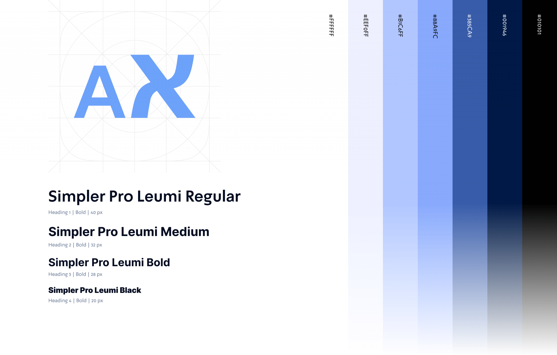
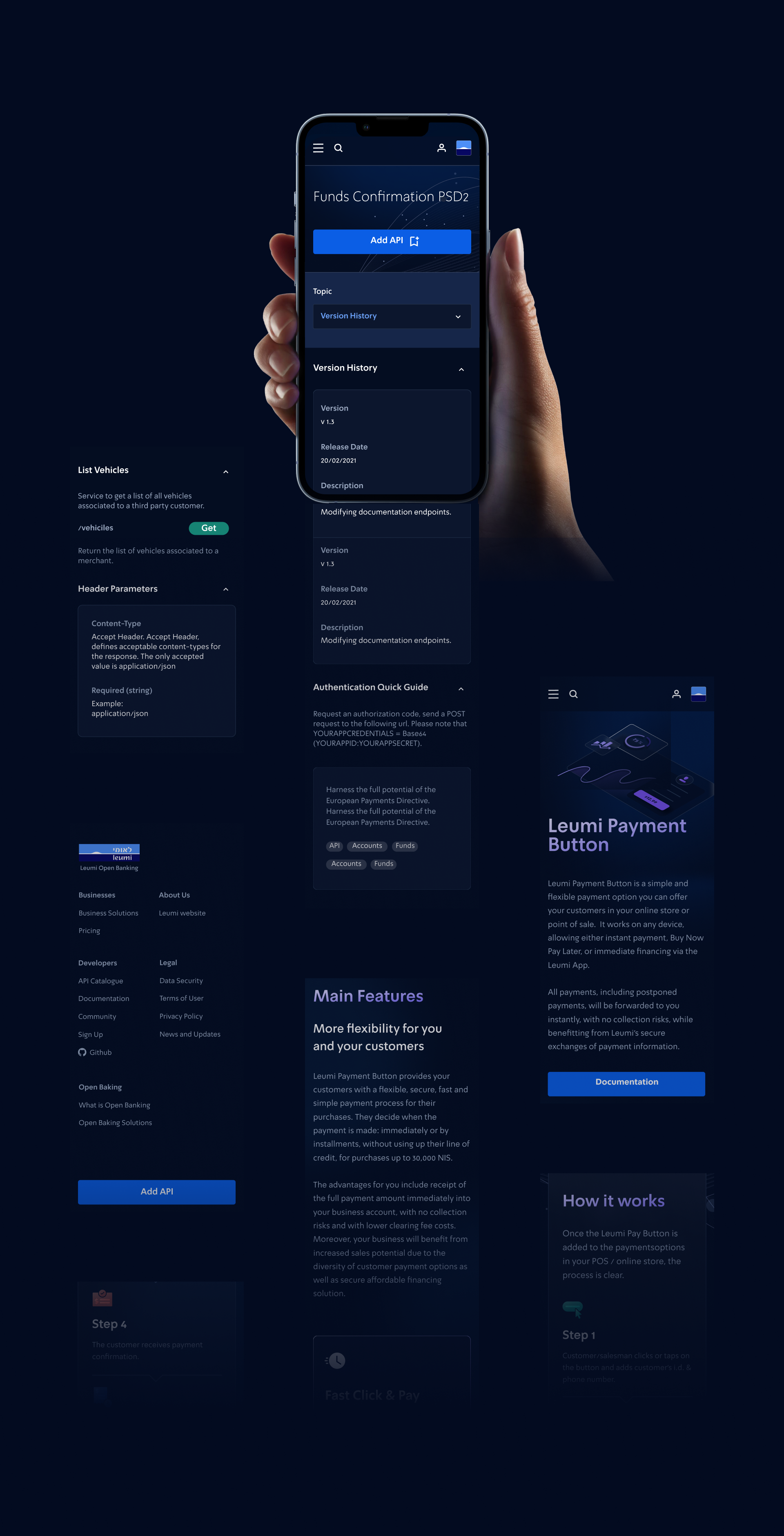
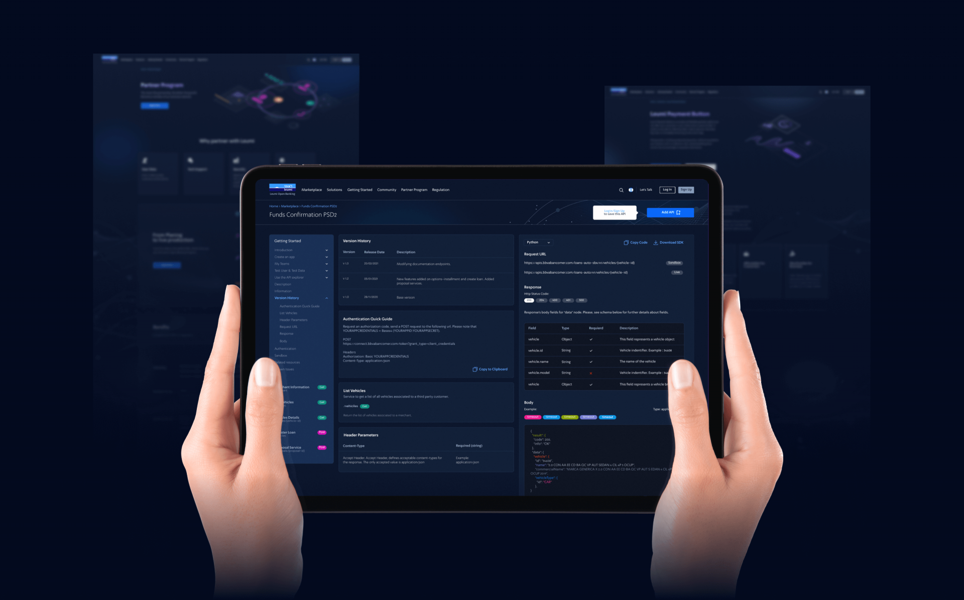
That meant giving it a name and creating a look and interface that would easily distinguish it from Leumi’s main aesthetic. It would still, however, need to be recognizable as a Leumi subsidiary. Targeting fintech players, a community of cutting-edge software engineers and thought leaders, it had to make visual sense and appear somewhat “familiar.”

New Mood, New Mode
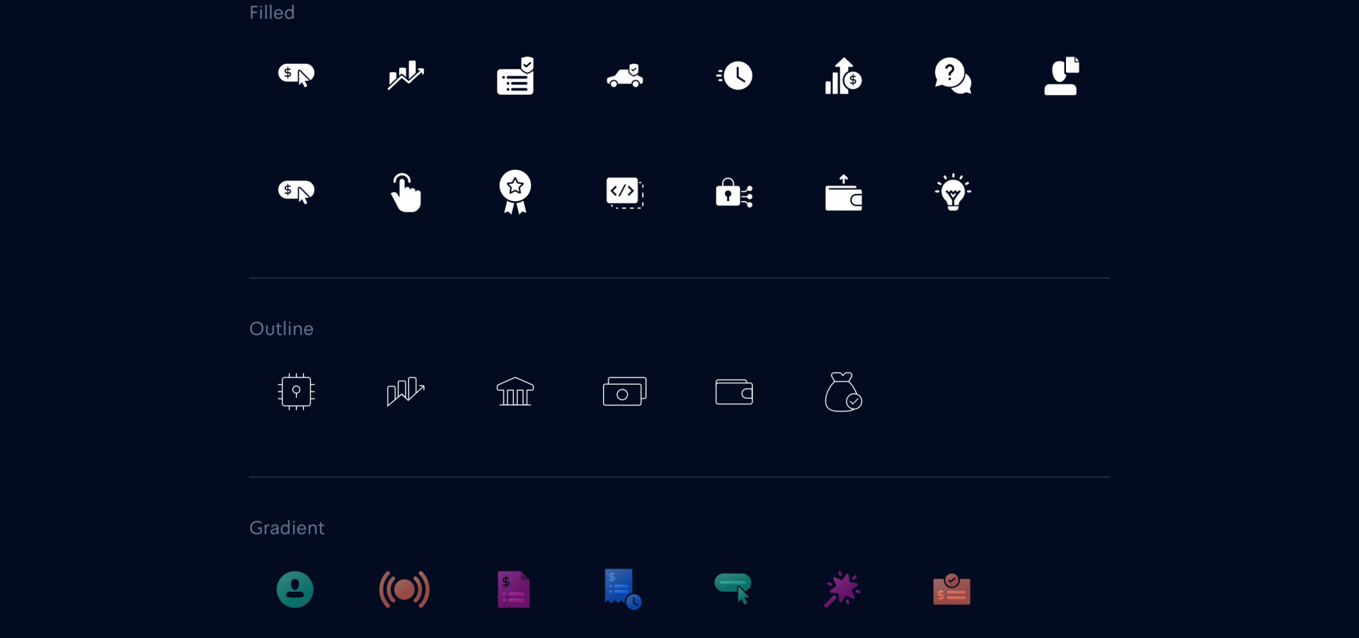
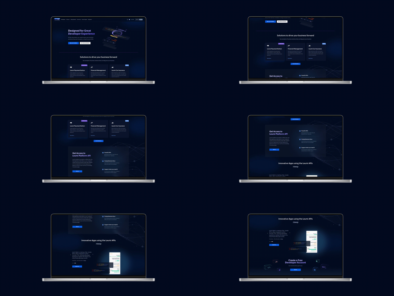
Enter Finteka, a technology company powered by Leumi. A sleek new look in “dark mode” was the look of choice. It’s an aesthetic befitting of a coder’s world. Black screens, and new icons for a whole new technological ecosystem. And although a bold move, as Leumi’s main interface is white it was important to depict this distinction. Still, it was crucial to portray Leumi at the center of it all by keeping the logo. “Finteka” alongside the Leumi logo interconnected with icons of buildings – a developing fintech industry perfectly illustrates the company’s role in this ever-evolving tech sphere.
