Client
Mediateque Holon
Industry
Culture
Skills
visual_identity | branding
Holon Design Museum
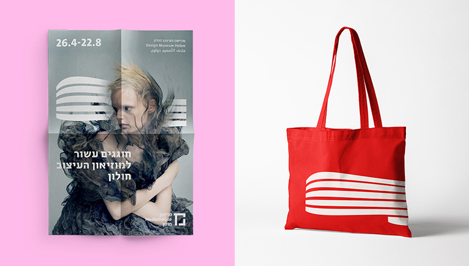
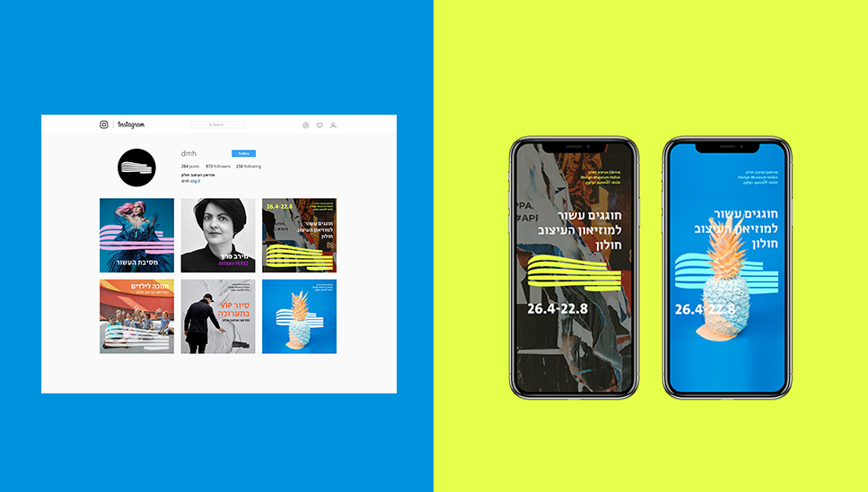
It may be all about design, but even the Holon Design Museum could use the occasional spruce up. We’ve worked with the wonderful logo created by Adi Stern, and digitized it – by making it more legible and free – without compromising the already existing iconic nature and flow of the logo. We’ve also developed a font for the museum with added weights and languages to expand its communicative range. With a new, fresh system, text and shape can look better apart and work better together.
Cinematheque Holon
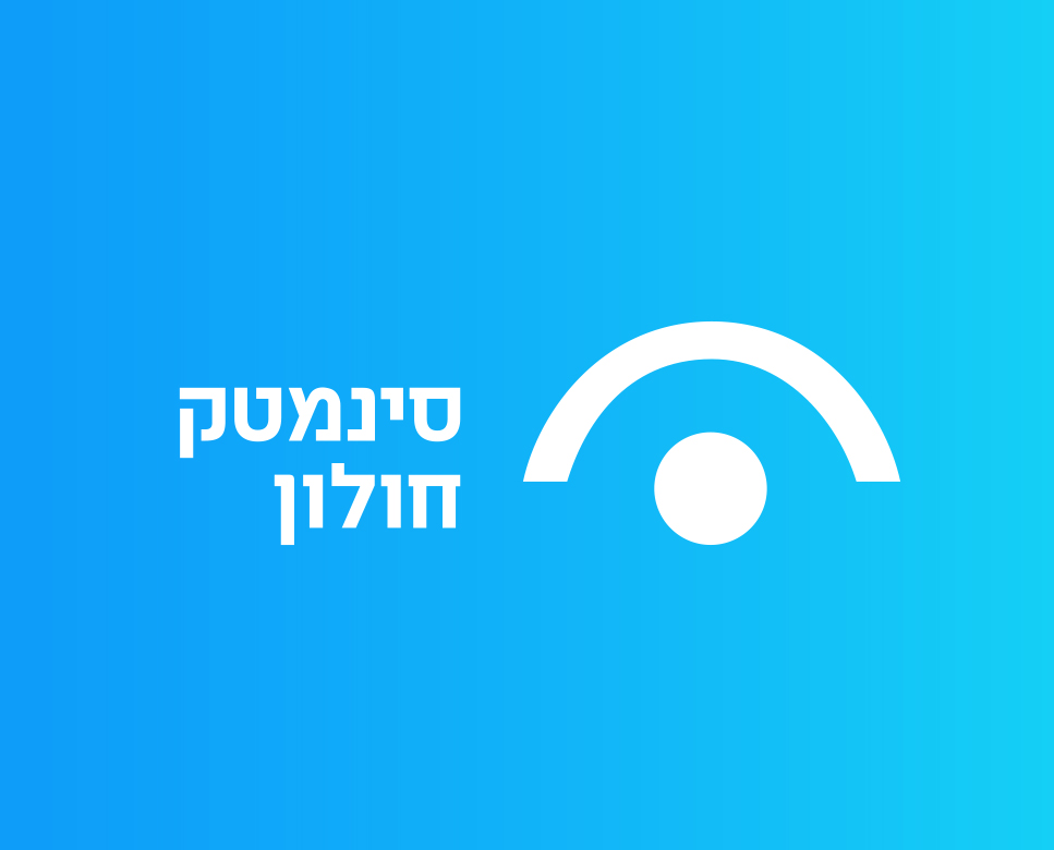
The Cinematheque had good brand foundations. We harnessed them to take the brand language forward, with a smart facelift. The eye is an icon that can be used in various ways and create memorable grids. The idea was allowing the logo to be naturally integrated with the all of the brand applications, in every front, and digitize it. The blue gradient give life and serves as a breath of fresh air for the brand.

The Central Library
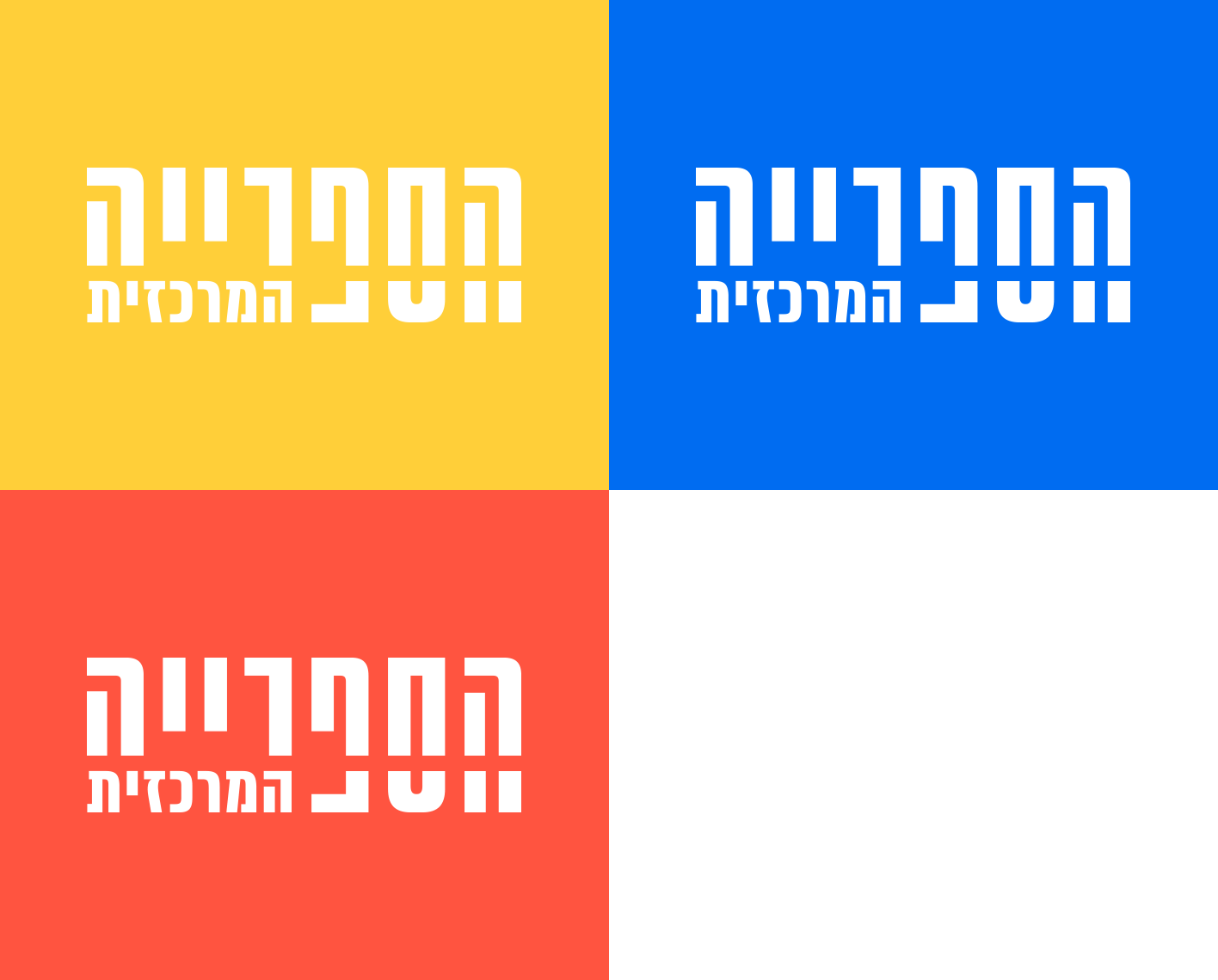
The library’s new logo refers to the mother brand, the Mediatech – with the mid slash that stretches boundaries and has the logo dancing between being perfectly legible, and daring to be playful. This adds The Central Library a surprising and fun aspect on the one hand, and on the other, it communicates with its main element – bookshelves. The primary color palette matches the building itself, and balance out a grounded nature with diverse and interesting colorfulness.


The Center for Digital Art
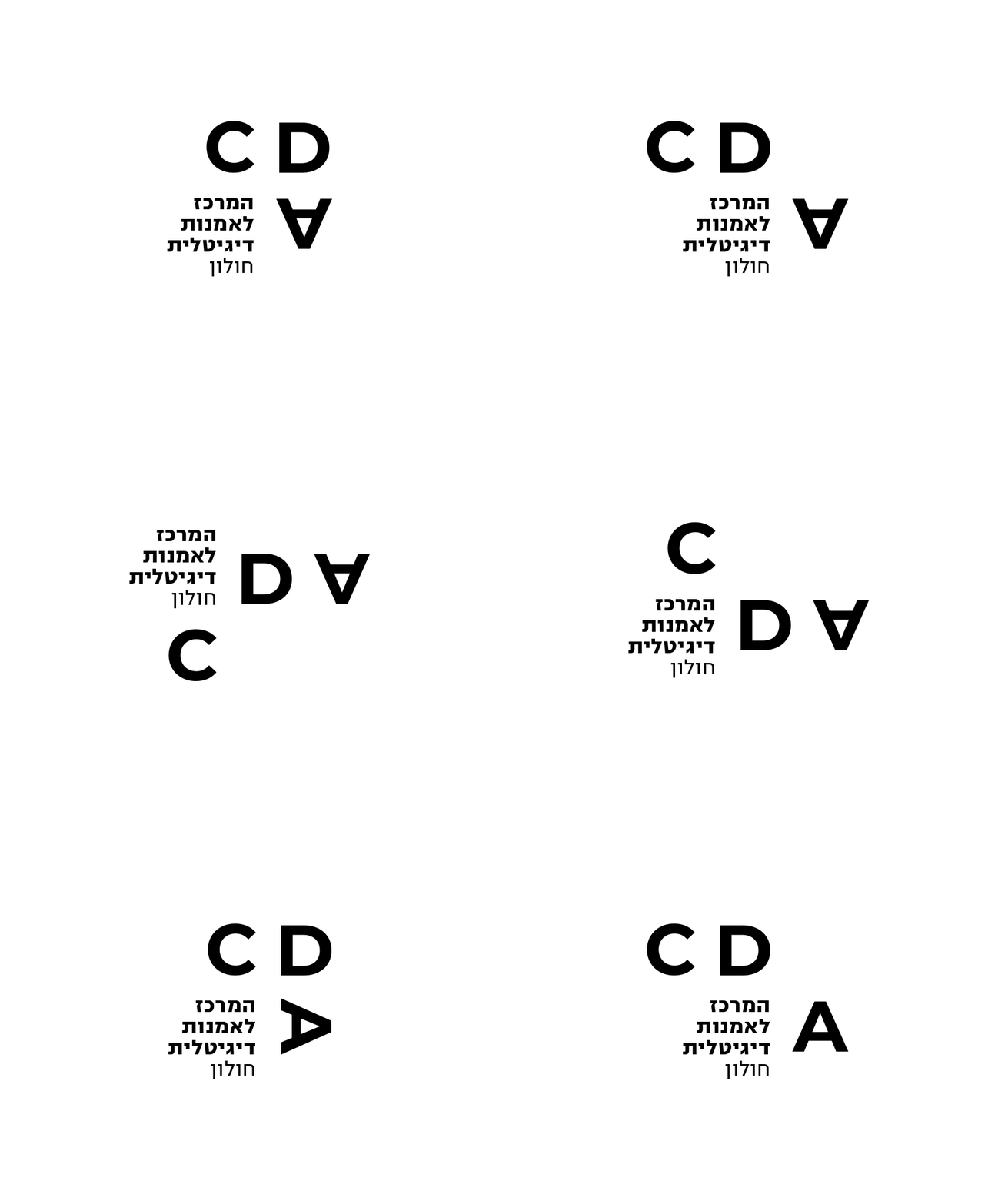
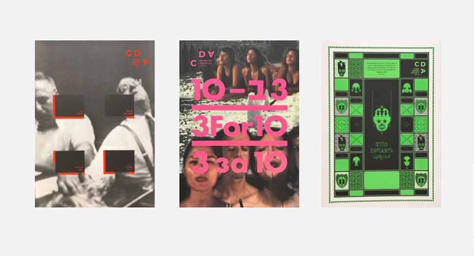
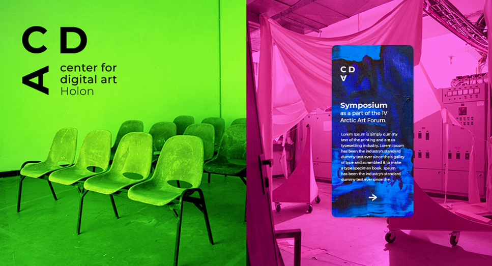
CDA is a multidisciplinary wonder with unique character, so we know we had to deliver a logo that can exist legibly yet freely, in every dimension. CDA is a place for craft. It serves both artist and students, and has an undeniable indie feel to it. The grids we’ve created allow CDA to remain iconic yet free, and keep its authentic, rogue sense. The logo stays legible and alive, yet flexible and playful. The new design introduces a breath of fresh air and dynamic energy to a brand that houses creations of that nature.
The Comics Museum
Working on The Comics Museum, we’ve created an entirely new logo that uses the familiar visuality of comics, and harnesses the genre’s conventions to convey a message and describe the craft. The logo incorporates a speech bubble and a pencil tip. It has movement and life, it works well in both physical and digital applications. We’ve picked a playful, quirky font and presented a new formative system that leans on comic strip grid – this allows image and text to move and out of it, and break the visual to build a new one.
