Client
Twii
Industry
Culture | Media
Skills
strategy | branding | logo_design | web_design | app_design
Knowledge as service
Learning from the best used to be the right of a privileged cadre, usually for professional purposes, as apprentices. Today’s knowledge dispersion, however, is as wide as the horizon. The access to top tier know-how is so easy now, as knowledge transformed from secret to service. The knowledge-sharing market is filled with offerings and opportunities, and some have managed to round up the absolute cream of the crop and serve inner-circle quality knowledge, to anyone curious and keen on evolving. Twii, for whom we designed an inviting, fun and knowledge-forward expert learning platform, set out to deliver skills to the Israeli audience with the best of the best.

Content reigns supreme
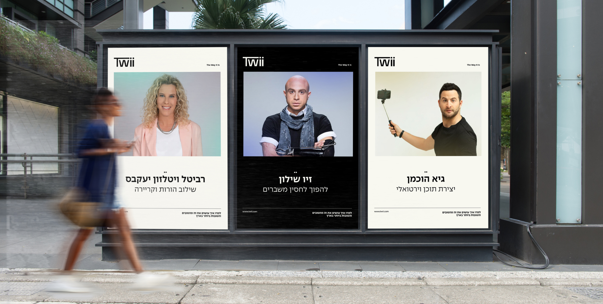
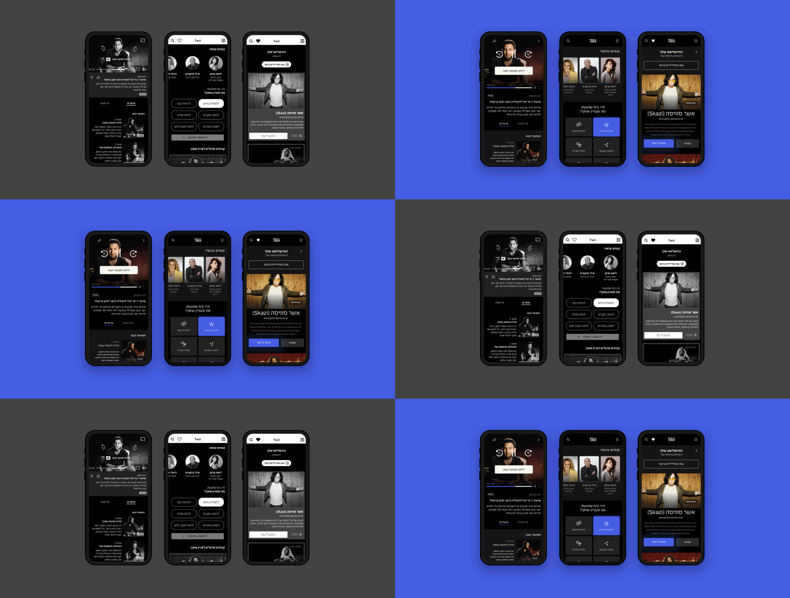
Twii opens a door to the arts and performance industry, and through online expert courses with big talents invites learners to expand their knowledge in any time, place, mood and setting they like. The tricky nature of the platform, however, is the inevitable competition between big names and big content. Our main insight was that the layout, infrastructure and design must empower content without turning every video into a self-reflection or a retrospective by the creators. Empowered content has to be valuable not just by the knowledge it passes, but with the accessibility and ease it offers it by. We see Twii as a lifestyle brand that integrates learning in everyday life, enabling growth and depth when and wherever. By tying content with choice, we position both talents and learners as eager consumers of knowledge – and crown content as queen.
How it really is
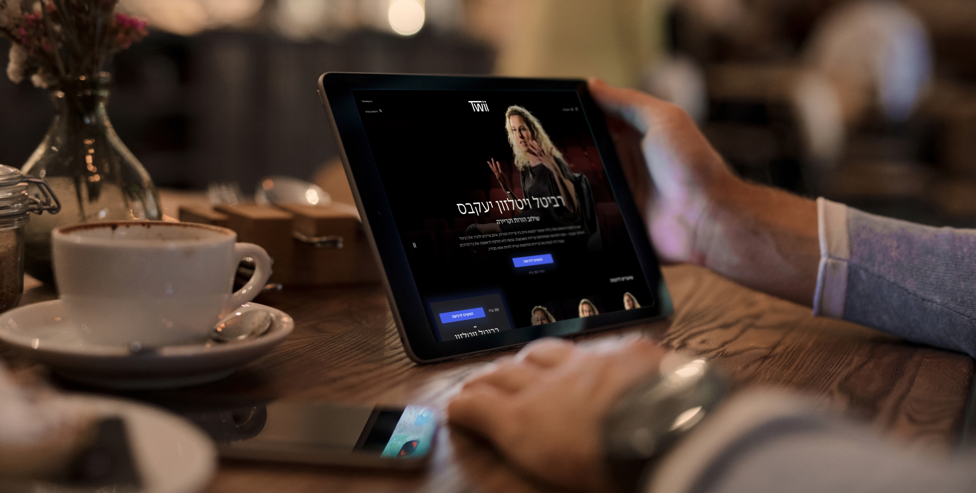
During the design process, we constantly faced questions about information hierarchy and accessibility. We’ve decided the design should be as clean as possible, to truly emphasize the value of content and make it the main event. The lessons themselves bring about color and character, and so the palette shows darker shades, as to put the spotlight on the big ideas.
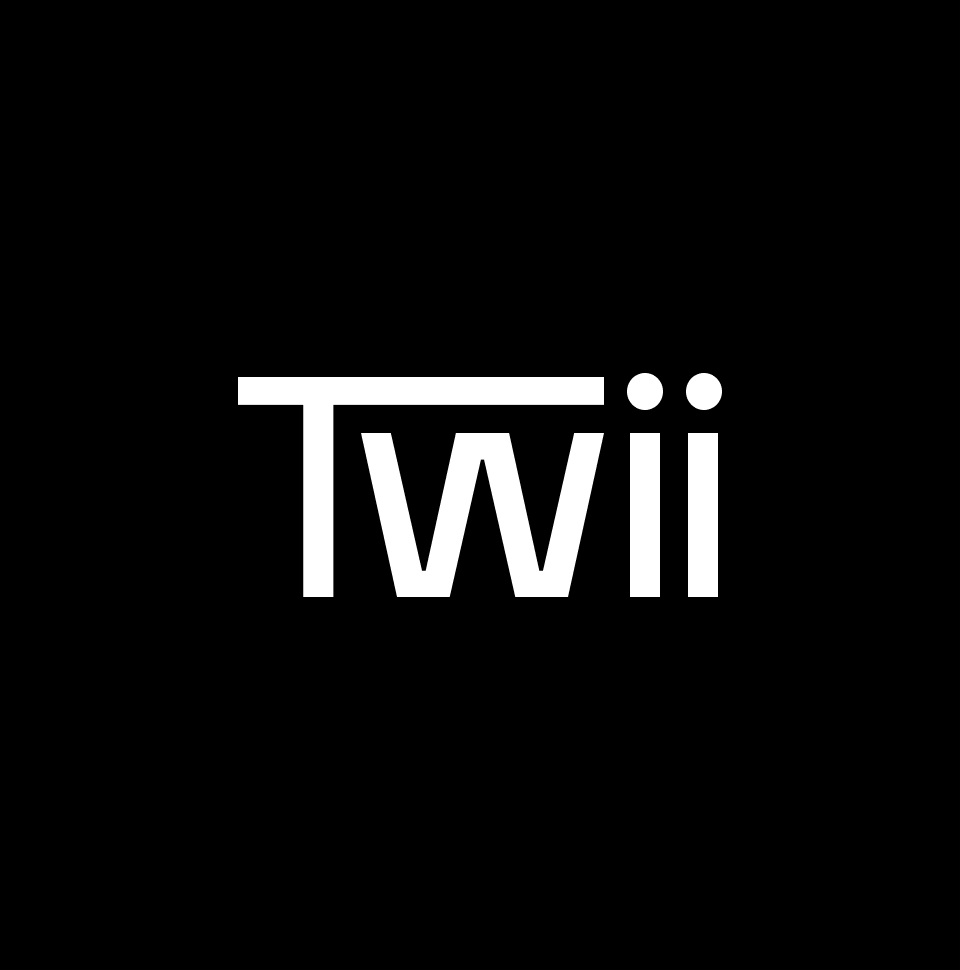
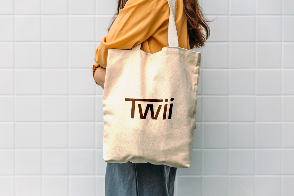
We’ve designed a new logo for Twii – which stands for The Way It Is, serving as a digital backstage pass to uncover the real wheels behind the industry. The new logo shows the capital T as a sort of stage and connector between people, while the double I signifies talents and learners as equals. Additionally, we’ve crafted some original icons that stick to the minimalist and clean approach, to boost content and the communication with it. After all, knowledge is for everybody – and that’s really The Way It Is.
