Client
FINQ
Industry
Finance | Tech
Skills
brand_strategy | visual_identity | digital_strategy | ux_design | ui_design | naming | website_design
Invest in yourself
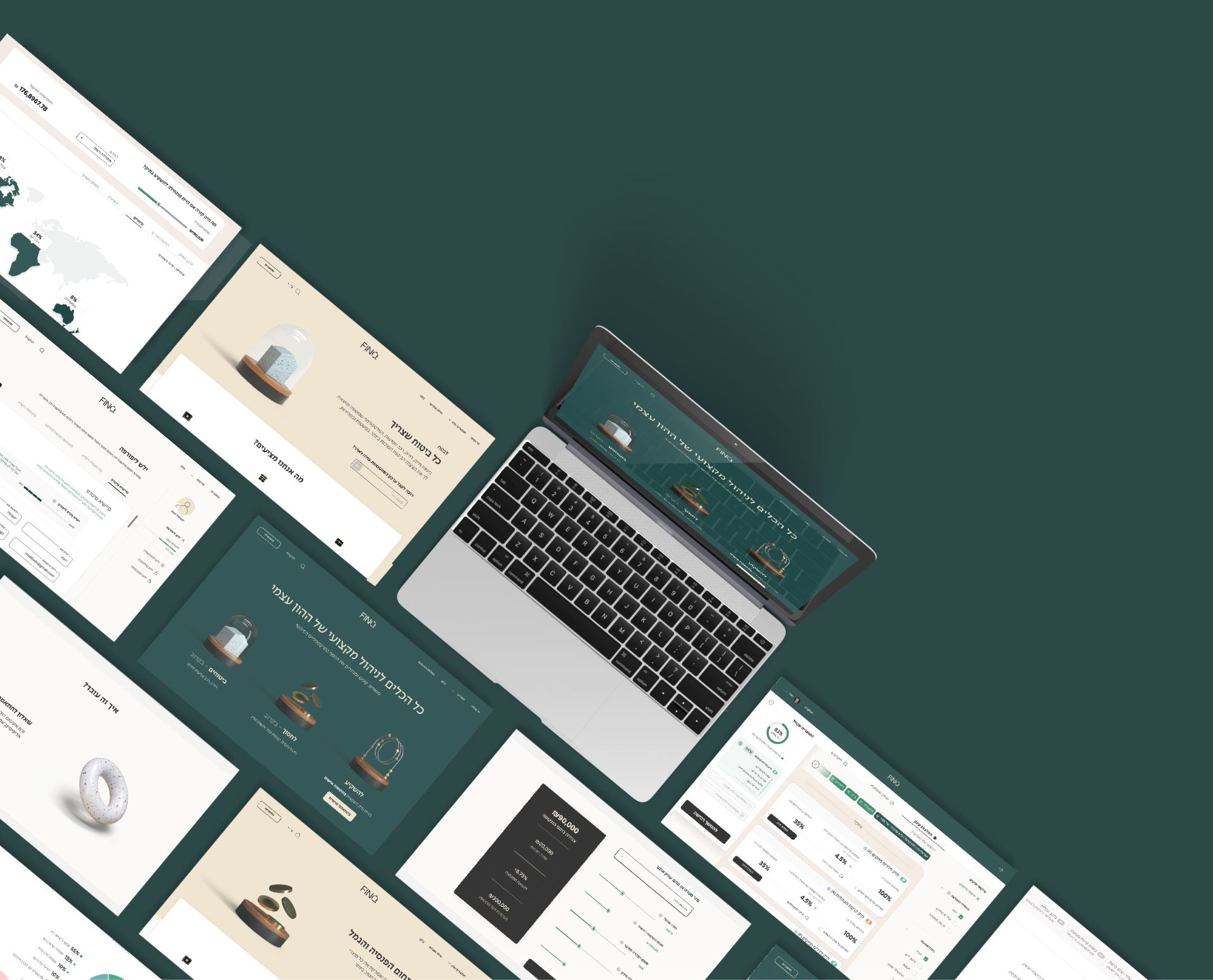
As much as self-managed investments have been increasingly skyrocketing, the know-how still isn’t common knowledge. The vast, wild field of investments includes many paths to tread in, some invite you to tread lightly, others call for sprinting. Beginners tend to run into pits, as investment roads are knowledge specific. FINQ, the first personalized and direct financial marketplace, offers users the power of investments with an educational benefit on the side. FINQ knows that more knowledge means more options, and so it gives you tools for better investments. What sets it apart is how personalized it is: FINQ finds and teaches you about your investment match. Following a separate brand strategy process and right before a big fundraising marathon, FINQ turned to us. Together, we’ve made a good investment.


What are you FINQing about?
When FINQ came back from a successful round of fundraising, we got to work. This project turned out to be far more holistic than we initially thought. We took FINQ back to brand strategy, to make sure the website has a consistent and whole brand backbone behind it – during which we changed its name from Fink to FINQ, adding a twist with the letter Q. It’s fresh, different, smart looking. It differentiates it from the actual word fink and conveys fintech IQ. The speedy brand strategy process brought about the descriptor TIME TO TURN THE TABLES: UNBIASED MONEY MANAGEMENT FOR EVERYONE, which positions FINQ as a revolutionary, transparent, personalized, and accessible fintech brand.


UXUI as a product
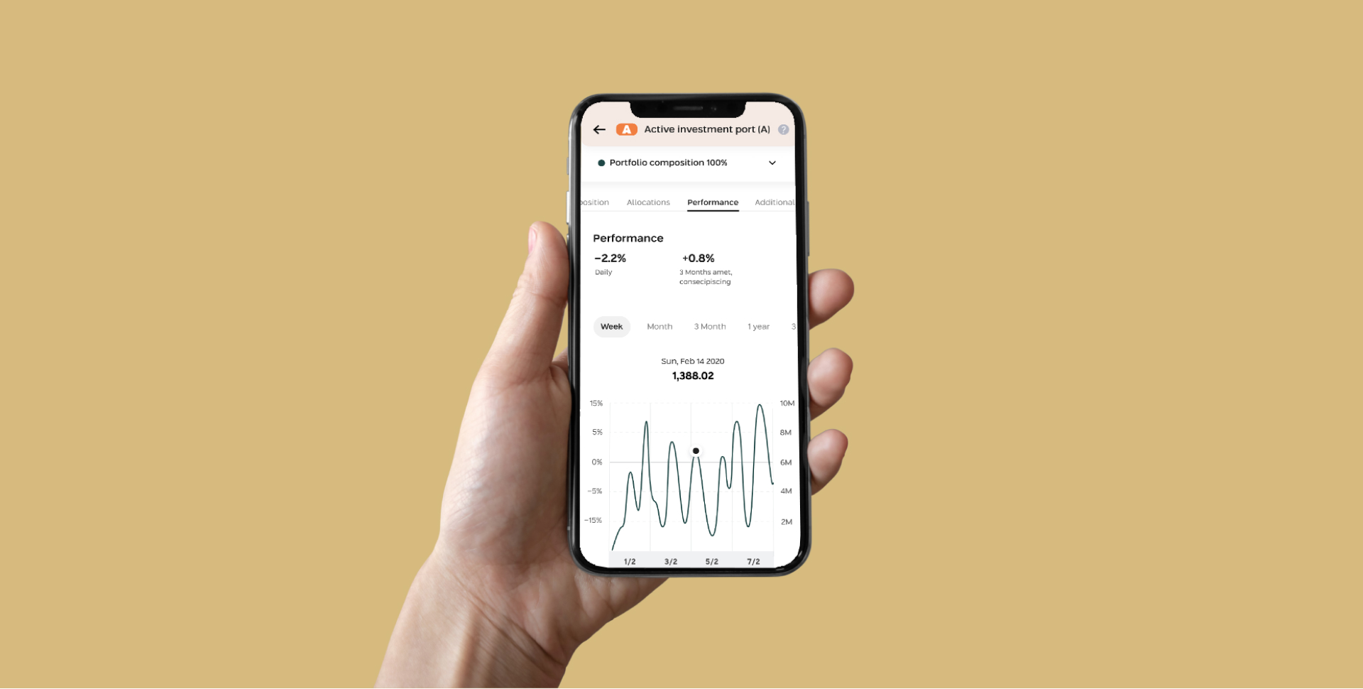
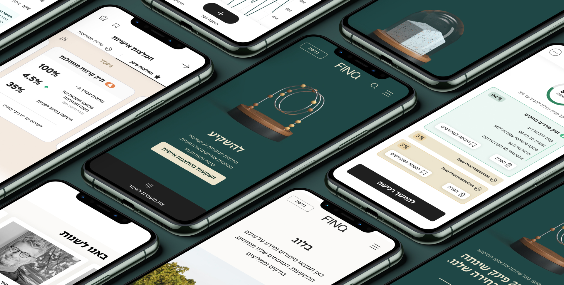
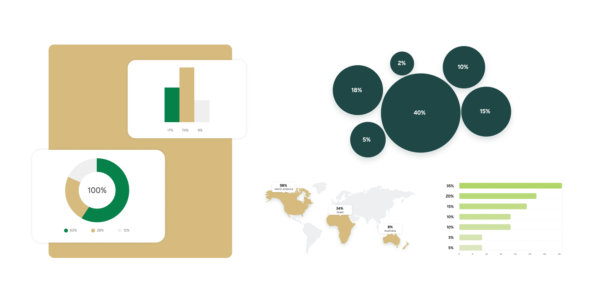
Our journey with FINQ has been unfolding for two years now, which allowed our UXUI teams an expansion of thought and experience. As opposed to the one-track webby service UXUI is usually perceived as, the FINQ project is a complex project that had us approaching commercial work as PRODUCT work. We then got on to crafting the website. Firstly, we conducted user research and personification. We met FINQ for digital strategy workshops for both company identity and needs, and product definition. The digital design, both flow and looks, leans on the very essence of FINQ: turning something complex that is perceived as challenging and exclusive, to a financial commodity through knowledge and freedom of choice and action.

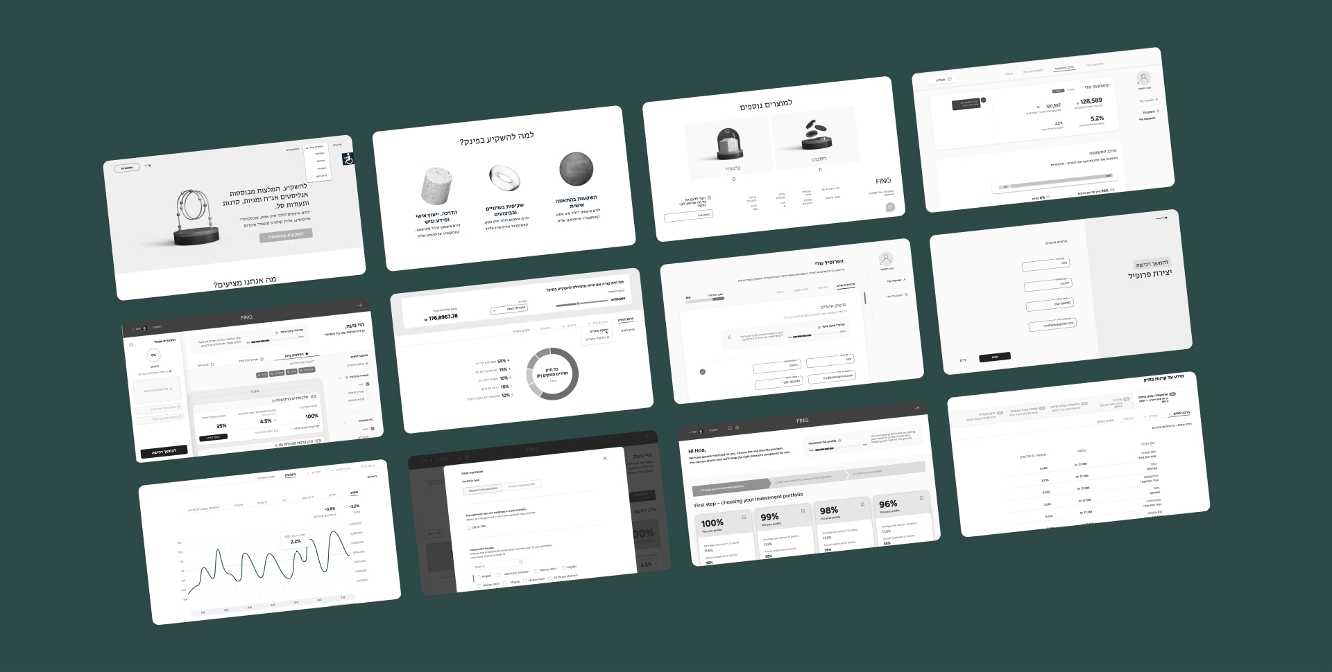
The future looks FINQ
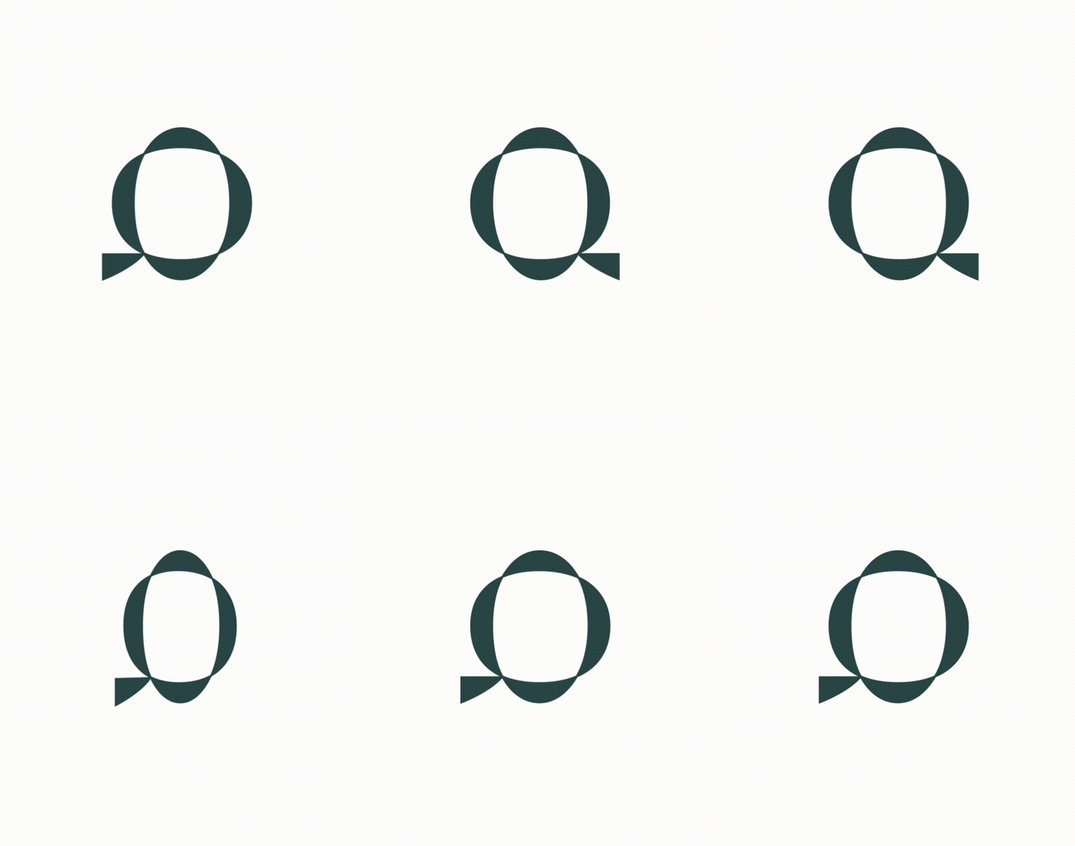
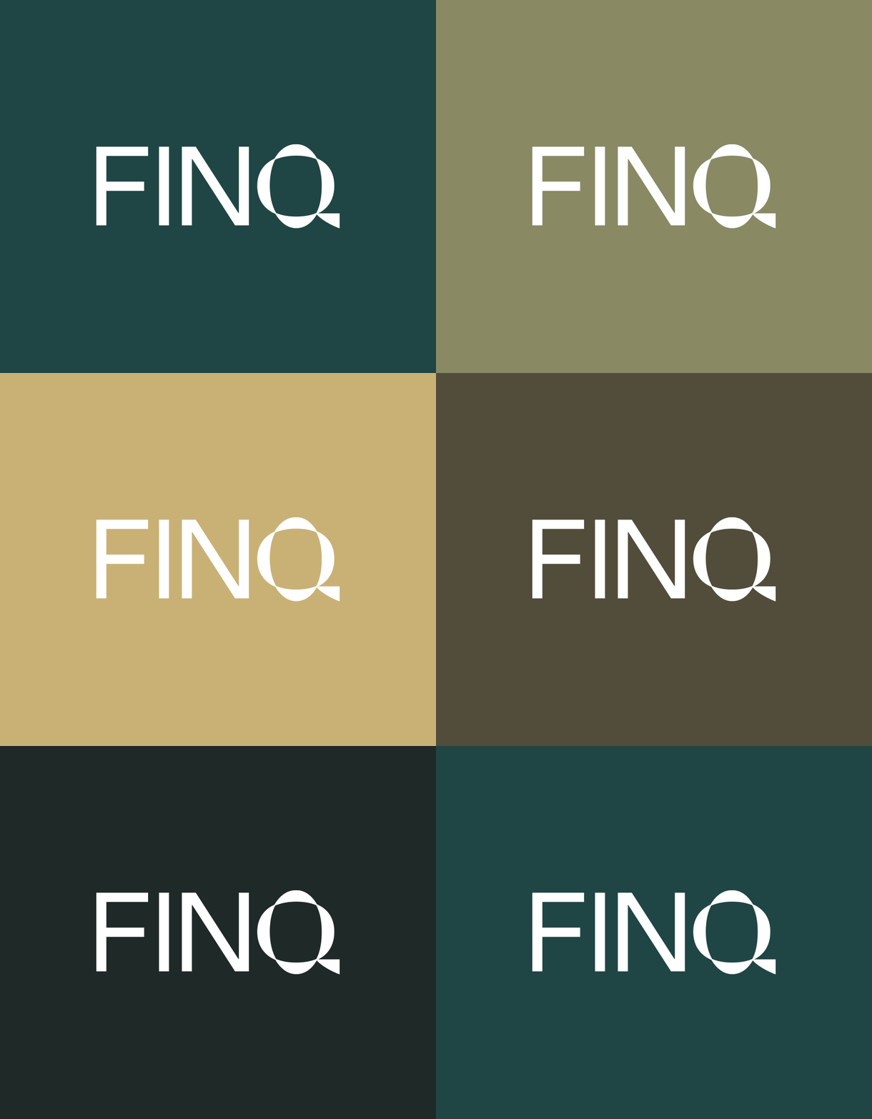
FINQ’s logo is in clean, simple caps. Its typographic structure conveys a corpo-boutique feel. The Q is crafted as the logo symbol. In this brand’s case, simplicity should be used fluently, as a language, to strengthen the bond with users and create a firm trust system. The main color we chose for FINQ is a deep shade of green – unlike shades of blue that rule the sector generally, and specifically fintech. Green conveys freshness and movement, yet this particular shade is grounded enough, unintimidating, doesn’t connect to banks and official monetary facilities. Green is also a color that’s connected to physical money, so it has a tangible, warm, tactile, and human dimension.
