Client
Klil
Industry
Industry
Skills
branding | visual_identity
Windows Down
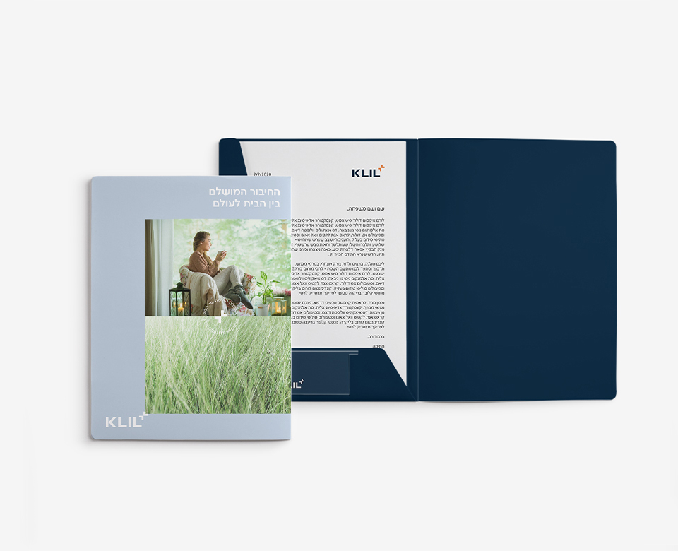
They say that daily exposure to sun and air boosts everything, from your mood and productivity to your metabolism, cognitive skills and ability to enjoy yourself. A sunny cup of coffee outside and we’re good to go for the next few hours – and if we can’t go outside for any reason, a good window is a true friend. It brings in light and life. Not to mention well designed windows that are equivalent to a piece of art that can turn any space entirely. Klil, a veteran in designing and making wonderful windows for the home or any space that needs light, air and style, had already established a firm associative connection between its products, and quality, careful planning and reliability. In our mutual process, we’ve expanded Klil’s brand definitions and created a set of tools that’ll assist them as they continue to grow.
Home Meets World
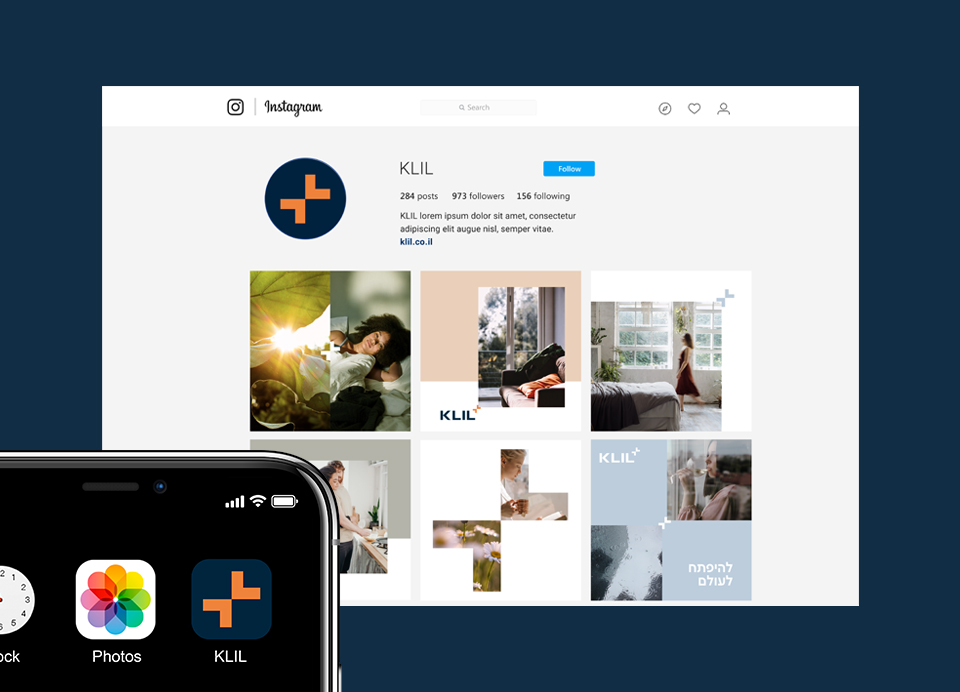
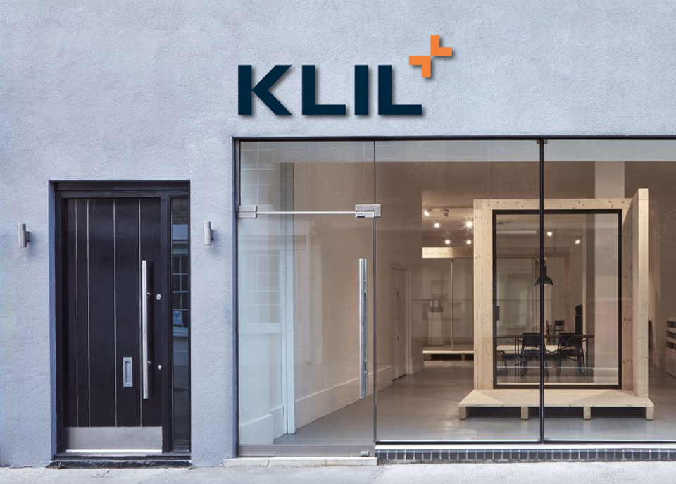
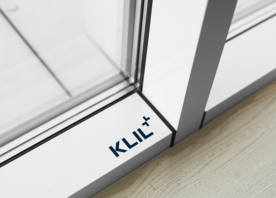
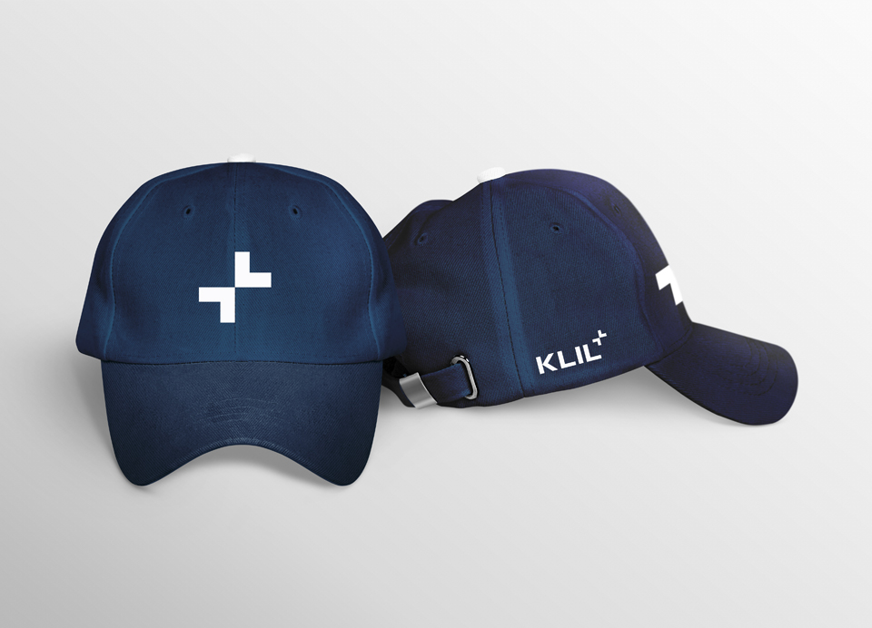
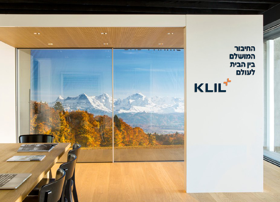
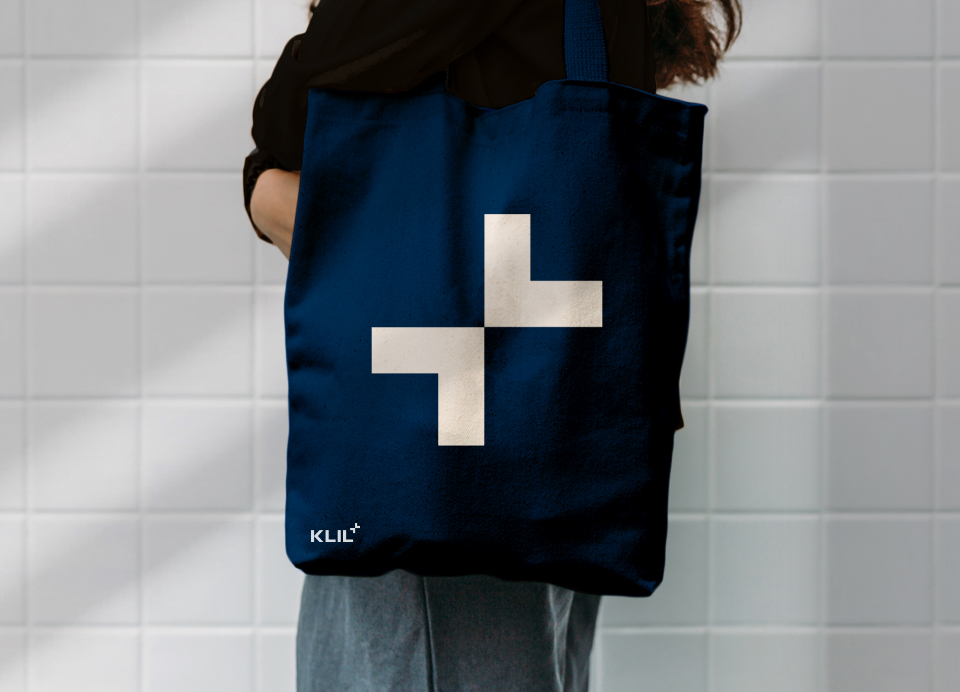
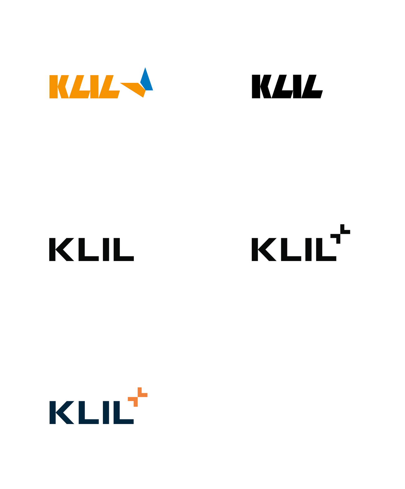
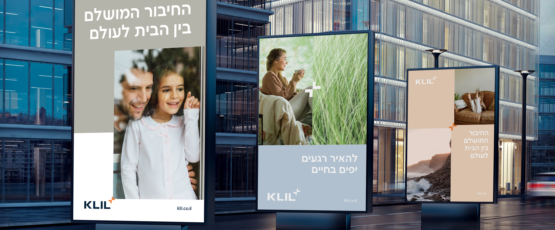
While crafting the visual language, we’ve worked with a brand strategy Klil had already done. The core idea of the brand is WELL-BEING AT HOME. This touches on physical and emotional wellness, serenity and feeling wholesome. The window is the perfect connection between home and world – which is also Klil’s positioning and a brand that makes it happen. The most important visual tool for Klil is the logo, mainly the butterfly symbol next to it. We’ve kept it on as an element that conveys freedom, air, light and nature, and shifted it slightly to resemble a plus sign. This way, we used both the original meaning and idea, and our new take that adds depth and meaning to the symbol, which now reflects a meeting point, well-being boost, upgraded lifestyle, expanding space and the emotional and aesthetic value one gets by choosing Klil. The letter L from the logo is similar to the plus sign ingredients, to create a witty and holistic identity. We’ve also demonstrated how the logo works with different brand sections – Authorized Installers, Showrooms, colabs and various products. We’ve created icons describing certain products’ attributes. And of course, as a source of inexhaustible style, the Bauhaus section got its own logo.


Outdoors Inside
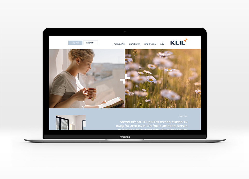
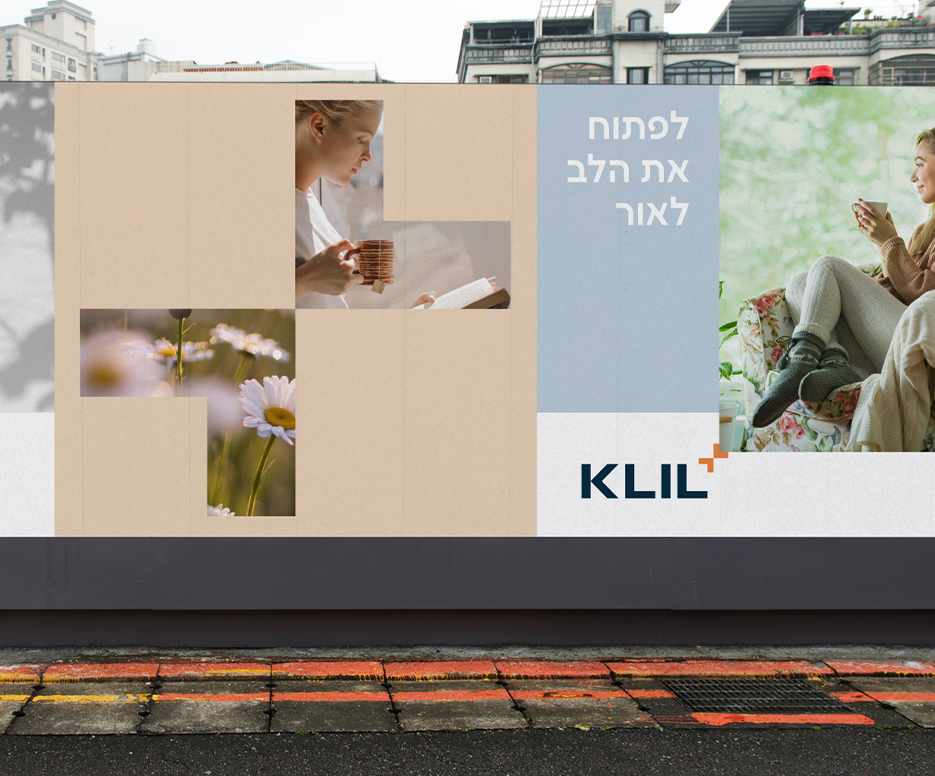
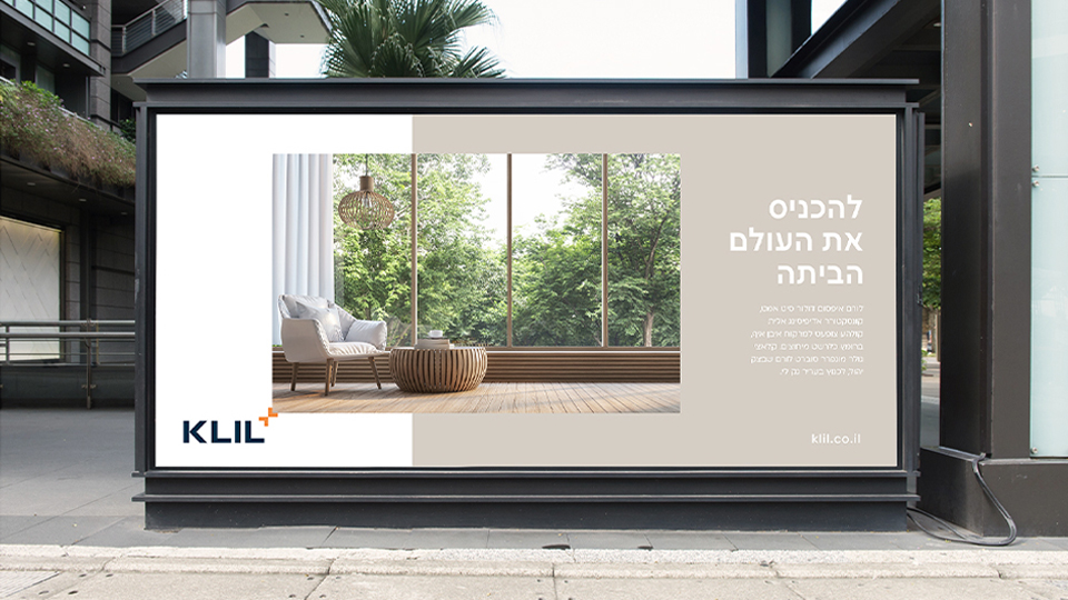
Klil’s photography language describes the meeting point between indoors and natures. We’ve used a double grid for this, so one side presents natural phenomena that moves the spectator like heat, cold, wind, sunlight – and the other side shows people and situations from indoor life, while conversing with nature. The contrast creates a complex and rich language that captures the brand accurately. Another visual tool is photographs of indoor architect and design that’s serene and relaxed, with windows showing. Using designed spaces from a personal point of view allows us to convey the visual and sensual effect in a direct and immediate way. The logo symbol ingredients – our butterfly plus – can be used as a grid to show pictures and tell a formative story: Klil windows have created the perfect connection between home and world, intimacy and lifestyle, and having them in your home will give you wings to gracefully flutter between them.
