
Industry
Retail
Skills
visual_identity | illustration
Little joys
A lot has been said about enjoying the little things in life. Funnily enough, finding joy in small subtleties makes them take a bigger place in our lives. Perhaps the way our imagination is activated when we focus our attention on details rather than skip between chunks of thrill, taps into a deeper emotional spot – one that absorbs and amplifies joys, makes them personal. Happy Lemon was built with that in mind. It’s filled with well-designed items that spark a sense of adventure, surprise and happiness, and is made to add magic to everyday life. Together we created a new identity for the store, that really squeezes out and serves the freshness it has to offer.
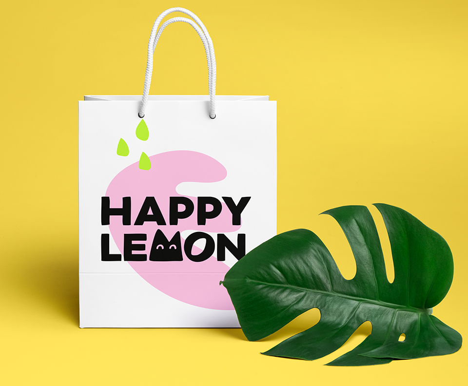
When life gives you lemons
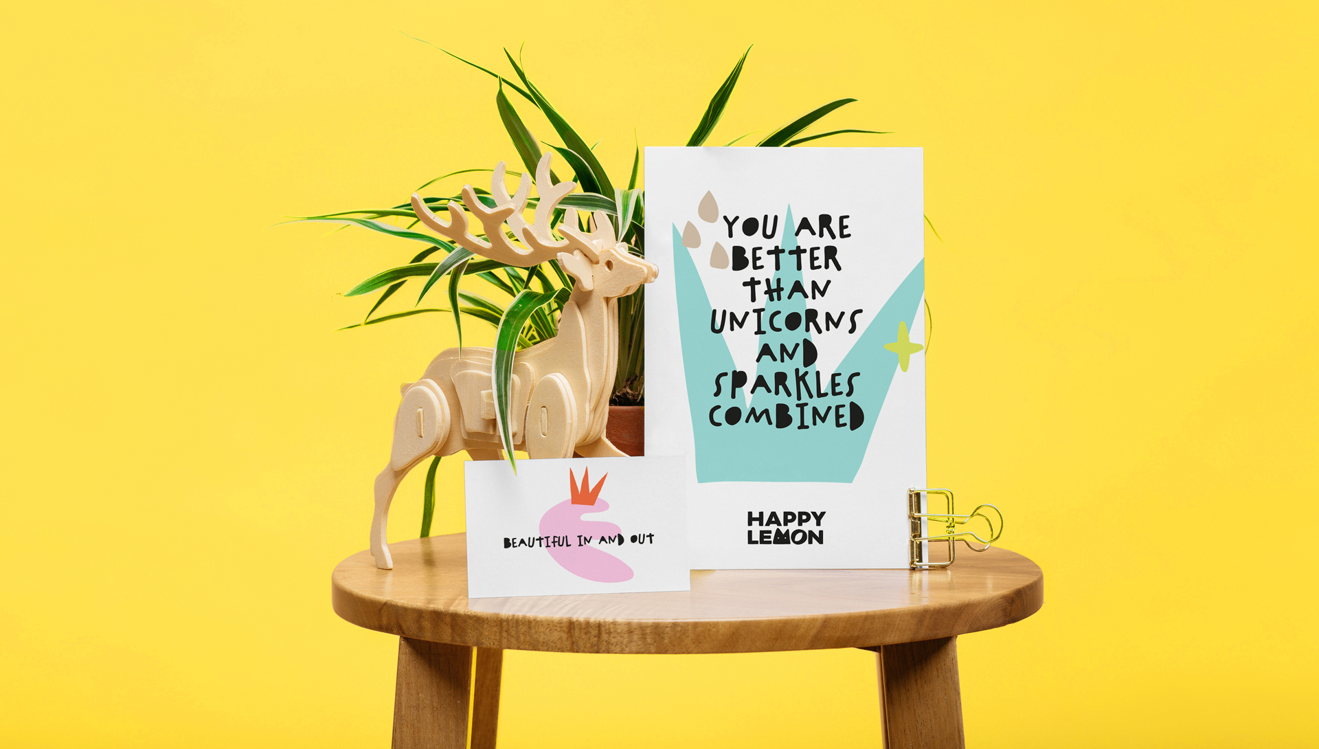
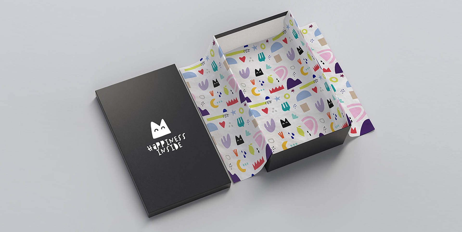
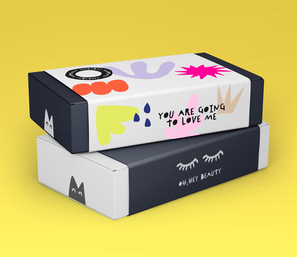
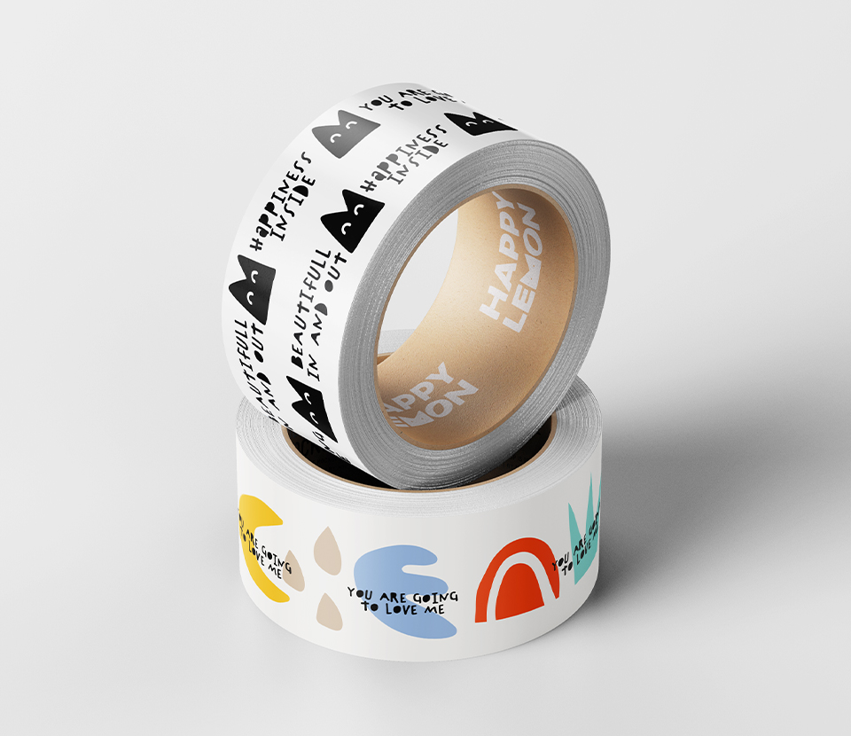
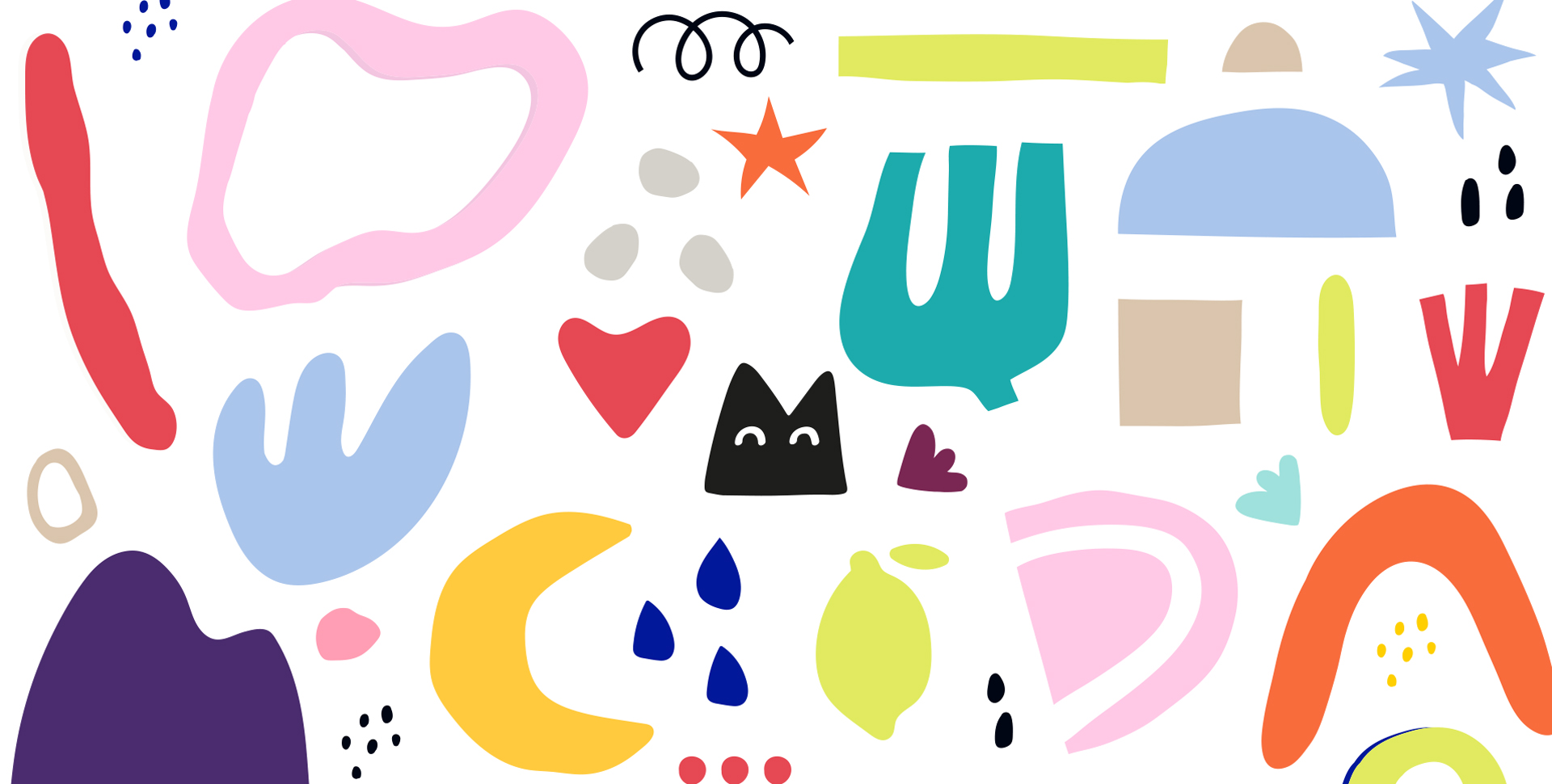
Your Happy Lemon experience is set to begin even before entering – just passing by its window evokes everyday happiness, which is the backbone of the brand’s strategy. We named it Happy Lemon, aiming at a name that communicates immediate satisfaction, curiosity and flavor. The visual identity we’ve created, captures the brand’s playfulness that adds zest to every moment. Black and white tones give it a sophisticated look, balanced by soft, quirky shapes and a wide, vivid secondary color palette. We’ve kept in mind the Happy Lemon philosophy: small joys are for everyone. While the items in the store are of great quality, the prices are fair and inviting.
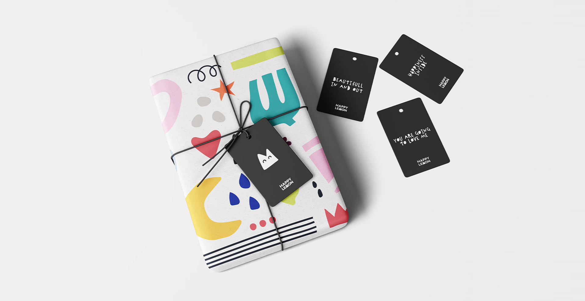
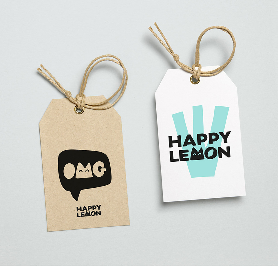
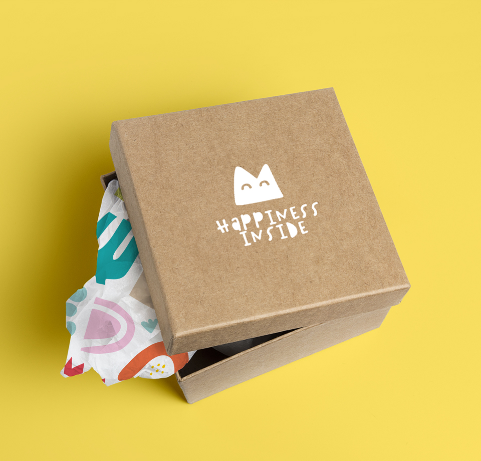
The juicy letters
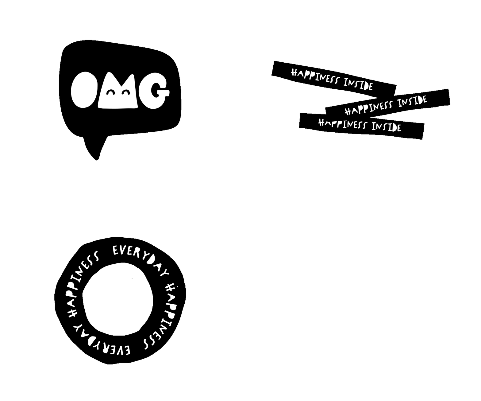
We’ve crafted a new logo for Happy Lemon. It is bolded, the letter M is smartly interchangeable and mostly appears as a character that can represent the brand. This keeps the logo simple and highly recognizable without compromising refinement. There are two sets of fonts in use: one to accompany the illustrations and elements that speaks a fun and free language, and one for more informative texts. The messages of happy lemon are always positive, inspirational and full of happiness – and are here to remind us it’s the little things that make life bigger and better.
