Industry
Professional Services | Retail
Skills
brand_strategy | visual_identity | brand_book
Shoppers' paradise
The ultimate image of shopping is that of a candy store: costumers enter, all bright-eyed, and are swept off their feet by the variety and choices. It’s a romantic concept that shrewdly encourages us to buy way more than we need or what we had planned – but mass and discovery were always part of the experience. In recent years, two main factors took over shopping experiences: accuracy and time. As online shopping gained popularity and became a necessity, not just for clothing but for your everyday grocery haul – these factors became the main drivers. Avo, an online supermarket, recognized an opportunity.



A surprising routine
Even before Covid hit and we all spent a year tucked in our homes, online markets offered a faster shopping experience, redefining convenience stores. As the physical aspect of it grew smaller, research found nowadays’ shoppers are happier when they’re able to be mindful about the little, tangible, and attainable things. This is what sets Avo apart: it allows us to pick, choose and buy exactly and accurately what we need, without any fees, minimum or hassle. We knew it was crucial to emphasize this in their brand strategy, so firstly we’ve positioned Avo as WHAT YOU NEED – EVERYDAY. It’s all about the daily.
A little yay everyday
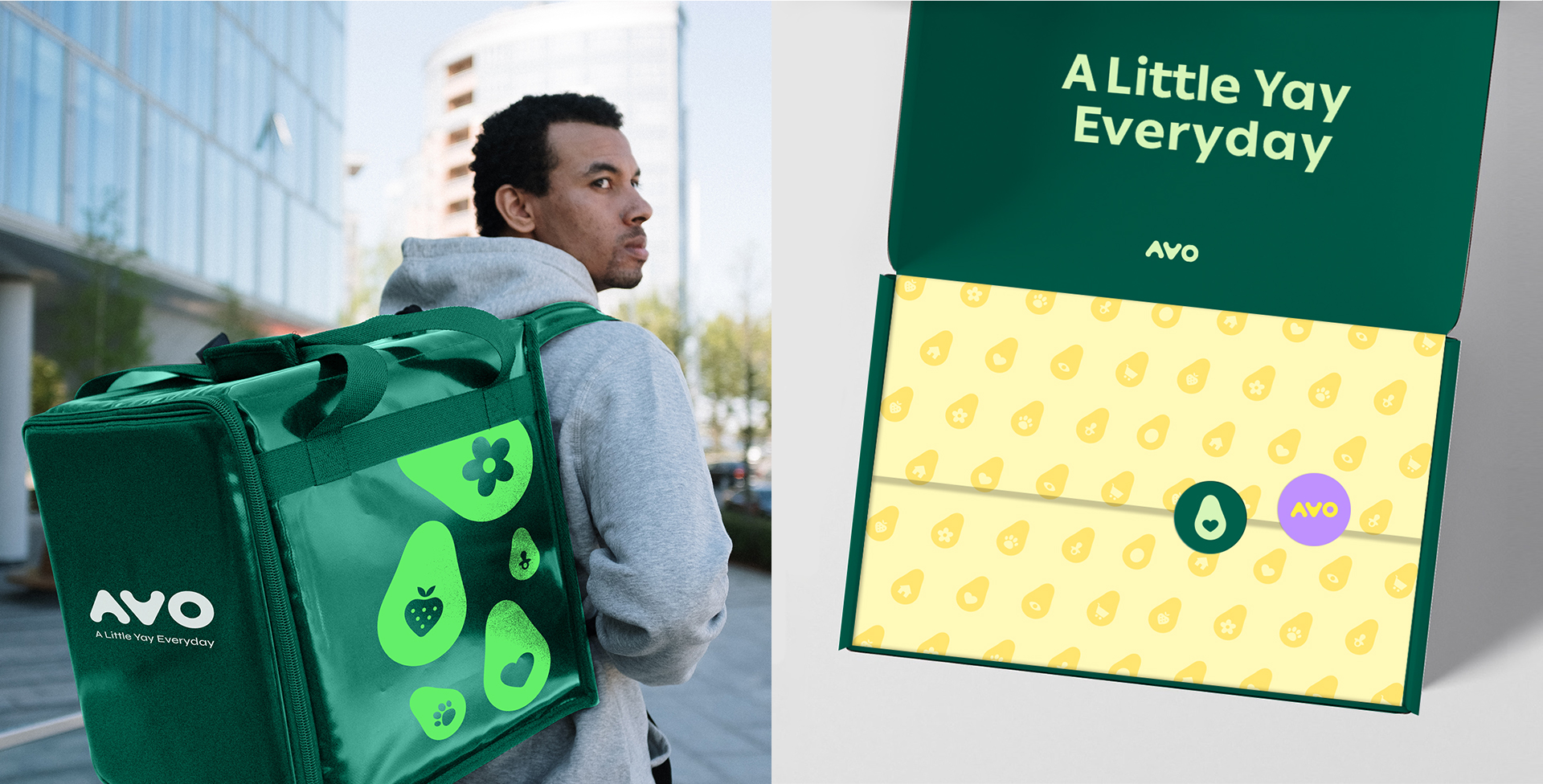
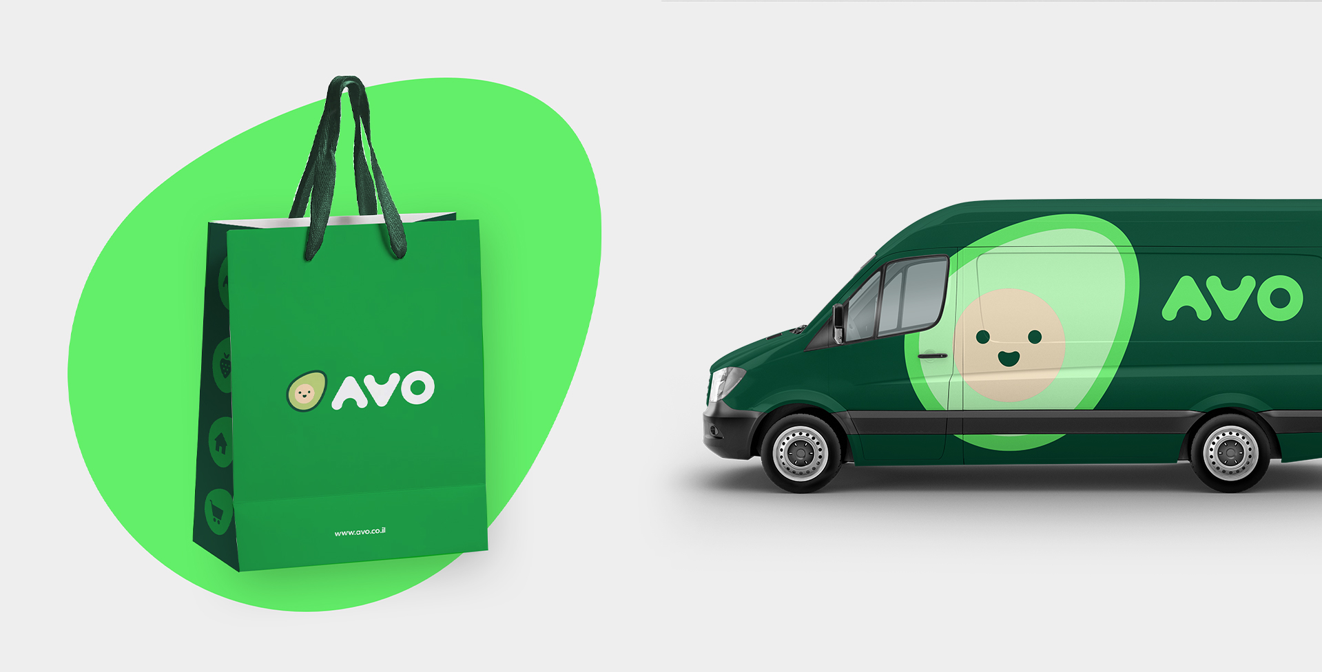
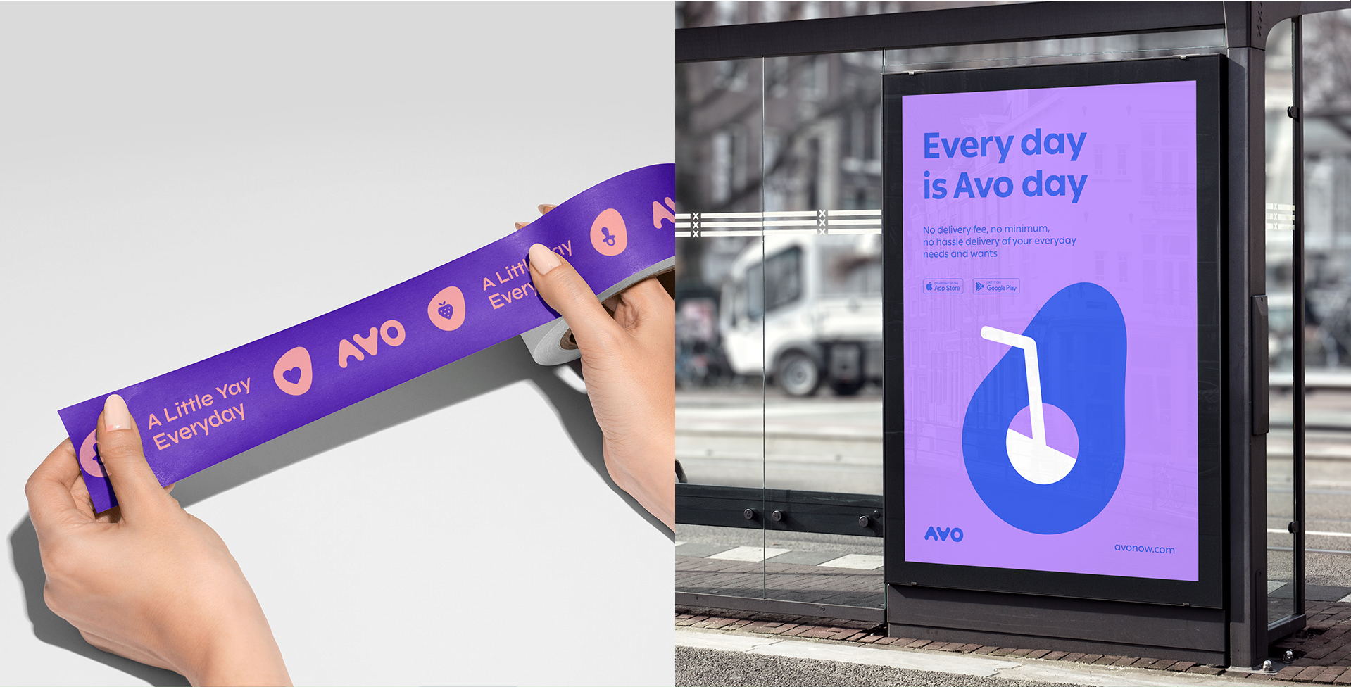
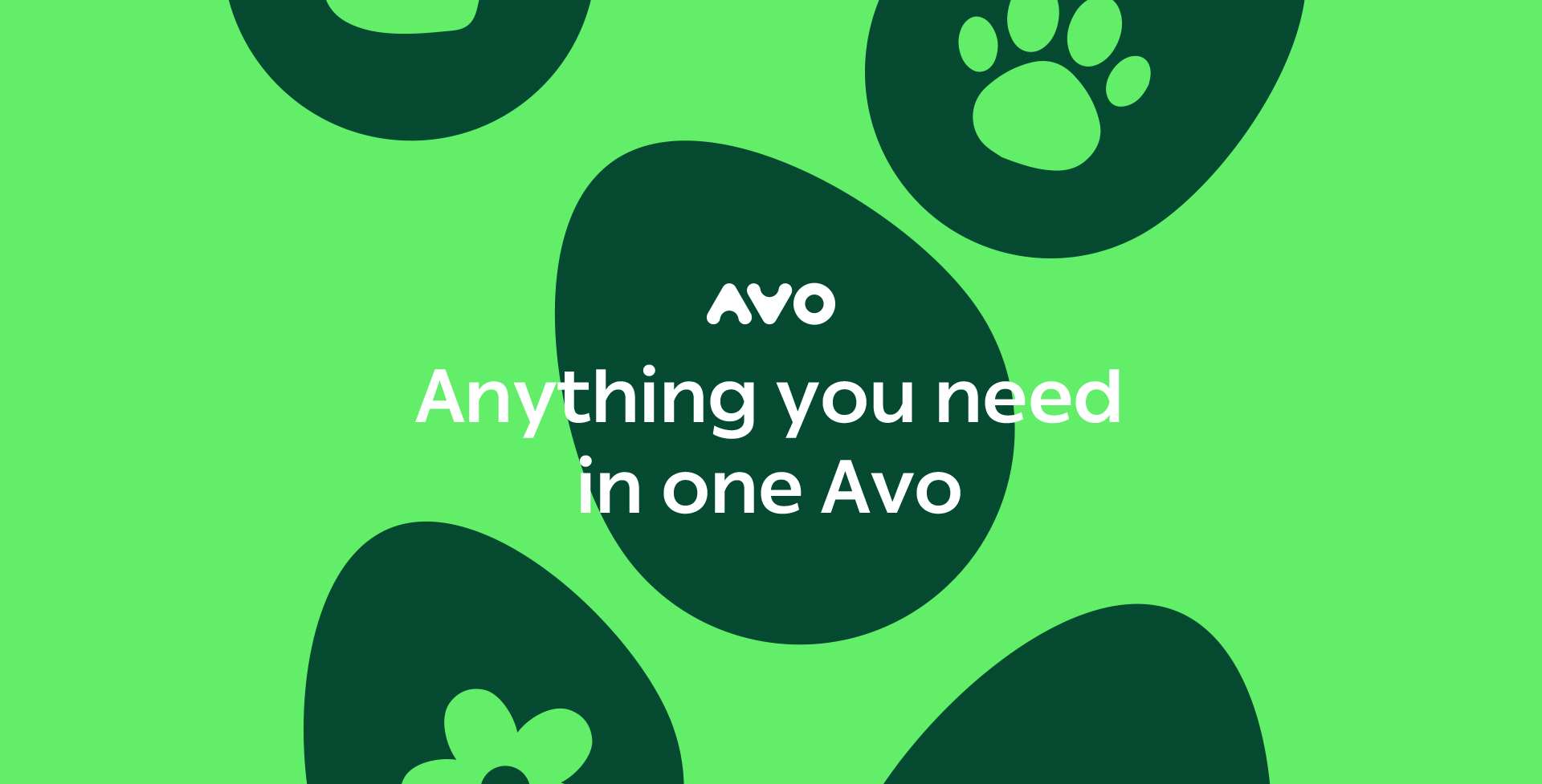
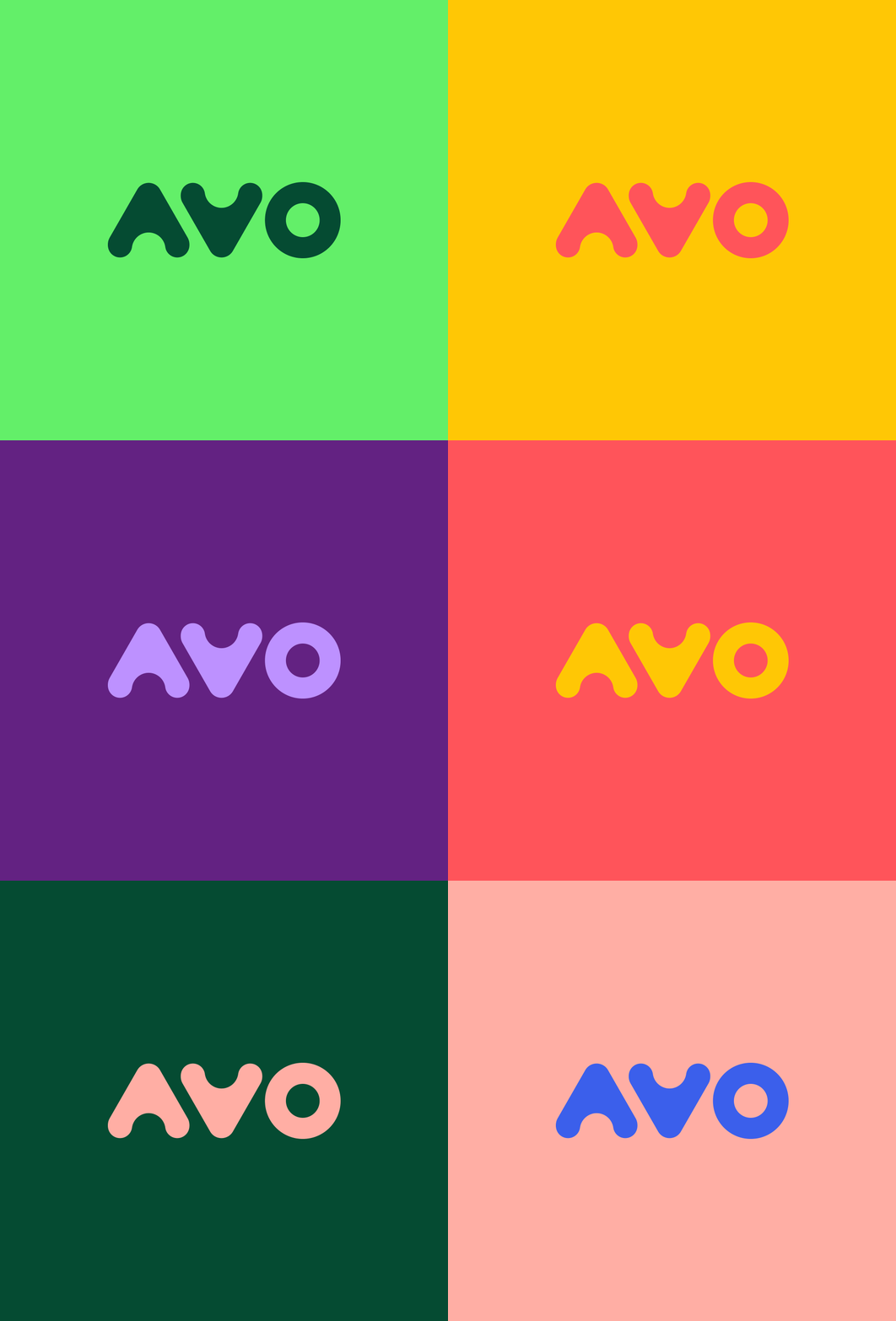
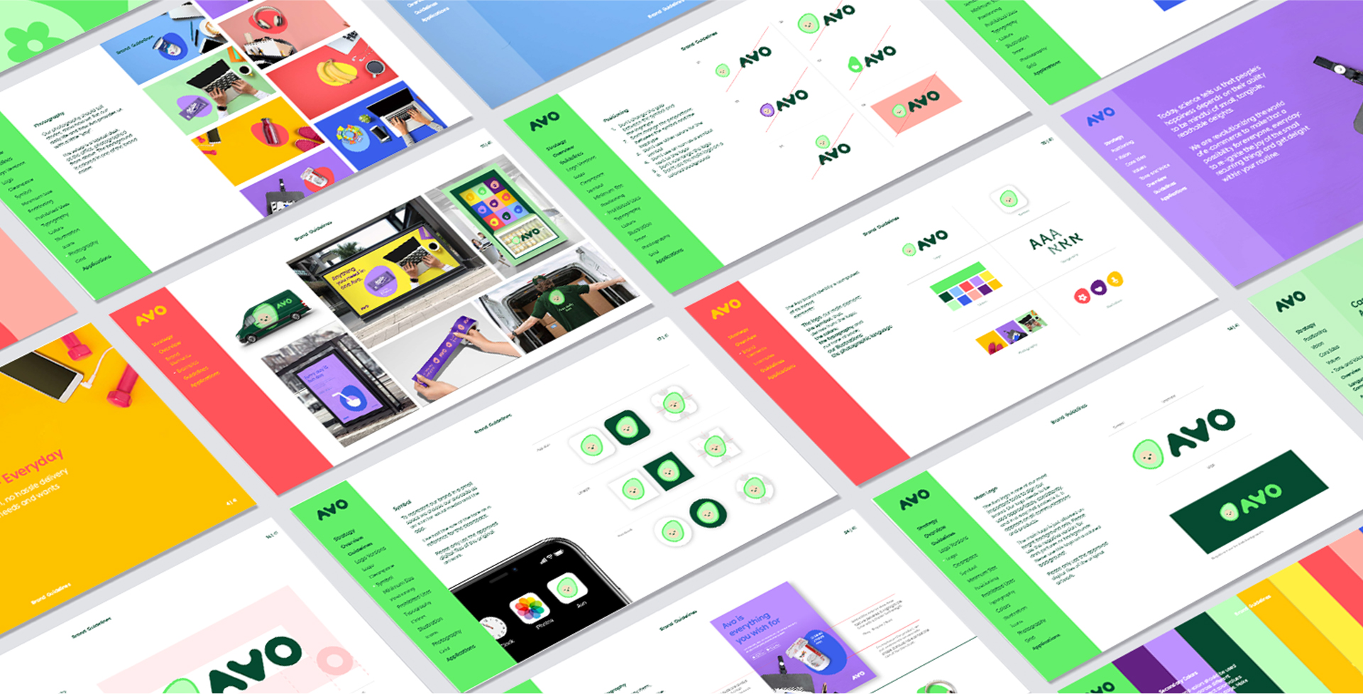
Avo’s core (lol) idea is EVERYDAY DELIGHT, promoting joy, convenience, satisfaction and routine presence. When we went on to design Avo’s visual language, we chose bright colors, primarily bright green, and soft shapes referring to an avocado – its pit shape-shifts to reflect that one little thing we need.
This is a different and subtle way to maintain a sense of shopping freedom and options, while still conveying control and accuracy. Avo’s boxes are in deep green, its inner surfaces are offer positive messages. From a centralized and unexpected experience to a surprising, satisfying and controlled routine, online shopping is a reflection of a deep social and commercial shift – and Avo brightly taps into it, connecting shoppers with a little yay everyday.
