Client
Be
Industry
Fashion | Retail
Skills
Brand Strategy | Visual Identity | Packaging Design | Photoshoot
A Retailer Reborn
How do you step out of the shadow of a big sibling you always looked up to? For decades, NewPharm operated as the “me too” pharmacy retail chain in Israel — always trying to imitate the look and appeal of the category leader. So when Israel’s top supermarket chain acquired NewPharm, the new owner decided it was time for the pharmacy chain to reinvent itself with a new, completely independent identity.

Brave New World
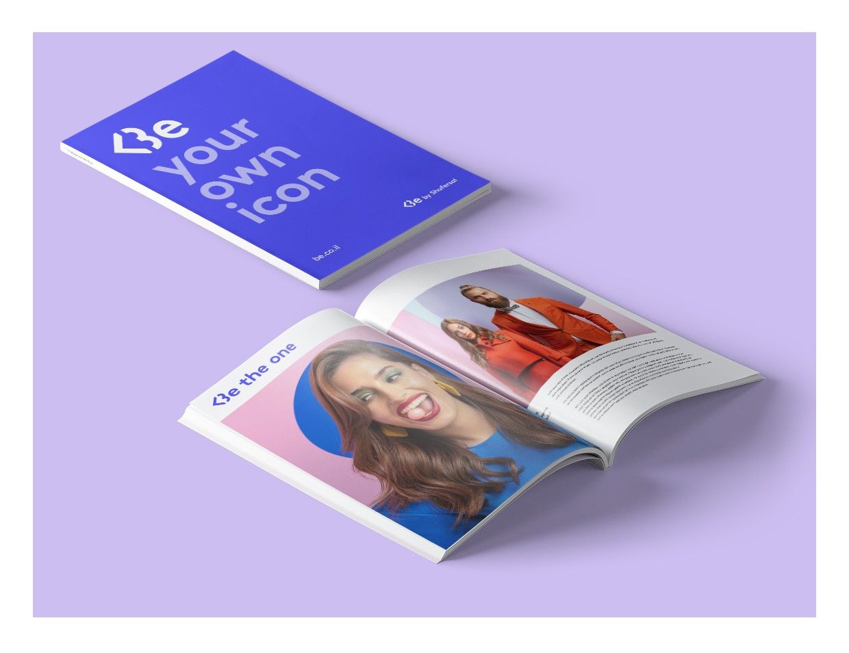
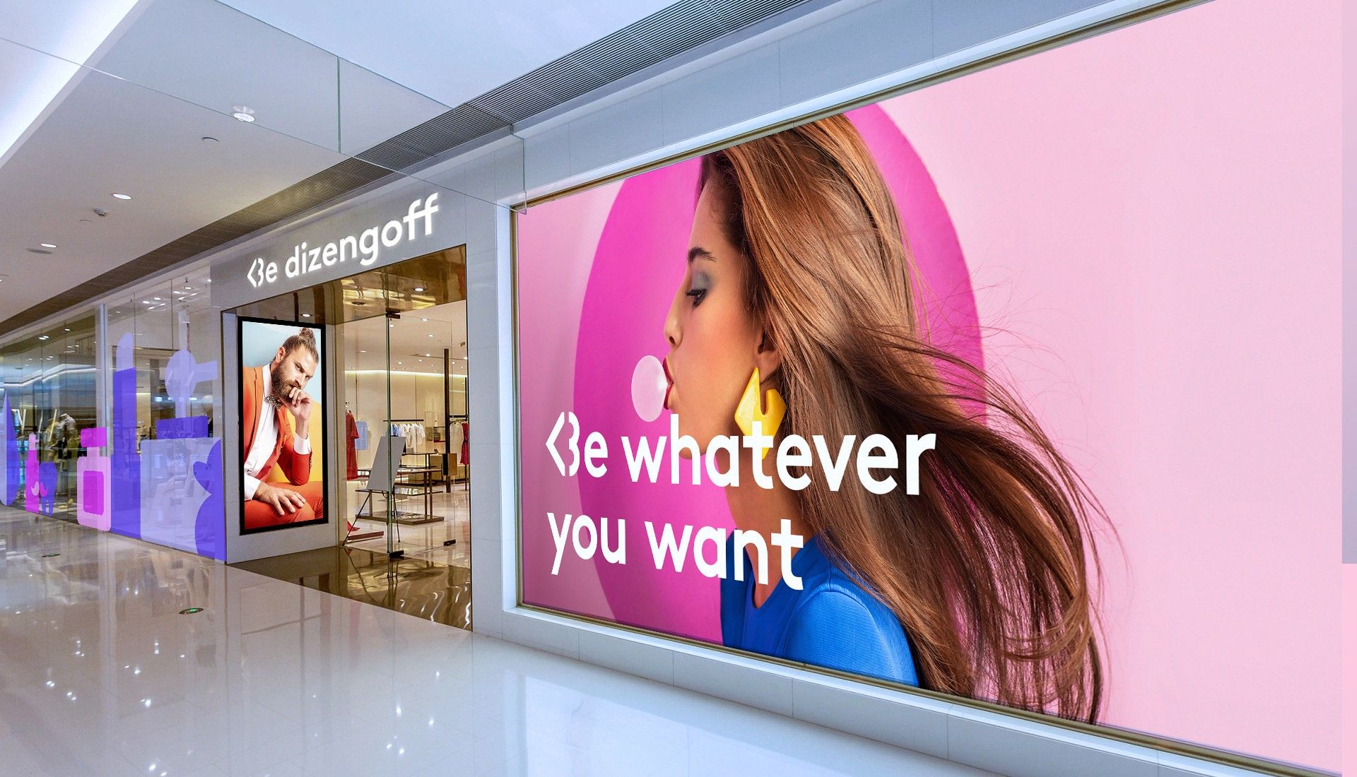
Our research indicated that Israeli pharmacy chains were perceived by consumers as practical, but outdated and lacking in appeal. The reincarnation — renamed as “Be” — represents a new retail phenomenon. The mission of Be is to challenge the front runner, offer a new interpretation of pharmacy chains, and reshuffle the deck. It’s a young and relevant alternative to the big player in the industry. Be was crafted from the start as a chain that appeals to the consumers in the new world of retail. The digital universe plays a prominent part in the customer experience. Be stores offer a new kind of customer experience, digital interfaces, and unique products.

Fast Pharm
In a world where technology is constantly accelerating, brands that want to stay relevant need to adjust to changing realities and move quickly. “Fast Fashion” refers to fashion companies that quickly translate contemporary trends to fashion items at accessible prices and introduce new collections at a high frequency.
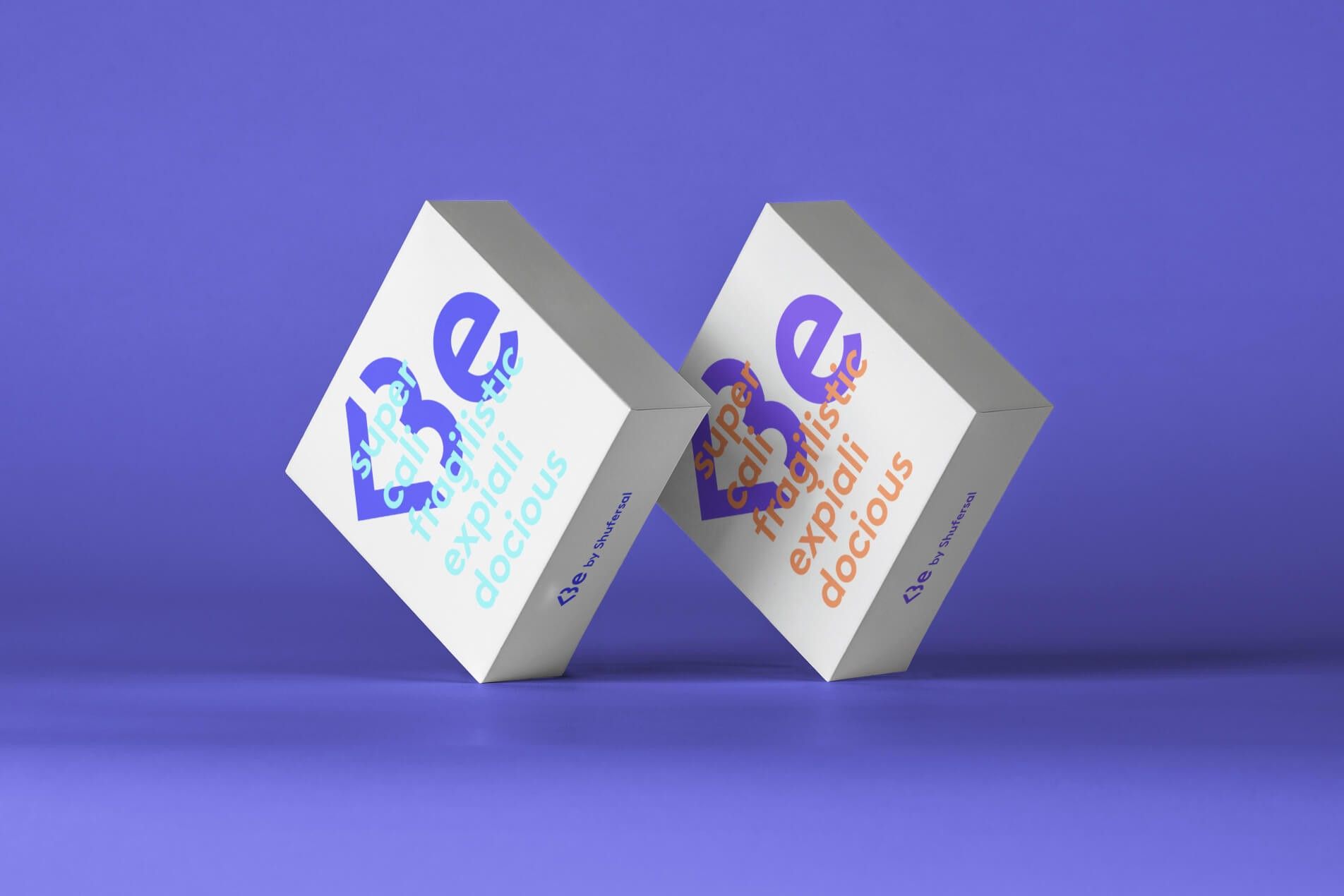



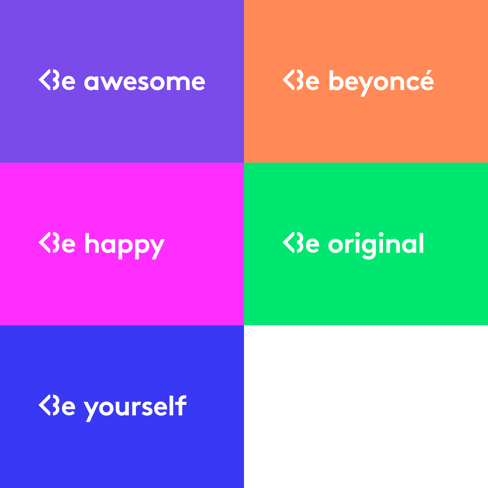
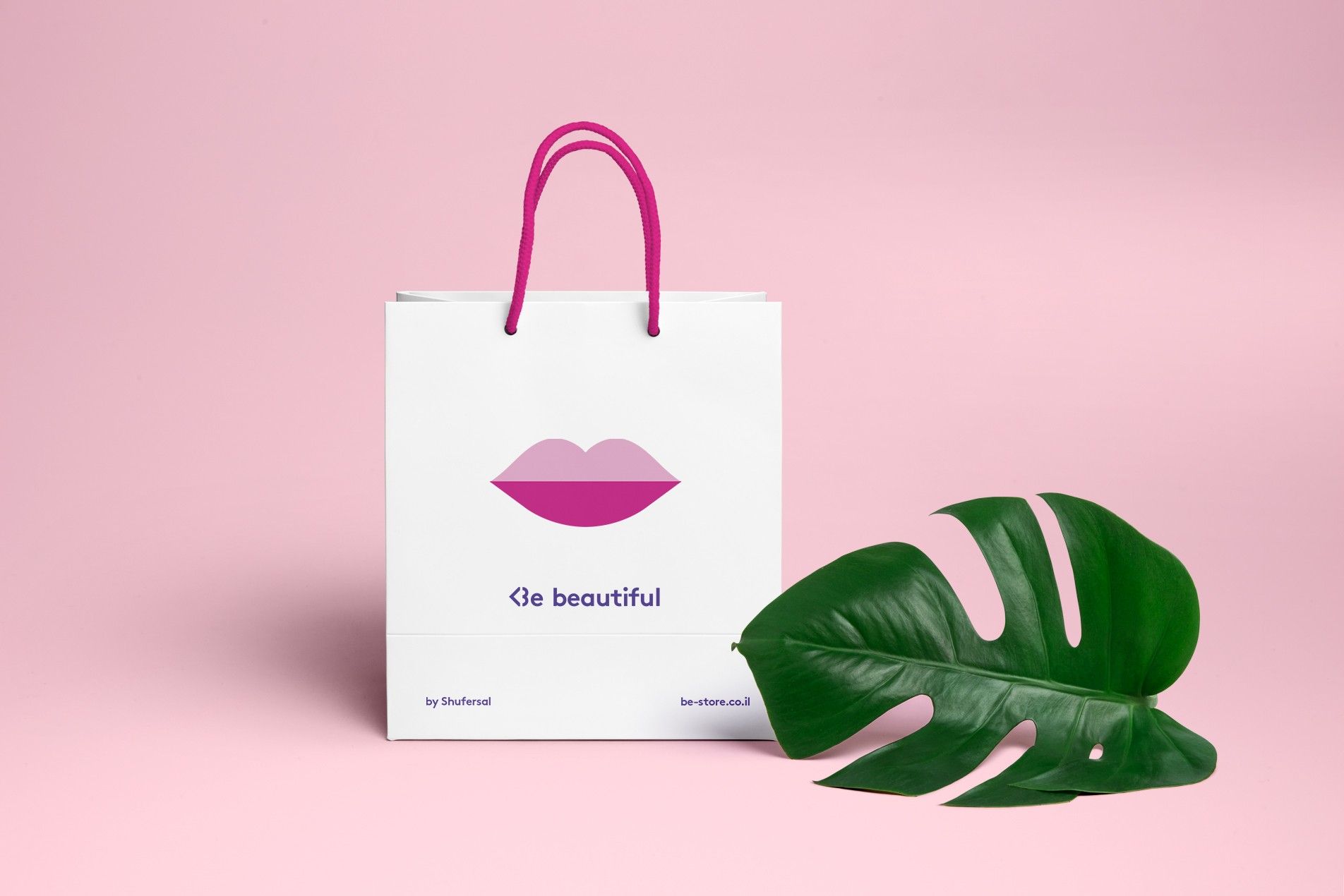
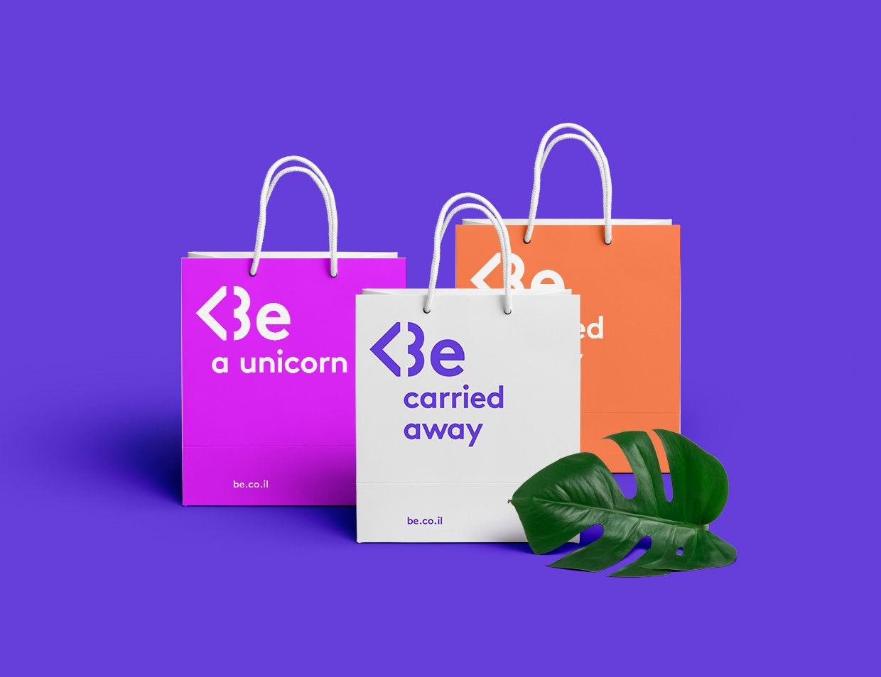
Inspired by that trend, we framed the brand essence for Be as “Fast Pharm,” a chain that’s updated, fluent in the latest trends, and always looking to offering the next thing in the world of beauty and health.


At the Speed of the Emoticon
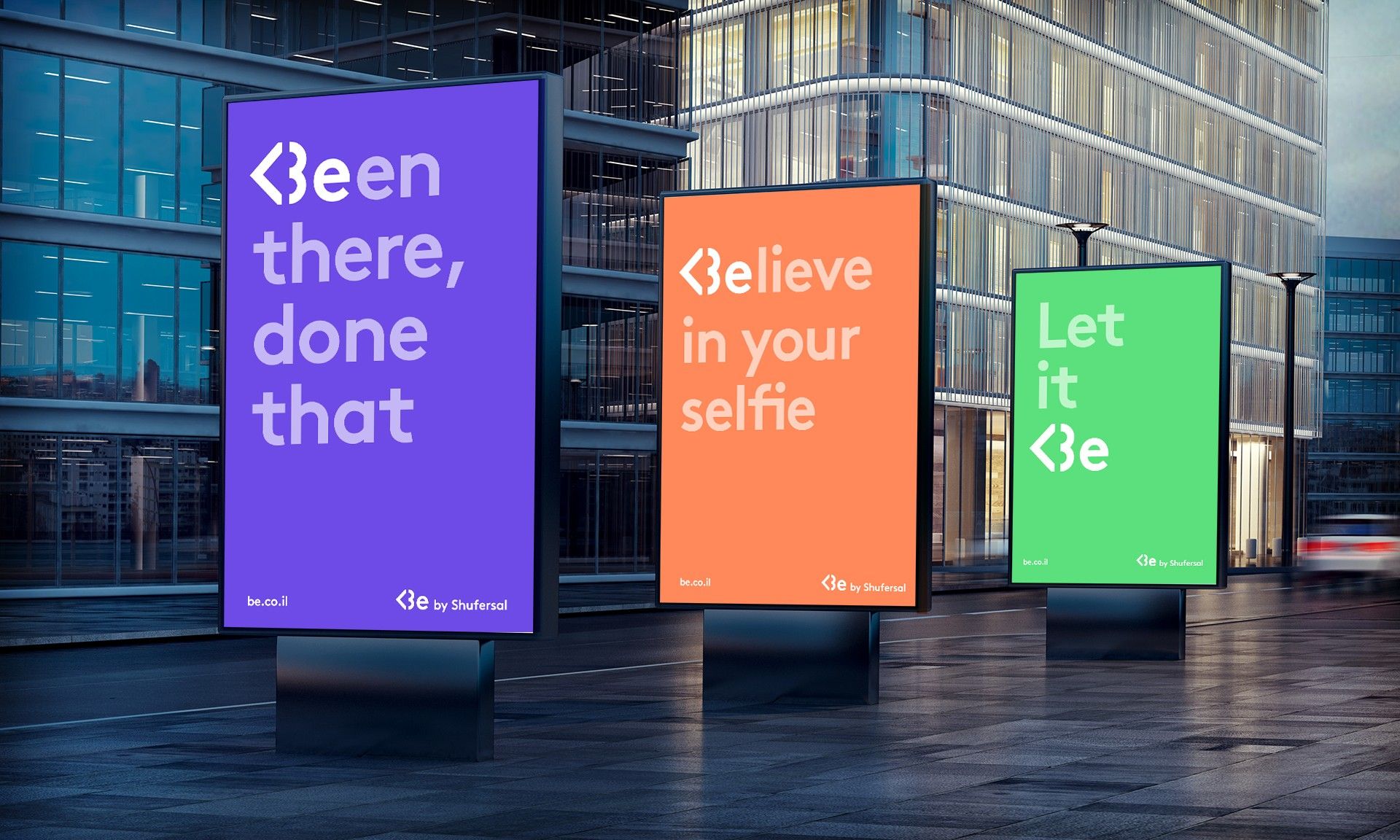
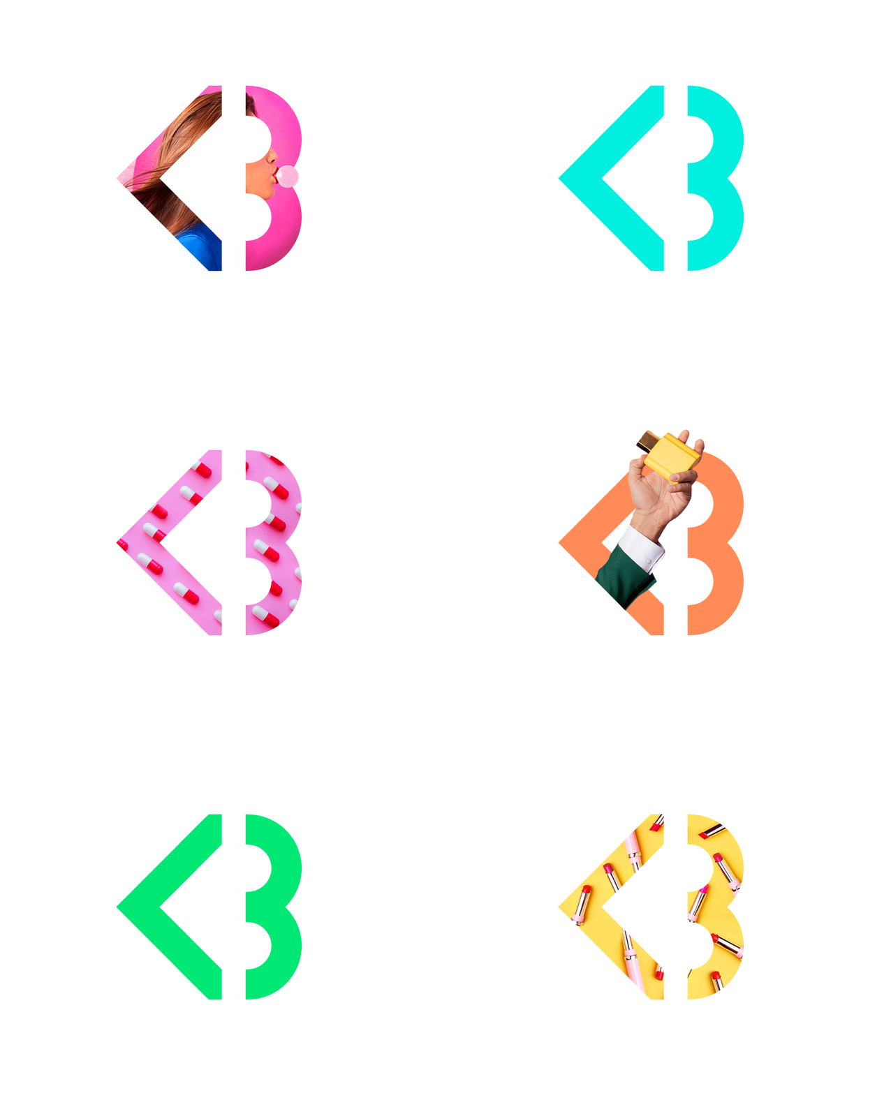
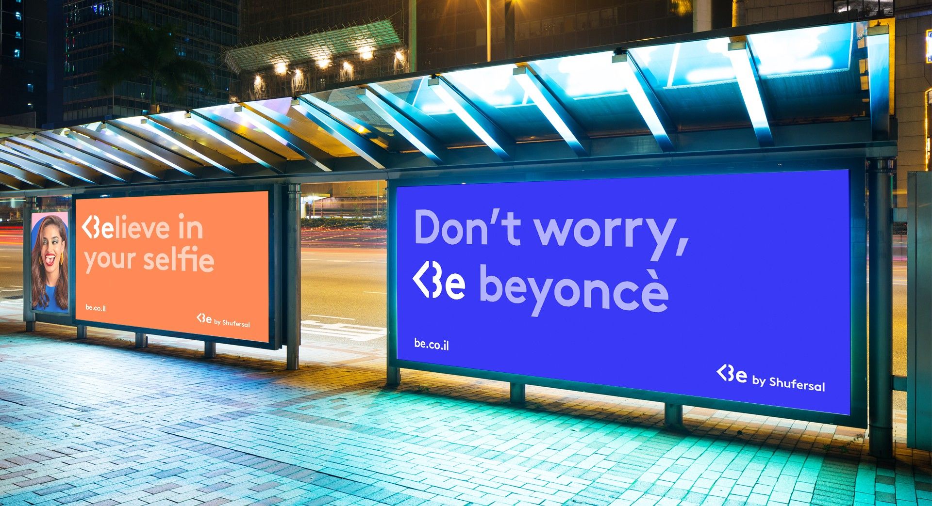
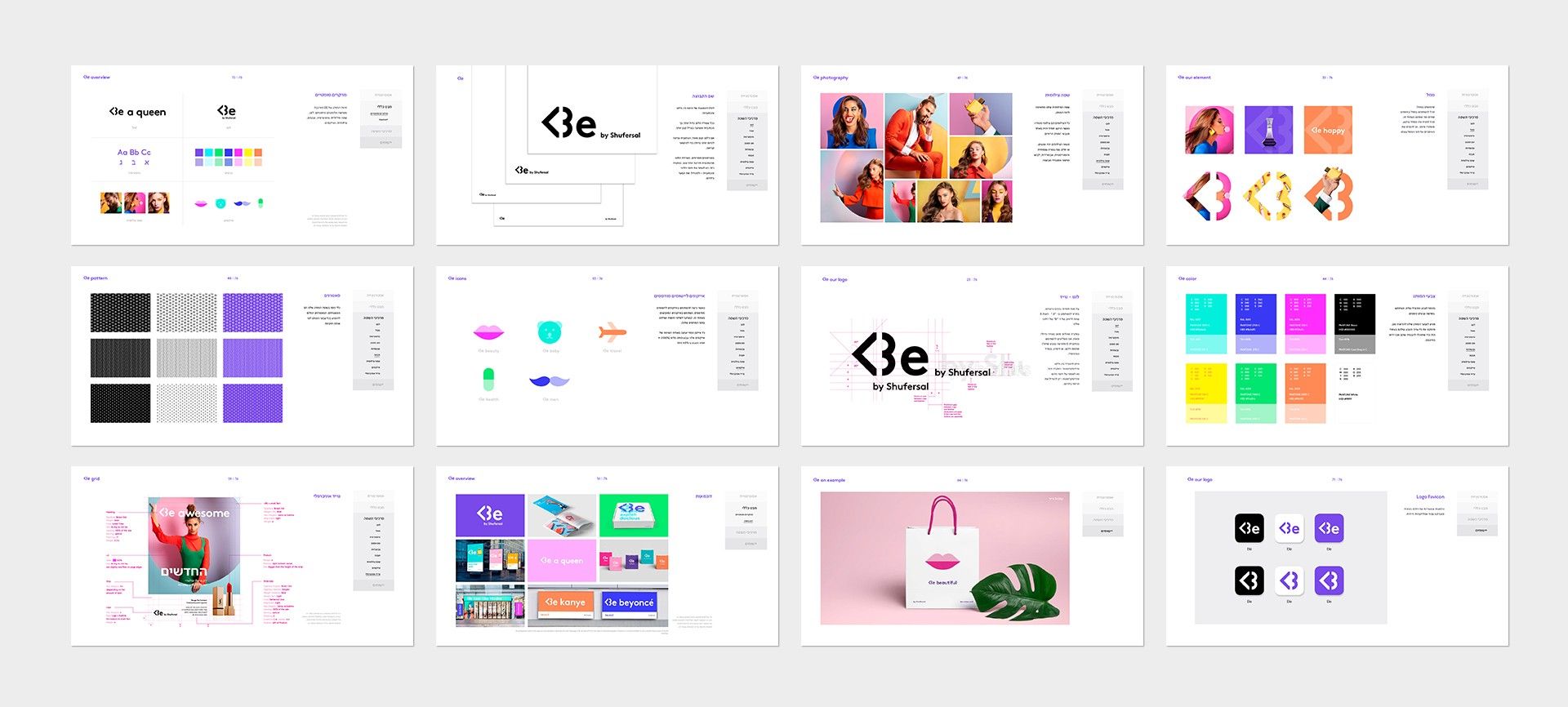
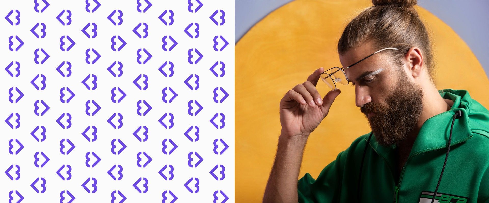
The Be logo translates that brand essence with an emoticon. In the texting shorthand of the digital generation, coming the “<” sign and a “3” creates a heart. It also forms the letter “B” in <3e. Purple, the Be brand color, is a departure from the standard red and blue favored by most pharmacies. It injects a vibrancy, and constantly alternates with other bold colors to express the concept of Fast Pharm. Like the color scheme, the Be brand photography conveys an urban, poppy, and super-updated sensitivity. It’s a fitting visual language for a challenger retail chain that’s stepping out into a new world.
