
Client
Kan
Industry
Media
Skills
visual_identity | brand_architecture | brand_strategy | copywriting | digital_strategy | environmental_design
A New Take on Public Broadcasting
Israel completely reformed
its public broadcaster,
so we completely reformed
what a public communications
brand is.
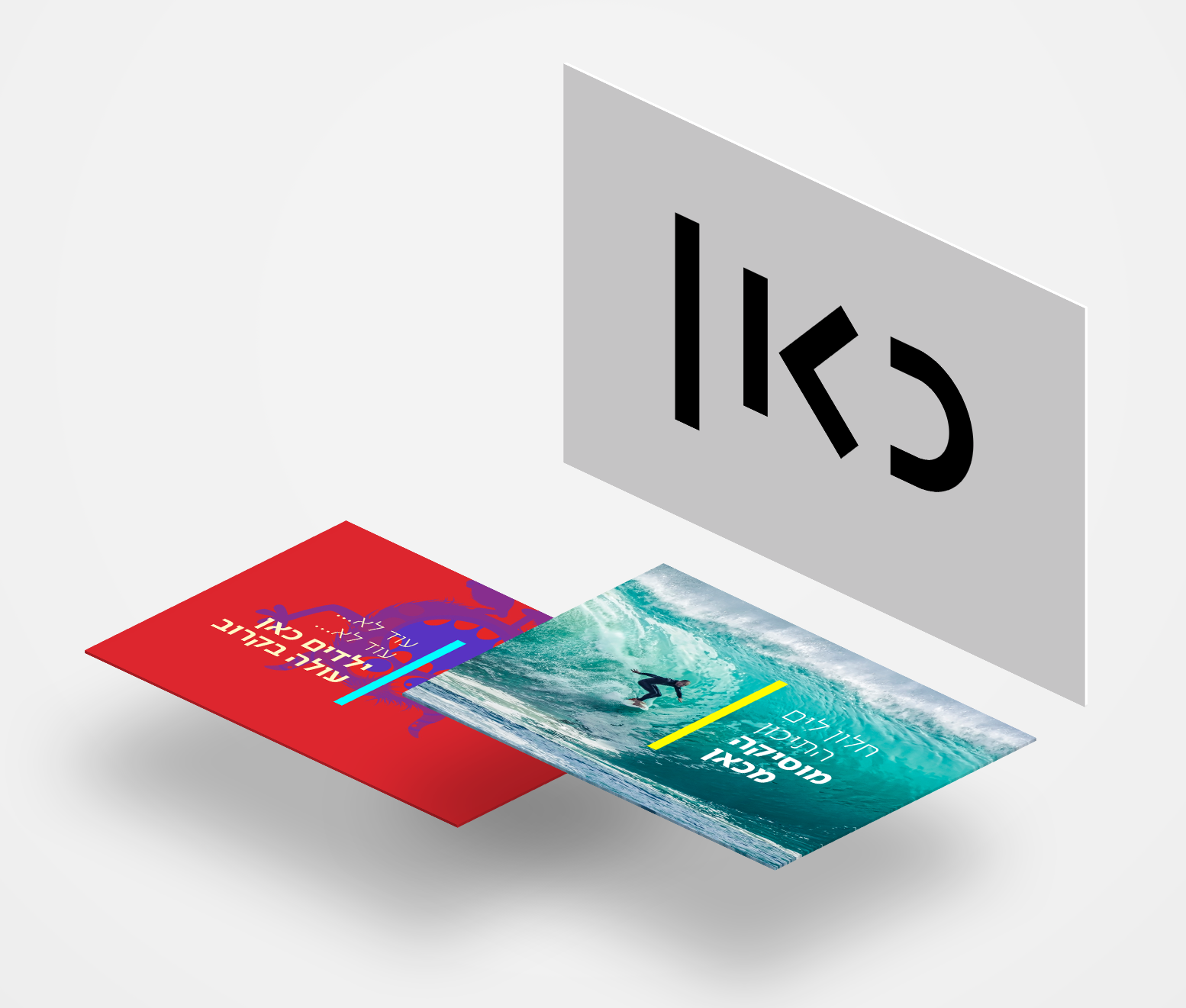

Ambitious Content
The old Israel Broadcasting Authority was established in the 1960s. By 2016, IBA was operating two TV channels and eight radio stations, but had virtually no digital presence. Citing IBA’s lack of relevance and efficiency, a government decision shut down the broadcast authority. The successor organization, the Israeli Broadcast Corporation, was just supposed to take over IBA’s broadcast assets.
The corporation’s founders, on the other hand, had something much more ambitious in mind. They aspired to create modern and relevant broadcast content for a contemporary audience that would make a positive impact on local culture and communications.



Unified Identity
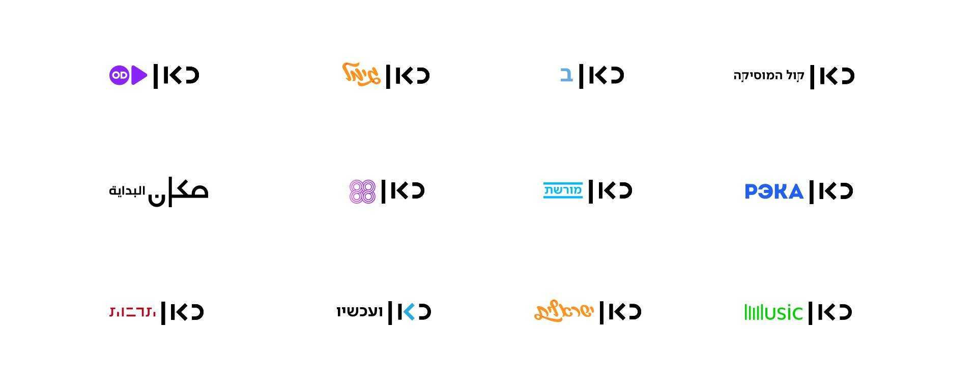
We began the branding process as the new corporation was being built. Working closely with the founders, we helped shape the vision, essence, and identity of the fledgling organization. We assisted the broadcast corporation to communicate the process of its creation, transform itself into a cross-platform organization, and craft a new brand architecture. At the outset, we made a strategic decision that affected content, form, positioning, and brand of the new corporation. Under the old broadcast authority, the individual public television and radio channels all cultivated individual identities. We decided that the separation between TV, radio, and online would end. The brand would be built around content and descriptive genres, regardless of medium.
Being Public is Being Free
The new broadcaster would be free from the pressure of commercial ratings, free from political intervention, free from exclusivity, and free from the familiar conventions of the broadcast industry. Instead, it would be all about quality and accessibility: delivering great content for everyone, in the format of their choice, that informs, entertains, and educates.


Here’s the Name
We named the company “Kan" — Hebrew for "here." Kan is a verbal indicator that ties together all the corporation’s sub-brands and activities. It’s also the foundation for a verbal language (i.e., “Everything begins here;” “Here is the news;” “Great music, only here…”).
Here's the Design
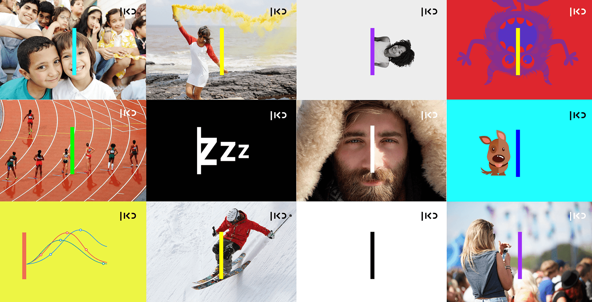
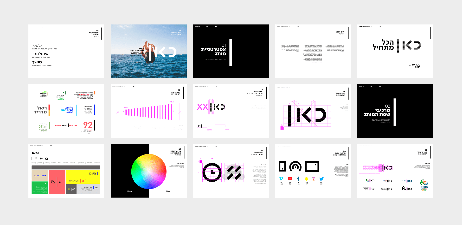
The logo and the foundation for the design language is simple: a line, where everything begins. In the loud and grandiose landscape of media brands, this line stands out as self-assured, fresh, free, and unique. The primary brand colors are black and white, which serve as a platform for the content itself. We developed a comprehensive system of platform, genre, and sub-brand communication — all based on the same idea. Though complex, the project yielded a simple, accessible, and attractive brand language — representing the communications revolution on behalf of the Israeli public at large.


